What is a manifesto?
Definitions
“a public declaration of policy and aims, especially one issued before an election by a political party or candidate”
A manifesto should be a battle cry to inspire you when things get tough.
A manifesto should convey:
Intent: What is my purpose as a designer? What do I am to achieve through this interaction design course and into my career?
Views: What are my beliefs?
Motivation: Why do I want to be a designer? What do I need to remember when it gets tough? Why keep going, why not give up?
What does a manifesto mean to me?
Intent
What is my purpose as a designer?
I want to create products in the highest quality possible with an edge, generating more than the industry standard by pushing into the unique yielding superior outcomes and results.
What do I want to achieve through this interaction design course and into my career?
I want to learn as much as possible as quickly and thoroughly as possible to develop my skills and push my limits. I want to keep this as my primary goal throughout my education and employment focusing more on training rather than monetary gains as this is what will lead to progression and sustainable success.
Views
What are my beliefs?
Work hard, be honest and never be afraid to ask for help. Never overlook what someone else has to offer. See the best in everything and everyone.
“All you can do is all you can do and all you can do is enough. But, make sure you do all you can do.” Earl Williams
Motivation
Why do I want to be a designer?
I do not want to waste my life doing something other than what I love and I love design.
As a skilled designer, I have something valuable to add to a project/ team/employer/ company.
As a successful designer, I will be sought after and this will lead to monetary gains and a great lifestyle with the option to freelance and to adapt my professional life around my personal life as needed.
What do I need to remember when it gets tough and I feel like I am failing or that it’s too hard?
Expect to fail and fail often this is what will lead me to success. There will always be another project, another client, another employer.
“In the middle of every difficulty lies opportunity.” Albert Einstein
Why keep going, why not give up?
The more I get, the more I can give.
It is my responsibility to be the best I can be so that I have more to offer to my colleagues, employers, clients, friends, family and community.
Examples of manifestos in art movements
Surrealists
“A twentieth-century literary, philosophical and artistic movement that explored the workings of the mind, championing the irrational, the poetic and the revolutionary” (Surrealism – Art Term | Tate, 2020)
The aim of the surrealists was to revolutionise the human experience. The word surrealist meaning beyond reality reflecting their rejection of the rationale in favour of the unconscious and unconventional.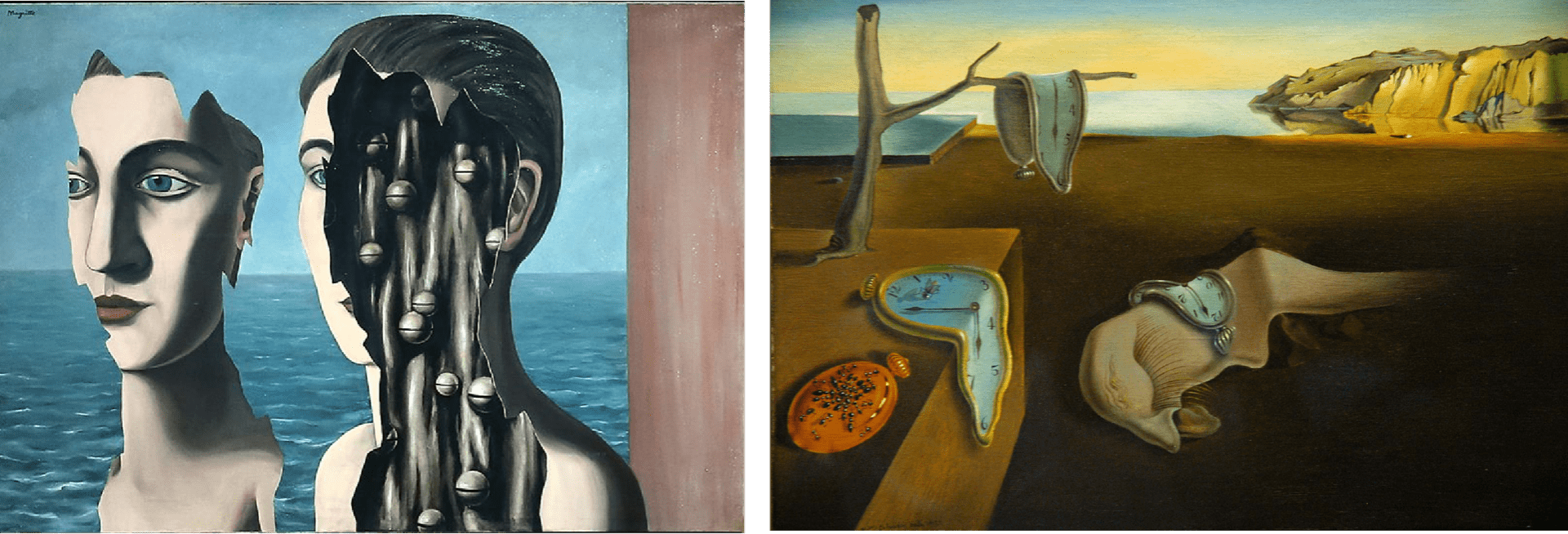
I love how much freedom there is in this approach to art and am intreated at how I could draw from a movement like this and incorporate a dream-like feel to the outcome by perhaps adding curves to straight lines as though the text were draped over a table as with the clock above or a torn effect as with the face in René Magritte’s, The Double Secret.
Pros of the Surrealists manifesto:
Very creative and interesting.
Very open, no limits, breaks to rules.
A platform for presenting and exploring very complex ideas and theories in creative ways.
Cons of the Surrealists manifesto:
Can be difficult to draw meaning from outcomes.
The lack of structure and rules complicates the subject matter.
Dadaists
The word ‘Dada’ means nothing however the art movement became one of the revolutionary movements of the early 20th Century. Stemming from the avant-garde modernists, the Dadaists favour luck in place of logic and irrationality instead of intent. The movement was a reaction to the rise of capitalist culture, war and the diminishing role of art. The movement also contemplates the definition of art exploring new art or “anti-art”. The style was underpinned by humour and clever turns.
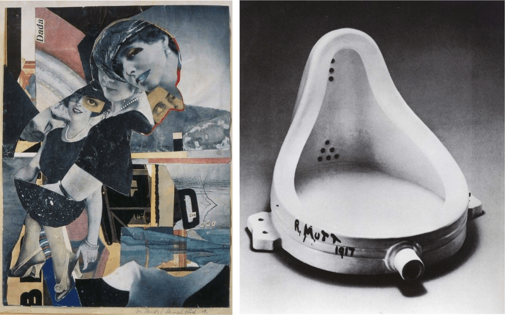
I find this movement very interesting and like the use of collage and the strange juxtapositions created however if incorporation this approach into my own work I would look to inject more colour into the final outcome.
Pros of the Dadaist manifesto:
It pushes the artist to break the rules, push boundaries simply to see what happens, providing freedom with purpose.
I love the idea of humour and irregularity in art.
Cons of the Dadaist manifesto:
Outcomes are in my opinion more likely to seem senseless to viewers.
De Stijl
“De Stijl was a circle of Dutch abstract artists who promoted a style of art based on a strict geometry of horizontals and verticals” (De Stijl – Art Term | Tate, n.d.)
The De Stijl meaning ‘the style’, movement began 1917 and moved away from the decadent forms and patterns found within Art Nouveau favouring simplicity, geometric shapes and primary colours. De Stijl began as a Dutch publication pioneered by Theo van Doesburg and Piet Mondrian. The publication turned into a movement that combated the trauma created by World War 2 by generating design work that had a sense of order and harmony.
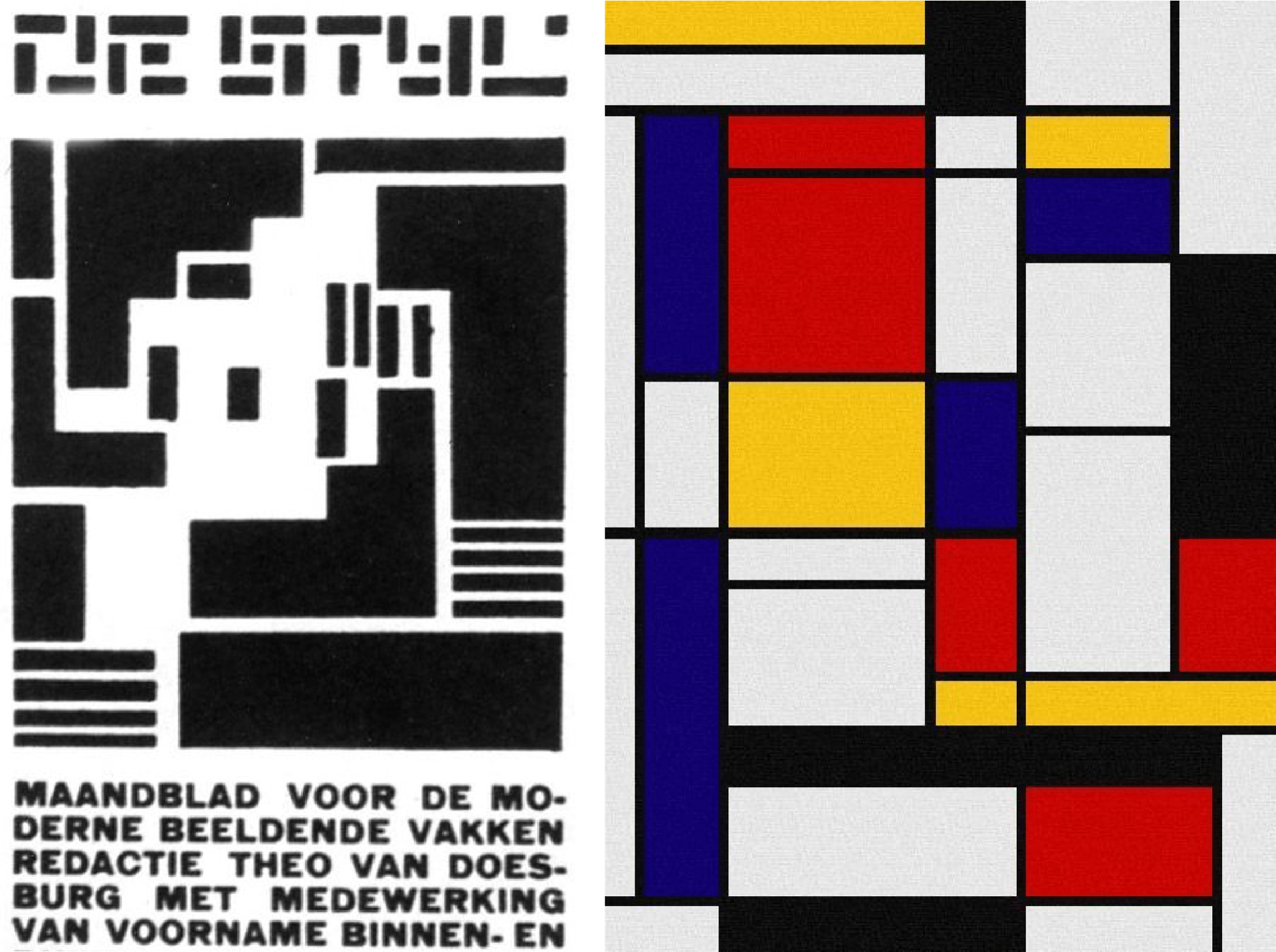
I really like this style as it is very striking with its bold use of primary colours and strong use line. In incorporating this approach into the styling of my own manifesto I feel confident that I would be able to achieve an outcome that is clear, well organised and striking.
Pros of the Dadaist manifesto:
Simple and easy to grasp.
Clear points of interest and structure.
Rule-based with strict geometry of horizontals and verticals
Cons of the Dadaist manifesto:
Less freedom as the rules are so clearly set
Other Mottos
The Eames studio motto: ‘Create the best, for the most, for the least’,
Modernists movement motto: ‘Form follows function’.
Preliminary Ideas
Option 1: The more you work, the more you get. The more you can get, the more you can give. OR Work to get, get to give.
I really like how this presents my motivations as a designer however while this is meaningful to me I’m not sure how clear the meaning would be to the viewer. This could be too associated with money which isn’t really what I’m going for, what I’d like to demonstrate is gaining experiences and knowledge rather than money.
Option 2: Don’t work to earn, work to learn.
Again, I don’t like having that money focus in my manifesto, while it’s a good principle I don’t feel it is my ‘battle cry’.
Option 3: More passion, better results
I really like this as I feel it is more reflective of design and highlights the need for a driving force behind my work.
Option 4: Find perfection in imperfection
This hits home with me as I believe I’m constantly striving for perfection while it is not obtainable and maybe not even desirable (perfection can be boring, your done, it’s hit the limit there’s nowhere to go). Imperfection is unique, different, interesting and perhaps exactly the outcome needed.
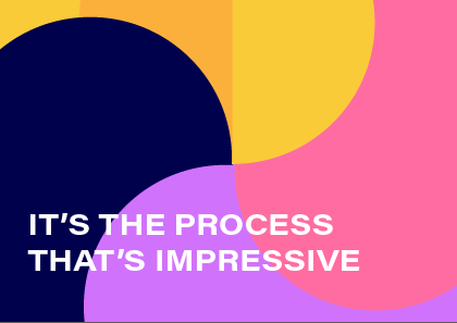
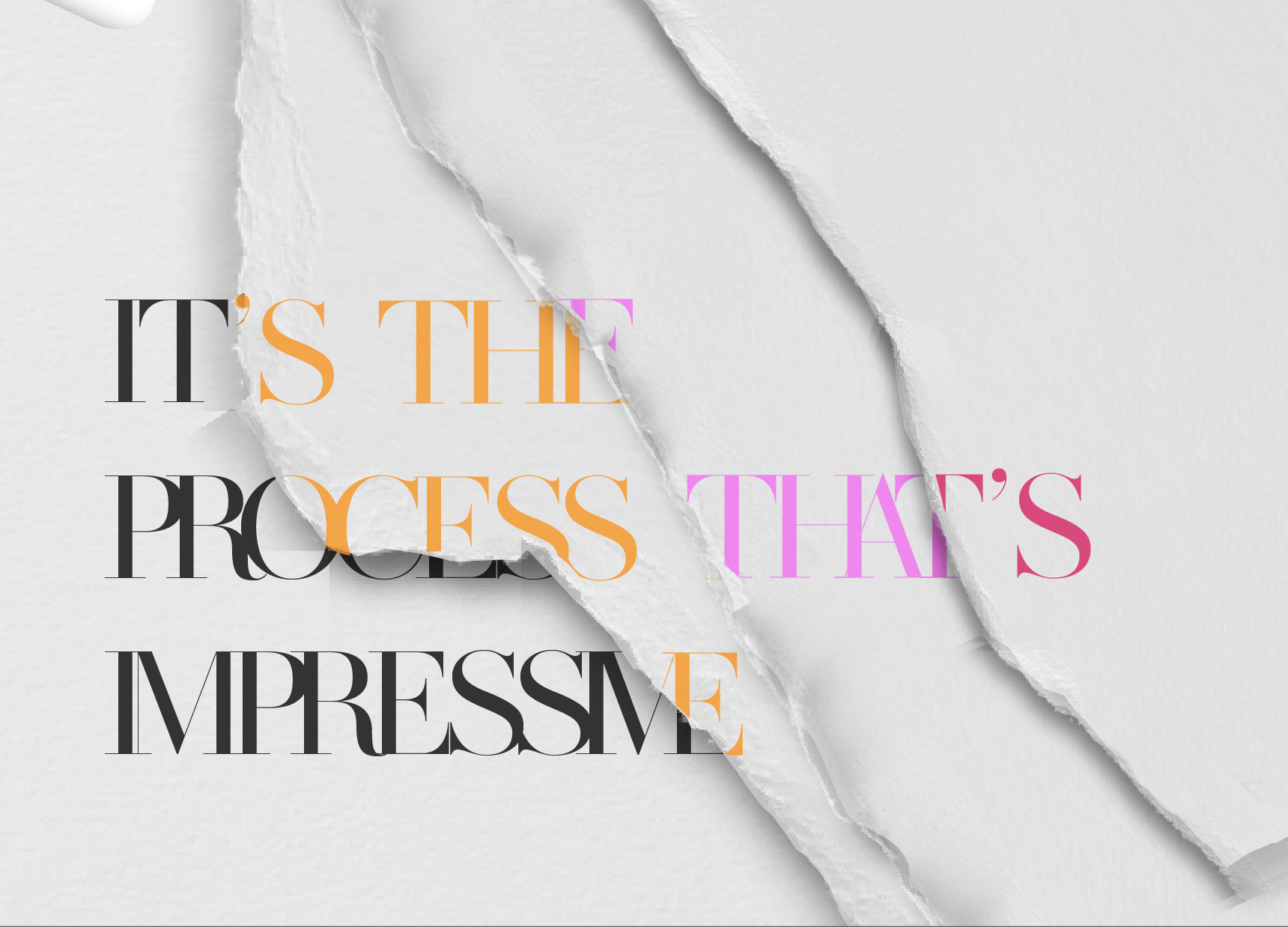
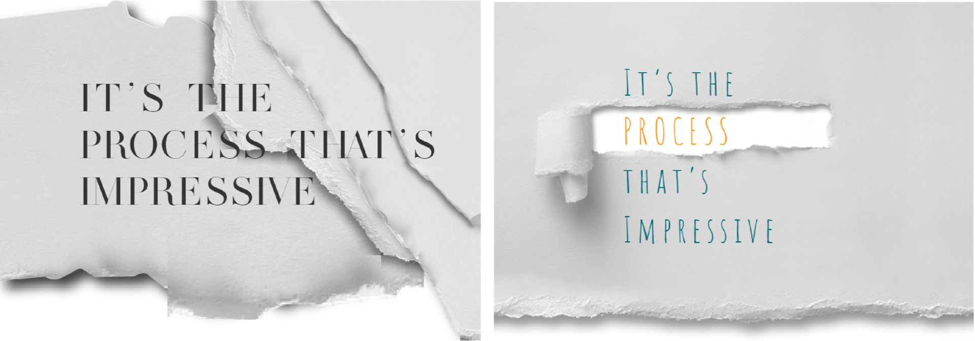
Option 5: It’s the process that’s impressive.
This is exactly what I want to portray as the end result may be great but the process that gets you there is where all the work and discipline is and that is what is truly impressive and inspirational. When faced with failure or difficulty this is incredibly encouraging because while I may not have hit a target or maybe struggling to get to a final outcome, that is all part of the process which is growing and developing me into an experienced designer.
Chosen Manifesto: It’s the process that’s impressive
Project Specific Research
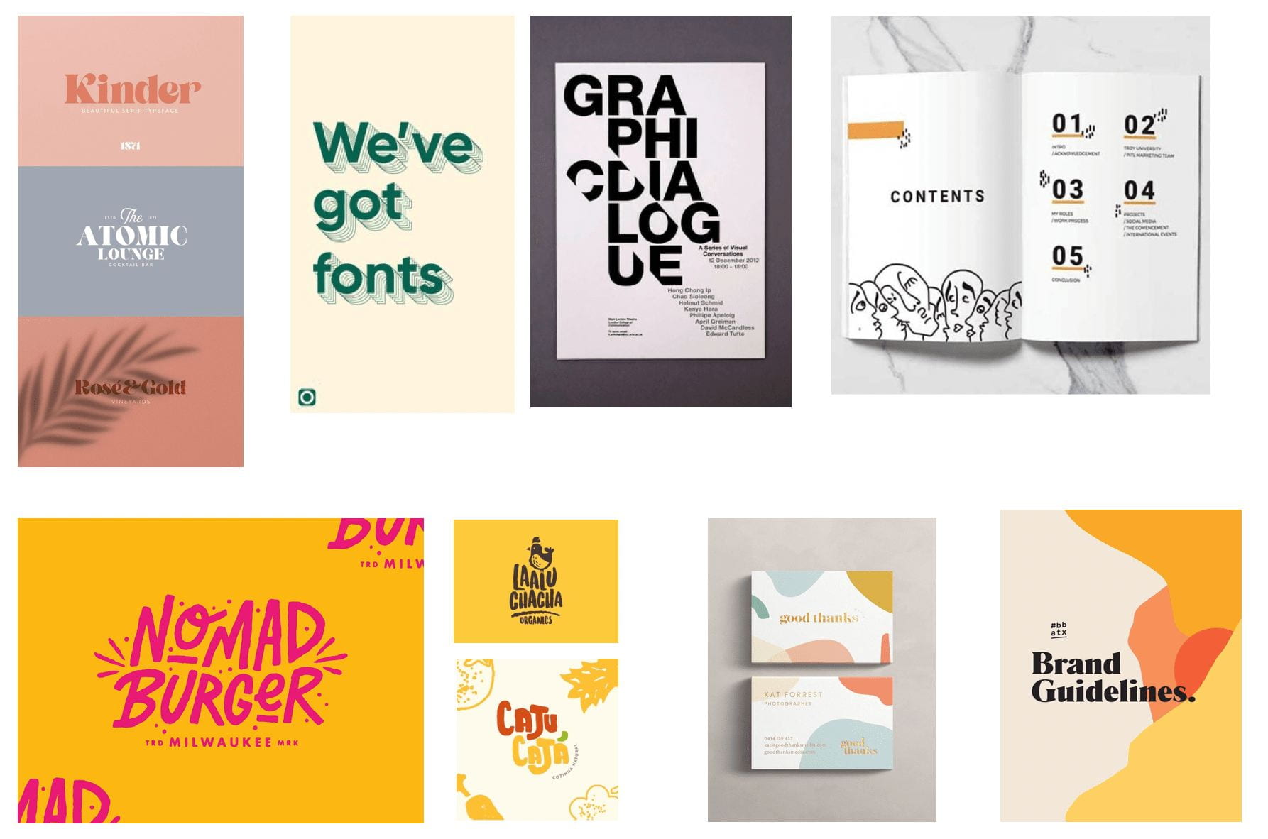
The Swiss Style
This Swiss Style of typography is one of my personal favourites, originating in Switzerland in the 1940s they movement has been influential as a typographic style throughout the 20th Century.
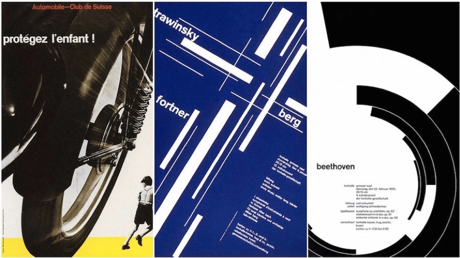
Josef Muller Brockmann was one of the pioneering designers of the movement in the 1950s. His work shown above demonstrates how design can remain current across the span of many years when executed effectively. This is something I would love to achieve in my own work as I believe this is a true test of functional and engaging design. Overall I love the structured feel in this approach to typography and the clever use of line. I like the idea of playing with this in my own work running the text, horizontally, vertically diagonal and perhaps even along a curved line while still achieving a very structured and grid-like format.
Minimalism
The minimalist movement began in the early 1950s and remains prominent today. Minimalism is perhaps my favourite movement as I love its simplicity and how by stripping back other design elements a clear and memorable focus can be established.

The currently popular minimalism focuses on the use of negative space, small points of interest and fresh simplistic designs with fewer words and sans serif typefaces. I love this form of design as it leaves room for the imagination with symbol shapes depicting sometimes complex concepts and subject matter. I am particularly drawn to the work of Christian Jackson, shown above and how Jackson manages to depict fairy tales through muted colours and simple shapes alluding to key features of the stories. I find Jackson’s work inspiring and would love to present the concept of process in a simplified and stylised manner as seen in the works above.
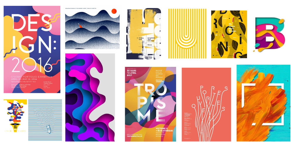
Baugasm
Baugasm is a series of digital design work by Albanian artist Vasien Katro following his 365 Project in which he creates a poster for every day of the year. The series can be recognised by the combination of graphic shapes, gradients and 3D objects and approach that is gaining traction in the digital design field.

I really love this approach and am amazed at how striking and effective the outcomes are. I love the playfulness of the colours, gradients and shapes included in the above outcomes and how the typography is repeated in one instance and only partially visible in both and yet remains legible.
Mood-board 1
Mood-board 2

I completed my project-specific research by creating mood-boards featuring interesting design elements in typography such as neo geometric influences, the inked effect i.e. hand-painted brush strokes creating outcomes that are both energetic and humanising, cut-outs, interesting typefaces, colours and compositions.
Non-Project Specific Research
Mindmap

To begin my non-project specific research I made a mind-map using miro and began by list personal areas of interest that I could draw from to influence my work. From these topics, I chose two primary focus’ animal prints and fashion magazines.
Animal Patterns
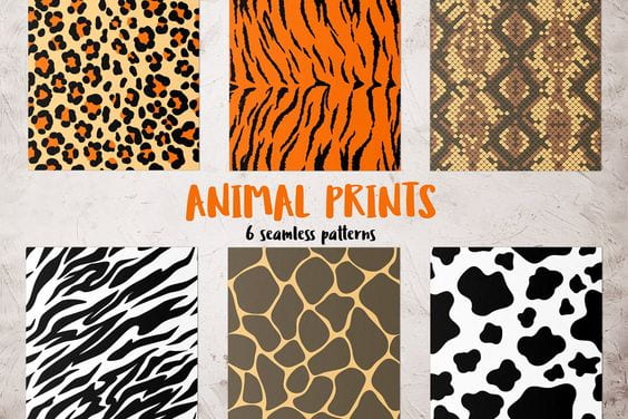
When researching animal patterns I began by looking at prints as shown above. I love the idea of incorporating these prints into my work perhaps through layering with the typography. I would also like to experiment with replacing colours with either rudimental primary colours as used by the De Stijl or even neon colours that could potentially be combined layering to produce a negative image effect.
Fashion Magazines
When exploring the idea of fashion magazines I utilised bother primary and secondary research as shown below.
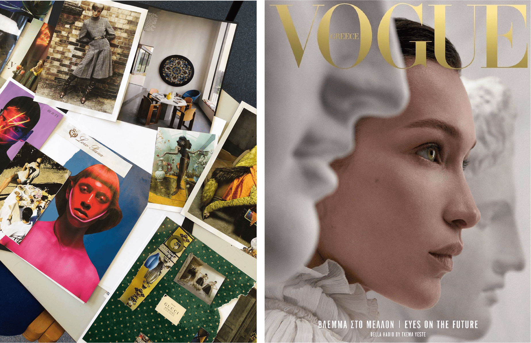
One of my favourite fashion magazines is Vogue as you can often find clear themes and influences from fine art, photography and interesting cultural elements, perhaps more so as Vogue in an internationally printed fashion magazine as shown in the example cover of Vogue Greece above. In the above left is a college of pages that I felt were particularly striking in colour and composition from a 2019 edition arranged in a collage. I would love to be able to include the interesting element of colour, pattern and typography as seen above in my own work particularly as seen in the minimalist style cover of Vogue Greece with its muted colours causing the subtle gold text to stand out clearly from the background photograph.
Sketches

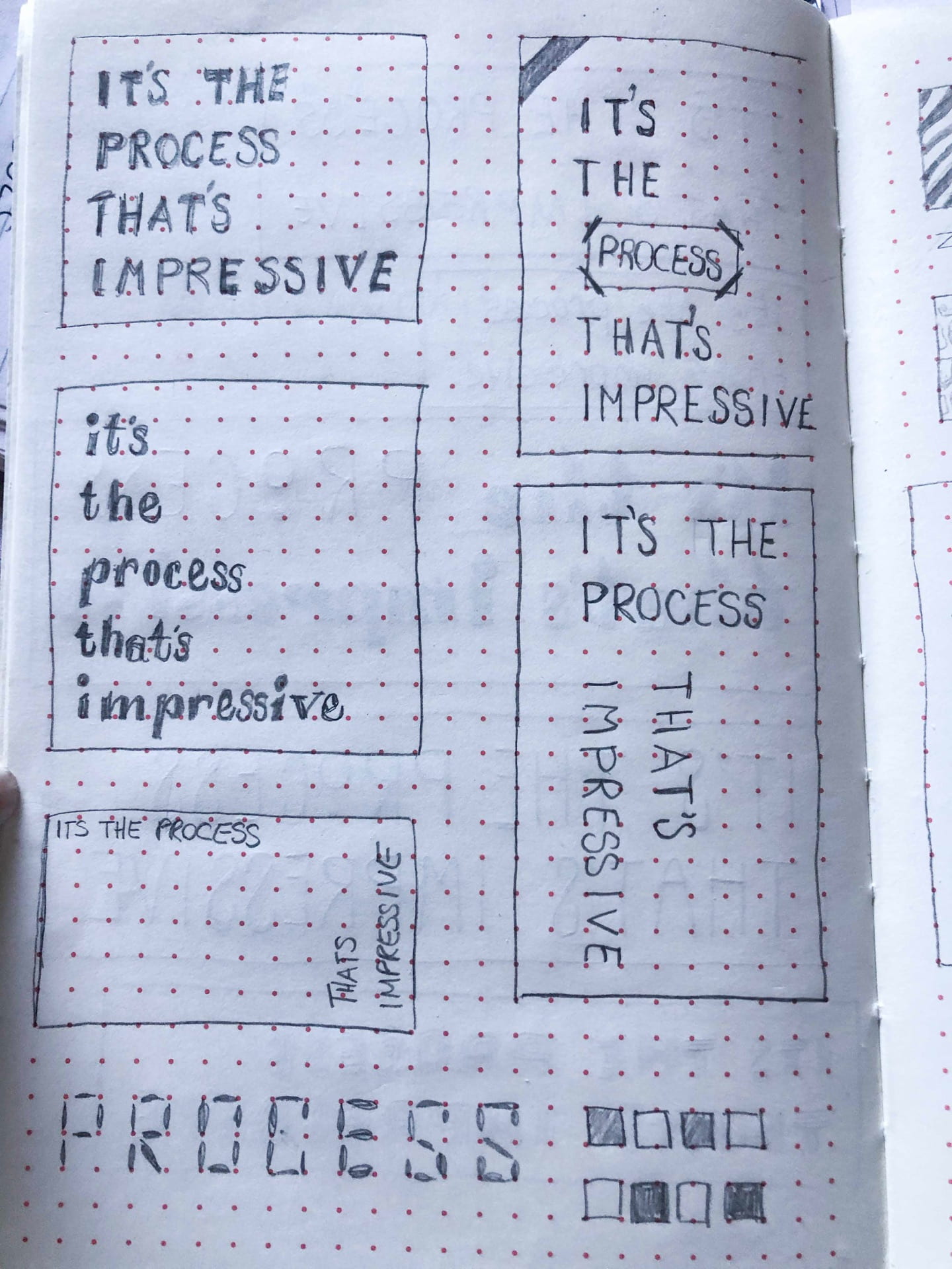
I began by putting my initial ideas on paper playing around with different typographic styles, see left and various compositions see right. I liked the idea of potential mixing typefaces and families to create an interesting composition that would potentially highlight the word process which I felt could potentially be the visual focus of my manifesto. In looking at various compositions I drew from the Swiss style experimenting with horizontal and vertical text placement. Of the various text placements above I favour the simplicity and legibility of the left alignment outcomes as I feel this will allow me to do more with the space surrounding the text while maintaining a readable outcome.

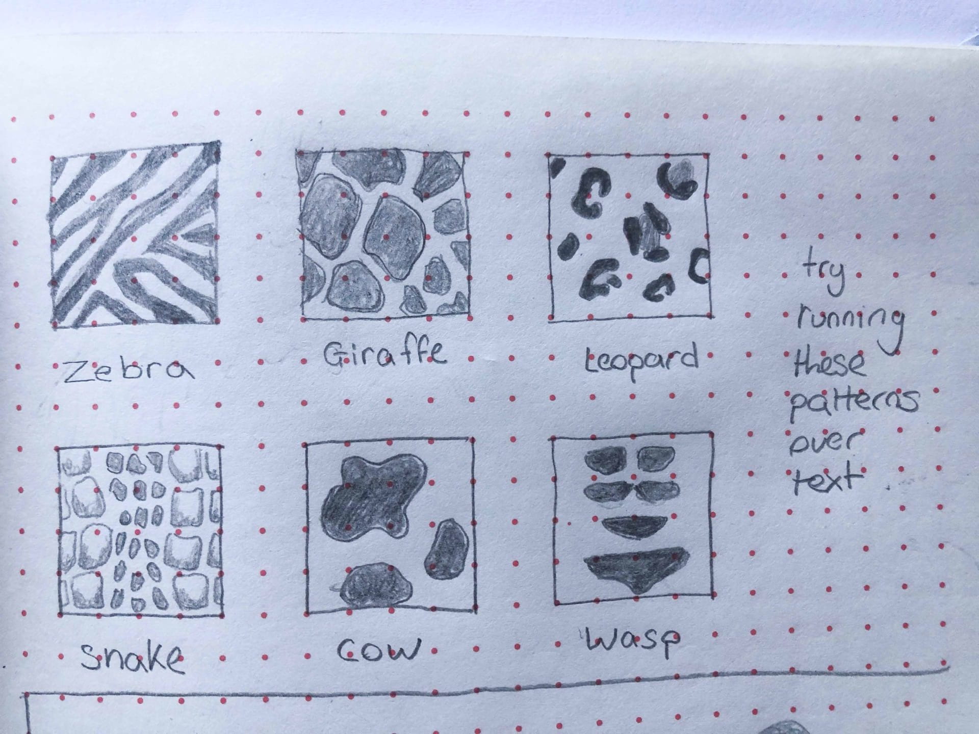
I then moved onto experimenting with shape and animal print patterns. Above I have drown various triangle glyphs, see left and smalls replicas of animal prints see right.
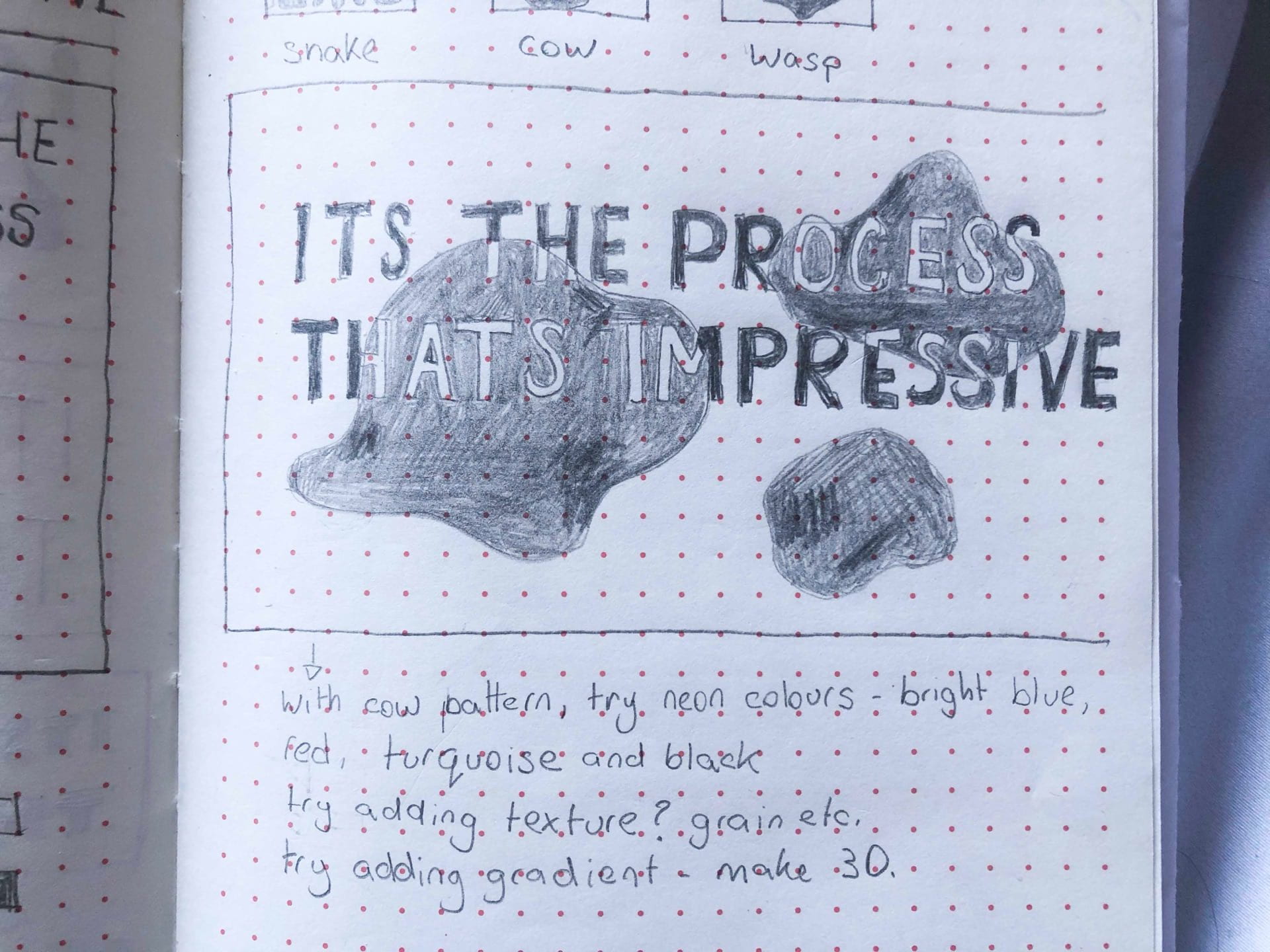
I then combined the cow animal print with the text in a sans serif typeface having the cow print layer over the text while keeping the text visible by changing the colour on the text covered but the print. I felt effect when paired with the correct colours could create a really cool effect.
Digital Outcomes
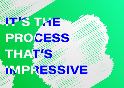

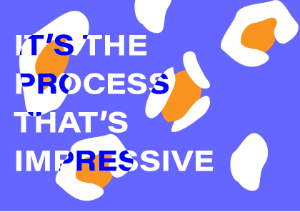
I then created the above outcomes using the animal pattern concept, layering the text in the sans serif typeface, Acumin Pro Wide, with animal prints and bright coloured outcomes. While I think the outcomes are interesting and vibrant, I have not achieved the outcome I feel accurately fit my manifesto and effectively represents my own artistic style as a designer.

I then looked at shape and arranged the above compositions. I began by focusing on squares triangles and circles coupled with vivid colours in order to create a Neo geo style outcome as seen in the first compositions. I then moved on to focus on curves, circles and layering coupled with softer pastel colours in the second outcome. Finally, I striped back the background colour to white and created the blob-like shapes above moving away from the structured shapes I had been working with. Finally, I filled the ‘blobs’ with a blue/turquoise gradient and place the text in the centre, with a left alignment. While I was really pleased with this relatively minimalist style outcome I still did not feel I was creating a design that visually presented the notion of process in the way I wanted.
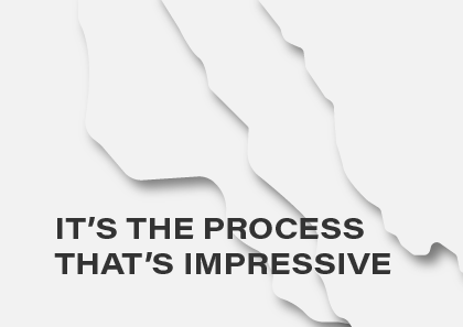
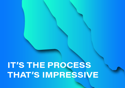
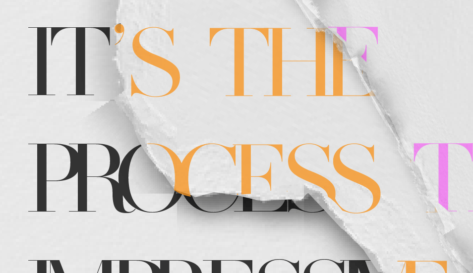
I, therefore, decided to explore the idea of layers and created the above effect to give the impression of torn layers by adding drop shadows. I experimented with various colours and gradients as seen to the right however I liked the white outcome as I felt by adding texture I could achieve a paper effect. I really like this concept as I feel it accurately presents the idea of process as the torn pages can represent 1st, 2nd, 3rd and 4th steps/attempts at achieving a final outcome or goal.
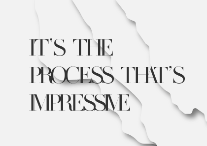
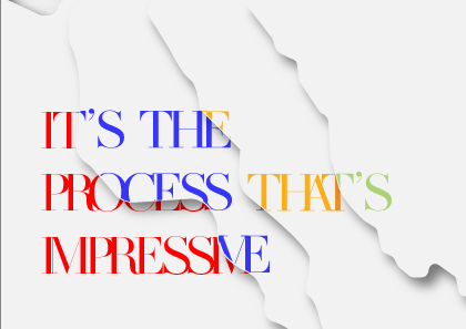

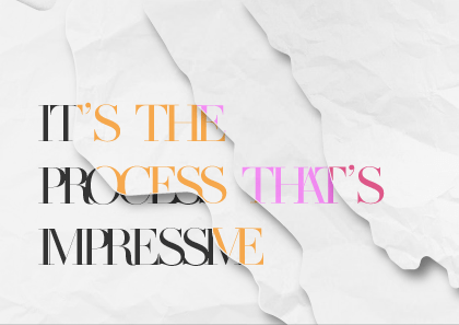
I then experimented with various typefaces before choosing the Vogue inspired MADE SAONARA 2 serif typeface which I felt generated the chic, print style outcome that complimented the torn paper effect without over-exaggerating it, as the script and inked style typefaces did. I then played with the colour adding a layered effect to the text by placing it under the layer above in separate colours and cutting off the text with the layer it was placed on by outlining the text and using the shape building tool to cut off the edge of the text along with the line of the layer. I experimented with a variety of colours including primary colours as shown above and layered them together. I finally decided on the slightly more muted colours of orange, pink and raspberry contrasting the striking nearly black of the bottom layer. I am really happy with this outcome.
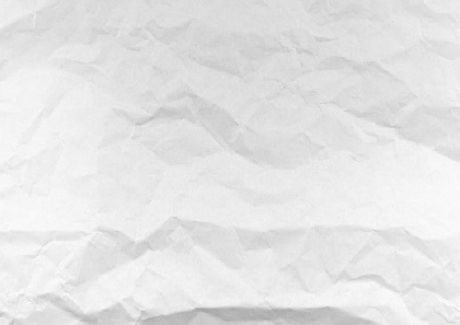
I then wanted to add texture to the background layers to create a more accurate paper look effect. I began by experimenting with the texture filter effects in illustrator but found none to effectively present a paper outcome so instead downloaded the above image of crumpled paper and created individual mask clippings to add to the separate layers at a reduced opacity. While I am pleased with the above outcome I wanted to achieve a stonier torn effect at the edges and experimented with further white textured layering at the edges that proved ineffective.
I, therefore, downloaded a second image of torn paper and used mask clipping to create the background layers and cropped the torn edges from the downloaded image and placed along the edges of each layer producing what I feel is a really effective outcome.
On completing the above I noted that various drop shadows and edges created unwanted highlights on the outcome as seen above. I, therefore, moved the final outcome into photoshop and use the spot healing and clone stamp tools to remove the effected areas producing the below final outcome.
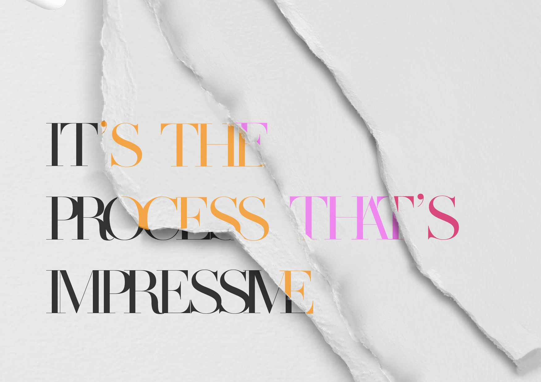
I am very happy with the above outcome and feel it is striking and memorable. I believe I have achieved a minimalist approach with interesting typographic elements in a simple yet effective composition.
Following the feedback given I experimented with using sans serif texts and increasing the kerning as shown in the above outcomes. While this was effective in producing a clearer and more legible outcome I had at this stage, begun to struggle with recreating the torn page effect in my follow the rhythm project which will be displayed on the same webpage. While some of the outcomes where effective in recreating the torn page effect I was trying to achieve I did, however, find the quality of the image and final finish to not be of a high enough standard, I also felt the outcomes themselves would have potentially been more suited to print rather than a digital outcome. I, therefore, decided to produce a different style outcome for my manifesto still moving in the theme of layering however away from the torn paper effect I had previously attempted to achieve.
A change in direction
Layering and typography mood-boards
 My primary goal was to create a very clean and minimalist outcome that would work well as the hero section for my website and establish a clear theme throughout that I could draw from in my follow the rhythm section. I loved some of the works I found in my research that used layering and drop shadow particularly the ‘B’ outcome shown in the top right-hand corner of the above mood-board and therefore began to experiment with this style.
Early experimentation

I began by recreating the layered effect I had found in my research as shown above to the right. I used illustrator to this creating wavy lined using the pen tool and then adding a drop shadow effect. I then wanted to have this layered revealed behind my type so I chose the typeface Abril Fatface (I wanted a really bold and well-weighted typeface to reveal as much of the below layering as possible) to create the word ‘process’, outlined and used the pathfinder tool subtract it from my top layer and added a drop shadow, see above right. While I love this concept I felt that it wasn’t really working in the way I wanted it to with too little of the below layering being visible.I, therefore, decided to try removing the top layer and placing the text directly onto the coloured layers.

At this point, I started to feel the visual representation of process in the layering was being lost and started to sketch out other visual representations including lightbulbs to represent ideas, cogs to represent the mechanics, arrows to represent decisions and moving in various directions as well as roadmaps and flowcharts. I felt the lightbulb was the most visually appealing of these ideas and therefore tried including in my outcome and shown in the above right. However I was still not happy with the outcome, I felt the layering as a full background was too distracting from the text and something about the Abril Fatface typeface reminded me of headings in newspapers and magazines, therefore, I decided to use a top layer with a subtle light pink gradient and use the lightbulb shape I had decided to include as the cutout portion to reveal the layering below.
Final Results

I added my manifesto and experimented with various layouts before using the layout I had produced in my type scale exercise in the typeface Comfortaa. I also used wight, scale, colour and uppercase lettering to establish a hierarchy of importance. I removed the lines surrounding the light bulb and replaced them with dots when cutting out the dots from the top layer this made layout too cluttered so I added them in the same colour gradient as the light pink backgrounded and added a drop shadow to make them slightly more visible. However, on reviewing this with my lecturer in a one-to-one session, it was suggested that I take out the dots all together and after having done so I found the outcome better achieved the minimalist feel I wanted it to. Overall I am really pleased with this outcome and feel that I have represented my manifesto “It’s the process that’s impressive” in a clear and effective way with visual representations of process in the use of layering and the lightbulb. I am also happy with my use of typography and the additional contrast and level of interest added in my use of scale, weight, colour and uppercase lettering. I also believe a have achieved a complimentary warm colour scheme that I will most likely draw into my follow the rhythm outcome.
What have I learnt?
- By completing none project-specific research I can generate more original and interesting ideas rather than simply recreating what has already been done within the area
- Sketching is an incredibly useful tool that will help me to get all my ideas out that can be returned throughout the creation of an outcome
- The importance of recognising the difference in designing digital outcomes rather than print outcomes
- How to design engaging and minimalist outcomes
- How the incorporation of effective type scale can give a project a more polished ‘look’
How can I apply this to my work in future?
- Explore both project-specific and project none specific research
- Always begin a project by producing initial sketches
- Be mindful of what I am producing an outcome for be it print, web, app etc. so that I produce an appropriate outcome for the medium it will be displayed on.