This week was another individual tutorials session, allowing us to work on our projects and ask questions if necessary. I took this time to mock up the reminders screen I wireframes yesterday.

I first mocked up the wireframe that I made for a general reminders screen. This will be connected the ‘sign in’ flow of my prototype. I made quite a few reminders to show what the grid would look like, however it is unlikely a user would have that many appointments in a week. I broke the grid up as well from the 9 tile grid I used in the wireframe, as I knew this was far too many. I really like how this looks. At the moment I am using placeholder icons from the noun project but these will be re-drawn along with some others to be consistent with each other.
I then wanted to create what a reminders screen would look like for a new account so I mocked this up.

While I was designing this I realised I had not made a home screen with the profile photo chosen. I mocked this up as well.
Now when going through the onboarding user flow you can go back to the corresponding ‘home’ page at every step and the nav bar now connects every screen from this flow to this reminders screen. As there can be no reminders or appointments in a new account, in the tile that would have shown reminders I explained why this is empty. My next development or this prototype is to mock up a ‘chats’ section to complete this process. Reflecting on my design now I realised I don’t have a call to action button on the tile to bring them to where they can connect to their vet practice. I did say in the text that it is through the ‘chats’ page but I think I should have a link or call to action in the text as well.
I will continue this but I decided to switch my focus towards the presentation for final critiques.
For this presentation we had to create the following screens:
Screen 1. Product logo/brand
Screen 2. Overview of all screens to date
Screen 3. Five screens representing the main focus of your digital product.
I started re-working the branding slide of my app with my new colours.

I took the previous slide I made with the orange accent colour and swapped it to the new, darker pink. I think this looks really professional, I was worried the pink and purple might look to bright together but because they’re broken up with shading, white stroke and that teal colour.
The next step was to decide on the 5 screens I would choose for my app so far.

The screens I chose was the opening sign up page and a profile in the new colours, I also showed the screens I had made before I changed the colours fully. This is because I wanted to show my previous idea and get feedback on which style was better.
The only other slide I had to make was a screenshot of my figma board to show the overview of my slides and that was my presentation for critique finished.
The next thing I wanted to get started this week was some ideas for more screens to develop for my app. To do this I went back to my user research. In my previous user flow I focussed on the onboarding process as I felt that was a good way to introduce people to my app design and run them through what it is. However I would like to take a step back and think about the flow and user process through the app if they already had an account. I decided I would make this user flow. I drew out a rough idea of what it would look like and then took to miro to complete this.
 This is an overview of the user flow I created. It is split into two halves.

This half focuses on what happens in the pet profile section.
 This half focuses on the reminders/chats section.
I used my user personas and empathy maps as help along with the screens I had made so far. Something I noticed in the user research side is that I mentioned the feedback the user would received after entering data about their pets but I haven’t show what what would look like in the product yet, Therefore, I feel this needs to be shown more in this prototype.
I wasn’t exactly sure how to present this so I looked at some UI examples for presenting feedback in healthcare.
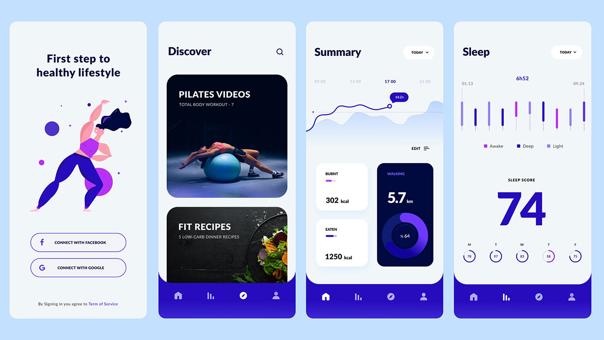 Many images came up of UIs similar to the one above. I like the graphs and how they’re presented but I wanted to get ideas of how to explain the data or have written explanations. I wanted written feedback so the user can understand what the data is saying quicker. To get inspiration for this I looked at my own Fitbit data to see how they tackled this.
I haven’t had the best sleep this week but I thought this would probably be the best way to see the feedback.

The journey starts with this screen after I tap on the sleep tile in the home screen.

I went to the most recent sleep data and tappe don the benchmark tab as this is the type of thing I would like to do with my app. Give the pet owner feedback on their pet’s development compared with others of its type and age.

The last screen I looked at was when I tapped into the sleep graph to get more information. In the ‘light sleep’ tab it gave me this written feedback. Fitbit have done this in quite a simple way, they just have the graph and written feedback under it. I liked how it indicated how the user could click into the graph by putting an icon like the one below at the top corner of the graph. This is a really simple idea to get that idea across and I will use an icon like this in my own design.
![]()
This gave me some great insight into how to develop the data in the pet’s profile and their feedback further. I will start with some sketches and ideas and for this I will focus more on the feedback for the ‘Chester’ dog in the sign in page. This is because there is more detail and data on this profile.

These are the sketches I came up with:
In the sketches I also showed how I plan on prototyping these screens.

these are my wireframes for the exercise and weight trends sketches.
I like how they look so far, one thing I noticed is that there isn’t enough padding between the graph and the heading. That will need to be fixed when it’s mocked up. I think the use of graphs is smart as people like having these data visualisations to turn to, to understand their or the pet’s health. I think there are some other spacing issues between sections on both screens that will be fixed when I am mocking them up.
After working through my user flows and sketching and wireframing some new ideas, I am happy with the development of my app so far. I think the prototype shows a lot of the key moments of these user flows. Something I do want to improve upon is having something to show for the ‘chats’ page on each flow, just to complete the process. Next week along with taking onboard any feedback I would like to add these screens and mock up the wireframes I completed this week.