In this week’s lecture we were given full feedback from our lecturer of what we have done so far for our CV and Cover Letters.
Before the feedback session started, we were given general points of feedback. One of which was was that as designers we shouldn’t be using Word to create our CV and Cover Letters. I asked what type of software we should be using and I was told Adobe InDesign. I had never used this software before so I was given a quick tutorial by my lecturer of how to set it up and the tools available to help me. The other general feedback points that applied to me was that I had forgotten to write a short bio about myself and to add my references.
After this I got right to redesigning my CV in this new software.
The most useful tool I found was the margin and grid tools. This helps me make sure that all of my content is evenly spaced and aligned.
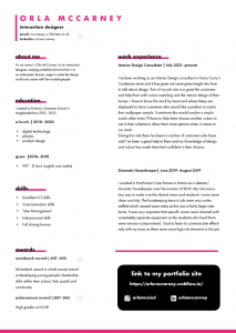
This was my original Word CV;

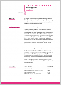
This is what I changed in Adobe InDesign;
I think my changed version has made a big improvement, the CV looks much more structured. I chose a darker pink for this document as its a closer shade to the colours I used in my portfolio site, I did this to add a some cohesiveness. I looked at some examples online and most of them kept all their information on one page so I tried to do the same. I used two columns for my information and with the space I had left at the bottom I made a box to hold my social links.
I then showed my lecturer my updated version of my CV. This was the feedback I received:
- Spread the content over 2 pages – its too condensed in this version
- Remove the black box containing socials and links – it can be distracting, find a way of integrating into header of page
- Add your first year modules and marks
I understand this feedback completely , the main goal of a CV is that it is easily scannable for all the information the employer will need. Having my content across two columns and a box on the side makes this more difficult and the document looks cramped. As CVs are supposed to be concise, I was trying to keep everything to one page, however if keeping it to one page gets in the way of the readability of the CV it should be spread across 2 pages.
Next Week’s Task
During our class, we were given our task to complete for next week along with continuing to improve our CVs and Cover letters.
Our task was to do some research and fact finding to get us started on the entrepreneurship process in writing a UX proposal document. We were given the resource, ‘A Project Guide to UX Design’ ebook, to help us with this
A UX proposal document is something we would give the client before a project. This explains what you are going to do for them and some details which the client might agree to and from then you can get started on the project.
CV update
After my feedback session with my lecturer, I made some improvements to my design.
The first thing I decided to change was to ‘get rid of the black box containing my socials’

Original
To change this I decided to make put these links in my branded header. This way it would appear on both pages, meaning my contact details are readily available for employers.

Changed
The next improvement I made to my CV was to add my module name and marks from last year.

Changed
This change has added more useful content to my CV and I enjoy how it’s laid out in a simplistic table form. I think it looks neat and organised.
The last improvement I made to my CV for this week was to separate all my content onto two pages.

This change was a big improvement of my CV. Spreading the content out allowed me to put all the content in one column and the headings in the other. This makes the document easier to scan for the employer but also shows that I know how to design simply and effectively in a professional manner.
Cover Letter Update
The main changes I made to my cover letter was to space the paragraphs out more and using the same header as my CV.

This is my updated version of my Cover letter. Along with changes mentioned below I also used the same font and heading styles as my CV to continue to emphasise cohesiveness between the two documents.