Visualising Data
In this week’s lecture we final part of the module, visualising data.
We introduced to infographics, and how important, easy to understand, simple, concise information is.
Diagrams- are a simplified drawing showing the appearance, structure, or workings of something.


Visualisations- are ‘an interdisciplinary field that deals with the graphic representation of data. It is a particularly efficient way of communicating’


We were shown that data is everywhere from bus timetables to forecasts and weather reports so why not take the the time to make this information beautiful and functional.
Research
For further research into visualisations and what they can be used for, I watched David McCandless‘s Ted Talk on the ‘Beauty of Data Visualisation’
The first project he brought up was his data visualisation on the military spending, worldwide which he called “The Billion Dollar Gram”

McCandless researched articles expressing the amount of money spent on something and scaled it accordingly with everything else to convey simply how much money was spent on something in comparison to say personal wealth. The project was then colour coded to show how the money was used. McCandless talks about presenting this information as a ‘landscape’ or a ‘map’ that ‘people can explore with their eyes’ I thought that was a really nice way of thinking about data and how you can even gain excitement from it.
The next project McCandless’s presented was called “Mountains out of Molehills” which he describes as a “timeline of global media panic” The higher the point the more intense the fear:

McCandless points out patterns in data such as the ‘violent video games’ timeline which occurs around November and April every year. This can be explained by buying video games for Christmas around November time however for april, the spike occurs due to the anniversary of the Columbine shooting which is a pattern that never would have been seen if not for data visualisation.
David McCandless goes on to explain how he feels “Data is the new soil” as it as a fertile medium from which creativity and visualisations can grow from. He talks about how disconnected raw facts and figures can be and it makes them hard to understand but you can do more than just making data understandable you can make it an art unto itself.
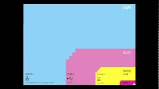
McCanless brings up this graphic to compare our human senses to the processing power of technology to allow us to see how powerful our minds are but the small square at the bottom right is how much of this we are actually aware of. This really made me think about how important proper presentation of data as is we, as humans, will immediately infer patterns and relationships between data from just a look at a graph. McCanless furthers this point by pointing out that we view America and China as military heavy and countries and figures back this up but these aren’t as true as they could be. If you put China’s soldier population relative to its general population it actually has quite a small army.
The world of data visualisations allow us to see how the beliefs of everyone around us and where they came from, it gives us a unbiased perception of how the world works and from this we can create our own opinions. The information I’ve learned about creating data visualisations has made me very excited about the topic and this is something I will look into myself.
Project 02 – Infographic / Data Visualisation
This week we were shown our final project- creating an infographic looking specifically at global population.
I did a lot of thinking about which direction I would go in for this project, looking at past students work it seemed to be heavily focussed on overall population statistics or population changes from disease or disaster. The second concept is something I found interesting and struck a chord with me at the time as I had been researching women’s rights and gender inequalities at the time. In that research I had heard of the term femicide- ‘ a man’s killing of a woman’ and thought this would be a slightly different take on the project but something close to my heart and especially in the aftermath of Sarah Everard’s death on the 3rd of March.
Weekly Tasks- Master Apprentice
These are the original diagrams:

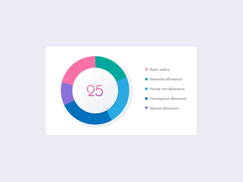
And these are my recreations:


I couldn’t find a good match for the number in the centre of the second pie chart so I chose a font I felt worked with the rest of the diagram. Overall I felt I did a good job at recreating these diagrams and have been enjoying these exercises.