Follow the Rhythm
Our third project was to take one of our favourite songs, we have to present the lyrics in a manner which is appropriate to the music and artist. We should take into consideration the pacing and rhythm of the song and if lines or words which are more meaningful than others they should be presented more prominently in the final poster.
For my research i looked at styles of typography I felt appropriate to the song and genre. The song I chose for this project was ‘Love is a beautiful thing’ by the American funk group, Vulfpeck.
The theme of Vulfpeck throughout all their music and albums is this nostalgia of 70s American Suburbia. In their stage sets they will often bring very ’70’s Suburban Basement’ elements such as sofas, rugs and tapestries. Which is why when coming up with designs for this poster my first thoughts were classic American , comfort and vintage elements.
These photos were my inspiration for my first thoughts and concepts;
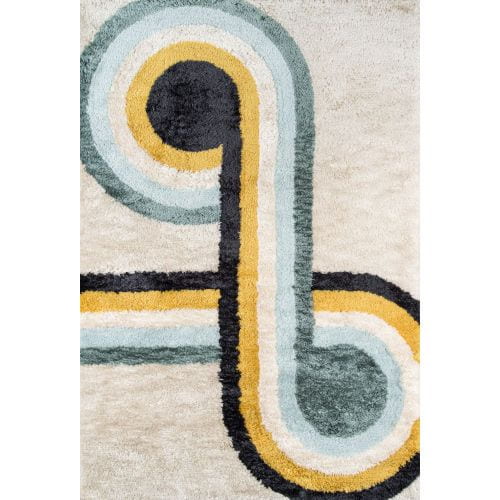


The reason I picked these images is that they all represent both the aesthetic and feeling I want and that is also prevalent in vulfpeck’s music. The orange and red colour that are all very bright and colourful in these images is something I want to recreate with this poster.
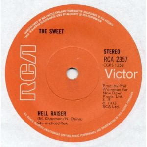
I really enjoy the vinyls on the wall in the second image, I think it could be a great way to organise typography so I grabbed another image of a record with a bright colour scheme that I could work from as well.
These are my initial sketches, just to get some idea down on paper but I think they came out quite well.
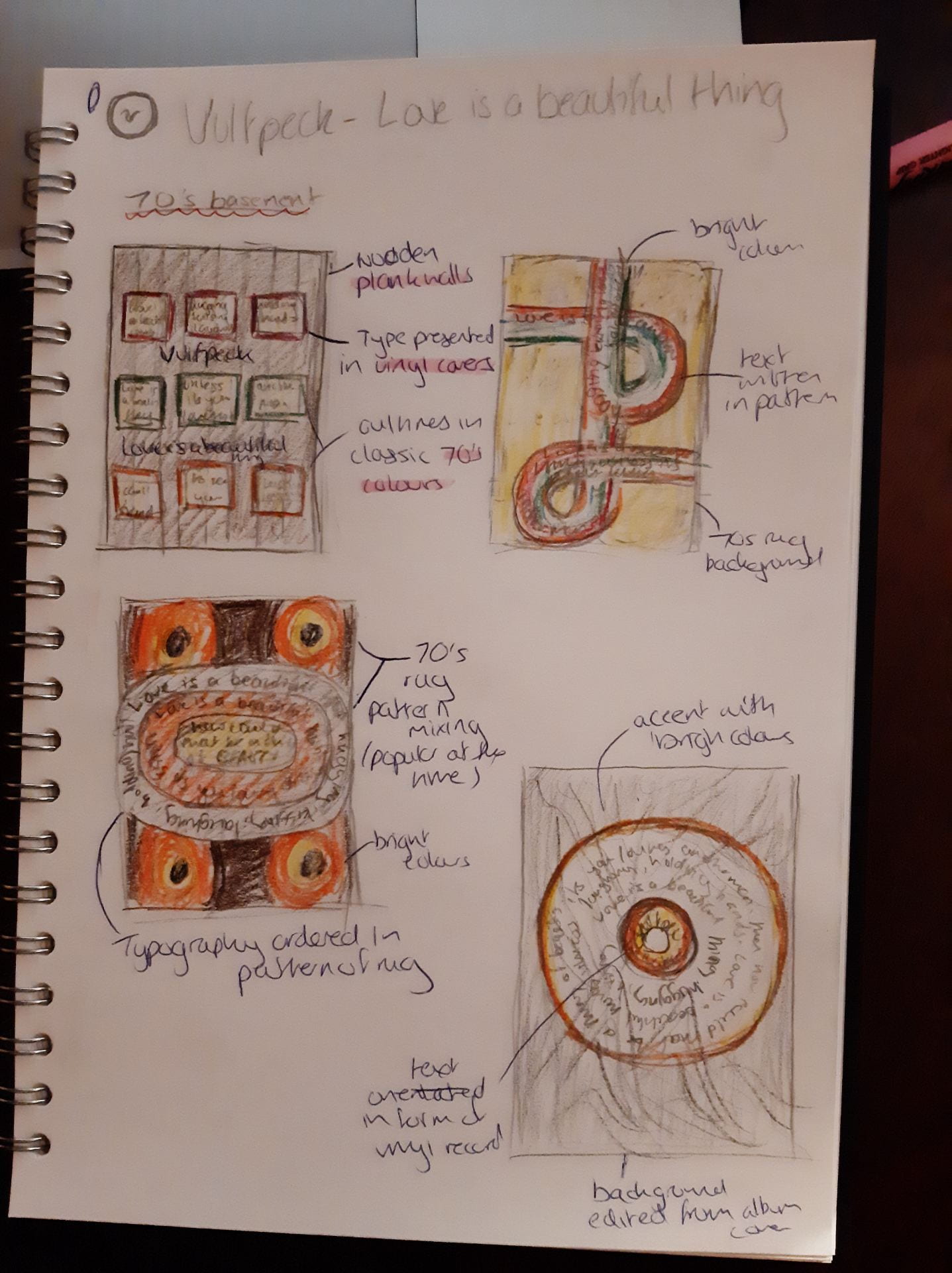
The first sketch is sort of a recreation of the room with wooden plank wall and vinyl record decor. I thought the grid that can be created with the records could organise text in both a way that’s easy to follow but is also effective at giving a 70s ‘basement’ aesthetic.
The second sketch involves a similar background pattern to the image of a rug I found. It’s colourful to fit the theme but also allows the text to be written within the lines of the pattern.
The third sketch is more of an experimental choice as I decided to pattern mix 2 of the patterns of rug I found, which was a common interior design choice at the time. I made the brighter coloured rug the background and placed the more toned down pattern on top. The lines in the second rug allow for a good space for the text, however I think overall it’s a bit too busy and could be overwhelming.
To change things up for the fourth sketch, I toned down the use of colours to create something more minimal. I did this to create a more modern look at the over-the-top, ‘groovy’ 70s aesthetic. I like it more than the others because it feel it could represent vulfpeck better, as vulfpeck are a modern band taking themes and motifs from the 70s not copying it entirely.
After these initial concepts, I developed the fourth sketch further;

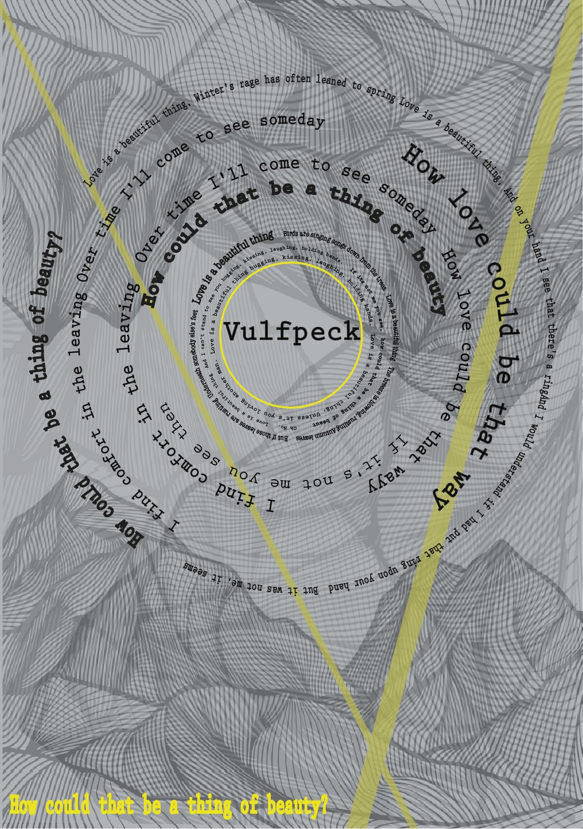
What i did initial I came up with was to arrange the typography into a disk shape to look like a vinyl record. At the centre of the record I recreated the logo for ‘Vulfpeck’, with the closest font I could find to the original.
For the background for the poster I took the album art for this song and duplicate parts of it, rotate them to create this funky lined background over which I thought to put a grey overlay to meld and create an overall more consistent background.
I wanted to add more of the colourful elements so I added to stripes in the shape of a ‘v’. I also added the same colour the last line of the song, at the bottom right corner to fill in that space and make it stand out. For these drafts, I chose different accent colours to se which I preferred for the final draft.
When completing my final draft, I think I will take away the coloured stripes as I think they add too much noise to the background.
I don’t like the placement of the last lyric and also its colours so I will change that in the final draft also.
Final Drafts;
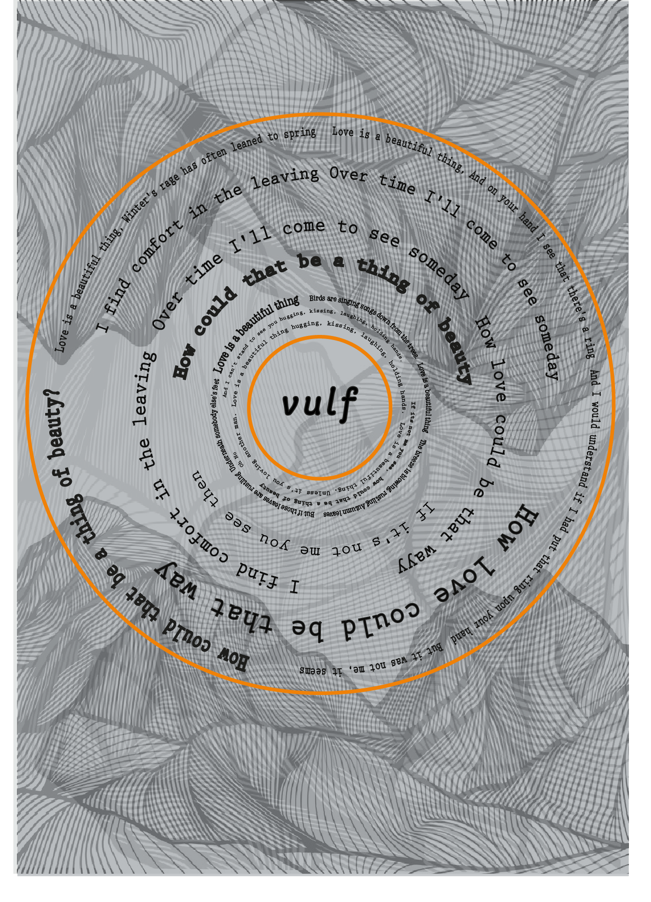
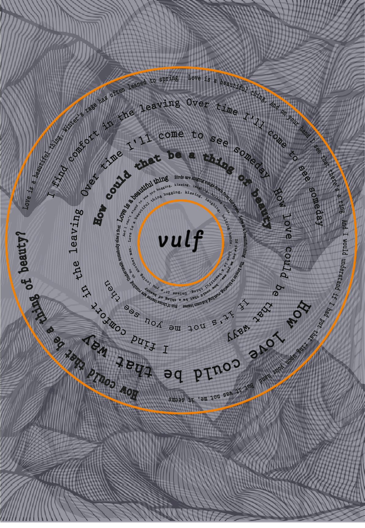
The design on the far left was the first draft I made with the corrections.
I really liked how it turned out but I felt the background still distracted slightly from the text and main design. Therefore I darkened the background slightly, which I think really helps the design of the record and the lyrics inside stand out.
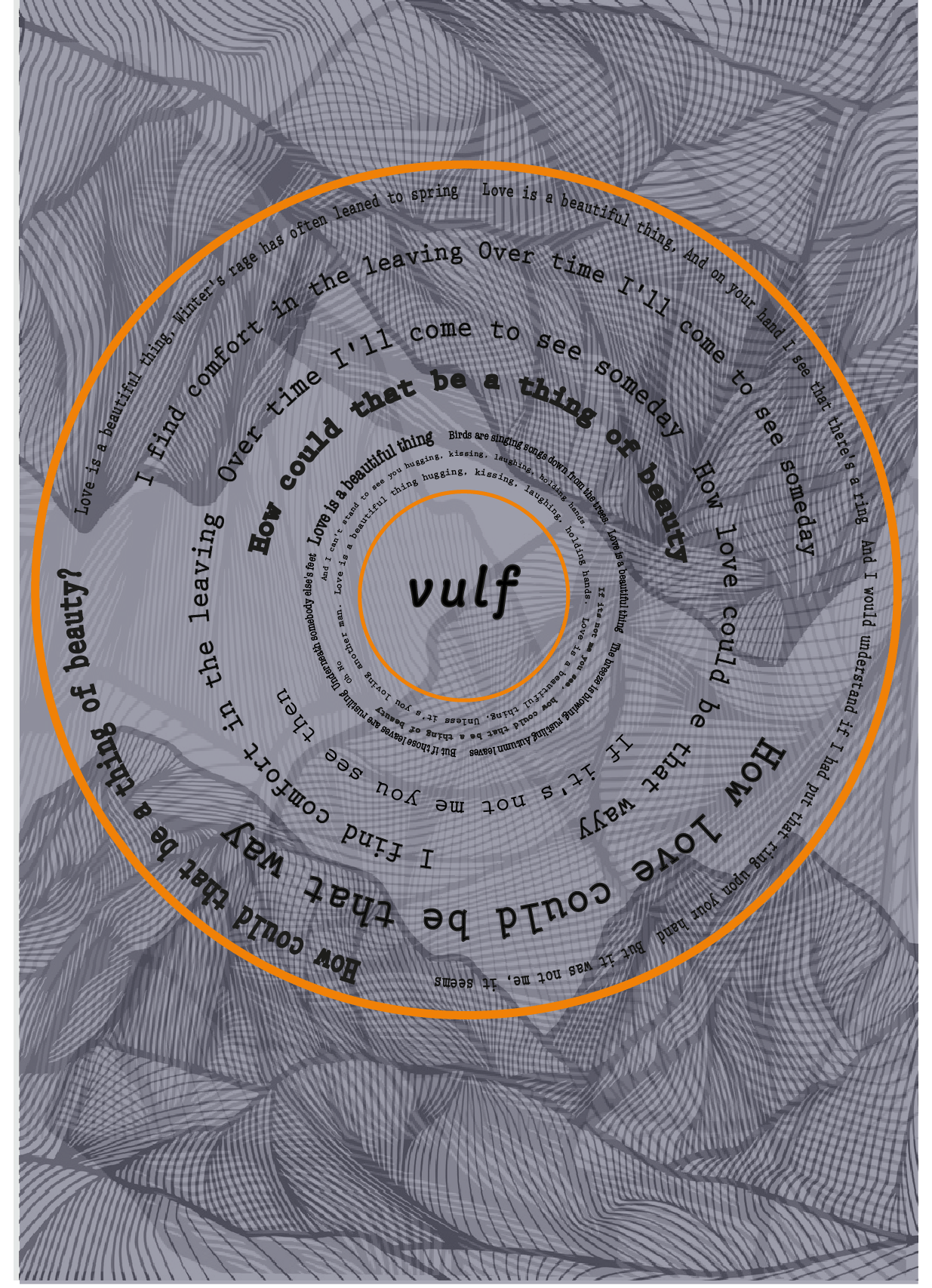
The final change I made was to change the weightings of the outlines of the record. I made the inner circle lighter and the outer circle heavier, to add more depth to the design.
I am proud of this designs even though there are still some improvements that could be done to make the writing more legible.