Week 03
Portfolio Mock-up Review
What we have completed
- Portfolio research
- Written content
- Wireframes (at home, case studies etc)
- Digital mock-up
Note – update blog
Leave post it notes on other’s work for some constructive feedback
Start – what you start doing?
Stop – what should we stop doing?
Have you thought about…?
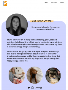
High-res Mock-Ups for today’s critique


Tutor Critique
- Add a home link.
- Remove ‘Student’ from subtitle profile description. Add ‘I’m looking for a placement for 2022.’
- Your footer: you can take away the ‘find me on’ and reduce the size of the icons or increase the size of the footer to give yourself more padding. You can change the LinkedIn icon to the shorter, square SVG so it doesn’t take up so much room. You can move the emails over to your right. Put a contact email or point on the left of the footer.
- Good work with the profile photo colours. You could change the footer to white coloured icons.
- The ‘tape’ theme on headers is great. Case study layout is 100%. You don’t need to have two app designs, one is fine.
- Instead of ‘View’ try ‘Read case study’.
- A lot of caps for headers. Under the intro to ‘Space Buddy Study App Design’ you could have the skills you used in the process.
- The information architecture: your sub-headings should be slightly smaller. Go to something like https://type-scale.com : this is a visual type scale to guide you through h1->h5 and body copy size to help you with the structure.
- Maybe show one of your final screens at the start, especially as your portfolio is quite long.
- Content is fine, maybe reduce the text width, so instead of going the whole way across the page it only goes halfway across.
- Sketches are nice but stitch them altogether, so they are one image rather than three separate images.
- Footer needs to be at the bottom of all pages.
- The case study pages could be white background to be easier to read. Or you could go a little lighter on the background, so it isn’t so heavy. A tint of the blue would make it subtle.
- Contact section has a bit of a gap and so could be moved up/together.
Peer Critique

Summary/Reflection
I found this week’s critique to be very helpful so I can see where I’m at alongside everyone else’s work, put it into perspective. I plan to take the comments onboard into fixing my mock-ups before building my site. I noticed a lot of the comments were small details that I need to start taking into consideration instead of bypassing them so the ‘work is done’ I need to spend more time on the details so I will have less difficulty when it comes to the building of my portfolio site.
This week’s tasks
- Work on your fixes from this session.
- Sign up to Webflow
Mock-up fixes