
Brand Guidelines
This is about setting the rules. These are all your decisions collated and summarised into a guideline to ensure it looks and feels the same, particularly with collaborators in mind. This allows a team to work from the same page and understand the decisions. A reference guide on what they can do and can’t do.
What should it contain rules for?
- Tone of voice
- Colour
- Typefaces
- Sizing
- Where the logo should and shouldn’t be placed
- Word bank (brand values)
- Logo/ monogram / visual marque
- Iconography (rules on modifying)
- Illustration
- Motion
- Photography
- Rules around hierarchy of information
- Layout
- Structure (rules around any document you’re applying this to)
Resources/References (all on BBL Week 07)
- 99designs page – how you should consider your brand style guide.
- Oberlo – good examples and tips on how to create your own.
- NASA and New York Transit graphics – extensive visual guidelines.
Today’s Task
Choose any brand you like and compile brand guidelines for it, sourcing information and imagery as needed. This should be easier to do with existing elements from an established brand.
I chose to continue on with the brand I did for my week 01 content audits. I found by doing this it made doing the brand guidelines easier as I had already gathered their word bank, brand dictionary, tone of voice etc.


This Week’s Task
Have a go at your own personal brand. Pull together your assets first and include the brand guidelines. You can think about those aspects – colour, tone of voice, shapes. It should help you finish your branding and make decisions that will stick, establishing them in real terms so you can see what you need to produce.
These are my brand guidelines so far, I maybe need to add a bit more, and maybe separate some of the content out more.


Group Critique of Work to Date
Below are my PDF slides I presented during my Group Critique.


Presentation Notes
Monday 07 March Presentation
Longer Bio
Hi, my name is Leonie Smyth, an aspiring Interaction Design student. I have a love for art in many forms, sketching, print, abstract painting, digital/graphic art. I just love to constantly try new things… which lead me to my interest in design! My focus yet unknown but not limited in any way. My key interests are in UI and UX design. I like to analyse film plots and sets. I love to indulge in different documentaries to constantly broaden my knowledge and further my creativity. One thing that always keeps me motivated is my dogs, with always having their happy energy around me.
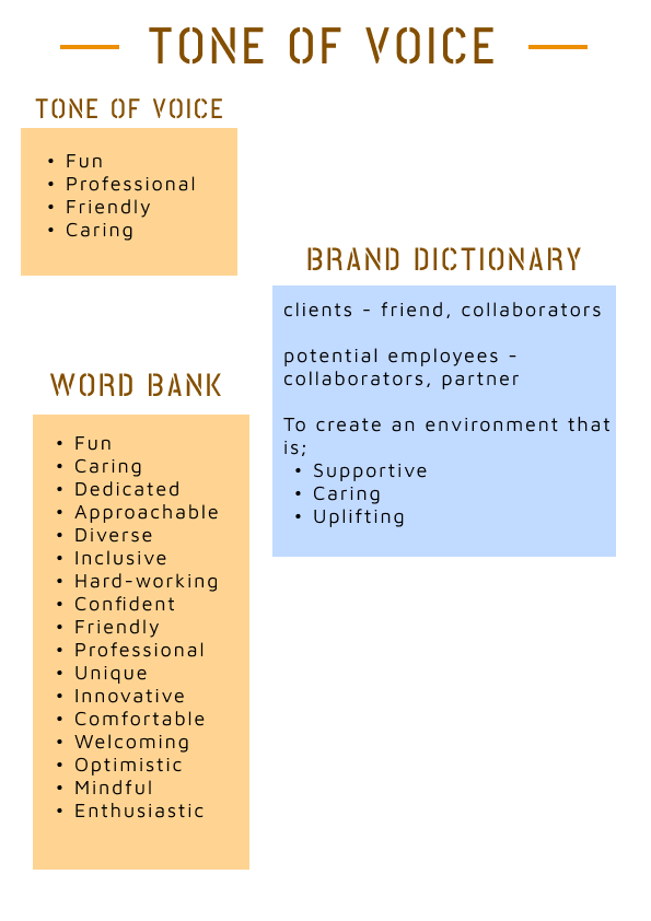
Tone of Voice
Fun
Professional
Friendly
caring
Brand Dictionary
clients – friend, collaborators
potential employees- collaborators, partner
to create an environment that is:
supportive
caring
uplifting
Word bank
Fun
Caring
Dedicated
Approachable
Diverse
Inclusive
Hard-working
Confident
Friendly
Professional
Unique
Innovative
Comfortable
Welcoming
Optimistic
Mindful
Enthusiastic
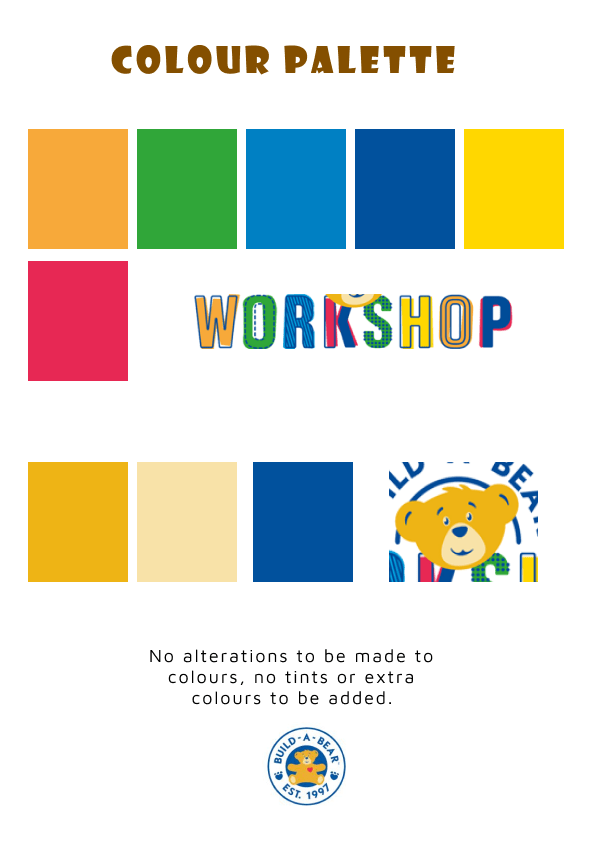
Brand Values
Unique – to offer a unique and different experience.
Fun– to give a fun and easy process.
Quality– to maintain high standard and quality results.
Loyalty – For you as a client can always trust an ongoing partnership.
I believe these values reflect me as a person which is the way I want my brand to be perceived – both personal and professional.
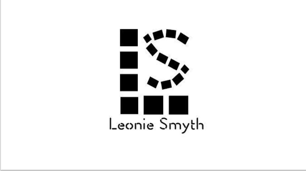
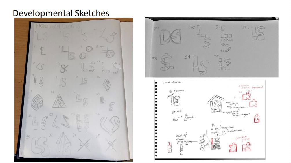
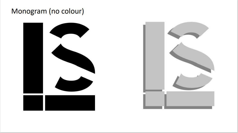
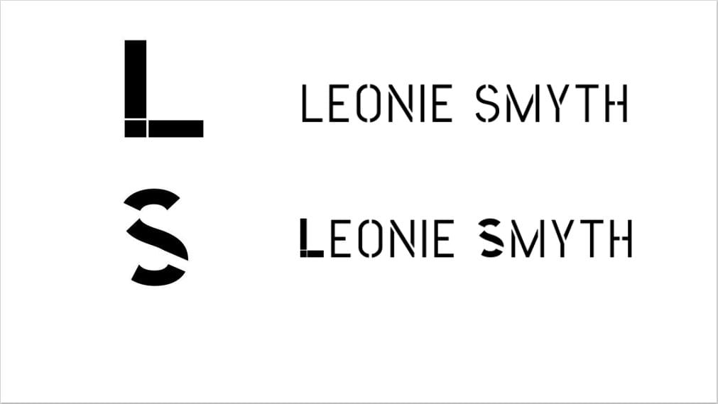
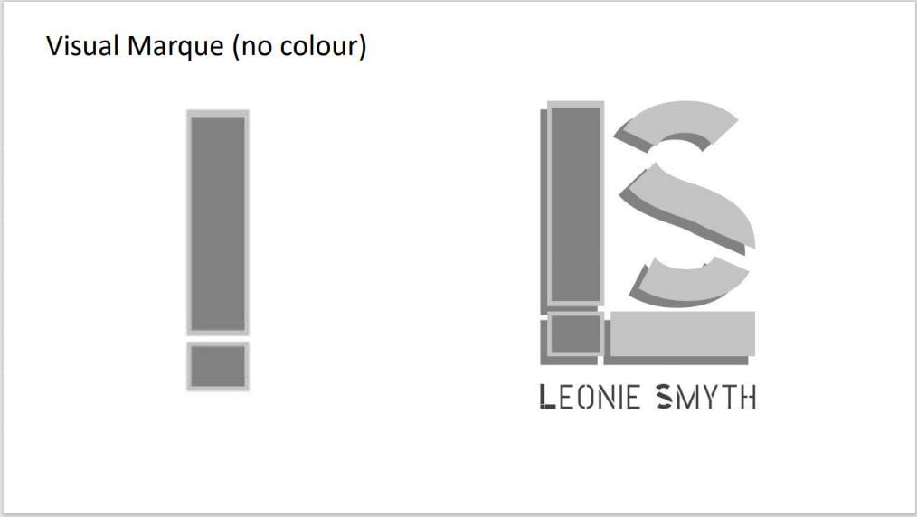
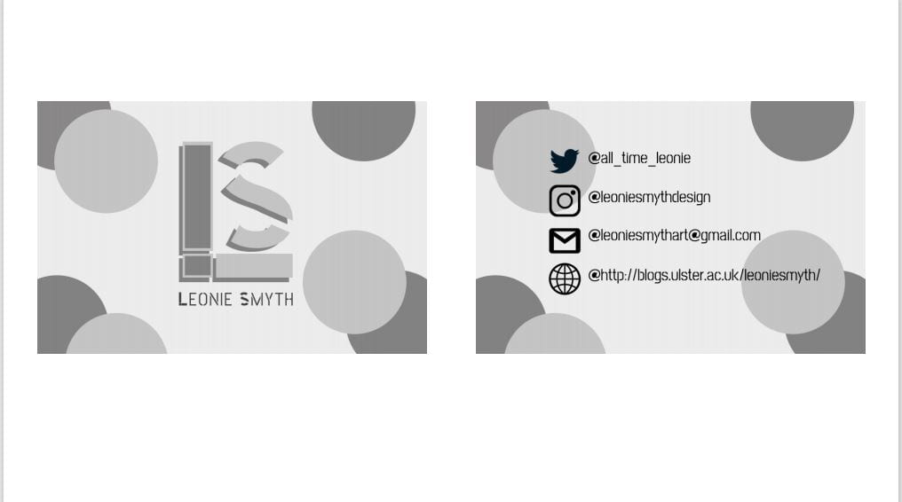
Monogram – building blocks as the idea is I’m constantly building upon myself and my brand to make both better and knowledgeable in the future.
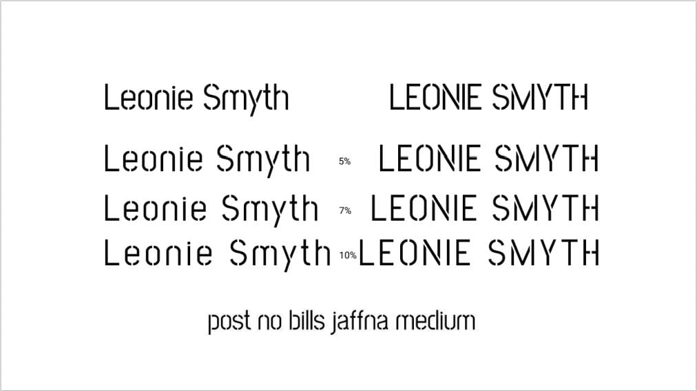
Wordmark – Whilst researching for a typeface I found one called ‘Fluo’ which was a stencil design type which I really liked, and thought would suit my monogram. After continued research on different types on figma I found the one called ‘post no bills Jaffna medium’ which I found very similar to the one previous, as well as it being stencil.
I also went on to add my individual letters from my monogram to my word mark to add my own twist on it and it also brings consistency to the overall design.
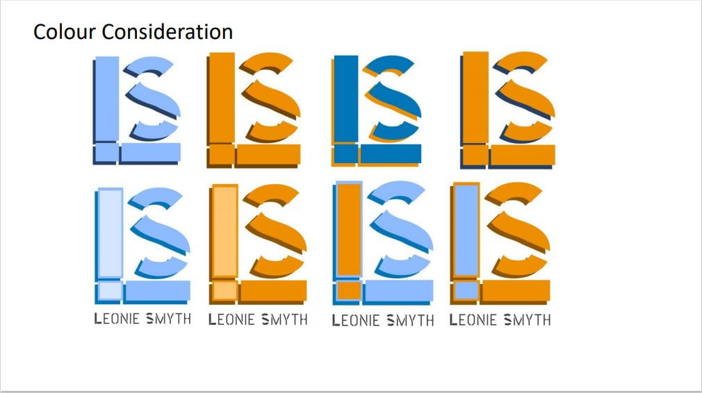
Colour Consideration
Blue – evokes trust, honesty, and intelligence.
Orange – evokes confidence, fun, friendliness, and optimism.
They are complimentary colours to one another.
Critique
- Drop shadow overdone, gets lost.
- Exclamation point is good.
- The spaces between the ‘S’ and ‘L’ needs fixed.
- Negative space in ‘L’ needs spaced more, or the negative space in the ‘S’ needs brought in more!
- Don’t overcomplicate the business card design with the circles as you have already used more square shapes.