
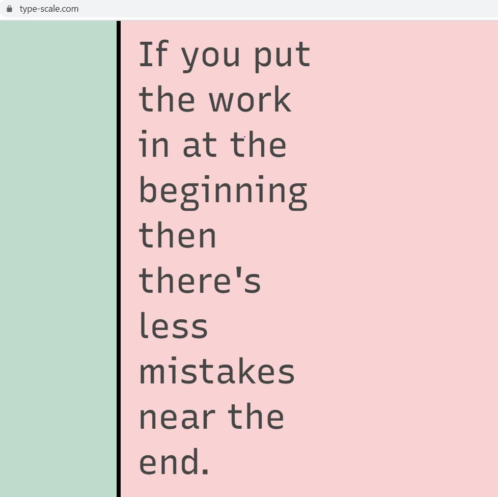
Trying out my Manifesto with the Golden Ratio setting on the Type Scale website. This helping me visualise how my text would look online in a variant sizes according to the Golden Ratio method.
What is Fibonacci Sequence?
Each number in the sequence is found by adding adding up the two numbers before it.
example – 2 is found by adding the two numbers before it (1+1)
3 is found from (1+2)
5 is found from (2+3)
0,1,1,2,3,5,8,13,21,34,55,89,144,233,377,610…
What is Golden Ratio?
The Golden Ratio is a design concept based on using the Fibonacci sequence to create visually appealing proportions in art, architecture, and graphic design. The proportion, size and placement of one element compared to another creates a sense of harmony that our subconscious mind is attracted to.
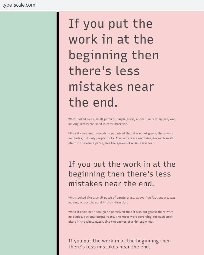
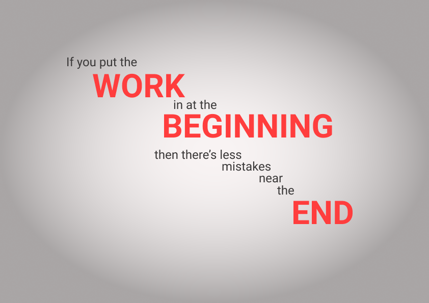
Looking at my Manifesto whilst using the Fibonacci Sequence in spacing.


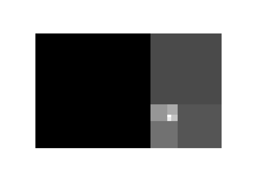
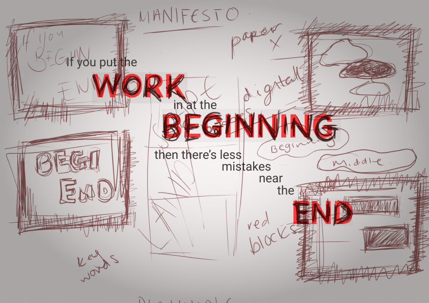
Here I tired to create the Golden Ratio Spiral but only in blocks to then place my Manifesto into the blocks so my Manifesto was in the Golden Ratio method. Doing this helped me understand the Fibonacci Sequence and Golden Ratio better by visualising it. I started at the number 8 in sequence then continued to create every other number up to the number 377 in the sequence.
8,13,21,34,55,89,144,233,377
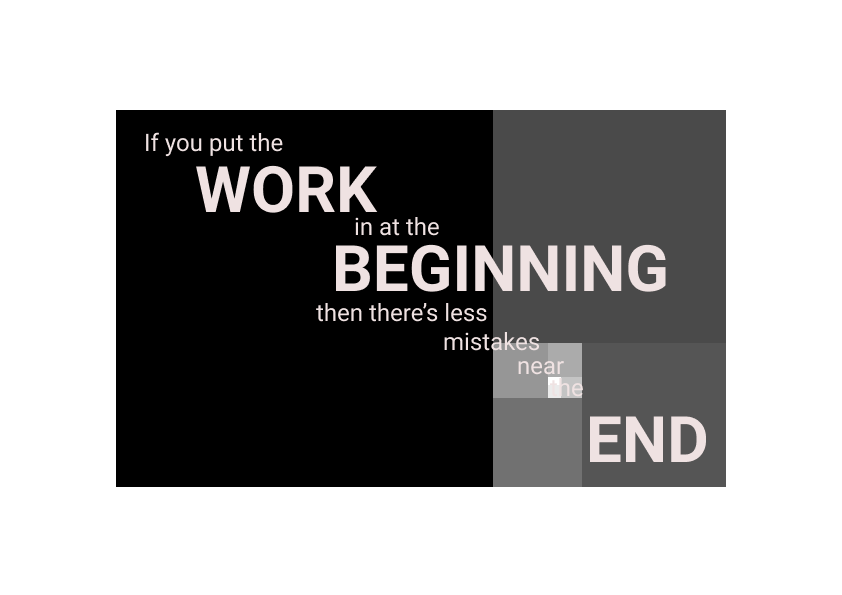
I quite like the look of my Manifesto being presented this way. I tried to fit a word into each box and I like the stairway effect it gave as I find this concept makes the eyes follow the text down to read it fully. With the actual design I went with a grey and white vignette effect for the background, black text, and red larger text for keywords to make them stand out more. I think this simple colour palette looks clean and bold and there’s nothing to distracting on the design so this makes it more legible and easy on the eye.
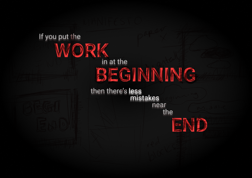
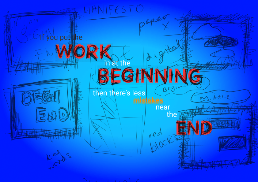
I wanted to play around with my design a little more, so I put into the red key words my own handwriting and set the layer as multiply to darken the handwriting more for contrast. I really like the look of this as it adds more depth and texture. as well as something a little more personal to my design. I think took some plan doodles and put them into the same effect into the background. This gave a texture to the background but I’m not entirely sure of this compared to the plain vignette background.

Testing Alternatives
Light Grey Vignette
Background doodles look dark and don’t contrast well, but the first one looks alright with just the handwriting. I took inspiration from the works of Jessica Hische as mentioned in my manifesto research that I wanted to try adding in hand drawn work into my piece. Even though my this aspect of my work is inspired by Hische’s style, I didn’t want to direct copy, so I did my drawings in my own messy drawing style. I like the scratchy messy look against the clean bold type underneath.
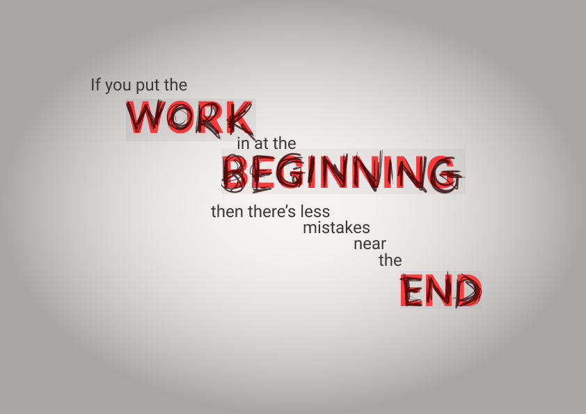
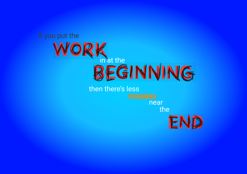
Trying alternative colour schemes
light blue to darker blue vignette. The doodles contrast well against the blue, then trying the use of a contrast colour against the blue with orange on the word ‘mistakes’ as it’s not necessarily a key word but still an important word to highlight. I could maybe actually highlight ‘less mistakes’ instead of just ‘mistakes’.
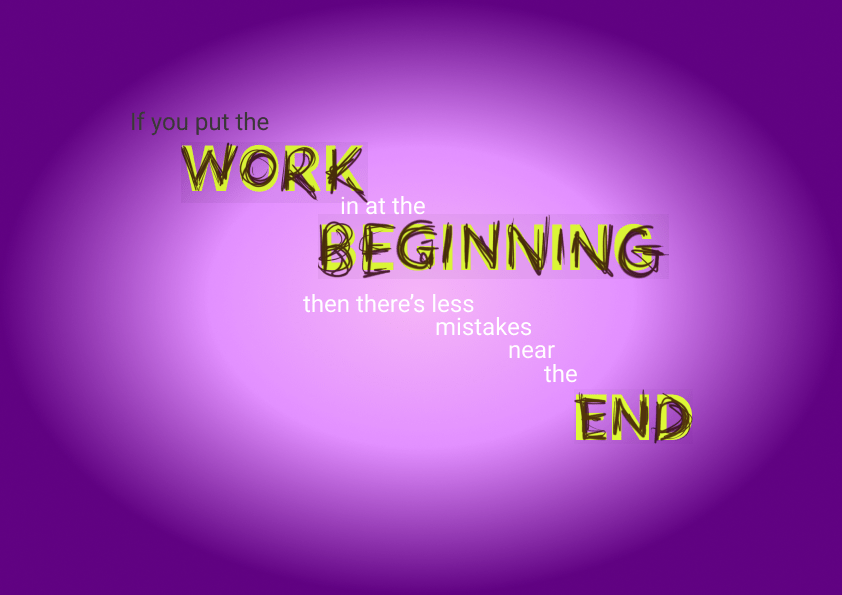
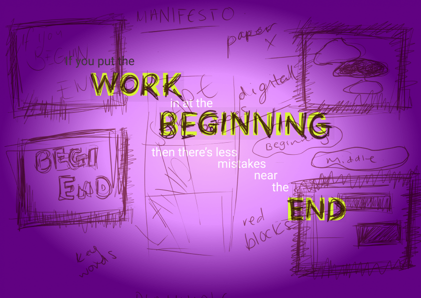
Same as above I think the doodles contrast well against the purple but the white text gets lost with the background. I don’t think the coloured backgrounds are going to work with my design as I like the grey or black with a accent text colour. I do like the doodles and handwriting so I think I will keep this aspect in my final design.
Final Choice
Comparing my first Manifesto design to the the most recent with added principles of fibonacci sequence and golden ratio. I like the simplicity of the newest one better than the layout of my first one. I think the newest one is better layed out and easier to read and follow. I also like the simple colour palette comapared to using different colours to highlight keywords as well using white and a drop shadow to highlight ‘less mistakes’ instead of having those words as big keywords , distracts less from the overall manifesto. I think the overall execution of the newest piece is a lot more better in design and a lot more thought out.
