
A typeface is a set of characters of the same design. These characters include letters, numbers, punctuation marks and symbols. Some popular typefaces include Arial, Helvetica, Times and Verdana. Typefaces are vector-based, so they can be scaled very large and still look sharp.
Typeface is often confused with font but a font is specific size and style of a typeface.
Example – Verdana is a typeface, Verdana 10pt Bold is a font
The first typeface was a Blackletter variety used by Johannes Guttenberg on the first printing press, starting in 1440. In 1470, Nicolas Jenson created the first Roman Typeface based on Blackletter and Italian Humanist lettering. Jenson’s early Roman typeface was more streamlined than Blackletter and saved space on the page.
His Roman type was the basis for multiple modern fonts, including Centaur (created 1914 by Bruce Rodgers) and Adobe Jenson (created 1996 by Robert Slimbach)
Modern Serif – Modern Serif was created by two type designers (Firmin Didot and Giambattista) in the 1780s. They’re not the most readable typefaces at smaller sizes, so they are best for headlines and displays.
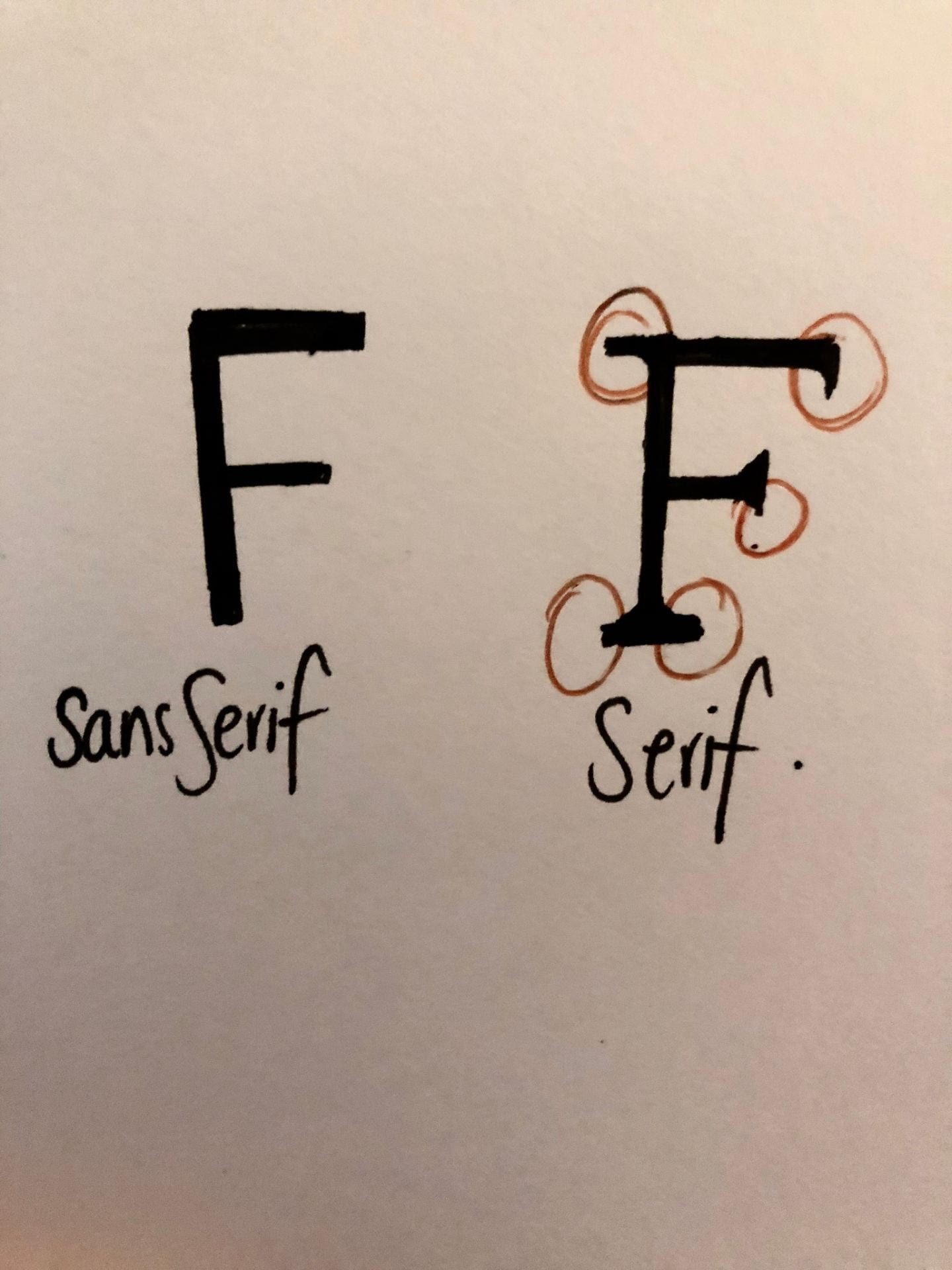
Sans Serif and Serif
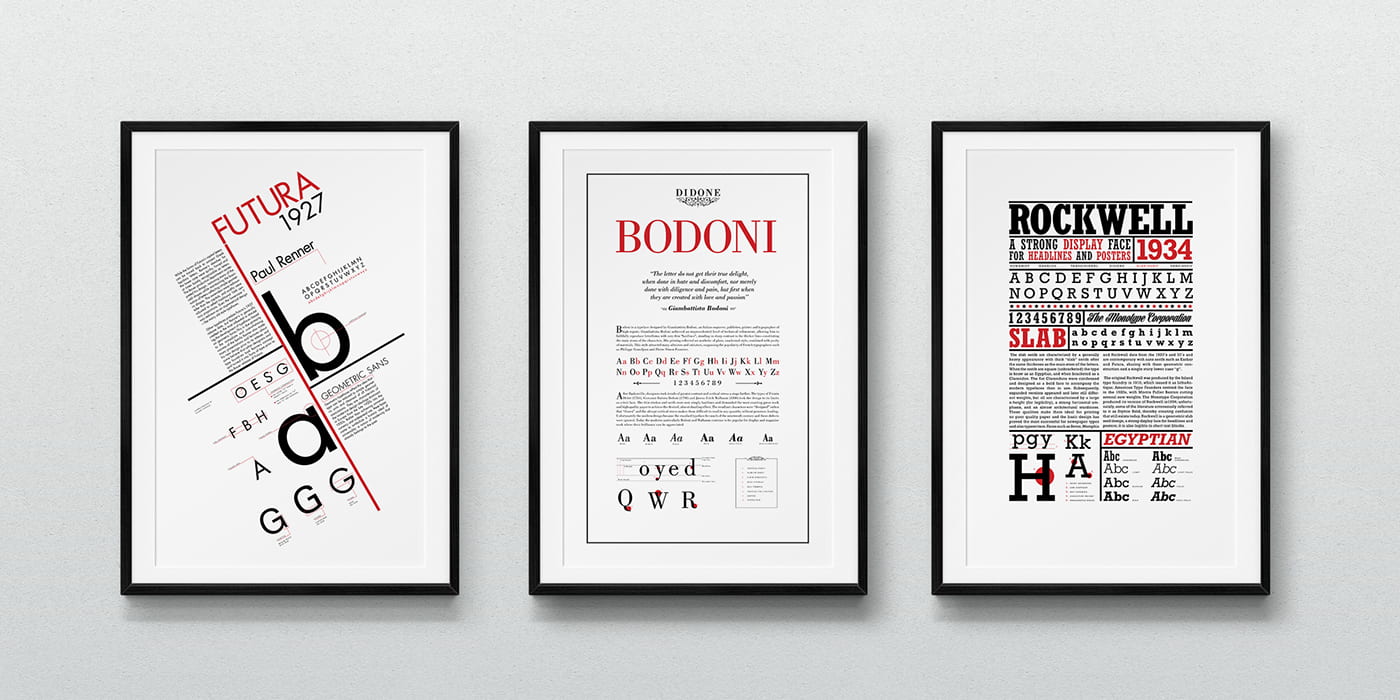
20th Century Typefaces that are still used today, – Frederic Goudy (1920s) designed fonts such as Copperplate Gothic and Goudy Old Style. Other typefaces were developed in the 20th Century ,Max Miedinger designed Helvetica in 1959. Other known typefaces created during the 20th Century were Futura (Paul Renner) and Optima (Hermann Zapf).
Palatino
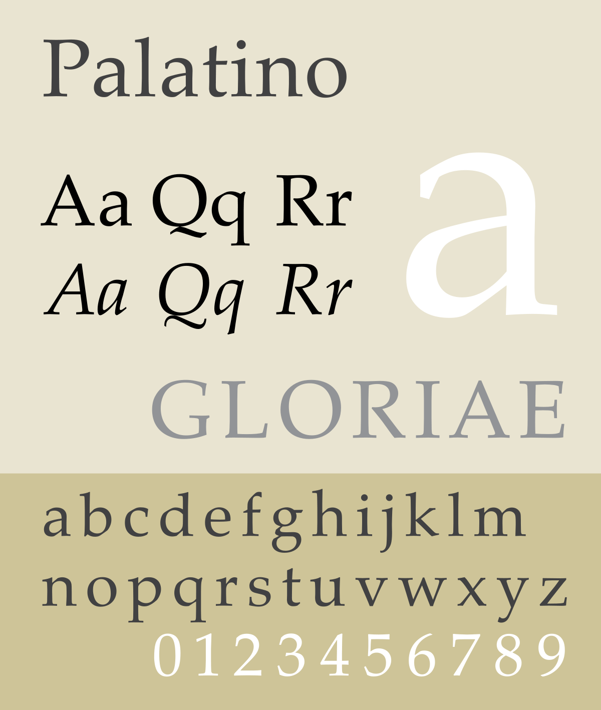
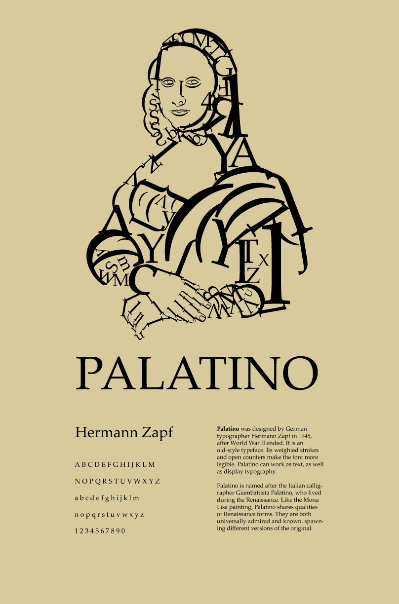
The Palatino typeface was created by Hermann Zapf in 1948. The typeface’s specific style comes from Zapf’s background in calligraphy, it being named after Giambattista Palatino, who was a master Italian calligrapher and contemporary of Leonardo DaVinci. Palatino is a very popular typeface, being released not long after WW11 , it is a classic serif typeface. The design employs a strong, attractive and open style that is easily read. The reason it’s very legible is due to its strokes being lighter and its proportions are larger than the smaller Renaissance serif designs that it is based on. With the typeface being easily read it made an ideal type for newspapers and magazines at that time. Since then it has developed into a typeface family with added, – bold , italic, titled typefaces, symbol sets and different character weights. In 1999 subfamilies were included such as, Palatino Sans, Palatino Nova, Palatino Arabic and Palatino Informal.
What is it used for now?
Palatino can be used for any purpose but it is a corporate typeface, for advertising headlines and text, as well other display methods. It is ideal for newspaper and handbills as its open counters make it very readable. Even at smaller sizes it’s easy to read with it use of light lines and larger letter sizes.
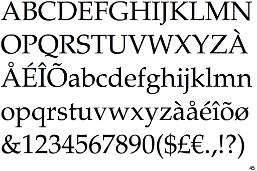
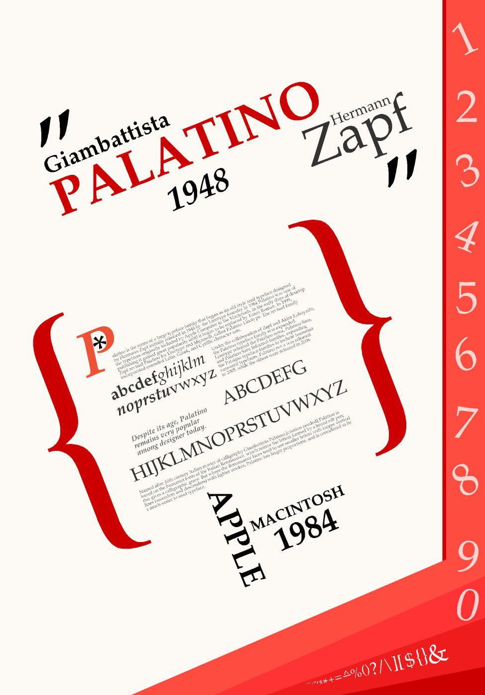
Palatino Type Specimens
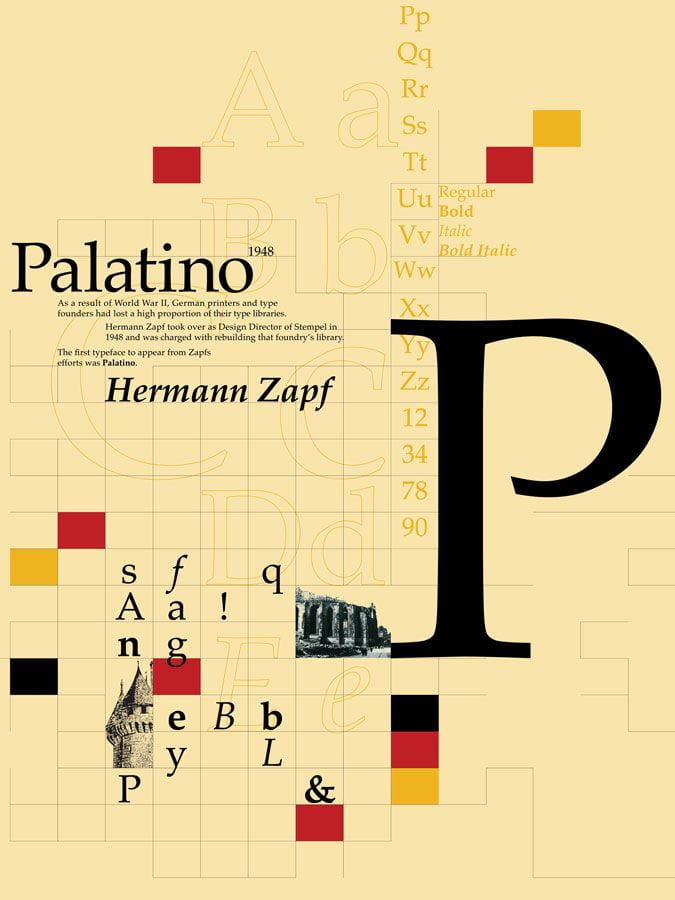
Below is a selection of type specimens which I liked the look of whilst researching the typeface. Most are very contemporary and very sleek and sharp which is an aspect of the Palatino typeface, so there is a link there between the type and design elements. I really like the contemporary aspect as it looks very bold and graphic.

Other Type Specimen Examples
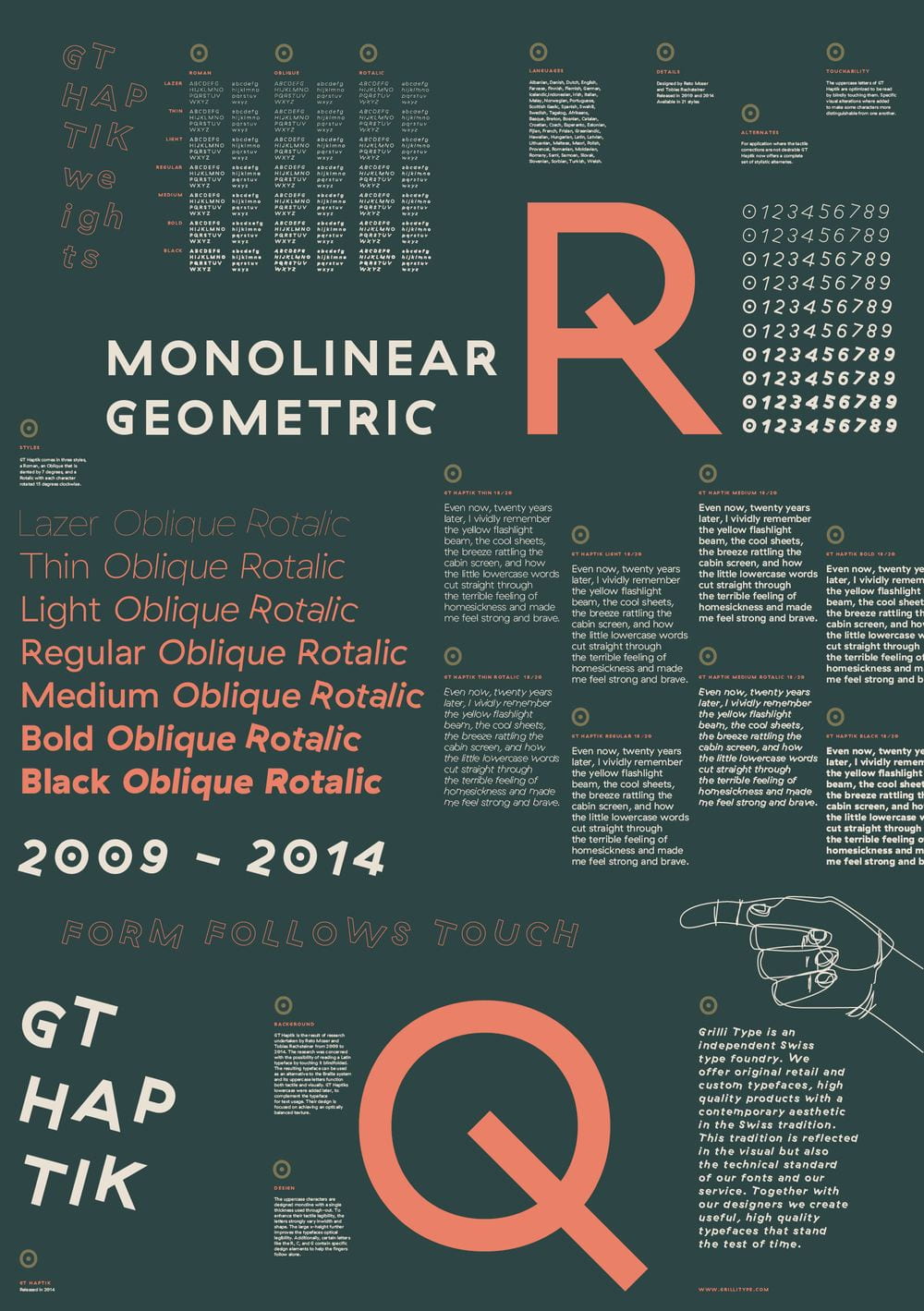
Below are other type specimens that aren’t related to Palatino that I liked the designs of . Again I really like the contemporary and graphic style which I think is evident through these examples.


Designing a Type Specimen
Things to consider
- Layout
- Composition
- Colour
- Simplicity
- Shapes
- Size and Dimension – IPad screen – height – 1024 pixels ( 27.09cm) width – 768 pixels ( 20.32cm)


Final 3 Designs


Design One –
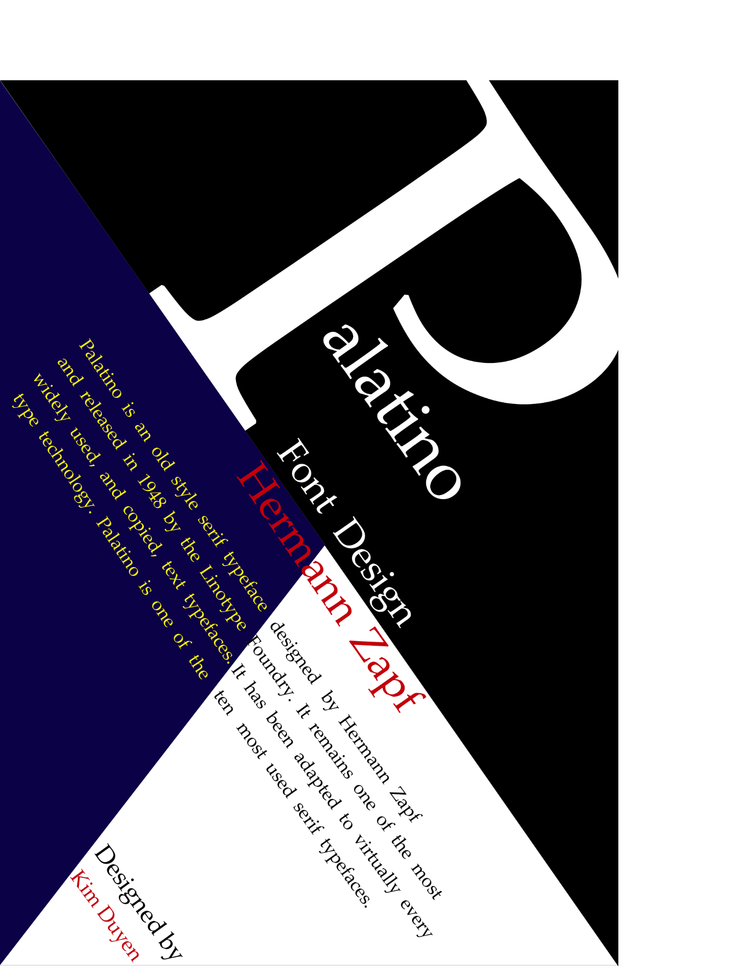
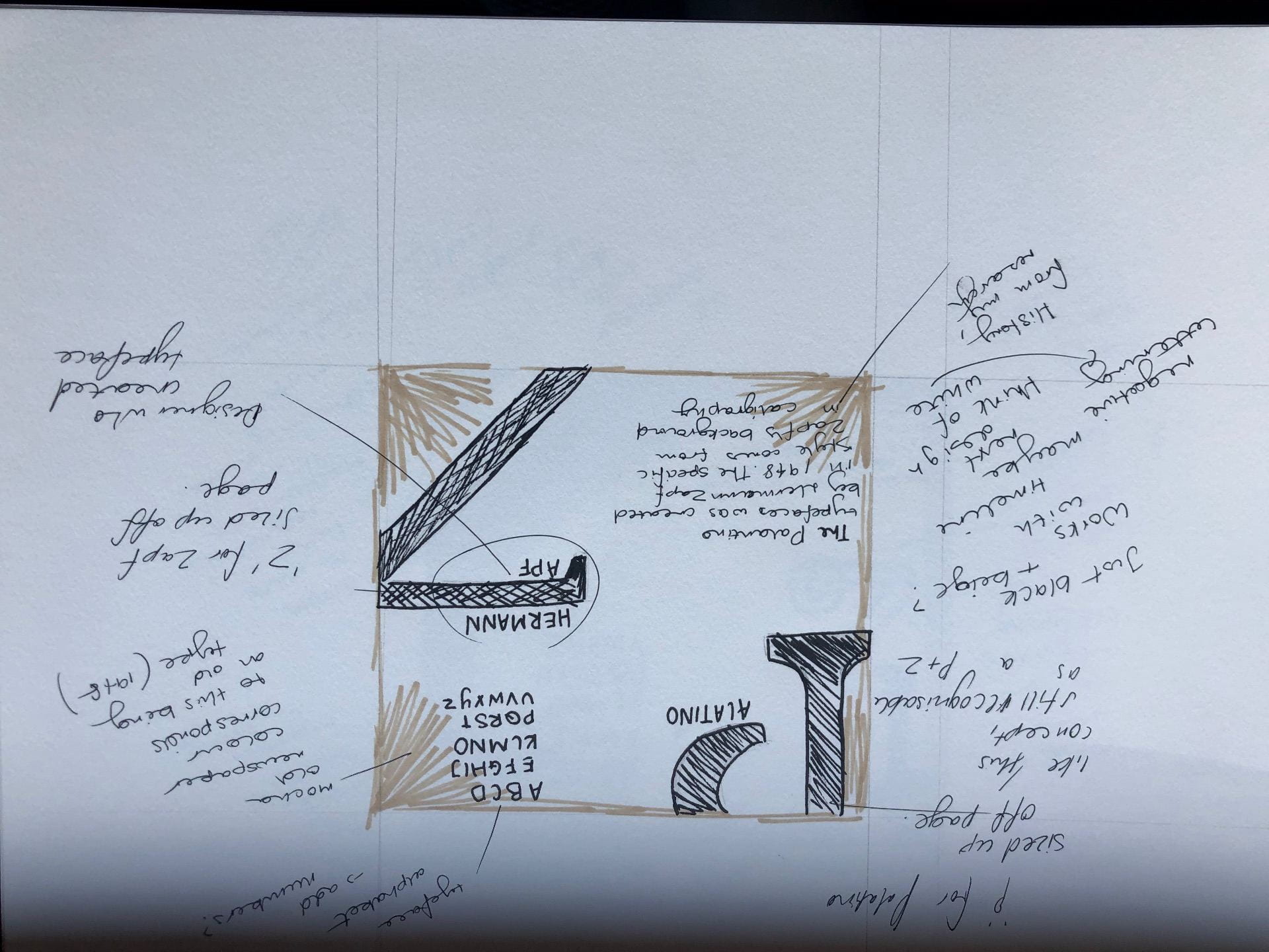
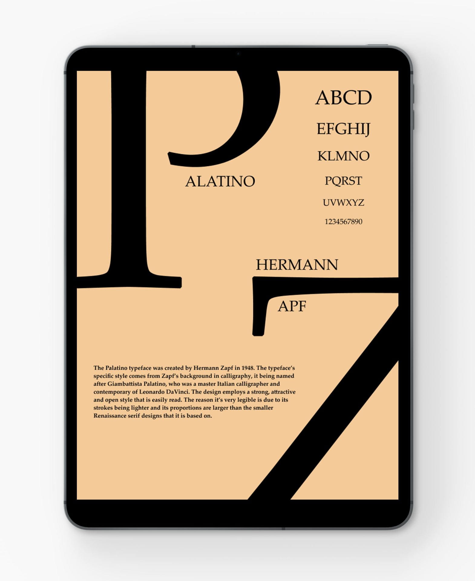
Here I went with the concept of having one letter the main focus. Taking the letter ‘P’ and having it stand alone in the centre more towards the top to meet viewer’s eye level. In my designs I wanted to include three elements I found important in a type specimen design – Year of design, History of Typeface, Type Alphabet. As seen in my first design I took some bits from my research and placed it into the design along the side of the ‘P’. I thought this was a great way of utilizing the space I had. I found trying to place the type alphabet into the design was difficult as it looked to ‘blocky’ and ‘formed’ when all letters where kept at the same size. So taking inspiration from an Optometrist eye chart, I scaled down the letters as I went along down the design creating that affect of catching your eye with bigger text then following the descending text (like when your at the Optometrist). I added two open circles around the ends of the letter to showcase the strokes of the typeface. I really liked this element of my design as it is a simple but effective way to showcase particular areas of my designs. I added to the half circle to showcase the typeface’s designer and year it was made. Adding the half circle adds slight separation which helps bring out the information displayed in it. With the colour scheme I wanted to stay simple as I didn’t want too vast of colours to take away from the design. I think the pale pink and darker pink go well together as I really just used different tints of the one colour which makes the colour scheme consistent. Overall I like this design mostly for the emphasis on the one letter and for how I laid out the history section. Even though the colour scheme is consistent, it still feels off and I’m not entirely sure why. So I’ll make sure to try something different with the colour schemes for design two and three.
Design Two-
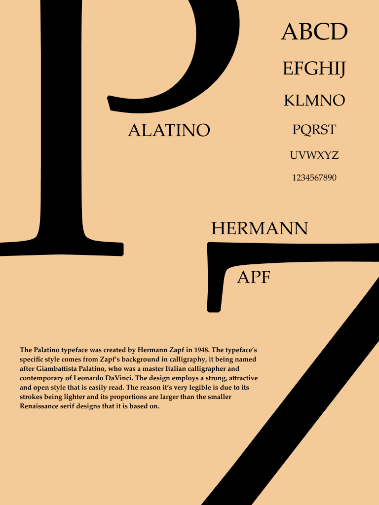
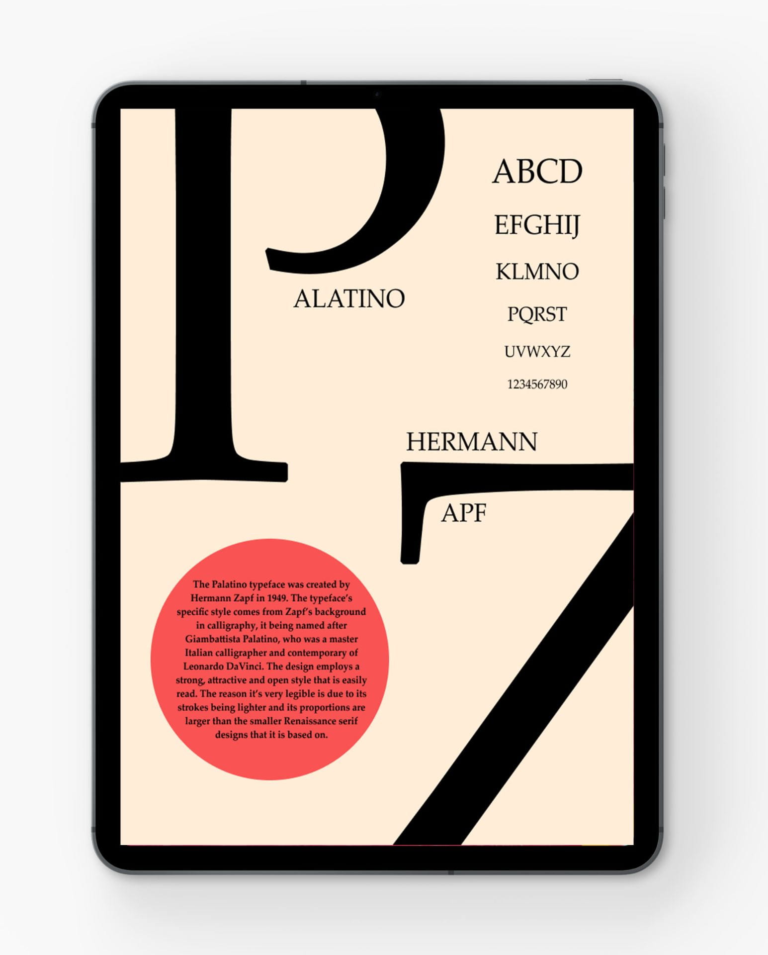
Here I went with a blown out effect with the text going beyond the screen, I liked the look of this as it gives an interesting take the design and allows room for other elements that would suit better being closer to the central focus. Again I found trying to place the type alphabet into the design was difficult as it looked to ‘blocky’ and ‘formed’ when all letters where kept at the same size. Still taking inspiration from an Optometrist eye chart, I scaled down the letters as I went along down the design creating that affect of catching your eye with bigger text then following the descending text. I took the main text and placed it centred between the two letters to fill up that space. I found this best as if it was anywhere else or even shortened , the alphabet element make it look top heavy to that corner and lacked a sense of balance. I went for an old paper type of colour scheme with the dark beige and black type. I really like the simplicity of this being two colours , I think they contrast well against one another. I like the positioning of the text ‘alatino’ and ‘Hermann Apf’ with the large letters being the focal point of to spell the word ‘Palatino’ and ‘Zapf’.
Design Three-
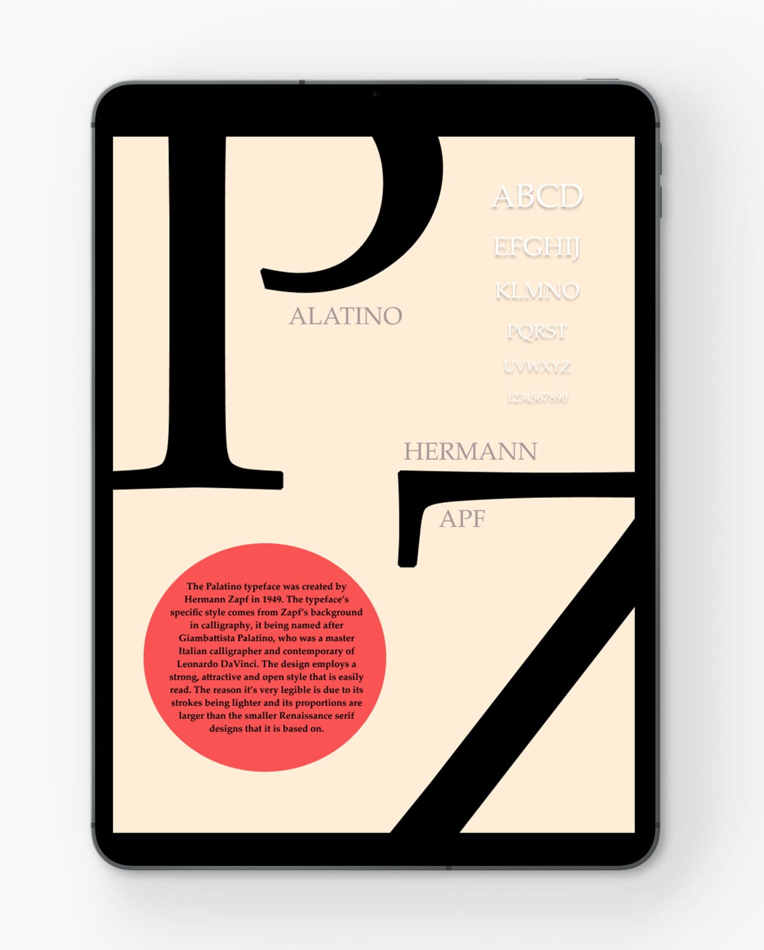
Here I went for the letterman type effect like you see on old jackets, instead of keeping both letters the same colour I went with black and white accents against the same dark beige background. I added the two open circles again around the ends of the letter to showcase the strokes of the typeface. I really liked this element of my first design as it is a simple but effective way to showcase particular areas, I wanted to try this again so added them opposite one another in the opposite colour of the opposite letter. I really liked this idea and thought it added a sense of completeness to my design. Again still taking inspiration from an Optometrist eye chart, I scaled down the letters as I went along down the design creating that affect of catching your eye with bigger text then following the descending text. I also put a think black lined border around the text to keep it gathered together and more neat. As well as changing the text to white to add contrast to the adjacent black text of information in the bottom left corner.

Final Design for Friday Critique
Friday’s Critique
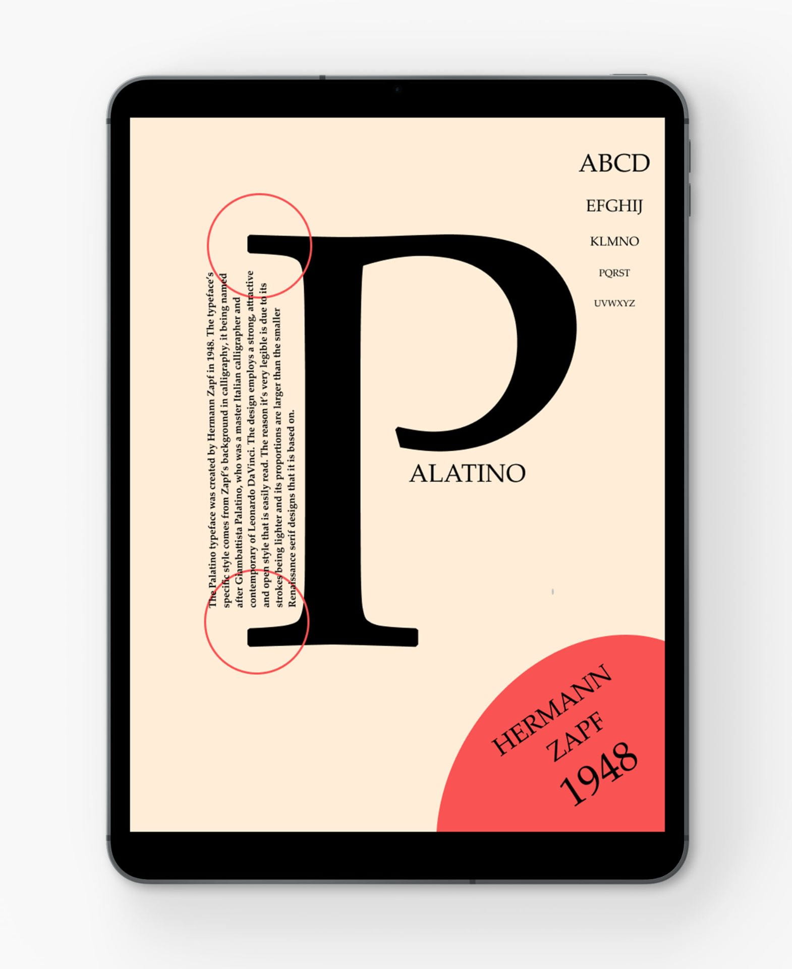
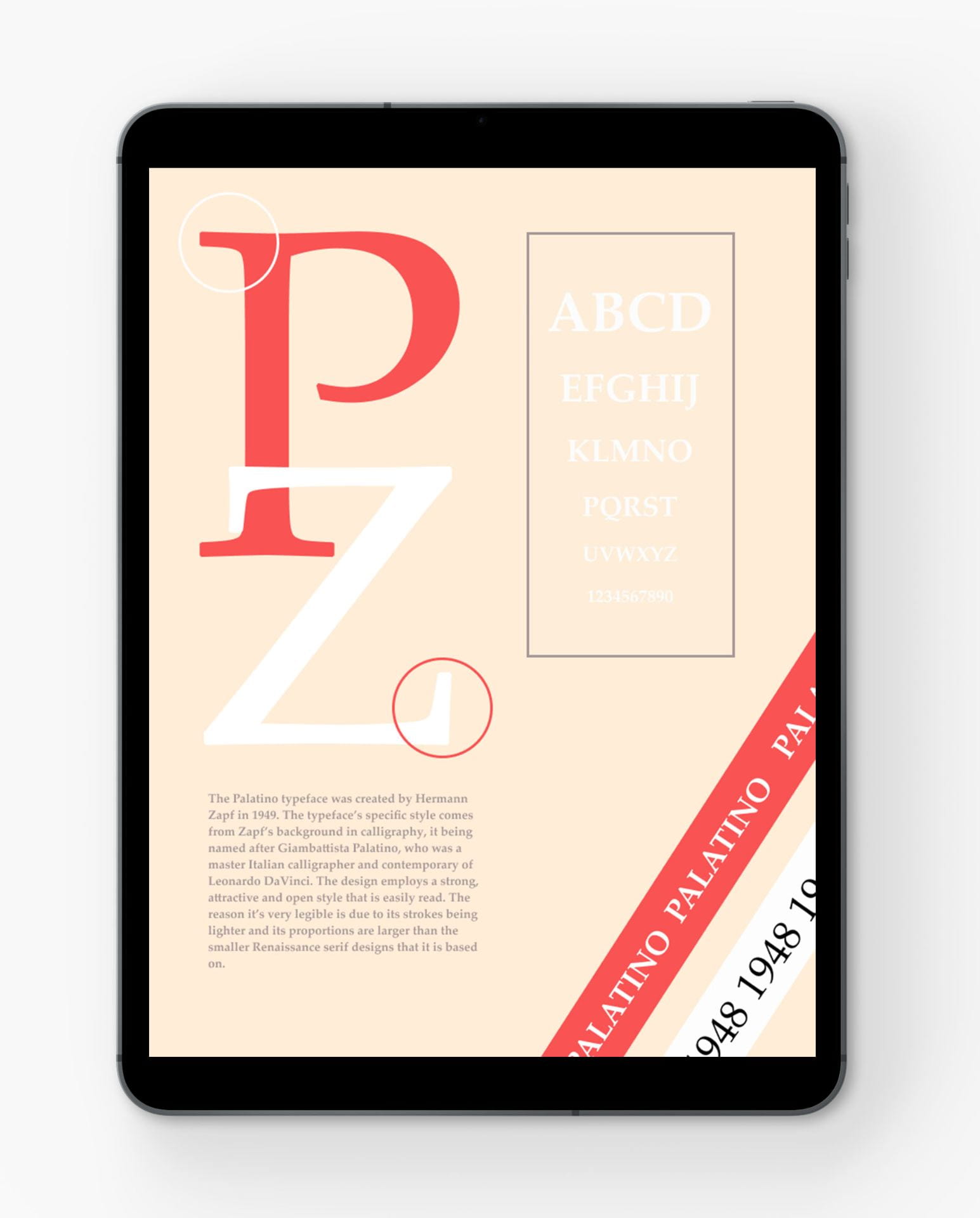
Decrease the leading to make tighter as one unit. bottom body copy: leading is fine, bring it in so it is not as long and bring it down so it goes further. At the side of your P, align the text below with that, and reshape that paragraph into a box. They quite liked the other colour palette from my first design and recommended to try that colour palette on my final design. I found this criticism to be very helpful and I will refer back to this when refining my final design.
Playing with the Colour Palette


Final Choice
After my critique and looking back at my design I have made a few final changes , I changed the colour scheme to that of my first design and made the darker pink an accent colour for the text ‘Hermann’ and ‘apf’. I also had the accent colour for the text ‘alatino’ black , so they both contrasted against the larger letters. I stuck with the Optometrist eye chart idea but instead of white text I changed it to a light grey so it wasn’t too stark against the light pink background, same idea for the informative text portion . I tired to keep all text aligned with other elements of the design, the Optometrist type chart isn’t completely centred but is aligned with the end of the stroke on the larger letter ‘P’, as well as the word ‘Hermann’ is aligned with the end of the word ‘alatino’ . In context to the informative text portion, I tired to keep the top and bottom as equal to each other from the edges of the top of the design and the word ‘Hermann’ to really try to keep a sense of balance . Overall I’m happy with the end result and glad I tried out some of the criticism as it ultimately make my design better. I’m pleased with the design and think it ties well together. Also from looking back at my research I made one notable mistake, I had the wrong year of typeface design, it was a simple typo, which can be seen in most of my designs beforehand but it has been changed and it is corrected in the final design.