
Point, Line and Plane are the building blocks of design. A point marks position in space, graphically takes form as a dot, a point can be anything in design from many points gathered together to create something of more significance or as a stand alone point to create a bold and powerful piece. A line is the connection between two points or is a path of a moving point. Graphically , lines come in many weights , the thickness, length and texture as well as its path will determine its visual presence. Line can straight, curved, continuous or broken to create many different effects to a design. When a line reaches a certain thickness it becomes a plane. A plane is a flat surface extending in height and width, it is a path of a moving line as well as a line with breadth.
During the IXD101 week 02 session , we were tasked with designing a scale of 3×3 boxes where we would use point to design with. 1st row 1pt (2 circles), 2nd row – 2pt (4 circles) , 3rd row – 3pt (5 circles) I did two quick sketches of small ideas for both Point and Line just to give myself an idea of what to do before starting on Figma.
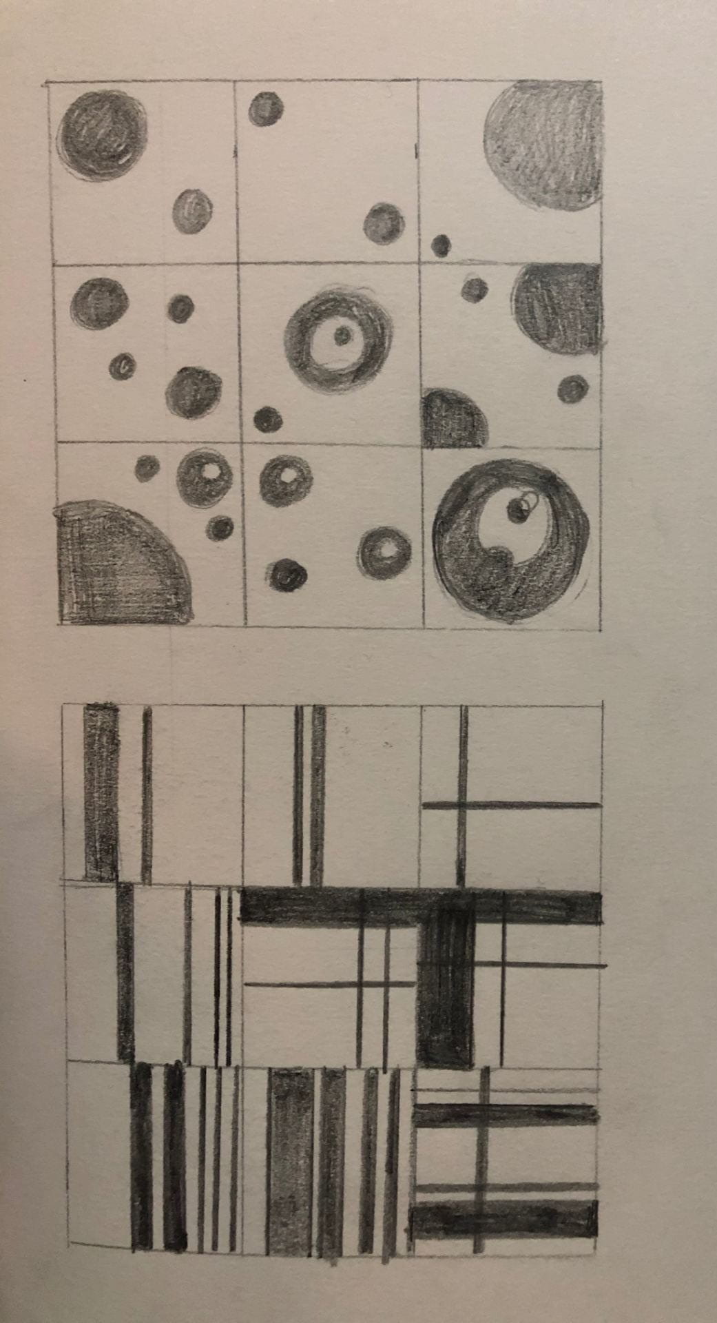
Below is the design I did on Figma. I didn’t necessarily go for a pattern or try to make an image as I’m still new to Figma and decided to play about more with the software and see what I could do with it. Throughout the whole process I played around a lot with size and composition. Some of the circles are cut off to give the look of like the moon and its surrounding planets. When doing this I couldn’t figure out how to cut the excess parts of the circles out, so I created a few rectangles the same colour as the background to cover up the excess. Also, I had some of the circles white to create negative space, I really liked this as some of them look likes eyes and faces. I think from doing this I can see how point can be beneficial to the way I design things. I think it is a great starting point to my designs.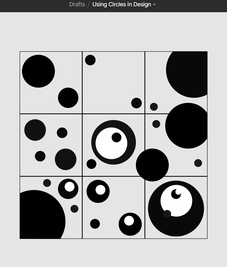
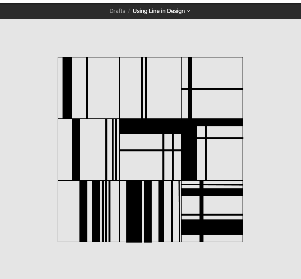
I found doing the Line task a lot more easier on Figma, as I only was changing the variations of the line weights and positions. Again I began with a 3×3 scale and the same layout – 1st row – 1pt(2 lines) , 2nd row – 2pt(4 lines) , 3rd row – 3pt(5 lines). Here I had the same sort of idea for the Point one , I just played about with different weights of the lines and different ways to lay them, I had a lot of contrast with thick and thin lines being close together and parallel to one another. I also had some lines going vertical and some crossing them and going horizontal. A few of the boxes remind me of barcodes or ‘glitch’ designs which wasn’t my intention but was a nice outcome. The last box in the bottom row kind of reminds me of Piet Mondrian’s work but without the primary colours.
When doing the Plane task, I found it more easier to complete as I had figured my way round Figma a bit more and realised how to use frames which helped with the layout of my grids. The task was 9 planes 9 ways. The first row I created my first design then duplicated it into the second and third frame and changed the positioning of the first design slightly, so pretty much the same design but rotated differently. The second row I did 3×3 different toned boxes, I didn’t really have much of a method for these ones except to just experiment with different tones against one another. The third and final row was looking and creating a more abstract set of planes. Here I really just again experimented more with width and length to see what I could come up with.

“Point, line, and plane are the building blocks of design. From these elements, designers create images, icons, textures, patterns, diagrams, animations, and typographic systems.” -Ellen Lupton