Research
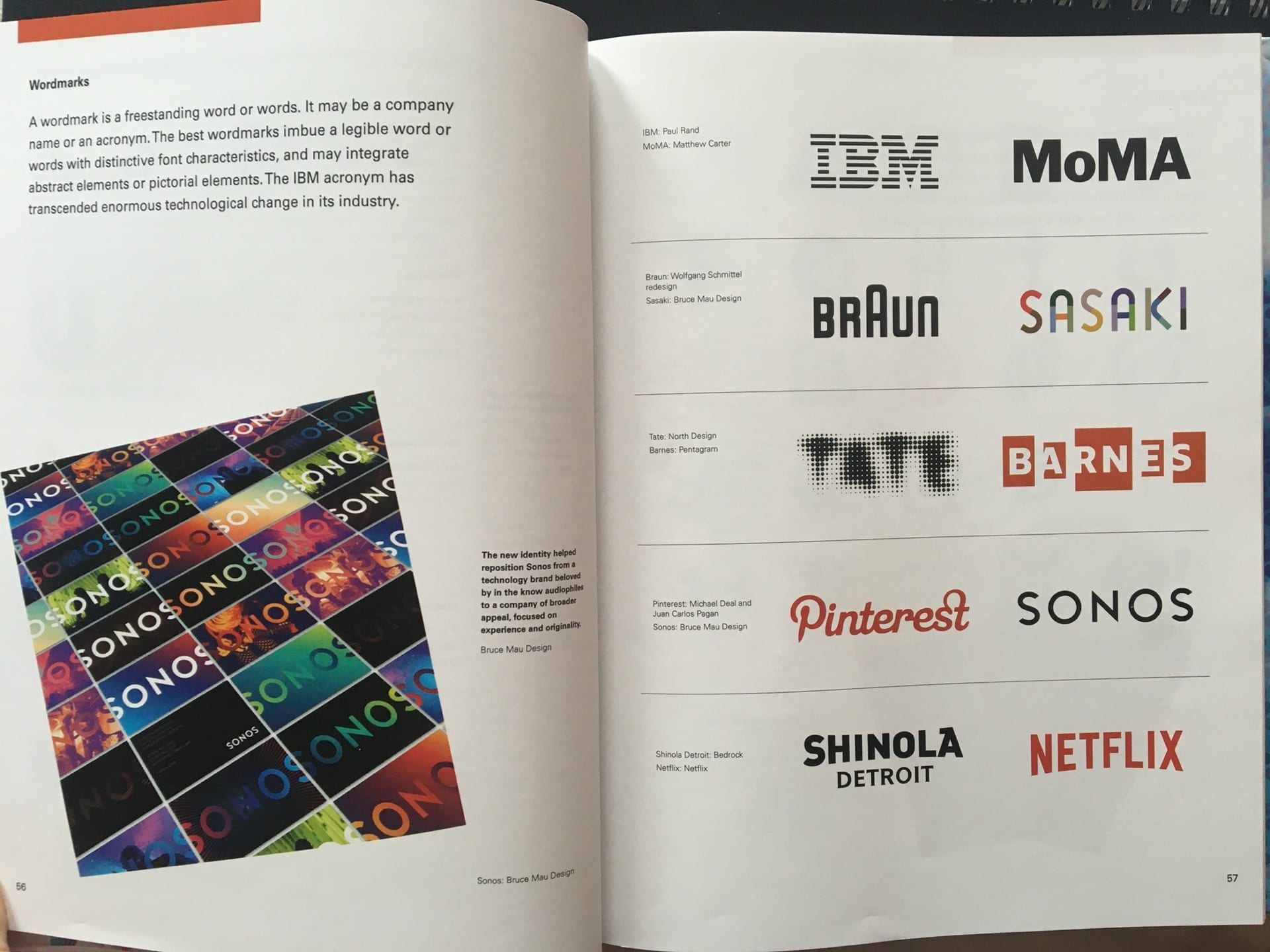
I first went and had a look at the pages on word marks in my “Designing Brand Identity” book by Alina Wheeler to give me a bit more insight into word mark design.
I also looked at the section on typography while I was at it because I feel that that sort of ties in with word marks in a way.

After that I made a Pinterest board to collect different examples of word marks and typography I think is cool to inspire me and help come up with some ideas for the style of my own word mark.
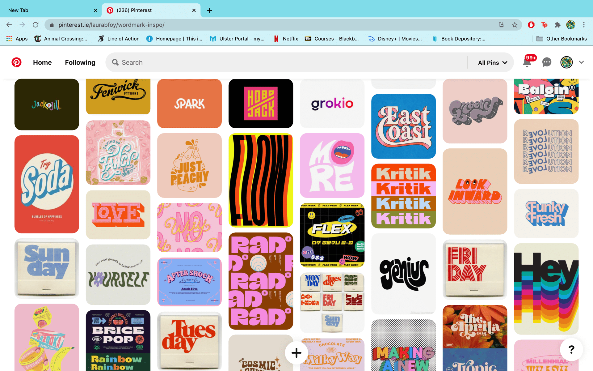
Here is a link to that board: https://www.pinterest.ie/laurabfoy/wordmark-inspo/
I then went and looked at the word marks of some of the brands I like that have a similar kind of energy to what I want mine to exude.
Cartoon Network
![]()
Lazy Oaf
![]()
Marvel
![]()
The Public Theater

Nintendo
![]()
![]()

All of these brand use a sans-serif type face. Formality, sophistication and elegance are things often associated with brands that use fancy serif typefaces that are often in a sort of joint hand-written style. This is why I think it makes sense for these brands to go against that as it makes the brand come off as more modern, approachable and straightforward (also less pretentious).
Majority of these brands bar Nintendo are in all caps which I think brings across a sense of boldness and confidence in the word marks. It’s like a proud declaration of they are as a brand and I like that. I think displaying the brand name in all caps like this is also a way of drawing peoples eyes more easily to it.
The word marks of Cartoon Network, Marvel and The Public Theater all use bold typefaces. This also brings across a sense of confidence and boldness, pretty much all the same things I said for the use of all caps. I think there’s something really fun about the varying weights of the Public’s word mark, it has an almost eclectic feel to it which fit well since they are considered as sort of champions of diversity in the theater industry. The boldness and boxiness of the Cartoon Network word mark, largely brought on by the fact that half the letters are incased in squares, comes off as very fun, energetic and playful to me which seems to be how the channel presents itself in every aspect of its branding so it works really fits well.
Based on that brief analysis of these word marks, I think I want to go with a sans-serif typeface that’s heavily weighted and also a bit boxy looking, if that’s even a word. Of course I’m gonna explore other types of fonts but that’s just where my mind is at right now.
Looking for the Right Font
After doing a bit of research I then started to compile a variety different fonts that I felt might work, majority of which I got from Adobe fonts.

This was the list I ended up with after my search for fonts. I then went and cut that list down further by getting rid of the fonts that just didn’t feel quite right. I had put some fancier fonts in the mix just to keep my options open but I ended up just scrapping them.

Then from this list the best fitting font became clear, which was PiePie (which I got off adobe fonts) in all caps.
![]()
Developing My Wordmark
This font is great. It’s similar to the Cartoon Network logo with the boxiness of the letters and so it also comes off as bold, energetic and playful which is how I want my brand to be perceived. I did feel that there was something missing though and so I decided to slightly alter the shapes of the L and the F so that they match my monogram. This means that if I where to display the word mark with my visual mark or just on it’s own, the playfulness and boxiness of my monogram would come through in my word mark as well. I like having that slight quirkiness in the F’s shape in particular, could come across that I have a unique or outside-the-box design approach or something like that. The idea that what I do is unique comes across without me having to say “I’m unique” so I don’t come off as trite or cliche if that makes sense.


Other than that, I was pretty happy with how it looked so there wasn’t much else to do in terms of kerning, although I did ever so slightly widen the gap between the L and the A, just so the L stands out as that individual shape from the monogram more.
Overall I’m quite happy with this Word mark. It’s simple yet at the same time bold, interesting and quite playful too. I think it fits with my style and values as brand very well.