Digitising Monograms
Before we went into the lecture content we were given a quick illustrator demo and tasks with digitising our monograms (and word marks if there was time). We were given the afternoon to work on this and then we all came back and uploaded what we did to padlet for critique. Here is a link to my blog post on this task: https://blogs.ulster.ac.uk/laurabfoy/2021/02/23/ixd103-week-5-digitising-my-monogram/
Colour
This lecture was all about applying colour to brands. One of my favourite parts of the design process is exploring and experimenting with colours so I was looking to this weeks lecture content.
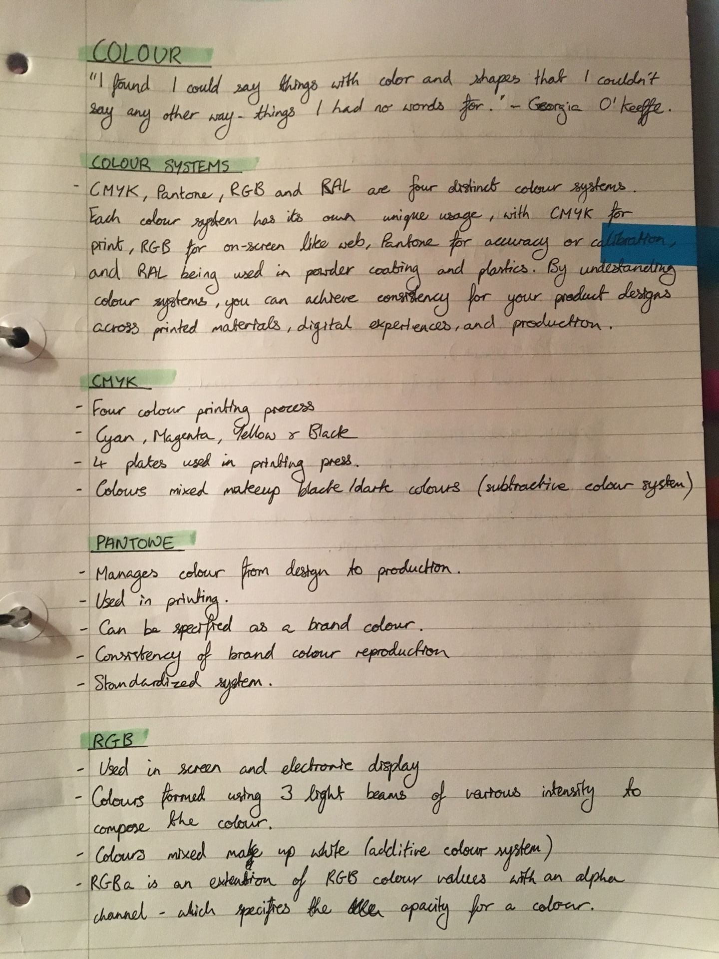
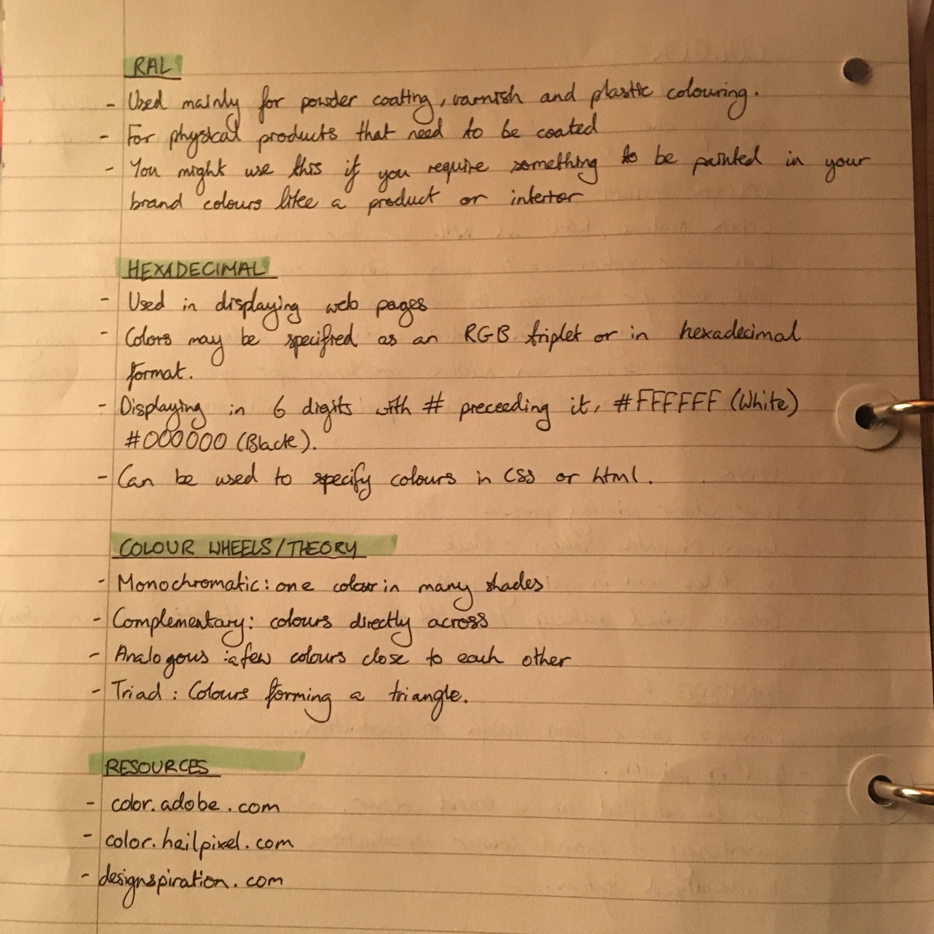
We started out by looking at the different colour systems like CMYK, Pantone, RGB, and RAL which are important to get an understanding of ignorer to achieve consistency through out your brand. Before this lecture I was only vaguely familiar of few of these systems but now I feel like I have a good understanding of the different colour systems and what they’re used for.
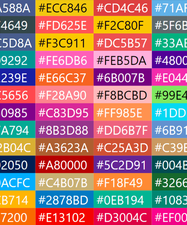
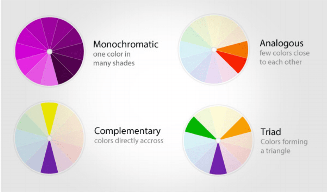
We also looked at some colour theory and resources that can help us choose colours for our personal brands. I learned it’s okay to observe things and pick colours from reference. Sometimes I like to inspiration from illustrations I like on Pinterest for my colour choice but I wasn’t 100% sure if that was an okay thing to do or not.


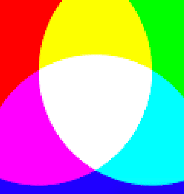
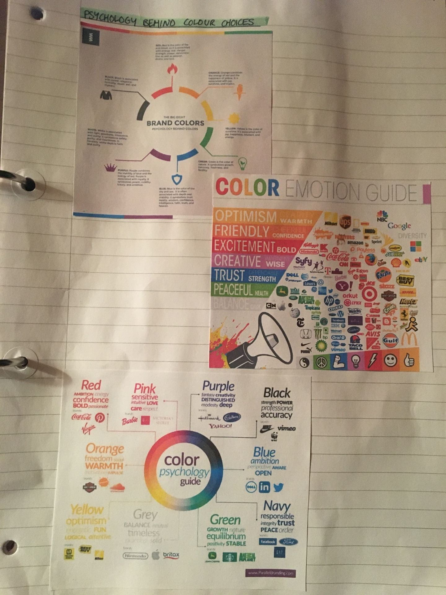
We the touched on the different perceptions of colour and the experiences, moods and emotions we associate with particular colours. Observing these perceptions is a way brands can manipulate people into perceiving them in a desirable way. An example of this would be that the Nickelodeon logo is orange likely because they wish to be perceived as fun, friendly and cheerful.
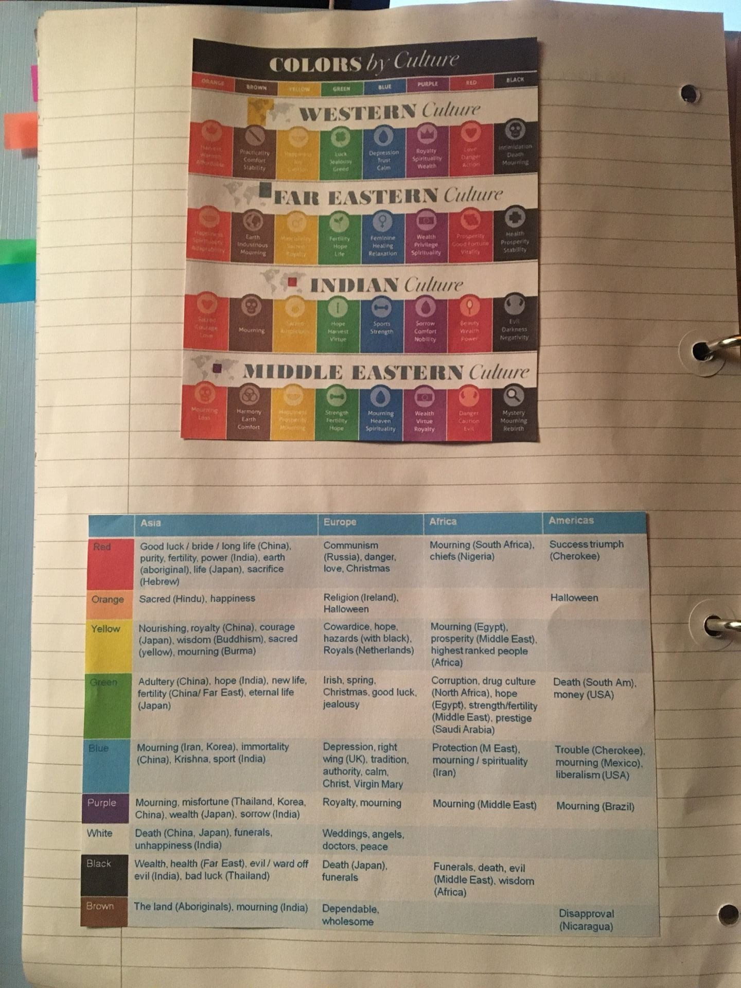
I found it particularly interesting looking at the disparities between colour associations in different parts of the world. This means that if you go to work at a different part of the world, it’s important to look into these association so that you don’t accidentally use colours that would be considered offensive, distasteful or off putting to your target consumers.
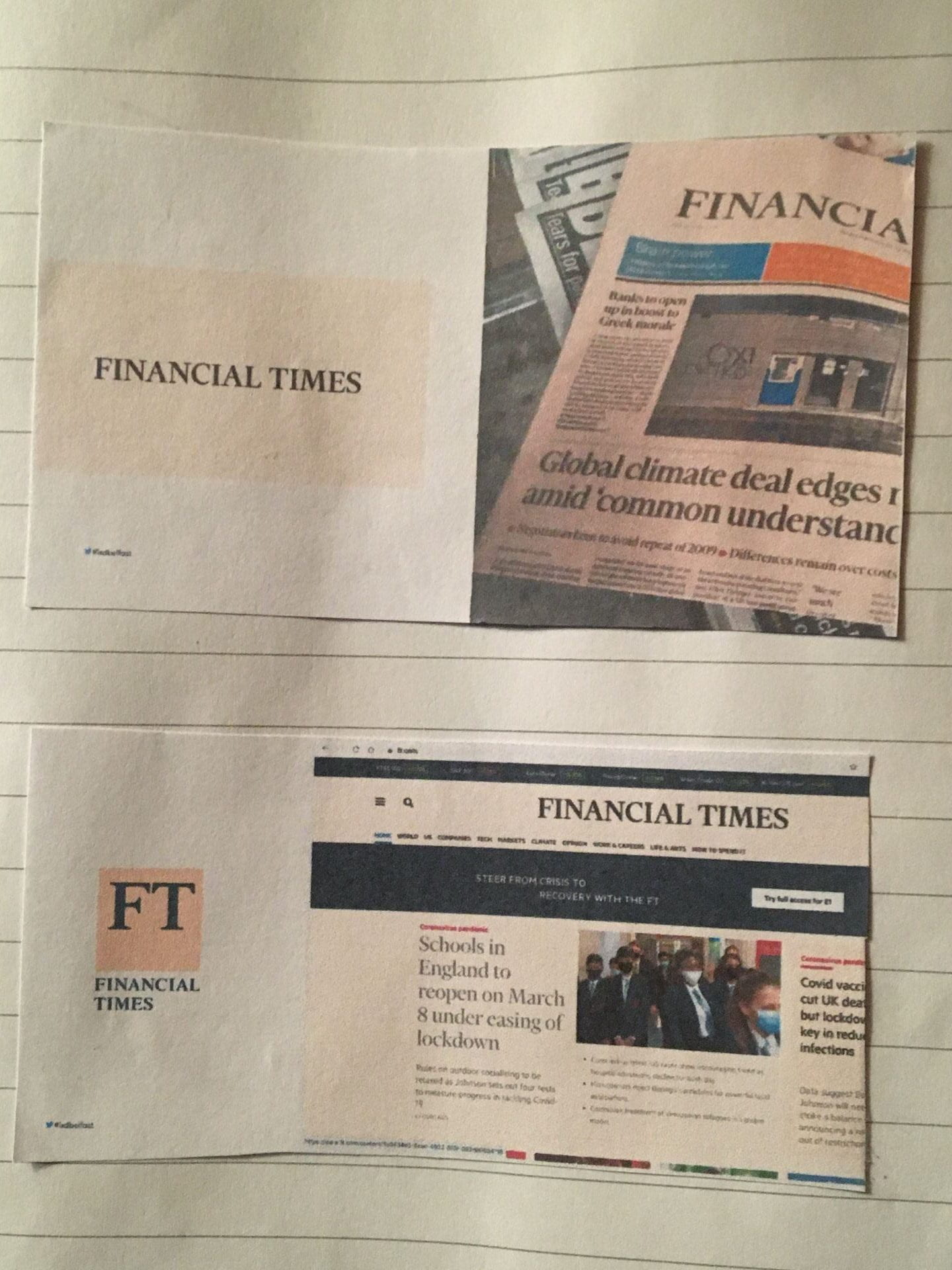
We then looked at some real life examples of colours in utilised by brands

The lecture then finished with the brief for this week’s 1 week branding task. We were given the task of doing branding for a pizzeria and creating three pages to upload for critique during next weeks class. This task should be a fun break from designing my own brand.
This Week’s Tasks