I made my first manifesto design in week 1. Since then I’ve learned how to use illustrator and also about typographic hierarchy. My hope is to do some further research for this project and rethink my design.
Research
Since my manifesto is movie related I was advised in the feedback session to take a look at the title sequences to get inspiration for my layout and font choice. I took a look at the Art of the Title website which lots of different title sequences from different award winning movies, tv shows and even video games. In some cases even giving a run down on how the sequence was developed. Heres’s a link top the site: https://www.artofthetitle.com
I made a Pinterest board to look at some of the different types of typography featured in movie titles. Here is a link to that:https://www.pinterest.ie/laurabfoy/manifesto-project/
In Week 6’s Ixd102 lecture on WWII and modernism in the US I got to learn a bout Saul Bass, the master of film titles. I thought it would be good to look at his film posters in particular. Before Bass came along posters just used portraits of the actors to promote films but he changed all that with his iconic poster for The Man With The Golden Arm. I thought that looking at some of his posters might give me some inspiration for my manifestos new design. Here are some of the posters I looked at.

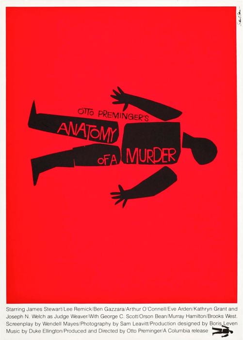


After looking at his work I had the idea of simplifying my film tape and having it just one solid colour.
My favourite genre is comedy and if my life was made into a movie that’s what I would want to be. One of my favourite shows on Netflix is Unbreakable Kimmy Schmidt and since its a funny show with a strong, fun and optimistic female lead it instantly came to mind when thinking of what would influence my font choice. In the summer there Kimmy vs Reverend movie special came out. In this movie you as a viewer are tasked with deciding what happens and different times through out the story. I decide to try to find a typeface that’s similar to what’s used for the options you have to decided between. I did this using adobe font finder on a screen shot I took. Although I didn’t get the exact typeface I think I managed to find one that’s pretty close. It’s called Urbane I think.

In Week 4’s Monday lecture on typography we were tasked with applying typographic hierarchy to our manifestos. Here is what I did.
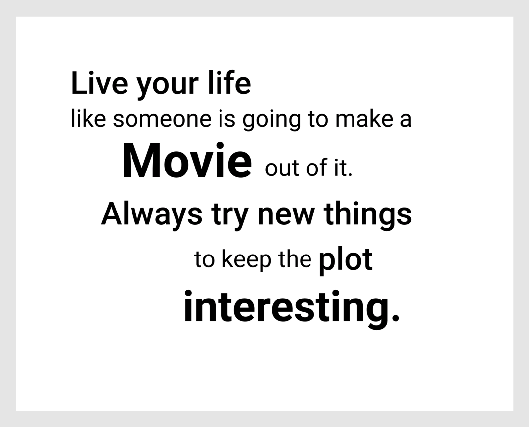
I’m quite happy with what I did here so this is now what I’ll be doing for the type of my manifesto just with a different font. I will have to move my tape to the side as the type now takes up more space and will be the focus of the design.
Sketching my design
I first did some simple thumbnails trying to figure out where to position my tapes.

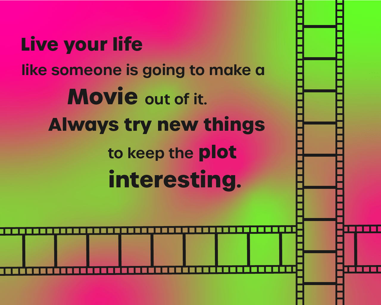
I then did a bigger sketch of the layout that I liked best. I wasn’t sure what colour the background would be yet but I knew I wanted some sort of gradient.

Digitising my design in illustrator
Other than making the tapes being a bit tedious, this process went quite smoothly. The only thing I really needed to experiment with was the gradient background.


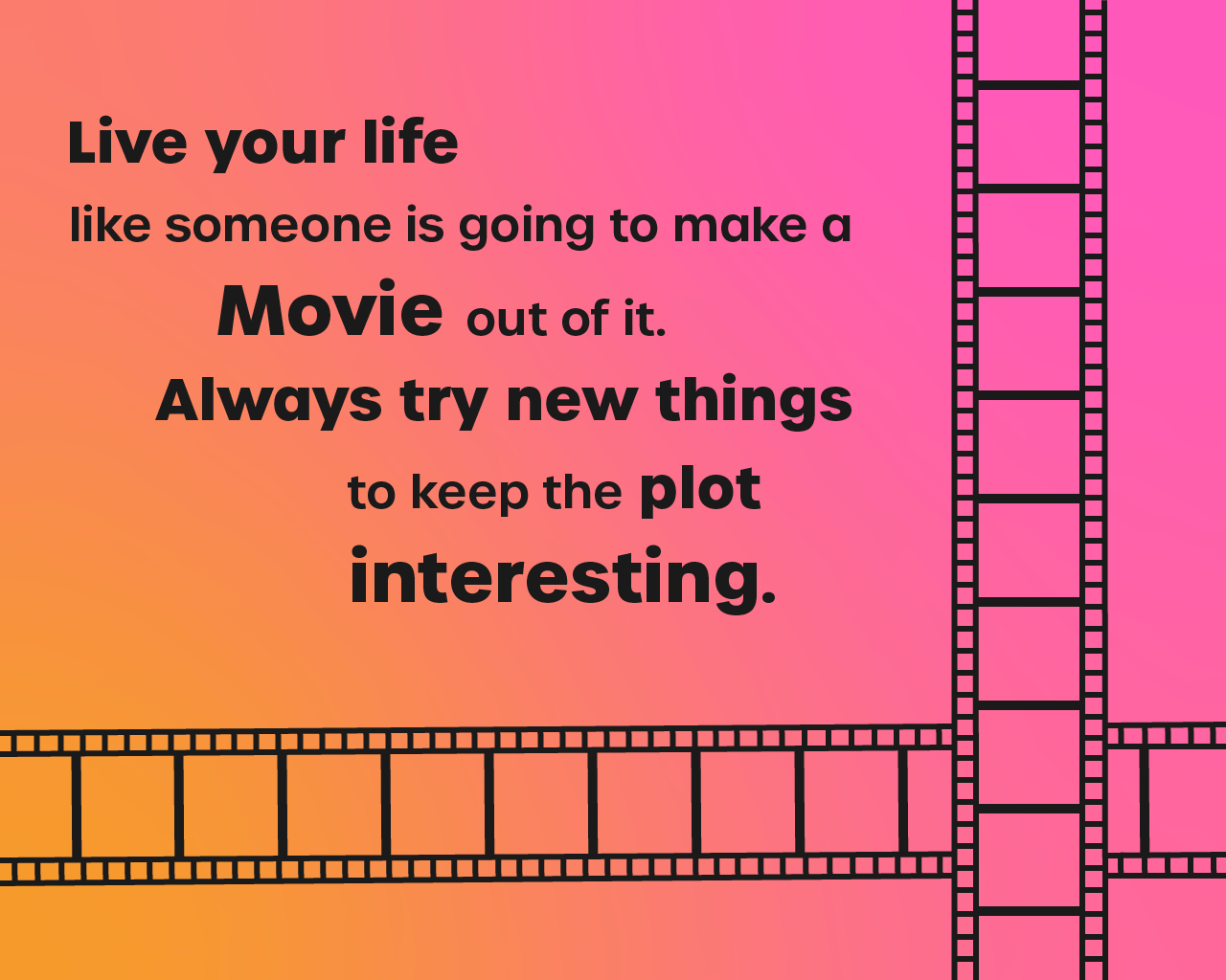
Final choice
I decided on the smooth gradient from orange to pink as I thought it turned out the cleanest. Pink is my favourite colour so it also just makes sense for that to be the colour of my manifesto.
#101