TThe final step in my project – creating a published site. For this part of the project, I decided to use Webflow, as they offer a free plan for students. I used the website last year for my previous projects, so I am very comfortable with it and know how it all works. Unfortunately, I cannot use this plan for this project as I am already using it for my portfolio, which I currently need live at the moment for placement interviews. However, since my site is all one page and requires no navigation between different pages, I can use their standard free site option.

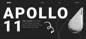
As I worked on building the top section of the site, I immediately ran into a few complications – I found that putting the body text directly below the title header just wasn’t working, as I ran out of room around the bottom of the screen. To fix this, I decided to place the body text directly to the side of the ’11’ on the second line of text. It lined up nicely with the lettering, and I found this to be a helpful mess-up.
The next problem I encountered was that I wasn’t liking the design of the original arrow I had, which would direct the user to scroll downwards. Instead, I went looking online for a few arrow designs that I could take inspiration from. I used Adobe Illustrator to quickly make up an arrow, and exported this as an asset. I placed the arrow directly beside the body text, so everything was in line and fit nicely onto the screen.


For the ‘Scroll To Top’ section at the bottom, I decided to add the same orange hover feature that I was doing with the navigation bar at the top of the site. I thought this was necessary, as the Scroll button offered the same style of link as the navigation links (by scrolling to a specific section on a page), and it added a sense of completion, as it starts and ends the site with the same style.
This was the final design of the top of the page on Webflow. It was now time for me to start animating the page, because as of now it is all completely static – aside from the navigation and scroll links.
I started with the header title – Apollo 11. I wanted this header to scroll in from the left and fade in. In order to do so, I needed to look up a few tutorials on YouTube. Here are the links to the videos I watched in relation to how to do this:
https://www.youtube.com/watch?v=aHufAI-m5lA&t=477s&ab_channel=NoahBateman
These videos were extremely helpful in terms of finding out little quirks and twists on what I could do for my website, as well as giving me the information I needed. I then used this information to begin adding the animations to my title, using the Interactions panel on the right.

This section offers a range of animations which can easily be added to the elements on your site, and they can be edited to appear and disappear as you choose. For this specific animation, I chose Scroll into view, which would allow the text to slide in from the left on appearance, and then disappear to the left again as the user scrolled away.

Next, I wanted to add similar animations throughout my site, but from what I learned in the videos that I watched, I knew it was easier to do all of this by not using the element trigger section, but instead the page trigger section. This meant that the animations would stay relevant in accordance to where the user was scrolling on the page.

For the mission storyline section of the site, I wanted each paragraph to fade in individually, and for each photo to do the same. This way, the site would feel more like it was telling a story, and that the user wouldn’t be too overloaded with information at once, as they would feel it was being handed to them in smaller chunks.

I quickly got the hang of this technique, and spent some time replicating it across all the elements in my site.
With the progression of the scroll animations, I felt that my site was coming along really nicely.