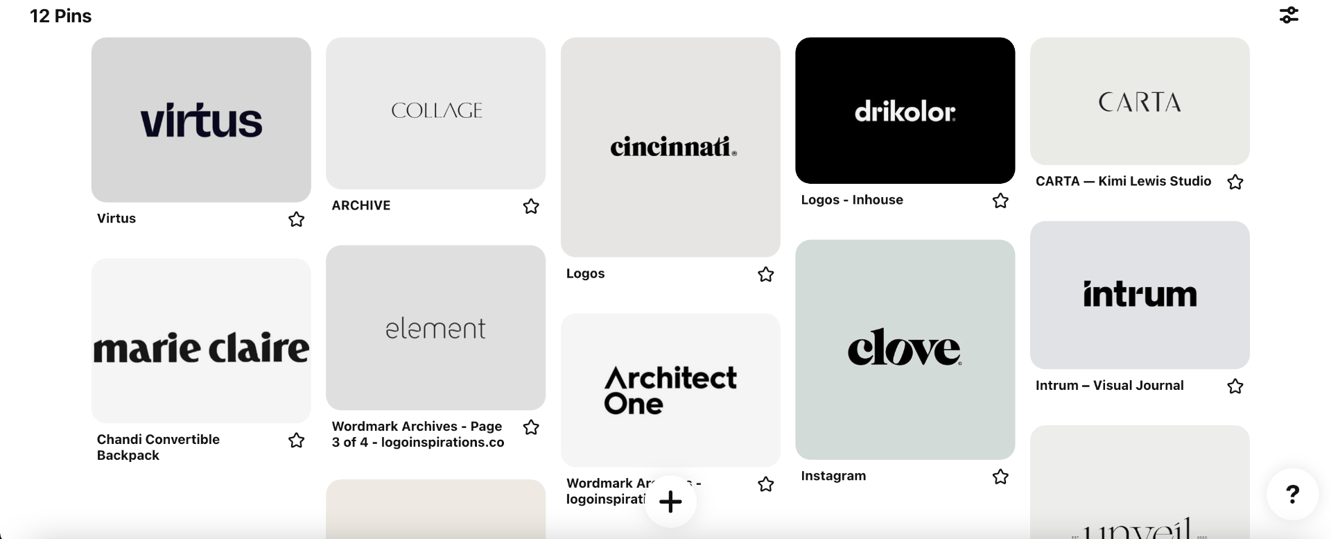
Our next task was to begin development of our wordmark. To begin, I first wanted to research and find some existing examples of wordmarks that I could take inspiration from.
I created a Pinterest board based around wordmarks that I liked the look of.
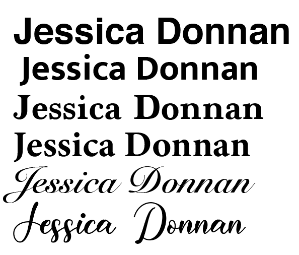
I tried out a variety of fonts to display my name. I also began using two different fonts for the first letter of my name and the rest of the letters, for a more definitive and creative look.


![]()

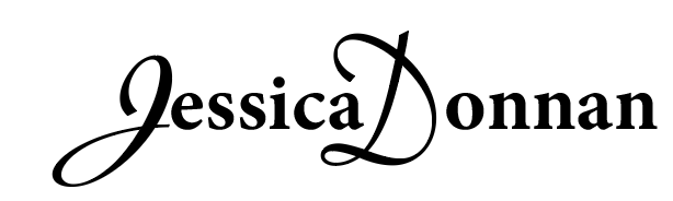
Out of all these fonts, I really liked the last one the best. I felt that the font itself displayed a great deal of elements that my brand consists of – elegancy, professionalism and creativity. I especially loved the A at the end of ‘Jessica’, and how it flowed into the C. It added a unique, small touch to the wordmark.
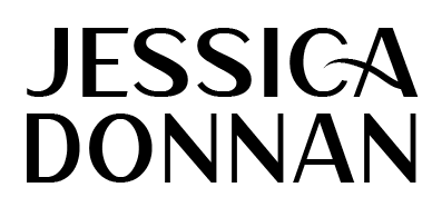
Here is the final wordmark placed beside my monogram. I feel the two work very well together: