There are a few specific monograms used in branding that I want to take a deeper look at, because I really like them and they are so effective.
Playstation

The original Playstation logo is widely recognised worldwide, due to its simplicity and use of shape and colour to define itself. It is an incredibly clever design. The logo was designed by Manabu Sakamoto in 1994 for the console’s release. The logo consists of an upright red ‘P’, which is accompanied by a “shadow”, which is made up of an ‘S’ on its side. The design has a 3D aspect, which reflects what the brand is known for selling – 3D graphics and games. The colours are vibrant and recognisable, making it suitable for all ages.
London Symphony Orchestra
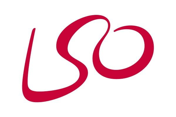
I’ve always really loved this logo. It consists of the three letters ‘LSO’ in a flowing, script typeface. It also has a double meaning, however, because it can also be seen as a conductor with a baton, which connects the logo to the essence of the business or brand. I think the logo is incredibly clever, but also has a timeless and elegant quality to it. The logo was designed by The Partners.
Flight Finder

This logo is another one with a hidden meaning, although it might be more obvious than the previous. It consists of two letter ‘F’s side by side, mirrored against each other. The negative space between the letters is that of a plane, connecting the logo to the brand’s purpose, which is all about planes and flights. It is sleek and clever, and makes you have a second thought about it. I really like how they have used the negative space to create a shape.
Tolkien’s Monogram
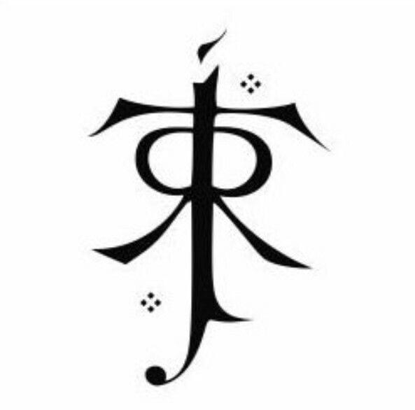
A specific monogram that I have always been fascinated with is one created by J.R.R. Tolkien himself, for use of signing off his work. The monogram consists of four letters: J, R, R and T. Each letter follows the vertical line in the middle of the design, but all the other elements of each letter go outwards on either direction, creating this branch-like appearance. The two R’s are placed to be mirroring another. The J runs all the way down the middle of the T. I like how you can go through each letter in his name and clearly read it or see it. It just works together so well. I really love this monogram.