This week during Friday’s class, we took a look at Postmodernism.
Postmodernism
Towards the end of the 70’s, many artists began to feel that modernism was drawing to a close, and there was a climate of cultural change. There was a rise to challenge the order and clarity of modernism, which sent shock waves to the design industry. The intuitive and playful aspect of Postmodernism design reflect a personal involvement, which was missing from modernism. Instead, the spirit of the time and the decade was captured.
Postmodernism was said to have began at exactly 3:32pm, on July 15th 1972, in Masury, as this was the moment a modern housing development were destroyed. It is described as the exact moment postmodernism began because the architect of the housing development was a Japanese architect, who designed the development strongly to the principals of modernism. The design involved perfectly ordered housing, wide open space, and the flats were orientated to catch daylight.

“After all, since it is fairly dead, we might as well enjoy picking over the corpse.” – Charles Jencks
“If I think about what modernism felt like in the seventies, it deserved a smack.” – Paula Scher
“I think the process in culture is always this xerox thing.” – Iain Sinclair
“Cracks that become faultlines… fruitful openings for the emergences of new patterns and forms.” – Robert Hewison
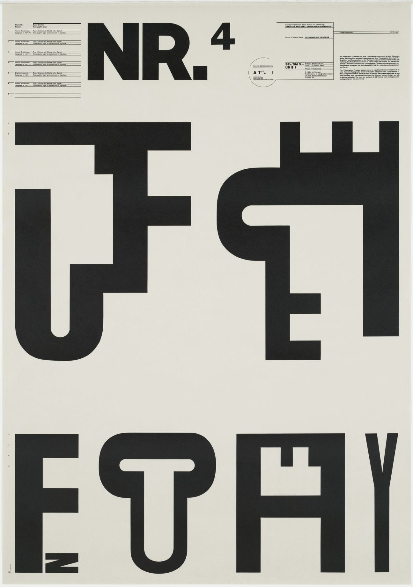
Wolfgang Weingart
Born in 1941, Wolfgang Weingart is a German/Swiss graphic designer and typographer. He is considered the father of the Swiss typographic style, and of New Wave typography. He was determined not to be constrained by the constructive conventions of Swiss modern typography, which in his view had hardened into an orthodox formula. He began to investigate basic typography relationships such as size, weight, slants and the limits of readability. He was fascinated by the effects of letter spacing, and he stretched words of text to being close to unintelligible.
“I was motivated to provoke this stodgy profession and to stretch the typeshop’s capabilities to the breaking point.” —Wolfgang Weingart
In the late 1970’s, Weingart began working more with images in his work.

Barney Bubbles
Barney Bubbles was an English graphics artist from the 1970’s, who worked mostly on album covers as well as his own compositions. He took his inspiration from the past, specifically post-modernism, which is clearly reflected in his work style. He would use paintings from artists such as Wassily Kandinsky, one of the artists of postmodernism, and take inspiration from it or redo it in his own way, which really illustrates the punk era in which the 70’s was known for. There is still something extremely powerful that carries over from the original painting and into the new one. It destroys the idea that art should only be for the upper-class society, by putting this famous painting on the front of a punk album cover.
‘Intersecting Lines’ by Wassily Kandinsky (1923)

‘The Damned: Music for Pleasure’ Album Cover by Barney Bubbles (1977)