Week One:- The Foundations
Week one was a chance to talk and go over the foundations of design and the course.
Even though it was quite a laid back session I still took away a lot from it that. I remembered that inspiration from from everywhere and how I can only be myself and create things that I am proud of. Some thing that I learnt was that paper should ALWAYS be where I begin when thinking of ideas al it allows me to see a draft of the design without having to create it. A pen and page is all you need to begin.
“You are an artist and a genius.
Don’t fit in. Don’t even try.”
—James Victore
I really like the above quote that was shown to me in class as it reminds me to not try and fit in but instead I should celebrate my differences!
Books to Read:-
There was also a list of books suggested to be read. I have included a screenshot of the books below –

Coursework Task:-
I was also given my first coursework project in week one which was to create a manifesto. I was encouraged to find a phrase that would act as a battle cry. Something that would encourage me to never give up and to always reach for the start and surpass everyone’s expectations.
Here are some Manifesto examples that I was shown —

Week Two:- Point, Line and Plane
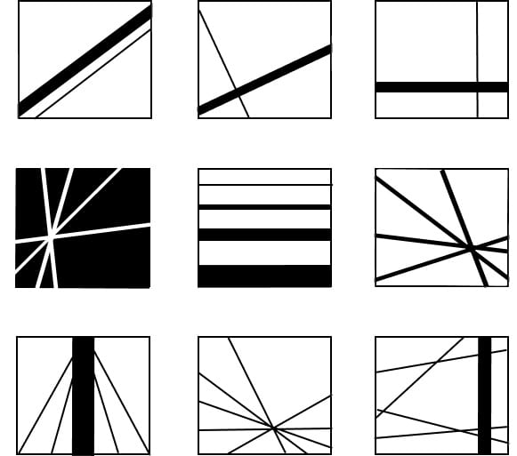
Week two was when we started learning about point, line and plane. Point, line and plane is a very important concept for designers to learn as it is part of the building blocks that allows them to create different patterns and designs. We were shown how they are in the world around us but sometimes we just don’t notice them.
Point can be represented as a circle or a dot. It can be any size and can be just an outline of a circle or a filled in circle.
Here are some images of point –


Line can be represented as a simple line, it can be vertical, horizontal and diagonal. It can also be any length.
Here are some images of line –


![]()
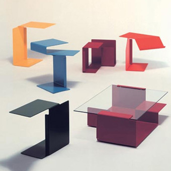
Plane can be represented as a square, rectangle or even a triangle. It can also be any size and can either be an out line or filled in as well.
Here are some images of plane –

Class Task:-
To create our own 3×3 point, line and plane images using only the basics – a circle, line, square and triangle.
(Original creations – updated later on)


Coursework Task:-
At the end of the class we were assigned groups and tasked that within our groups we should gather 100 images of either point line or plane.
Week Three:- Core Principles
Week three was a very theoretical week as we learnt about a lot of the core principles that go into the foundations of design.

In class I had a look at The Golden Ratio which is an example of The Fibonacci Sequence. These are factors to consider during design as it helps to make project more visually pleasing for the viewer. Using what we learnt, I then went back to the point, line and plane work that I had previously done and I applied the the Fibonacci Sequence to help structure it in a better way. This also gave me a chance to look back on my previous work and I even decided to change some of point, line and plane work that I had done previously.
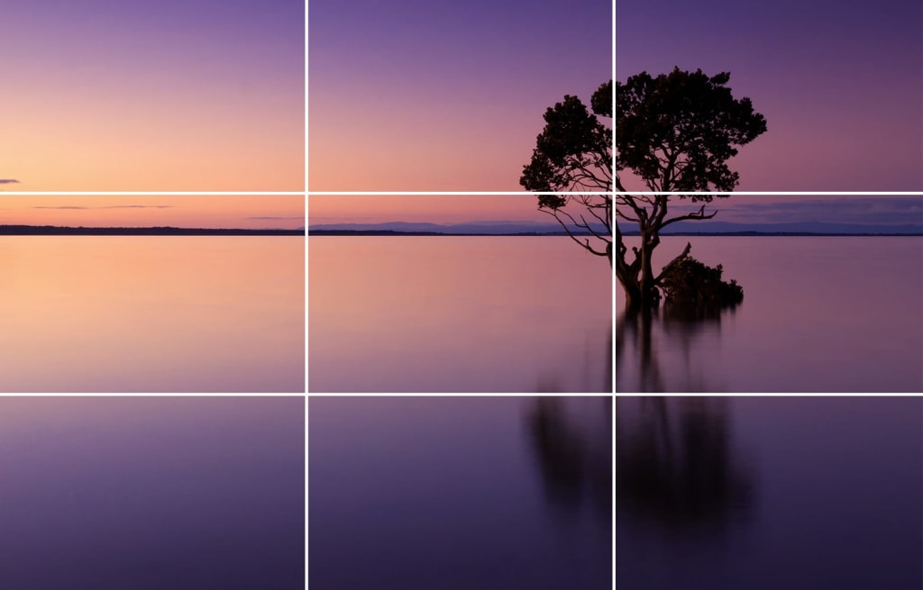 We also looked at the rule of thirds, and how even though it is mainly used in photography and cinematography there’s still a place for it in design. Looking at the rule of thirds was familiar to me as it was something that I had previously looked at when i studied film studies so it was a nice refresher on how the place designs on a page or on a computer.
The rule of thirds is a guideline that photographers, artists, cinematographers and designers use. It involves splitting the image into three equal rows and columns. The points where the lines intersect are known as the focal points, objects within the design should be placed at one of these points of they could be centred as these are the places that draw the eyes.
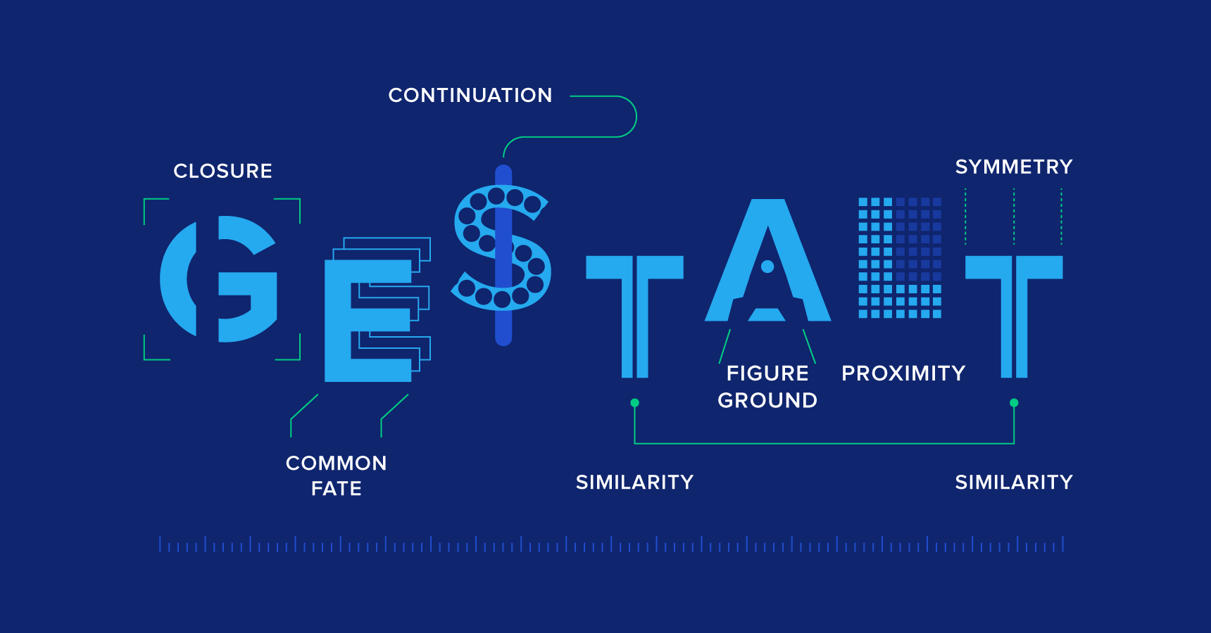 The last concept that we looked at was the Gestalt principles, there are seven concepts within it, which are:
- Proximity
- Similarity
- Continuity
- Closure
- Common Fate
- Figure and Ground
- Focal Point
What I understand about each principle (with examples) –
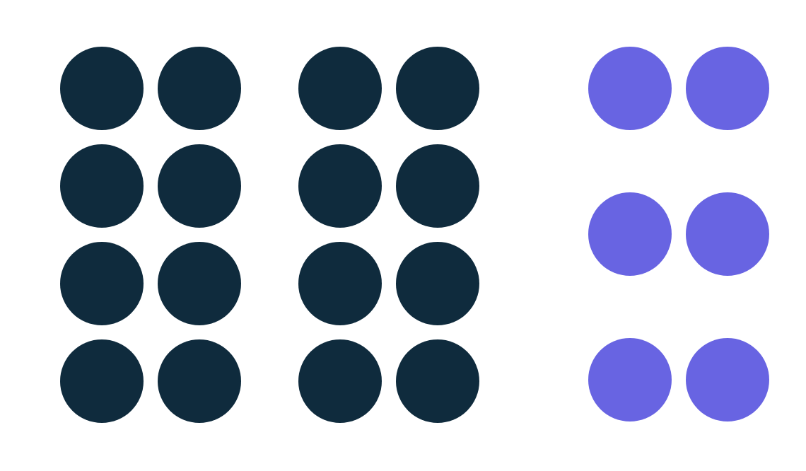
Proximity – we view things that are close together to be related more than things that are spaced apart

Similarity – when things are similar we associate them and may even think they hold the same function
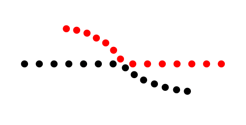
Continuity – the eye naturally follows a line or curve in order to see a continuing path rather than see separate shapes

Closure – when you look at a complicated pattern or design, we tend to look for a single recognizable pattern

Common Fate – similar to proximity it means that when objects within an image are located within the same closed region we view them as being all together.
![How to use Gestalt Principles for a more powerful business website [Infographic]](https://www.impactbnd.com/hubfs/Rubin-Face.jpg)
Figure and Ground – people view objects as either being in the foreground or the background
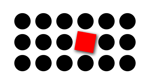
Focal Point – whatever stands out the most within an image or design is what will capture the viewers attention first.
Coursework Task:-
The design work that I was given this week was to select nine images from the 100 that I had collected with my group and to create a narrative with my chosen images, I was then encouraged to post the final product on Instagram as a way of displaying my work and to use the hashtag #ixdbelfast.
Week Four:- Typography and Colour
In week Four I learned a lot about typography as they are suppose to be the building blocks of the page. Typography is in everything whether we notice it of not and it can make or break a piece, so understanding it was very important.
A list of books about typography in great detail were recommended to read in case greater insight was wanted.
- My Way to Typography
- Thinking with Type
- The Elements of Typographic Style
- Stop Stealing Sheep & Find Out How Type Works
I was told that for online web typefaces I can uses –
Google fonts is also what I also used for the fonts within my webpage later on
Example of typography that I saw in real life and liked –

Week Five:- Introduction to User Interface Design
Usability.gov defines UI as –
User Interface (UI) Design focuses on anticipating what users might need to do and ensuring that the interface has elements that are easy to access, understand, and use to facilitate those actions. UI brings together concepts from interaction design visual design, and information architecture.
What I understand about User Interface Design is that it is about the designers creating a system that will be able to be easily operated by any user for the functions that it needs to be used for.
Class Task:-

The whole class was then tasked with finding different UI card layouts and UI card buttons from some of our favourite apps and websites and to post them on Miro. After we then talked through everything that was posted
Link to button and UI exercise
I noticed how companies would highlight certain buttons that they may want you to select for example on YouTube the subscribe button is a bright red colour. This is done to catch the viewers attention and make they aware of the fact that they can subscribe to their favourite YouTube channels. I realised a button does not need to be complicated in order to be effective.
When looking at the UI cards I realised that it is important to structure your content in a way that will let the users easily know what they are meant to do and that will also allow them to easily navigate the app or website. I also realised that visual hierarchy is really important when considering UI cards as you want the most important information to be easily seen and noticed by the user.
We were then tasked with creating our own UI cards promoting a musician for a music app. Here is what some of my classmates created

Link to class UI cards creations
It was interesting to see how everyone decided to layout their own UI cards and the colours that they chose to use.
This are some of the ones I made –


Week Six:- Human-Centred Design / GitHub 101
In week six I learnt that all design should be human centred and as designers we need to be conscious of who the will be using the design, whether its children, teens, adults, or someone else and then we need cater the product to them through the approach, language, colour and images used.
This was the week that I was also introduced to Git and GitHub. Git is the version control software within GitHub, this means that it allows you to add changes to your work without deleting the previous version. While GitHub is the actual hosting service where the coders on the system can share their work, collaborate and contribute with each other.
In order to be able to post work on GitHub a text editor needs to be used, I personally chose to download the text editor Atom but there was other options such as Bracket and Visual Studio Code .
Week Seven:- An Introduction to HTML
In week seven I learnt that the web is not the internet and HTML is not a programming language – it is a mark up device.
It is very important to use all lowercase for HTML
We then started looking at the foundations of a typical webpage beginning with the head element.
The <head> element contains information about the actual document like the title scripts and style sheets. Coding elements that can be used in the <head> are:
- <title>
- <base>
- <link>
- <style>
- <meta>
- <script>
- <no script>
- <template>
After learning about the <head> elements, we then learned other HTML tags:-
- <title> – define the documents title
- <header> – define the header portion
- <h1> – <h6> – define HTML headings
- <p> – defines a paragraph or a short sentence
- <blockquote> – defines a quote
- <cite> – defines the cite of a quotation
- <section> – defines the different text sections
- <div> – defines a section within the document
- <article> – defines a article
- <footer> – defines the footer portion
- <b> – defines bold text
- <i> – defines italic text
- <em> – defines an emphasis
- <img> – defines an image
- <br> used to insert a single break line
After learning some of the different tags I realised that a lot goes into HTML. Even naming a file needs special attention as you cant use any special characters or have spaces. The file name needs to started with a letter and kept short. Only lowercase letters can be used and the file extension must be added at the end (.html, .css).

My HTML work putting all the information that I learnt into practice
Class Task:-
Everyone then received a John Baskerville document that had to be turned into HTML. Once I knew the tags it wasn’t very hard but i did still make some mistake which I corrected later on
Coursework Task: –
I was also tasked with turning the type history documentation into HTML as well.
Week Eight:- CSS 101
In week eight we started learning about some basic CSS (Cascading Style Sheet) that can be used to design webpages that are made using HTML.
CSS can be used to define colours, typefaces, positioning, size, layout and many other aspects of the webpage. If a CSS is not added to a HTML webpage then the webpage will be styled using the browsers default stylesheet.

Example of the browsers default stylesheet
The default stylesheet appears very bland with no life and that is where CSS comes in as it adds something very important in terms of design.
There’s is a lot of information to know in regards to using CSS such as how a heading can either be H1, H2, H3, etc. this is due to visual hierarchy so that attention can be drawn to elements such as titles so they can stand out within text.
I also learnt some other simple CSS such as:-
ordered lists <ol> and unordered lists <ul> –
<ol>
<li>first item<li>
<li>second item<li>
<li>third item<li>
<ol>
would be shown as –
first item
second item
third item
while
<ul>
<li>first item<li>
<li>second item<li>
<li>third item<li>
<ul>
would be shown as –
first item
second item
third item
Creating the CSS:-
We started off by copying and pasting the Baskerville file as each week with every new thing we added we had to create a new file so that our progress could easily be viewed.
To make the CSS you had to simply create a CSS folder in your respiratory and then save a new text editor file labelled style.css within the new folder.
A simple reset had to be done to the CSS at the beginning in order to take away any inconsistencies that a browser may present
A code ( <link href=”css/style.css” type=”text/css” rel=”stylesheet” /> ) also had to be added to the HTML of the webpage in the <head> content in order to link the CSS to the HTML.
Using the information that I had previously learnt about ordered and unordered lists I then used the code:-
<nav>
<ul>
<li>href=”#the-man”>The Man </ li>
<li>href=”#the-typeface”>The Typeface </ li>
<li>href=”#mrs-eaves”>Mrs Eaves </ li>
<ul>
nav>
To create hyperlinks that take the user to different sections of the webpage.
We were all also allowed to choose how we individually wanted to style our content so that they would all be different. I enjoyed this as it allowed me to be creative and pick the colours and designs that I felt would best suit my webpage.
I chose to use the main colour #008080 as I liked how it looked along side a light grey on the webpage

My CSS work putting all the information that I learnt into practice and my webpage with the changes
A tip that I got and found really useful is that in order to keep everything organized labels can be used so you know which section that is being worked on. In the screenshot you can that I have put that into practice by labelling each section e.g. /*——–MAIN STYLING——–*/ , /*——–TYPOGRAPHY——–*/
Coursework Task:-

I received plain john Baskerville text and for practice I had to create different John Baskerville versions, I decided to try and get mine similar to the screenshot shown but not exact so that there would still be differences. This was suppose to be done so that my CSS skills could grow and so that I would become better at typing CSS code
Starting to do the CSS was hard especially when something didn’t quite work the way it way suppose to but once you got the hang of it it became easier.
While doing my HTML and CSS work I discovered a website that really helped me, it was really helpful as it had a lot of detailed instrucions on how to do and achieve different things – website
Week Nine:- Web Typography
Web Typography was looked at during week nine. We took a look at Baskervilles typeface
Then we used Google Fonts to add type to our websites, this was done by linking the HTML to the Google Font. To link I went onto Google font and selected they typeface that I wanted to use, once selected a box opened at the right had side containing a link for me to copy

This is a screenshot of my HTML to show the link
Websites to view in relation to Type –
Books Recommended –
Week Ten:- Table and Images
This week we focussed on adding images and tables to the webpage.
Image –
Before adding the images they would first need to be edited and changed to JPEG. In order to add images to the website, the code <img src=”img/imagename.jpg” alt=”Image Description” title=”Image Title” /> had to be used

The highlighted section shows the code that I used for the CSS styling of the image.
Table –
HTML tags to consider
- <table> – opening tag
- <caption> – placed directly after the <table> , signifies where the title will go if there is one.
- <tr>, <th> and <td> – table row, table head and table data.
- </table > – closing tag

Once I Knew these I then formatted my table in HTML, as seen in the screenshot
After the code for the table was entered I then had to style the table in with CSS

Week 11:- CSS Grid
By week eleven we had all of the basics of HTML and CSS learnt and practiced.
CSS grid was the last topic of the semester. CSS grid has a lot of aspects to it but we learnt some of the basics to help out when creating our portfolio website
Websites given to help with CSS Grid –
- Grid by Example
- A Complete Guide to Grid
- CSS Grid Layout Module
- CSS Grid Layout
- CSS GRID.
- Learn CSS Grid
Later Annotation –
While attempting my CSS Grid for my portfolio website, I ran into some difficulties. I tried to use the guidelines that were provided but I still had some trouble with the grid. I did get most of my issues sorted and I think the Portfolio didn’t turn out bad.