
Book Review – Logo Type by Michael Evamy
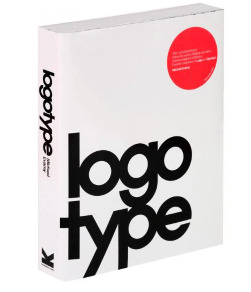
Logotype is the definitive modern collection of logotypes, monograms and other text-based corporate marks. It features more than 1,300 international typographic identities, by around 250 design studios. It is described an indispensable handbook for every design studio, providing a valuable resource to draw on in branding and corporate identity projects.
Logotype differs from many other logo/branding books because its display is so international. It features work from some of the world’s outstanding identity designers. Rather than just focusing on designers from Western Europe and North America, they have also featured designers from Australia, South Africa, the Far East, Israel, Iran, South America and Eastern Europe. Contributing design firms include giants such as Pentagram, Vignelli Associates, Chermayeff & Geismar, Wolff Olins, Landor, Total Identity and Ken Miki & Associates as well as dozens of highly creative, emerging studios. By showcasing a more global display, I was able to pick up on how culture and other factors can influence design.
One of the many things I picked up for Logotype was something quoted by Jason Smith…
“Something every designer should do is learn how to achieve expression through type. How do you make a word like “fizzy” look fizzy? It’s not about typing out the name in Helvetica and applying a fizzy filter to do it. It’s about thinking of an idea and drawing it!”
Smith recommends to always begin with sketching. He explained you must search for words in a name for any interesting relationships between the letterforms that can become a ‘hook’. You should then apply an essence or vibe, which will capture the personality of the brand. I think these are great tips which I am going to use to apply when I’m trying to be more creative with letterforms, for example, designing my wordmarks.
Logotype included a lot of analysis’ of many logotypes found in their simplest forms. I have decided to include some of my favourite…
Asprey –
“For the company that has enjoyed royal patronage since 1862, a logotype with stately letter spacing and a final flourish to make its split from Garrad in 2002. As a luxury goods brand, designed by Pentagram (Angus Hyland) the logo fits the brands tone of voice so accurately.”
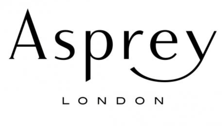
I completely agree with what they have stated in the book! The logotype is so elegant and shows its authority through its confidence.
Jeep –
“Off road vehicle brand, Unknown designer from 1960’s. Pure no non-sense Helvetica Bold for the original off-road vehicle. It’s to the point, trustworthy and recognised.”
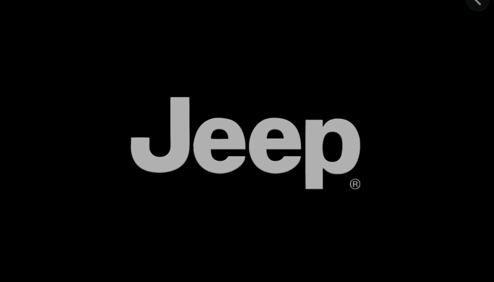
This logo is so simple, yet so powerful. It really shows how simplicity is key for successful design.
There were many more examples of logotypes however these were the styles which just stood out to me the most.
What I learnt from reading these breakdowns of each logotype, was that every single element is important when designing using letterforms. There are no room for errors as there is no where to hide.
There was another section in the book called “Alternative Arrangements”. This was something that I hadn’t really considered yet when sketching my ideas for my wordmark. Rotating, reflecting, slanting and stacking words and portions of words can generate some interesting dynamics, rhythms and hierarchies with plain or long names. Groups of letters are used as building blocks orientated to suggest disruption, harmony, ascent, descent, space and structure.
One thing I did struggle with when designing my monogram and wordmark was getting the hierarchy right, as in not allowing the monogram to completely overtake my wordmark. If I was to improve my designs I would definitely would use alternative arrangements and I think it would help me feel more inspired. Because my name is quite plain, it would definitely add more variety.