IxD103 – Developing my Business card
The next step in developing our personal brand, is developing our very own business card. I have been really excited to complete this task, as I feel that actually having a physical thing with our own brand that we have designed, is a very exciting thought. It is something I will be able to take pride in and will also benefit me. Before delving into designing it, I done some research on the importance of a business card…
A business card says a lot about your business, in more ways than one. A good card succinctly conveys what your business is all about. It tells someone what you do and how they can get in touch with you. It shows off all your branding essentials: The name of your business, your logo, and possibly your tagline.
A good business card tells people something about you that isn’t written on the card: It speaks to your level of professionalism and preparedness. It can also show off your taste: A well-designed, eye-catching business card will make you look creative, innovative, and thoughtful. It’s a simple and effective way of standing out from the pack.
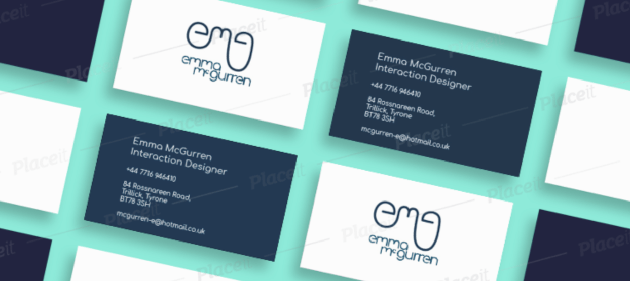
Business cards play a significant role in creating opportunities. They help increase sales due to the power of personal networking and with this your brand can build a true identity. Some things I learnt along the way is to only include what is necessary and make sure the font is legible. From a design perspective, white space also helps draw attention to the space that does include text or a logo. It will be important when it comes to it, to get my cards printed professionally.
Developing Ideas…
Idea #1
Below you can see my initial business card Idea. This was created before the new development of my monogram and wordmark. I didn’t really like this design as I think it was too busy and doesn’t look very professional. I think that the font is quite legible etc. however I knew I was going to have to do a little work to match my brand’s tone of voice better!


Idea #2
Below I have included my second concept. This was also developed before I went back and developed my monogram and wordmark. I really stripped back all of the chaos from the first concept and used the negative space to my benefit. I think I have perfected the layout of the text on the back of the card perfectly, however on the front side, I found myself adding more detail by layering my monogram in different colours. Initially, I thought this was really fun and playful , however when I took a step back, I realised that again I was starting to loose that professional look I was trying to achieve. This was when I knew, something had to change with my monogram and wordmark. I have a blog post which explains my process… Go check it out!
As you can see I done a lot of playing around with colour schemes during these developments. I love pastel colours and think they suit my brand. I still wanted to carry on my decided colour scheme here onto my next design. The design process can be quite frustrating sometimes, however it takes time and reviewing your own work to reach your end goal. You are not always going to achieve what you want straight away, and it’s okay if you have to start again… so that’s what I done!


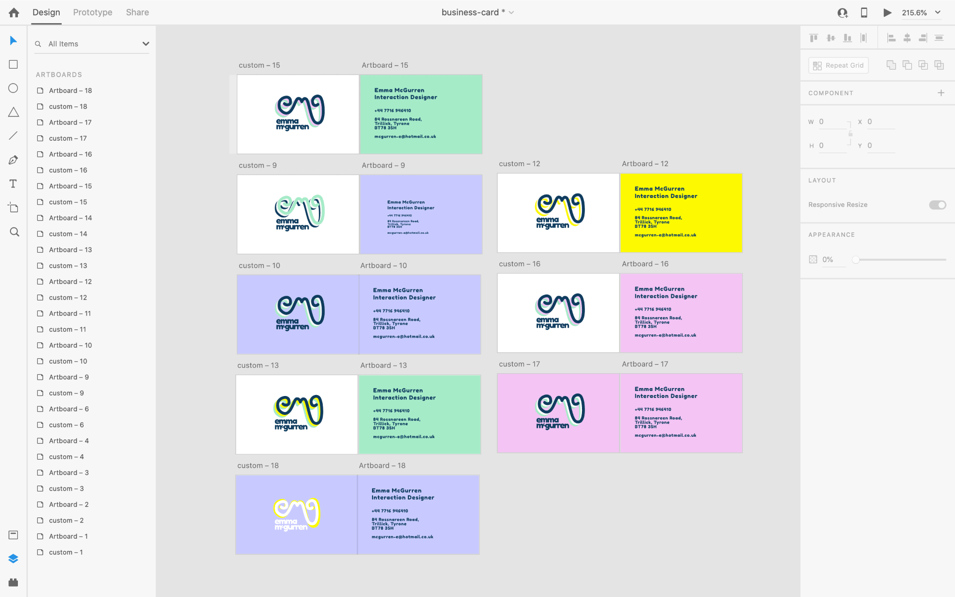
Colour scheme I decided on…

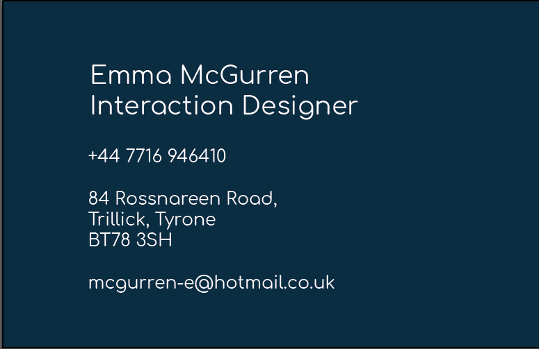
Idea #3
I am so much happier with this concept. I really like how slick and efficient it looks. I think it is very legible and I also really like my colour scheme. I think for my finish, I would like to just keep it simple with a plain white card.