Week 5 – Colour – Content and Overview
This week Daniel introduced us to different colour systems. I knew a little bit about this from school however it was great to get a more in-depth look at colour. The different systems include CMYK, Pantone, RGB and RAL. Each are unique for individual usages, eg. RGB for on-screen like web. We learnt that through understanding colour systems, you can achieve consistency for your product design across printed materials, digital experiences, and production.
We were introduced to many great resources that will help us when choosing colour schemes and keeping themes looking consistent. One of my favourites that I already use quite regularly is Adobe colour. It is great especially when you want to extract colours from an image that you’ve found that has inspired you etc. It is also great for using in association with the other Adobe apps, for example Adobe Illustrator. You can save the schemes to your library. Things like this always help to make designing more enjoyable.

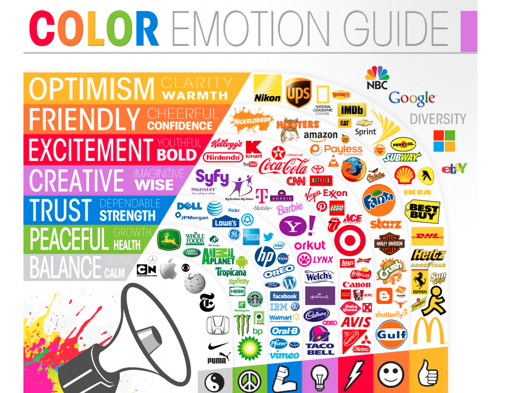
We learned a little about the psychology behind colour choices. I find this so interesting and can totally see that colours really do help you to form opinions about a brand’s identity. This is why I need to take extra care when choosing my own brand colours and shows that you can’t base your colour choice just because you like a colour or it’s your favourite. There is more than meets the eye when it comes to the choice of colour.
Reflection –
Our task this week is to create a Pizza brand in one week. I am really excited to get started with this and I think it will really push me out of my comfort zone. I really enjoyed the content from this week’s lecture and I think colour theory is a very important thing that every designer should be aware of. I am going to look up more resources to find out more information about colour.