This week our task is to begin to gather all of our work to date and present our brand guidelines. Brand guidelines are essentially an instruction manual and rule book on how to communicate your brand. They lay out all the visual details, as well as important notes about the company’s voice, tone, and messaging. They come in the form of a physical or digital booklet filled with examples of what to do and what not to do.
Brand guidelines comprehensively cover a company’s brand identity including its:
- Logos: full logos, secondary logos, and icons
- Colour palette: primary and secondary colours
- Typography: font styles, sizes, and spacing
- Other imagery: photos, illustrations, and artwork
- Voice and tone: how the brand uses language and emotion
When companies take the time to create brand guidelines, it helps to ensure that their brand image stays consistent no matter where it shows up. This will pay off big time in the long run, as your company will generate the familiarity and reliability that open the doors to brand loyalty.
The brand I chose to research, is one which I’ve always been fascinated by… Lush Cosmetics! Lush has always been one of my favourite brands, not only because they appeal to my pro-active generation, but because it’s not just a shop, but an experience. Reading through Lush’s guidelines, which they have presented so clearly in an 87 page brand book, I’ve fallen for the brand even more.
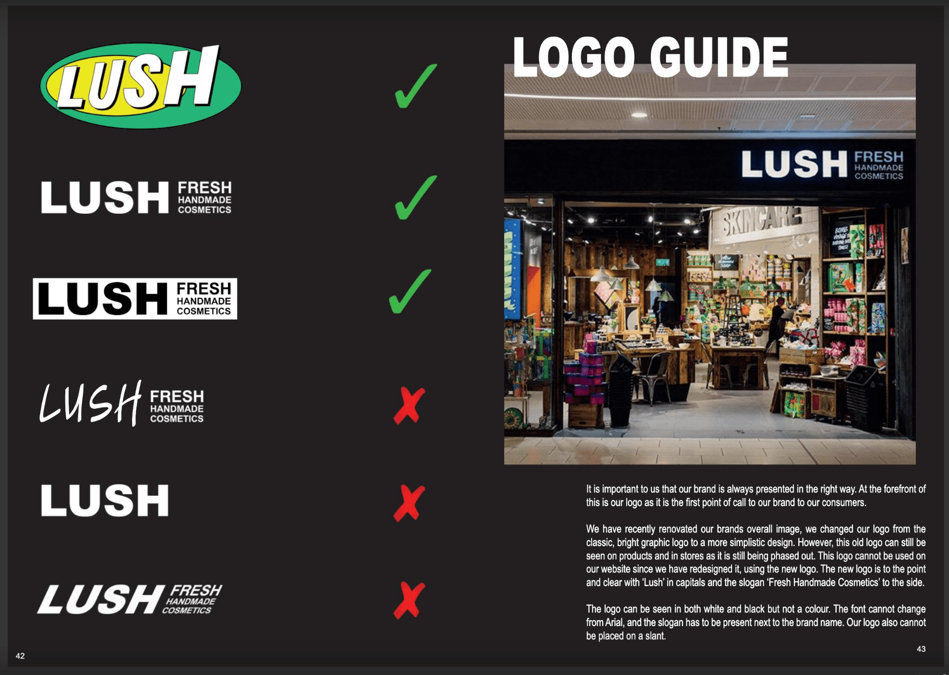
Lets start with their logos…
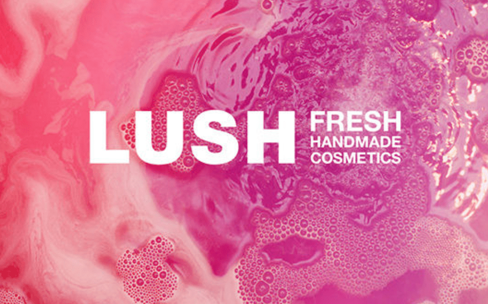
Their logo is so simple and to the point. There’s nothing to distract from the fact that they are LUSH! All of lush’s products, including their bath bombs and soaps are so vibrantly coloured that they don’t need to over do it with the logo. They speak about how they have changed their logo and have strict protocols on what and how their logo can and can’t be displayed. This heightens their consistency, helping to make their brand more fluid.
Next up we have their colour choices…
Like I’ve already discussed, LUSH have such an array of colours already present through their naked products, so they need to be careful not to make their brand, in particular their packaging, so colourful that it distracts from them.

Their Pantone colour choices can be seen on the left side of the picture above. The colours are clean and easily recognisable to LUSH.
Next I’m going to talk about their typography…
They really seemed to emphasise the importance of consistency of type choice in their brand book. Their main font used in their logo is Arial Black, a very straightforward font. It’s direct and clear and shows that LUSH are serious about certain issues, but then this is balanced by the next font, showing that they can also be fun. The next font is called Lush Handwritten. They designed this custom font, creating a digital version of the handwritten font you can see in all of their signs in store. They done this to create a fluid and cohesive brand image, both online and in store.
Arial Black and Lush Handwritten are the only fonts ever used by Lush. This in my opinion is definitely one of the success secrets behind their flawless branding.
Next up is Voice and Tone…
Lush are such a vibrant and confident company, partly because they know and understand who their consumers are and what they expect. They realise that they mostly appeal to women and people from a younger demographic, between the ages of 16-34. That is because we are more likely to view them as innovative. We realise they are ethical and trying to make a difference in the world and we are likely to want to be a part of this too. They are playful and attract urban, up and coming consumers who care about living their best life. It feels morally good to shop there.
The thing I love most about lush, is that they’re not afraid to use their voice. They’re honest and transparent. When shopping in lush you are always approached with a conversational and direct tone. Their website is the same. You can tell that their staff know and love the products they’re recommending to you.
On their packaging, there are short, sweet sometimes witty sentences explaining the use of their products. Their online presence is full of puns and jokes. They stay active, as they know their younger demographic are most likely to discover them online. They care and have a strong colloquial voice to send their message across. A message of unity and love and that leaves a mark on people, making them want to return and stay loyal.
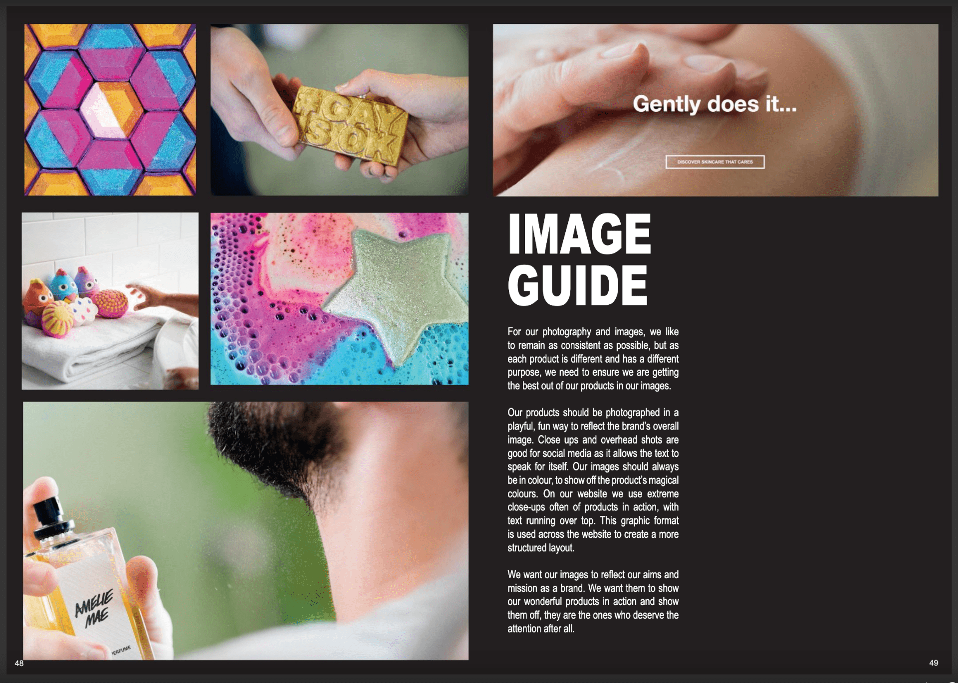
Other Imagery…
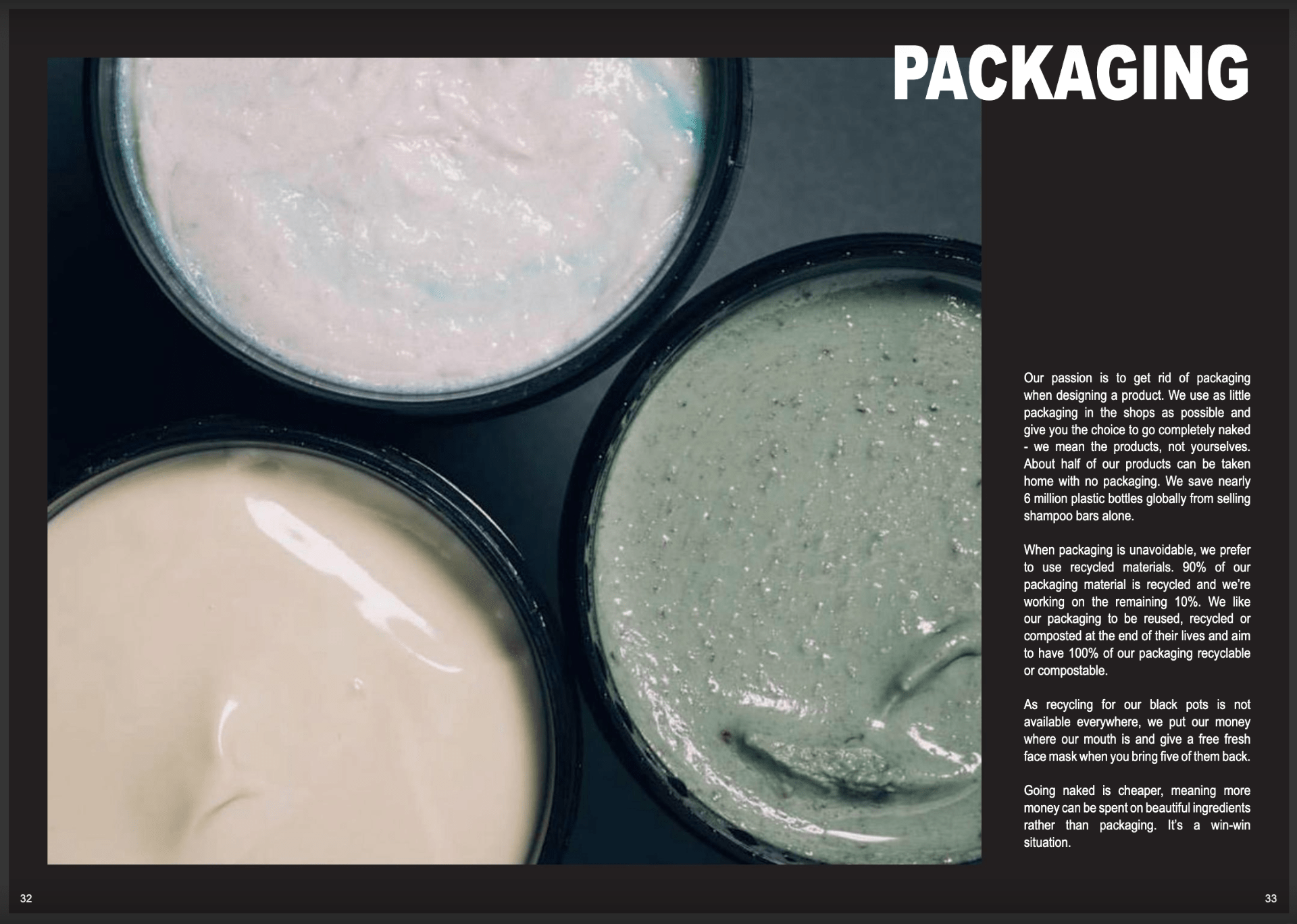
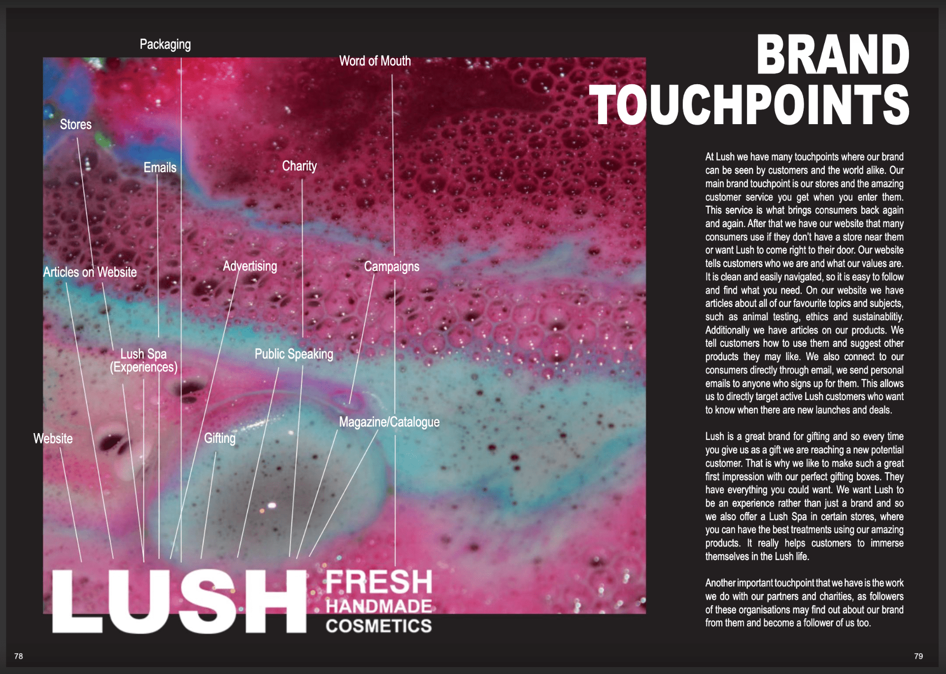
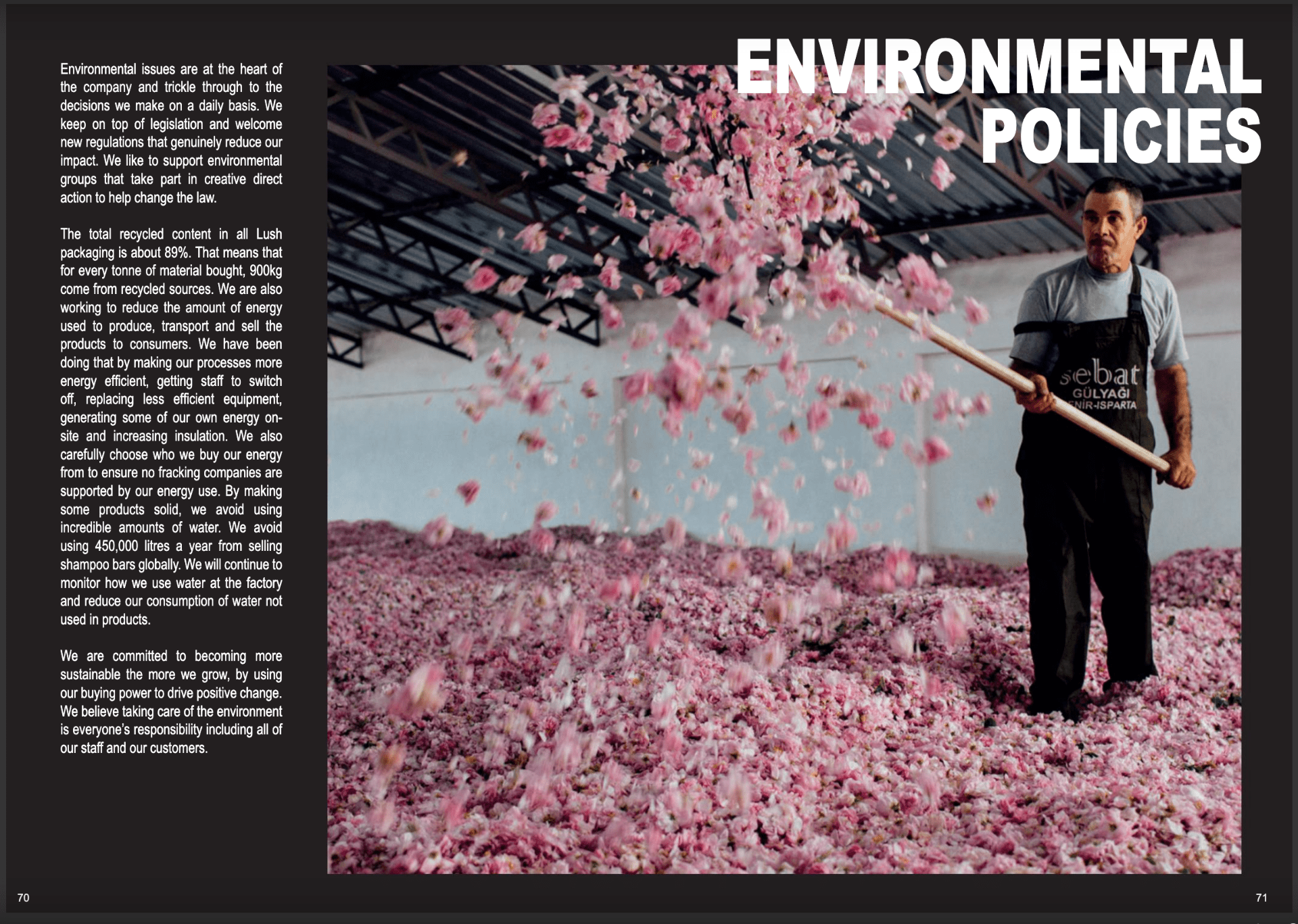
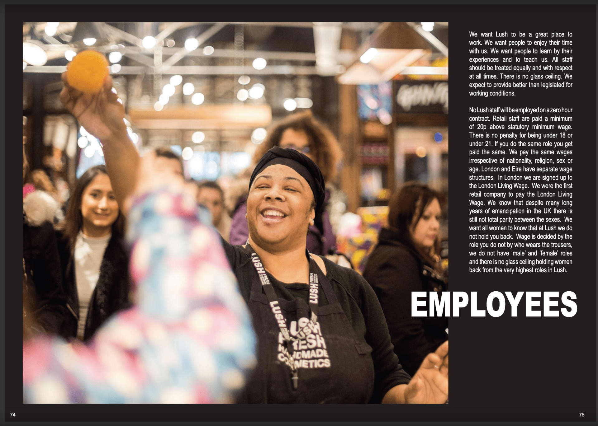
Lush have a lovely way of incorporating nature into their designs. They also have very strong campaigns against animal testing, they take recycling very seriously, and are always working to find new ways to decrease their water consumption. Below I have included some of the pages from the book which I found really interesting.


I think Lush is a brilliant brand, who know their identity and therefore this connects to everyone around their company. I have never left Lush without a smile, I can’t walk past the shop without wanting to go in. You can smell the shop is near a few streets down. These are all just a few things that represent their impeccable branding.