When gathering inspiration for my monogram, I kept in mind the personality and tone that I wanted my brand to present… Reliable, slick and professional. I want these qualities to be apparent as I think that the brands with professional logos/ monograms are always the most striking, fluent and timeless.
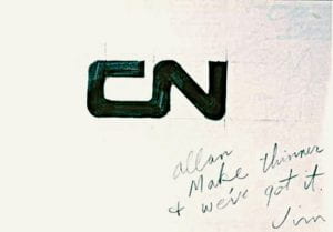
One of my favourite examples incluse the Canadian National logo, designed in 1960 by Allan Fleming.
CN had carried out a survey in 1959 revealing that people thought it an “old-fashioned”, “backward” organisation, hostile to innovation. Dick Wright, CN’s head of public relations commissioned New York designer James Valkus to study the problem. Valkus proposed a complete overhaul of CN’s visual image with a new logo (replacing its staid maple-leaf based design). He gave the job to Fleming.
Fleming was said to have had the idea on a flight to New York. He sketched it out quickly onto a Napkin.
The continuous flowing line symbolised “the movement of people, materials, and messages from one point to another,” Fleming said. “The single thickness stroke is what makes the symbol live. Anything else would lack the immediacy and vigour.” This proves that less can be more, it is smart design! Abolishing the R for Railways also made the logo bilingual (‘Canadien National’ as well as ‘Canadian National’), an important plus-point in Canada, and made it more suitable for the many non-rail businesses CN ran at the time such as hotels, telecommunications, and ferry services. The logo is fluent and fits alls sectors of the company. “I think this symbol will last for 50 years at least,” said Fleming of his work. “It don’t think it will need any revision because it is designed with the future in mind.” Fifty-one years on, it’s still going. This goes back to my point about it being timeless. I am going to try to keep mine quite geometrical and simplistic.
Below I have left a link for my Pinterest board full of inspiration for my monogram development.
https://pin.it/7ItIqjx


