One of the first projects we enrolled on here at IxD was to create our own Type Specimen posters. Although I have never made anything like this before, I was so excited to try something new and push myself out of my comfort zone. When researching Type specimen posters, I found a lot of them to be quite similar and for me personally, I don’t feel that I’ve been creative enough If my work looks something similar to what I’ve seen on the internet. This is why I researched my chosen font Futura, in great depth.
See Blog post below…
Positive No.1
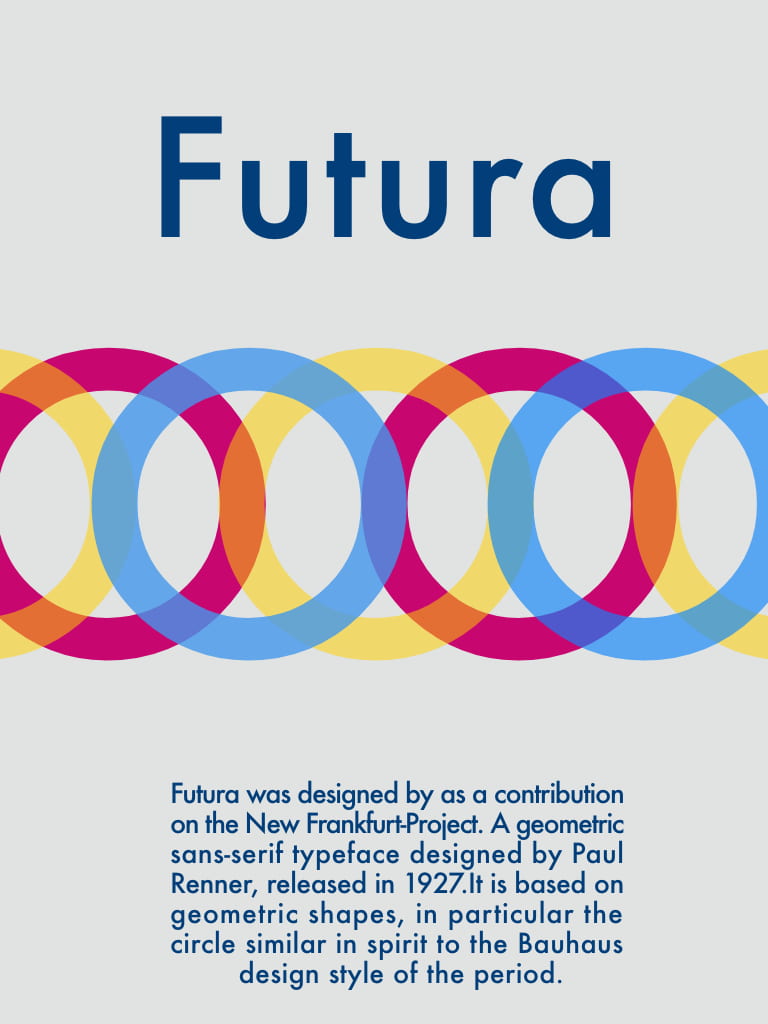
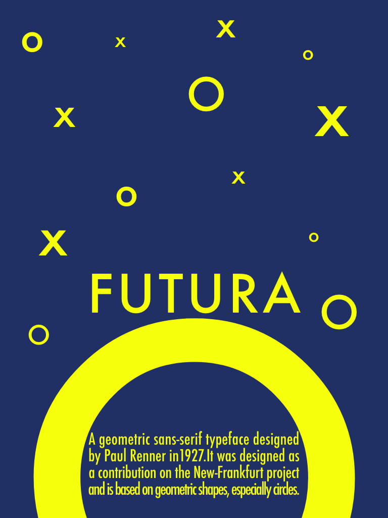
I am very happy with the colour combinations that I have created. I feel that this is one of my strongest assets.
Positive No.2
I am really proud of the originality of my posters, mostly the first two!
Negative
I do struggle with the placement of my text and find the tools quite difficult to use on any design software. I hope with time I will be able to improve and know where to place every element naturally.