Personal brand, Portfolio website and research blog – These deliverables should demonstrate your understanding of the subject matter covered each week.
Recap
This should all be reflected in my work!!!!!!
- Week 1: Language – values, tone of voice, bios, stories and strategies. This should always be the starting point when creating a brand.
- Week 2: Monograms – Examples, case studies, requirements, Axes ( how to balance the letters) and sketching.
- Week 3: Typography – Choosing and using type, Kerning, Anatomy.
- Week 4: Visual identity – design programme, pictorial and abstract drawing.
- Week 5: Colour – Colour systems, phycology, culture and meanings.
- Week 6: Application – Business card, touchpoints, animation.
- Week 7: Brand guidelines – Guideline documents, considerations and rules.
- Week 8: Style guides – style guides, pattern libraries, element collage.
- Week 9: Portfolio website – planning, inspiration, standards, wireframes, Osborne checklist.
Research blogs:
Needs to be updated more often, loads of content missing. Put the time in! Maintain it. if you don’t it will slip. Take an hour a day and post !!!!
- Lecture summaries – Class notes.
- Independent research (literature reviews, blogs and articles) be critical of your sources. Make sure articles are from a reputable website. Lean more towards book – they are credible.
- Backup and development work – paper sketching, you need to draw as much as you digitalise!!! Include all developmental work.
- Self-reflection – weekly summaries of what you have learned.
- Assigned tasks – progress and final outcome and reflection.
Read
- Designing brand identity by Alina Wheeler
- The future beyond brands lovemarks by Kevin Roberts
“The word ‘brand’ is overused, sterile and unimaginative” – Michael Eisner, Disney
To me this maybe suggests that branding needs a bit of a shake up, we are over saturated in them. We are bombarded with branding – it’s everywhere, even in our homes. Has it just become a way to compete instead of creating a meaningful interaction? Does brand now equal boring?
Values
Brands are all about values. You need to believe in something and you need to explain why you believe in it ( they might get on board because of this, if you don’t believe in it, why should the audience?) This enables you to form an emotional connection with your audience.
What are the functional benefits? without this you have nothing. Emotional benefits – what makes it better than the competitors?. Is it self expressive? If done correctly the customer will not only believe in the brand but they will feel like the brand expresses them as well. It allows the audience a way to be self expressive with the brands products.

“Consumers who make decisions based purely on facts represent a very small minority, yet, even for these people, there is always some product or service they buy based on impulse or emotion.” – Maurice Levy, Publicis.
We tend to make decisions based on emotions not facts, a good designer plays on this. They will create a brand that inspires loyalty beyond reason.
You need to make your brand desirable. How do you make your bio captivating? statement or story? A captivating tale. Frame your thinking process as see in the image bellow.

I need to become an idea person as this is what will make me valuable to customers and employers. Designers are here to sell ideas. Professional and passionately creative. Passionately creative makes you think that the person thinks, eats and breathes creativity; they cant help but be creative.
A brand that not only creates a great emotional connection and sense of respect will create real, impactful value and that in turn will cause the customer to pay you back with loyalty and love. Don’t just dress the brand up nicely, make it something that will last. If you make an emotional connection with your client, they will not only keep coming back but they will also refer you.
What I stand for matters and this should be reflected in not only my brand but my work.

The Nespresso not only feels stylish but it also states good – its a lifestyle choice in a way. Kenco taskes good but its appearance doe not convey any sort of enthuthiasium
BxP Value proposition map

This is another way of looking at it – values are at the core.
- The brand: This is the number one indicator of value for a customer. Users develop emotional connections to brands that far supersede any …
- The experience: The experience of the users is key to reinforcing brand perception as it connects your products before it did. It might solve a problem that has not been solved yet or it might address an untapped need in the market. Just be better than everyone else basically. For me this will be the look and functionality of my website.
- The product: Ironically this is the last thing a customer will interact with.
Examples:
- Patagonia: It is respected but also loved. It is a lifestyle kind of brand, eco friendly, recycled and natural materials.
- Nike: It offers products of great reliable/good quality.
- Lush: They offer and great and somewhat unique bath bomb Experience. It is a cruelty free & environmentally friendly company.
- Disney: It offers a sentimental connection to your childhood and offers you a way to keep memorabilia of it in a way. It exudes happiness, family and fun times. It is a respected and loved brand.
- Amazon: you can buy pretty much anything you want and get it in a day. Convenient, reliable, cheap.
- Sharpies: The Reliable marker, it will last longer than others. Fun and recognisable branding.
- HP: Technology. It makes daily life better for everyone.
Brands and reputation take time to build
Focus on:
- Consistency – quality/ tone of voice. Be it in adds, social media, website. Consistent messaging. Customers expect the quality to be good so keep a consistent quality portfolio, branding, business card, etc…
- Attention to detail – Consider everything. People care so much that they make unboxing videos.
- Emotion – Tell a good story, people will pay attention to a good brand story.

- Experience – Ways in which people ‘feel’ your brand. This could be the lighting used in a store, the logo of a brand used as décor, etc..
- Reward loyalty – Gestures and tokens
“A brand is the set of expectations, memories, stories and relationships that, taken together, account for a consumer’s decision to choose one product…..”
“If you don’t give the market the story to talk about, they’ll define your brand’s story for you.” – David Brier.
Is my bio captivating? or is there room for improvement? Is there a way to make it more exiting? Have my values evolved?
Task
- Post examples of 3 businesses you respect and study how they form an emotional relationship with their customers. Instantly I want to use Disney
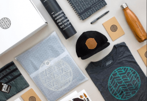
- One step beyond (for 3pm) Design one additional touchpoint for your personal brand. This can be anything at all and the purpose is to promote an emotional response to your brand. Design something that will attract attention. Don’t just slap your logo on a t-shirt.
Ideas
Animated loge, Animated gif show reel of work for website/social media. A wearable item but make it desirable. Branded merchandise (Look up Merchandise.com and awesomemerch.com). Supporting app idea or micro interaction. Desktop/phone/table/Wetransfer background.
IT must be relevant to the brand/service with customers and people in mind.
Look at
Twitter and Brand New (blog) for example. Selling a tweet (NFTs)
My outcome


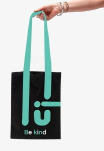
I started by mind mapping some ideas and exploring my options – I really liked the idea of a tote bag as it will not only help the environment but also give advertisement to my personal brand whilst also not being too in your face.
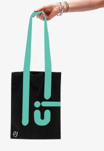
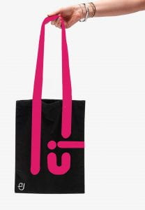
I think this could be a very cute idea as its very useful, I can never refuse a free bag for life so I think this would be a great marketing scheme for my personal brand. I would do many different colours, it doesn’t have to be the same background colour or even consistent line colour.
I would also like to make a few more with the phrase ”be kind” I think it is a strong and recognisable phrase with a lot of weight to it.
I really liked this, it’s something I would be happy to use..
I want them to be as unisex as possible – something for everyone to be able to enjoy.
I wanted to have something simple and useful; I love shopping and for me a bag for life or a tote bag is a must. I personally can not resist when one is being offered, so I decided to play on this. I used the handle to extent and also represent part of my logo to create a pattern that is interesting and a bit abstract. Ideally they would all be lovely, happy and varied colours. I added the phrase “Be kind” to my last one as it is a message that resonates with me and many other people.
I would like to experiment with notebooks, pens/pencils, Hair clips, “Thank you” cards for customers, water bottles (safe the turtles and stay hydrated), Antibacterial (To avoid Rona)
Feedback:
Great, simple idea, the logo in the bottom is not needed, take it out – other than that, its great.

Here is a link to my Pinterest moodboard
New Ideas:
- Loading screen animation of my logo
- Phone case
- Try animation for portfolio site
- Wall paper
- Thank you cards/stickers
- QR code that takes you to my portfolio website/app?
******** Try to animate your logo so the lines and dots fall and become the logo.
Animation
I decided to attempt to animate my name as a way of practicing – I used procreate to animate my name; I could not figure out how to put the animations onto my blog so I put them in a separate Miro board.
Click here to see them.
I was quite pleased with my outcome, my favourite one was the one I created of my name being typed out. I would love to use it in the future.
