Website update part 2

After learning so much about accessibility and how to design with a user centered approach I decided to make some changes not only to the layout of my website but also to the colour scheme I use not only for my branding but also for my website. Adobe colors was a great resource for researching typography contrast and colour combinations.

The colours while lovely did not have a high enough contrast so I made a few adjustments to ensure everyone who would use my website could use it to its fullest.

I then started considering these colour changes and took a look at my previous designs; it previous looked like this after working on it for a few days:

Now I realize that the pink not only clashes with my illustrations skin colour but as a way of highlighting text, it does not fully work as it is not dark enough. The contrast ratio is too low.

To make this section easier to view I removed the colour for the background; I think this made a big difference in the presentation of my illustrations, making my illustrations stand out more.

I also tried to add the social icons to link my socials but I could still not figure out how to align them to the center – so I asked Kyle.


Here are some snapshots of the changes I implemented to my website to improve it:

I removed the block colours to separate the sections and instead stuck to white – I think that overall this looks and works better.

I tried removing the background colour for my intro section of my home page and I believe that it really improved its ease for viewing.


After Kyle helped me understand my issues with my navigation bar (It was no longer sticky) I was able to fix it. I really needed the navigation bar to be sticky as I had shown my website to some older family members both here and in Venezuela to see if the general layout of my site was easy enough for them to understand and navigate. I also sent the link out to other friends on Instagram (some who only speak Spanish) to see how accessible my site was – I sent it to my Spanish speaking friends to see if even with a language barrier the set up was straight forward enough to lead them through my website.

One of the things I learnt by doing this is that less is more and that consistency is my friend. The colour changes were also preferred as it made it easier for all who viewed it (They were all of varies ages, abilities and backgrounds) yet aside from aesthetic preferences, there was a general agreement that the higher contrast was the preferred version of the website.


As part of my IXD302 class Ronan McKinless came in to give us some information on applying to placements and how to make the most out of our time in placement. I reached out and sent him a link to my portfolio and he was kind enough to offer me some feedback.

I will be taking this on board and hopefully making the changes as soon as possible.

What I learnt the most through this process is that feedback is vital. Be it by peers, friends and even better yet more experienced designers. I also learnt to consider the user throughout the process.

Portfolio

It is easy to get lost in the infinite sea of information so I decided to make this a little easier to view by listing all my research blog post links and other relevant links here to keep things nice and tidy. I will also be organizing it by week.

Here is to hoping it works out!


Project 01 brief – Portfolio

Portfolio site and content strategy. Your Instagram, LinkedIn, Slack must be active and functional and professional ASAP – they should all match, think brand recognition.

This year I will need to create a new portfolio site. The portfolio should be simple and functional. A bit part of developing my website will be focused on research and learning from other more experienced designers.


emilyussher.com


Portfolio part 1

Week 01 – research conducted between 23/09/21  to  30/09/21

Portfolio part 2

Week 02 – research conducted between 30/09/21  to  07/10/21

Portfolio part 3

Week 03 – research conducted between 07/10/21 to 14/10/21

Portfolio part 4

Week 04 – research conducted between 14/10/21 to 21/10/21

Portfolio part 5

Week 05 – research conducted between 21/10/21 to 28/10/21


Something that really stuck out to me during this process is that feedback is gold, accessibility is a must, starting on paper is necessary and that a website is never fully finished and perfect and while my current website serves my current needs (showcasing my work for employers offering placement) it will have to grow with me as I grow as a designer. I have made small but good changes since having blogged my process. My website is changing along with me.

Visual Grammar

Visual grammar are all the parts that make up a website, eg buttons, typography, illustrations, windows, etc… and just because a UI is not complex, it does not mean it is not beautiful of functional, there is beauty in simplicity.

Perfection is achieved not when there is nothing more to add but when there is nothing else to take away

A great example of this is seen in “If the moon was only 1px

Now not only is the type simplistically gorgeous, it really draws you in and the way how you scroll to go and search the rest of the website is very intuitive and engaging.

Once you start scrolling towards mercury he gives little pointers of text along the way to make sure you keep scrolling and also to alert you that this is just the illustration of the space in a funny and simple way.


Reflection

  • Simplify as much as possible – focus on the essentials
  • What can you do with constraints – think of how Instagram only allows the 1 size of images for posts and how they have stuck to it. It has been highly effective.
  • Focus on re-using elements and minimizing visual complexity. Think of how you can re-use the design of the main navigation and the footer. Think of adding a home button to cater to all audiences and convention

Language and typography

How did you write the content for your website? Is it in the 1st person? How did you speak? Is your language super friendly? Energetic? Calm? Basically, what is your tone of voice and your tone.

Ask yourself

  • Who are you? (As an individual or a business)
  • What are your values?
  • What’s your mission or purpose?
  • What do you hope to achieve? — In my case maybe add that you are looking for a year-long placement
  • How will we know if you are successful?

Think of Dropbox and how when a download is going to take a long time, they jokingly say “Grab a snickers” this is great design, it humanizes it and makes it easier to understand and maybe even alleviates a stressful situation.

“Typography is the craft of endowing human language with a durable visual form”. – Robert Bringhurst

I learned early on that I tend to find something I like – like a typeface – and stick to it instead of branching further out and continue to investigate the other options.

something I want to strive to achieve with the typeface I choose for my website is that it:

  • Optimize legibility, through the appropriate choices of typefaces
  • Improve accessibility by considering contrast between the foreground and background colours
  • Improve usability through a considered typographic hierarchy. – Think of how you structure the typography as this will guide the user on how to read the content and in what order.

Considering the visual grammar for my website

I started considering the visual grammar of the content of my portfolio site. I need to consider visual aesthetic, colour, typography, layout, …

I need to make the content work for me. Be expressive, to not be limited by my skills. Be as imaginative as I can.

While in class we were given a task that was great for getting my ideas flowing – Crazy 8s:  8 ideas in 8 minutes. Here is how I got on:


Where does content and visual grammar come from?

This week what I need to focus on is the design of my portfolio as next week we will have a critique for our portfolio – we must have 3 pages done (especially the home page and case studies).

I need to create a high resolution mock-up; which is an image/prototype of how my website will look. It should look like the real thing whilst only being an image. I will most likely use Figma for this as it is the software I am most comfortable with.

Where does content come from?

  • Client:  A client can sometimes give the designers in any form; however, it may not always be in the right format, so it is up to us then to fix or suggest changes.
  • Self-generated: eg our portfolio. Blogs, design, branding,
  • Third party sites: eg Wikipedia,
  • User Generated content: eg YouTube, it creates the content for the user. Things that people make and then share. Social media in general. We are all basically content creator now. Instagram – we don’t realize it but within one post the amount of content offered is massive! Not only does it have the initial content but also ways to interact with it eg comment, like, tag …

Content has (or should have) a purpose

What is the acceptance criteria? Eg can people find my content or in my case can people find my portfolio in my website?

The acceptance criteria/ condition for satisfaction defines the criteria that must be met to suit the requirements of the user.

The 3 C’c: Card – conversation – confirmation.

Content curation

This is the process of sorting through the vast amounts of content on the web and presenting it in a meaningful and organized way around a specific thing.

Doing this is a must as we are living in an era of oversaturation of content and having someone that can sort through that is vital. Think fake news and how negatively impactful they can be when they are not called out.

Good content should be appropriate, useful, user centered, clear, consistent, concise and supported.

It is important to get good sources of information to better inform your design decisions.

Here are some great sources of content

This is a great resource for good UX content. I have actually read a few of the articles and learnt some tricks from them.

I really struggled with coding last year so this is a good resource, although there is so much information out there on coding that I was not short of information – it was kind of overwhelming actually. So the way the website was layout made it easy to find content. Now that is good content curation!

The great thing about this magazine is that it is centered towards UX designers so the content there is very relevant information here for me – this could be something I could bring up in interviews.

This is a great example for self-generated content.

Apart from being extremely beautiful and effective it is incredibly engaging – something I must strive for my portfolio website to be.


Idea

This is something as a designer that I could do, send a newsletter each month, it doesn’t have to be ground breaking work, it can be useful content, an update on your work – this can help grow your audience. This would actually be a great idea for when I am doing placement?


User and job stories

User story is a way of pinning down what you need to do. It helps you identify the users needs to better design around their wants and needs.

An example of how this would work, would go as follows:

As a [person in a particular role]

I want to [perform an action or find something]

After conducting some more research on user stories and job stories I found that Sarah Winters explanation was the most helpful.

According to Winters user stories and job stories are ways of capturing what a user wants to do. They are often written on little cards and stuck up on the wall so that the whole team can understand the user’s perspective.

User stories can look at follows:

As a [person in a particular role] I want to [perform an action or find something out] So that [I can achieve my goal of…]

User stories are great if you have a number of different audiences who might all want to consume your content. But there’s an alternative to user stories that might be better if you only have one audience, and that’s job stories.

User stories are a great way of figuring out what the different user categories are. These should NOT be specific as they restrict creativity.

After some more research I found a very interesting article by Alan Klement on ‘Replacing The User Story With The Job Story’ – his idea is that we design problem in a Job, focusing on the triggering event or situation, the motivation and goal, and the intended outcome: When _____ , I want to _____ , so I can _____ .

Job stories always start with:

When [there’s a particular situation] I want to [perform an action or find something out] So I can [achieve my goal of…]

Here is an example:

How would you design a fracking website? Maybe talk to home-owners, community groups, geologist people that work in this industry. It could have a scientific area with raw data as it would interest a geologist

Job stories are all about context and causality.

Here is an example he provided on his website that really helped me understand how to best use these  design tools.

1 – User Story:

As a moderator, I want to create a new game by entering a name and an optional description, so that I can start inviting estimators.

2- Job Story:

When I’m ready to have estimators bid on my game, I want to create a game in a format estimators can understand, so that the estimators can find my game and know what they are about to bid on.


Task 01:

Create 2 user job stories

Remember it is not about the designer but about the user.

Eg When [ ] I want to [ ] So I can [ ]

Results:

As an employer I want to assess a student’s potential

As an organization I would like to easily find the contact details so I can show my interest in hiring them.

When I want to find out more about interaction design

Designing with Content


“Well-structured content is the backbone and starting point of all successful web designs and user interactions.” – Karen McGrane content strategist.


What is content?

Content is not restricted to words. It can be understood as a way of showing what users need. Content helps to highlight what the users needs compared to what they want.

“As someone who writes for the web I want to learn what content design is, and how to start doing it so that I can communicate in the most user-centric and efficient way for my audience” – Sarah Richards

The content designed and created should be focused on the understanding of the user. As Sarah Richards (now Winters) explained it in her book; content design is simply data and evidence that the audience needs, at the time they need it, in a way they need it.

Richards then explains the content design process; Richards breaks it down into 7 points:

  1. Research: this is were it all begins. It can be desk research, usability research, expert research but there has to be data and evidence of what the audience wants and needs.
  2. User needs: User and job stories are key as they allow us to define what the audience wants from us. Do users have a problem? what is it? Can I solve it? As Sarah Winters put it in this article “When we write content based on well researched user needs it’s automatically answering specific tasks the user has at that point in their journey. This kind of content helps them move on to the next stage and, ultimately, reach their goal.” By conducting the research we can then understand the user’s journey (the offline and online steps the user must take to complete their task). What are the motivations of the user when they reach your content? How much effort did it take for the user to reach the information they needed and how much of it did they get?
  3. Channel and journey mapping: Consider which channels are the right ones to offer the information to the user throughout their journey. These channels could be a website, social media, advertising or even events; that’s why it is important to have all these things in mind when designing content as it offers us (the designer) the language, priorities and flow to work with. Understanding when and how to offer the information to the user can mean the difference between successful or failed content design.
  4. Language and emotion: The way people communicate, especially per section or even country can vary due to colloquialism  – An example that comes to my head from personal experience is how in my home country – Venezuela – some words that we would use with friends like ‘chama’ in Spain it would not be considered appropriate. Differences in terms, need to be considered when designing content. The language used for a product MUST reflect the intended audiences vocabulary, otherwise it will make the user-content interaction extremely difficult and rocky. Whilst language is a very important part of content design, considering emotion can be just as important; Am I connecting with the audience? What is my tone? Richards follows the following set of steps: What will the audience see (and where are they seeing it)? What are they hearing and who from? Which channel? ,How they are feeling, What will our audience be doing? What decisions do they feel they have to make?
  5. Creation: This process should ideally be very collaborative in order to find the best solution for the user.
  6. Sharing: This is an essential part of any designers creative process. Peer reviews whilst scary can offer valuable insight.
  7. Iteration: Learn – Apply – Move on

In Sarah Richards’s book (content design) she highlights the importance of certain content design components such as:

  • Push content: Look at this! Buy it ! This can be described as the content the designer wants to impose unto their audience. It’s content the user did not necessarily or directly asked for but still receives, like a notification.

  • Pull content: It is the description of a product or an eye catching fact, eg good price. This is the time of content that is specifically tailored to the viewer.

  • Ease of use:  fastest way to a happy audience is an easy to understand and interact with website. Knowing your audience can inform you what you need and how you need to execute it. Users will pay more if the interaction is easier; a great example of this was illustrated during Dr Boyd’s lecture where he remarked how users would knowingly pay more for the UK driving test by using other providers over the official government website as it was a very difficult website to navigate. They will especially remember a bad experience.
  • Trust: A trustworthy website will not only promote consumer trust but also loyalty. How does the website present itself? does it look like it could be a scam? Is it littered with spelling errors? if so this will most certainly not instill a sense of ease with the user. Ideally the website should be consistent throughout with its tone of voice, branding and identity.

Here is a marketing article I found written by Céillie Clark-Keane (Head of Marketing for Building Ventures) which I found very helpful. In this article the author highlights the importance of the next 7 marketing strategies:

  1. Building content communities: Building communities specifically around content sharing and creation allows marketing teams to continue to expand their reach, even with fewer resources.The image above illustrates how Slack communities have grown 2.5 times since 2016 and have over a million members. This highlights how communities like these offer benefits beyond networking. Tools like Slack, Twitter, LinkedIn allow you to tap into massive audiences by utilising a modern version of digital ‘word-of-mouth’ marketing, along with increasing brand awareness. As stated by  Masooma Memon (a SaaS content marketer) “Whether it’s content for social, your blog, or a webinar, it’s going to continue focusing on making your audience feel like a community,” she says. “Folks love this sense of community belonging. It makes them feel valued, so this trend should continue picking up pace.” which in turn will positively affect audience engagement.
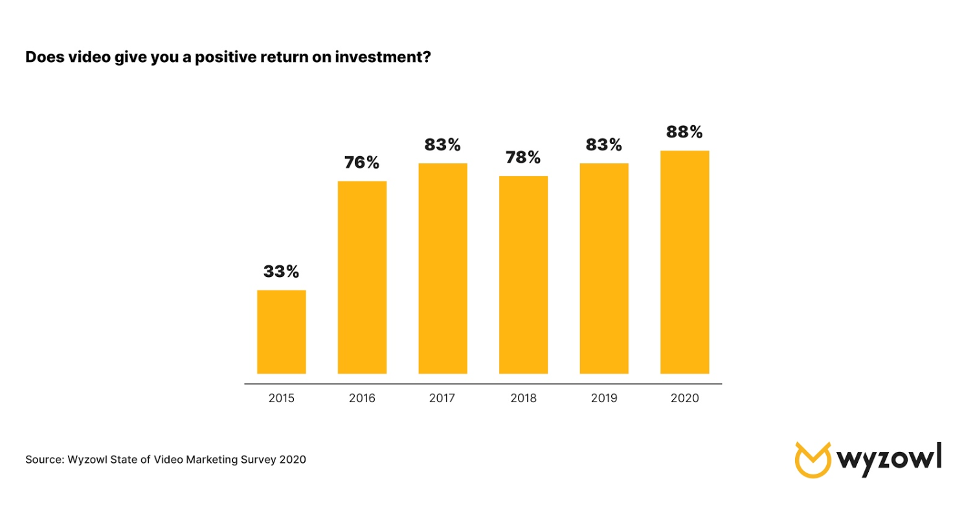
  2. Going live with video and webinars: Covid-19 has resulted in video and webinar content becoming vital, something that will not soon go away. “My guess is video marketing including the boom in live video will continue to grow in 2021,” Masooma predicts. But it’s not only because of in-person restrictions; there’s a reason why live video was trending well before the pandemic. “The reason? Video is a quick and effective medium to communicate your message and educate your audience. Consumers want to quickly get information and video marketing is the most effective way of doing this.”
  3. Improving content experience: sometimes how you’re interacting with content is just as important as what content you’re interacting with.  Content marketing trends are now focused on content experience, be it, interactive content or better UX.
  4. Focusing on products and services
  5. Repurposing content

(I did not go into detail in the last two as they are self explanatory).


What is content wireframing?

  • A content inventory (audit) is a great way of looking at the content or even the layout of other more skilled designers and see if you can apply or take as inspiration to produce your own ideas. Bellow is the example Kyle gave us.

I found a great article showcasing how to conduct a great content audit – The Step-by-Step Guide to Conducting a Content Audit in 2021.

  • Site-mapping your site is a great way to create a layout for your website on paper before actually bringing it to life.

Here is the example Kyle gave us:

And here is my version – It is still very rough, I will need to continue revising this and improving it.

  • Content wireframing can be considered as the skeleton of the website. Think of the outline of a building and how everything is placed around (the blueprints). Once this is established then you can start making a more detailed wireframe. Design small first then big but only in reference to designing for mobile and then onto desktop view. This should not be as detailed as an actual digital wireframe. These are to be done in great quantities and quickly; they are just a way of quickly noting down your thoughts and ideas.

Think (scale wise) mobile then Tablet then Desktop and then Desktop HD. This is the best way to accurately figure out where the content should go.


Learning from others

Bellow are some great designers with great portfolios I would like to further research.

  • Jack Mcdade
  • John hicks design
  • Xavious Cusso
  • Vandana Pai: Her use of typography is awesome. It takes a real skill to reduce a site down.

Reflection

This week was very informative, in all honesty I had no idea how much work I had yet to do. It however encouraged me to start my research and to develop not only my website, portfolio and CV but also my personal brand.

I also discovered the importance of content designing and how the users should always be the centre of my focus when designing. The user is key and I should aim to design with them in mind.


Tasks for 30/09/21

  • Write the content for your portfolio – in plain text or in html. Focus on the content. Using your inventory and content wireframes
  • Research and discovery – google trends/job specs/look at language. Look at some portfolios, really study it at a granular level
  • Content audit
  • Sitemap your site
  • Write site content – 3 case studies, home page, about page, contact page
  • Sign up for Webflow.