In 3 weeks (week 7) we will have a group critique ***
Recap
Bio, word associated with our values and tone of voice. We created unique marks based on our initials and investigated appropriate typefaces that encompass our character and personality. What am I doing and why am I doing it? To get an understanding of the foundations of branding so that we can create authentic branding for ourselves and for potential/future clients, to solidify our ideas and develop our skills. To be unique and stand out in industry. We are trying to make ourselves look desirable/employable.
In my course alone there are 22 people, they are competition in the industry, that is why standing out is so important. I will be in competition with many people, I NEED to stand out. Who I want to work with will find me through my brand. MY brand will also dictate how people will perceive me.
Kinds of identification: uniqueness, value, holding power, description, association, tone of voice, graphic excellence (quality) reputation, discretion, repetition (& recognition). Which ones will my brand be focused on?
The power of identification and recognition – think of McDonald, Apple, Nike, Twitter, PlayStation, even if you don’t see the full logo in its original colour it is still easily identifiable.
Design program
When a trademark is used to identify an organisation it works together with other graphic elements in a design programme, each part of the plan for a visual identity. Through this a company can inform how it is (its values) how it wants to be seen (it’s image). A large part of it is informing people/the customer.
Includes basic elements like:
- Name mark: company’s name written in a special way (typography)
- Symbol: A picture mark or decorative abbreviation.
- Colours: Selected colour(s)
- Type: Selected typeface(s)
- Fifth element: An extra, decorative element. ( example 1 monogram used to create an icon set; this gives an expansive tone of voice)
Note —> you would never use a name mark and a symbol, it is one or another not both.
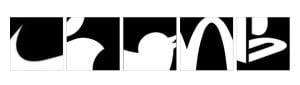
Pictorial & abstract
Pictorial marks are non-abstract and iconic in nature. They depict a stylised version of something – anything’really: a fruit ( like the Apple logo), a mythical beoing ( like the Starbucks logo), an animal
This kind of logo may be preferable when your brand is a bit abstract or open to interpretation. Pictorial marlks can also be really efective is your brand lends itself to a specific image: Apple and Jaguar are good examples
Abstract marks arre abstract, they usualky consist of very simple geomatric shapes
They lend themselves to brands thata are more descriptive because their logog just needs to be recognisable by repetition
Combination marks
A wordmark combines with either a letter mark or a symbol. They are versatile and can use the symbol or the wordmark in isolation as well.


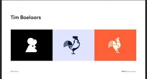
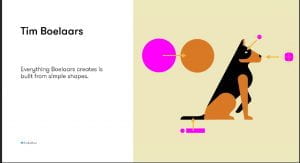
- Tim Boelaars – forms and shapes are key for his designs
- Jeroen van Eerden
- Fabio Basile
- Vic Bell
- Ivan Bobrov
- Airside
- Jason Santa Maria
Process
Thinking by drawing – drawing loads and loads of ideas. Thinking it through as you draw. How can I represent it pictorially. You should put EVERYTHING down, it is an important part of the design process; put down your mistakes, realistically your idea stage should be 95% mistakes.
Pictorial Superiority effect
Humans process visual info 60,000 x faster than words
Sketch noting
The 5 basic elements: circle, square
Always keep a sketchbook with you; a good sketchbook will have a mixture of words and drawings.
Containers, Shadow & highlights, line and dividers, shapes, compound shapes, objects and icons, type styles, layout and structure (3points x 3 bullets).
Mind Maps: Helps put it all together.
Think outside the box
—-
Task
- Doodling talk by Sunni Brown – watch and analyse
- Book – Ed Emberley ( Make a world)
- Penguin drawing task on slides
- Make a mind map with words about yourself and use that as a guide for your word mark. Select the ones that are important. Find the important word and sketch out what you think it is.
- Sketch the following objects using the techniques talked about today _ iPad, Laptop, Camera, Sketchbook, Pencil, Browser, USB stick, Paper, Tv and Radio. ON PAPER.
- Pick 5 key words from your week 1 word association mind maps/bio (these could be your values) and explore a range of ways to represent them visually.
- Research visual marques – design a symbolic
- Look up brand new blog
Next week – Brand guidelines and colour.
Tutorial:
look up venezuelan type foundries
quirky – duality of 2 words organisation but whimsical nature. visually have loads of variety. ditot thick and thin lines.
type foundries that have quirky aspects. Fonts myths look up
variable fonts – more technical, google pioneered them.