What is a type specimen?
After doing some research I found out that in typography, type specimen refers to a any presentation of a certain typeface to showcase its design and/or use.
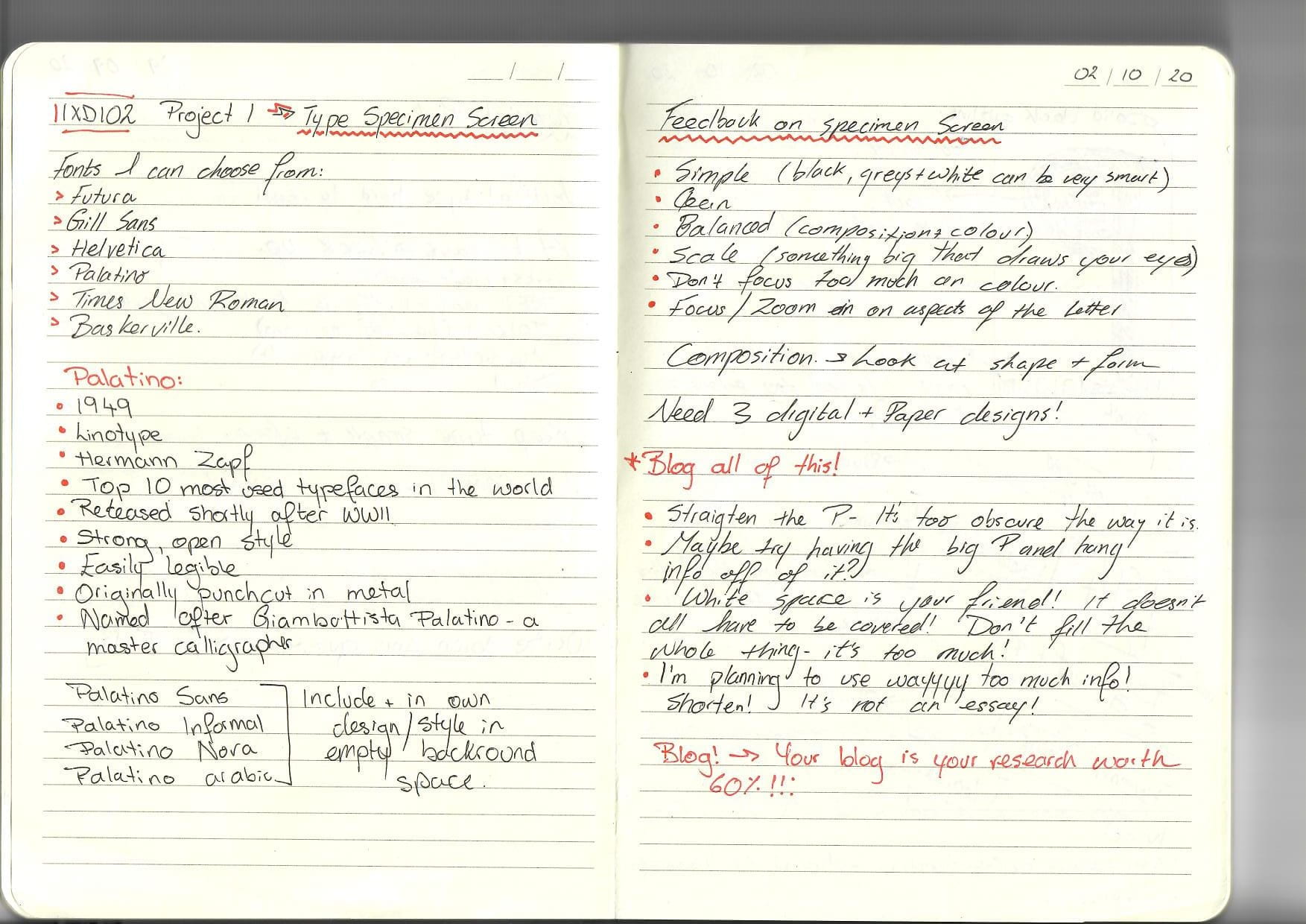
For this project I will have to design a type specimen screen for an iPad based on one of the following fonts:
- Futura
- Gill sans
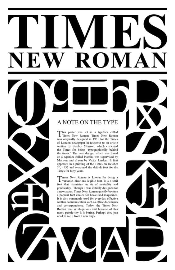
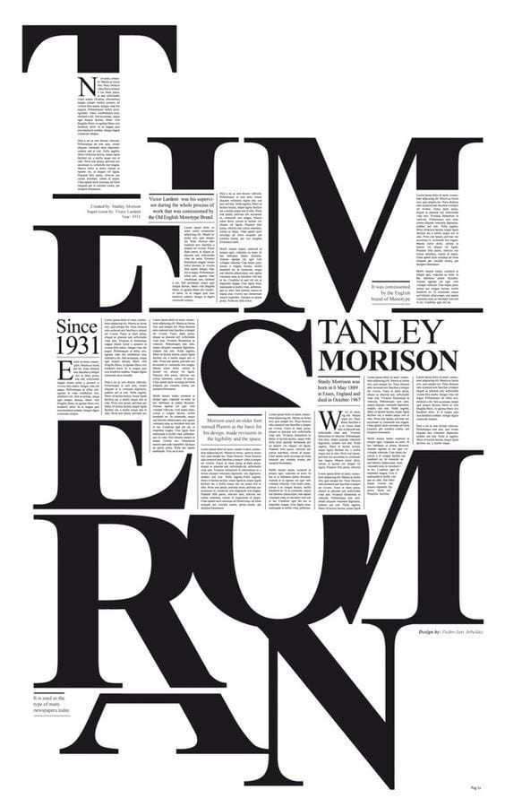
- Helvetica
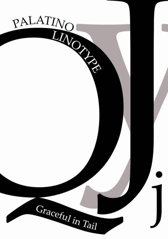
- Palatino
- Times New Roman
- Baskerville
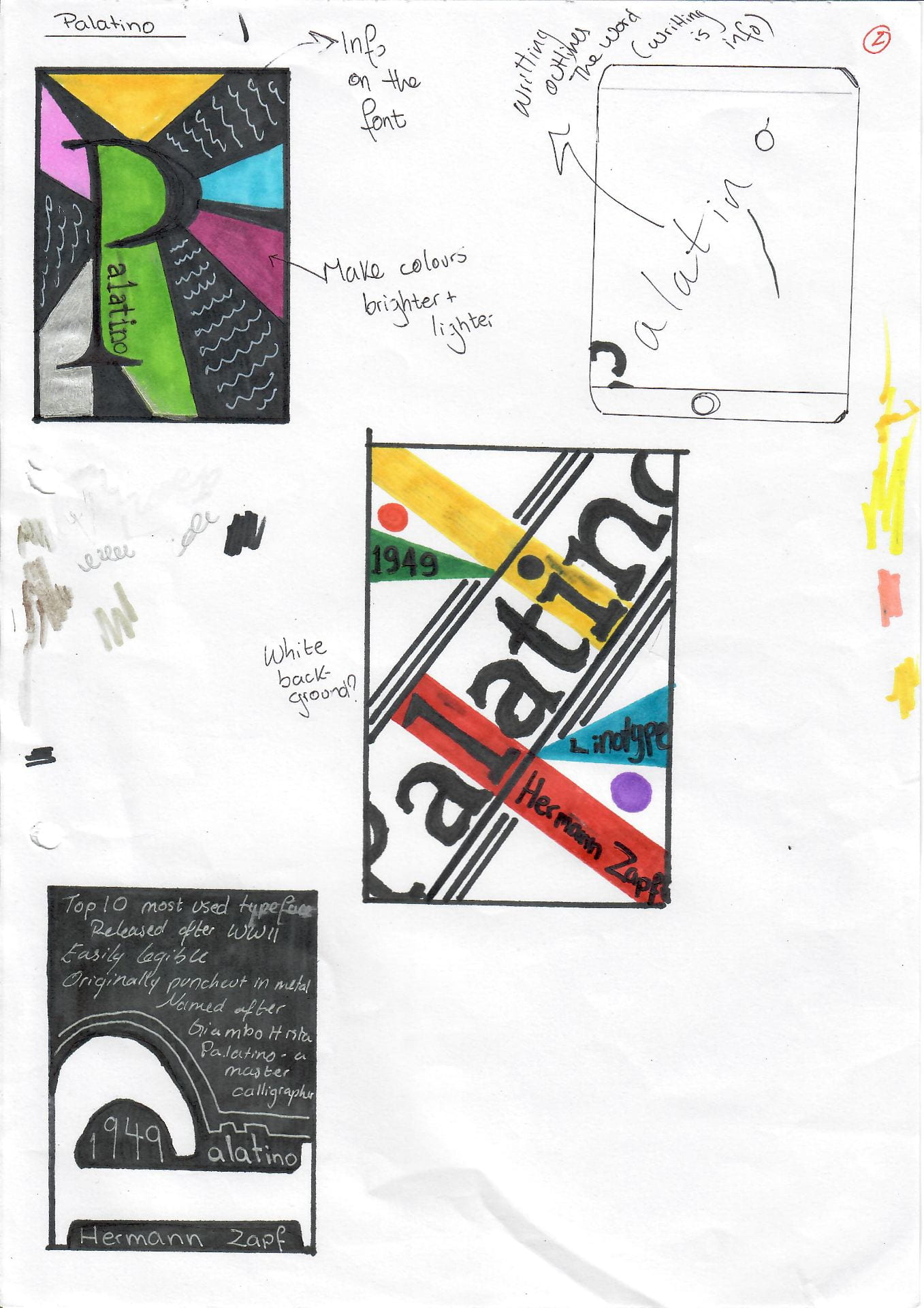
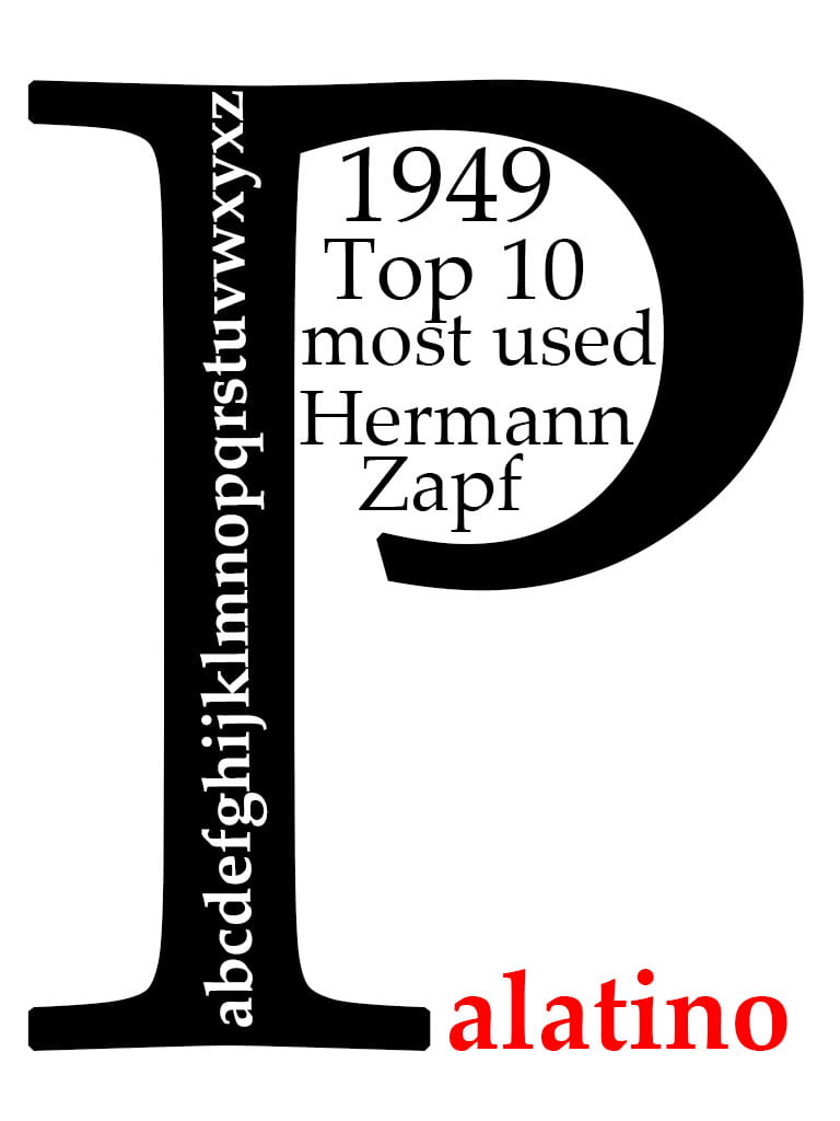
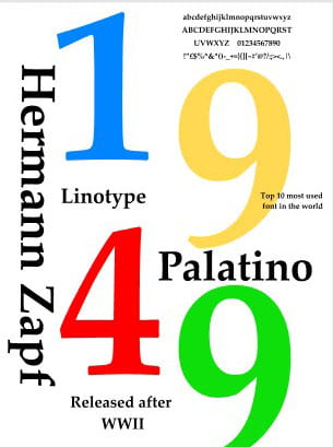
I have chosen to go with Palatino – I like the simplicity of the font and how easily legible it is.
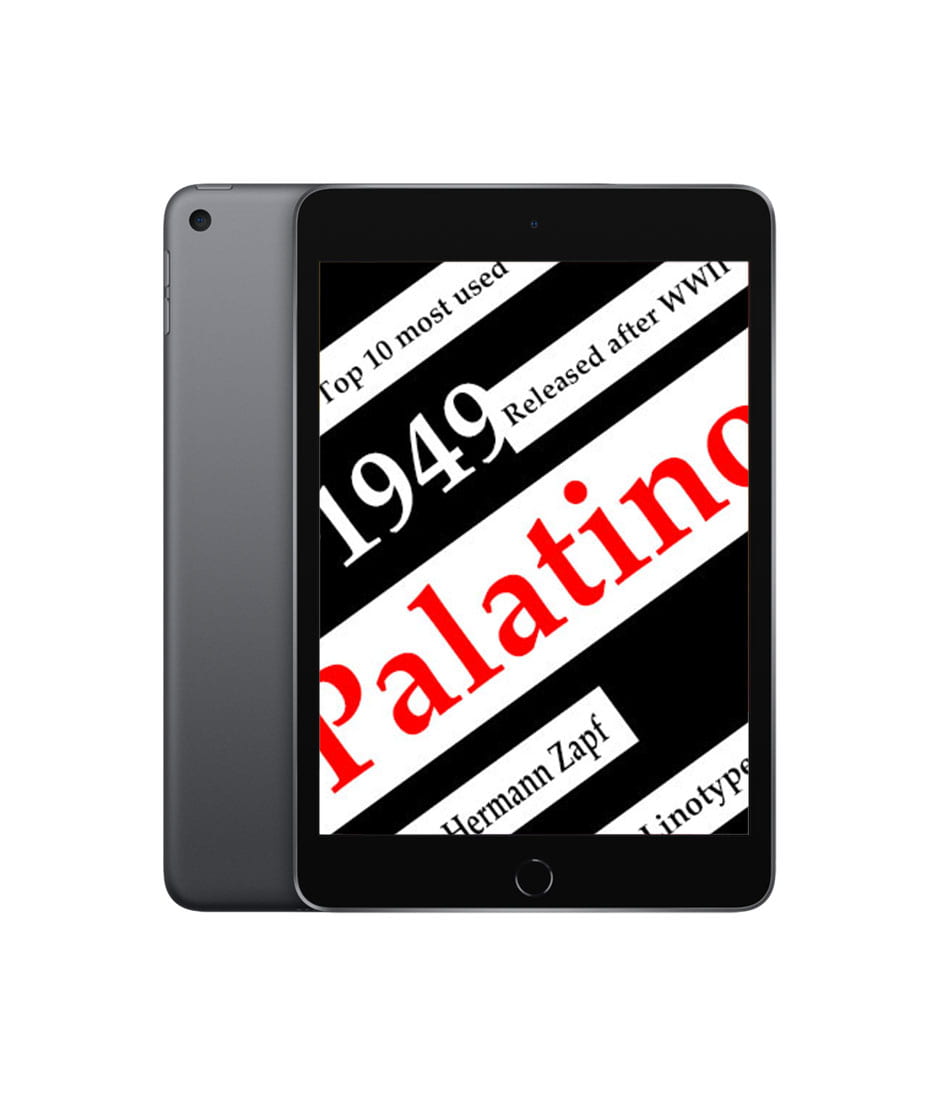
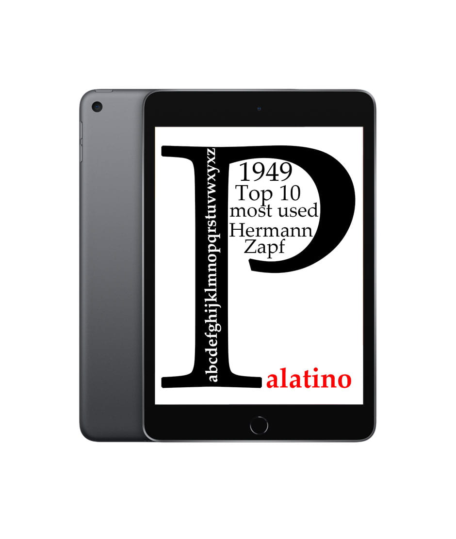
After doing some research on my chosen type face I decided to keep it simple and clean – this typeface was designed and released shortly after the war ended, I would like to integrate some colour in my design as a way of symbolising freedom and the end of darker times.
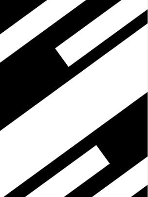
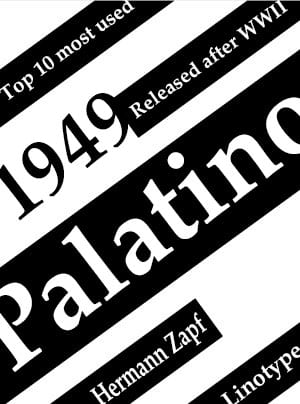
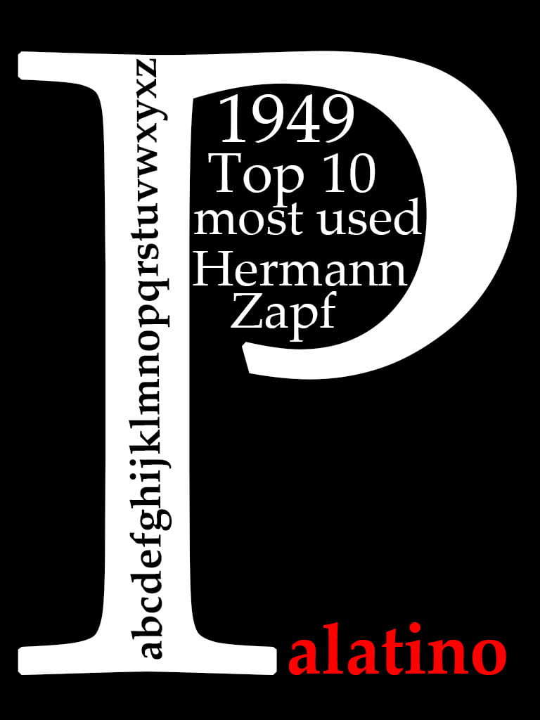
Key information on the Palatino typeface:
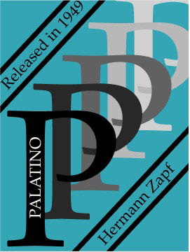
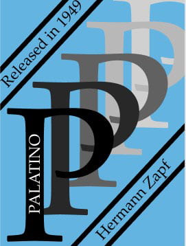
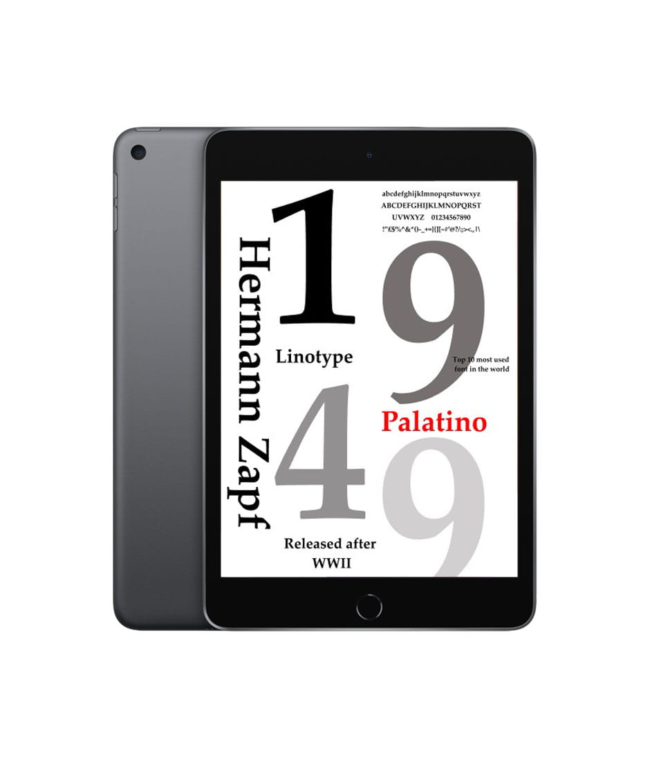
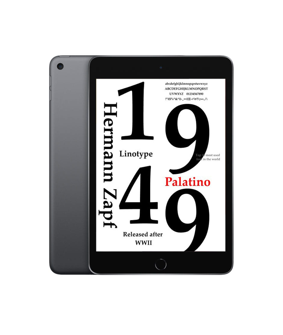
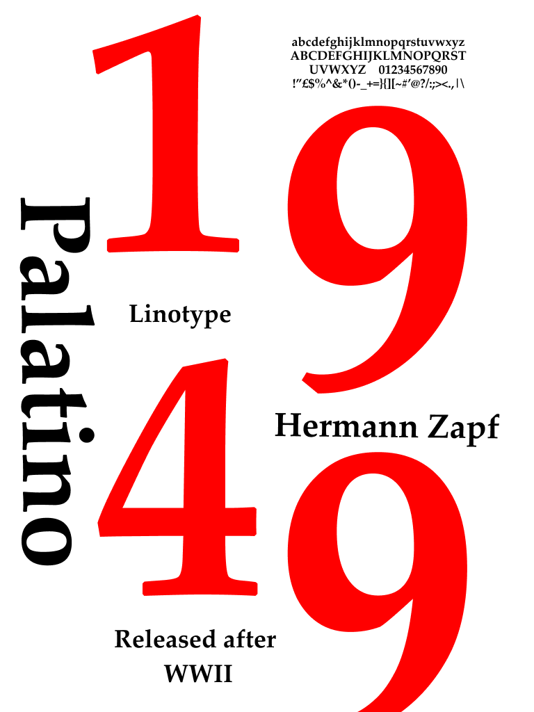
- Was released in 1949 – shortly after WWII
- Initially designed as a linotype
- Created by Hermann Zapf
- It’s the top 10 most used typeface in the world
- Has a strong, open style
- It is easily legible
- Originally punch cut in metal
- Named after Giambattista Palatino – a master calligrapher
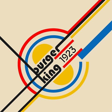
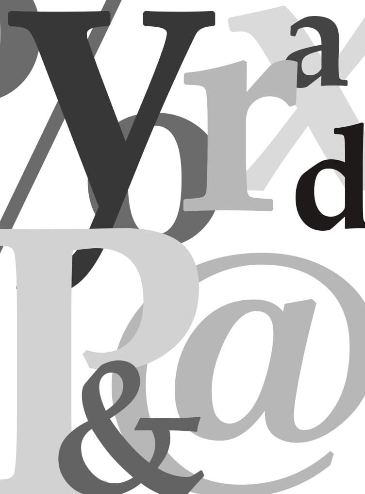
Inspiration:


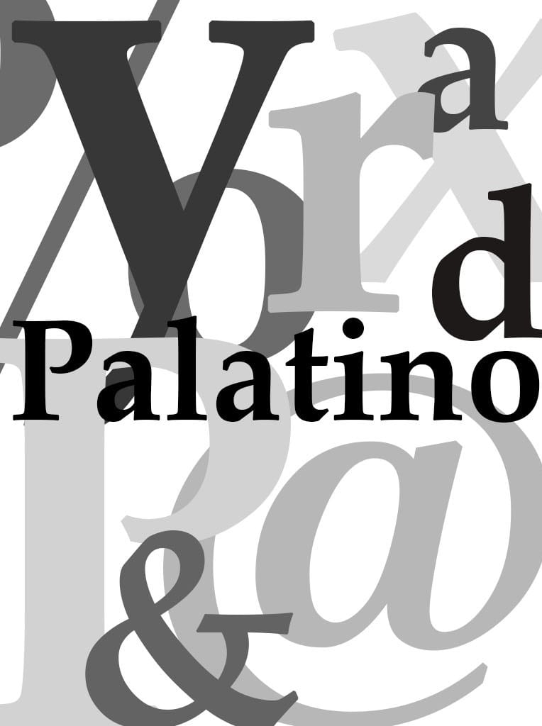
Sketches and notes in preparation:


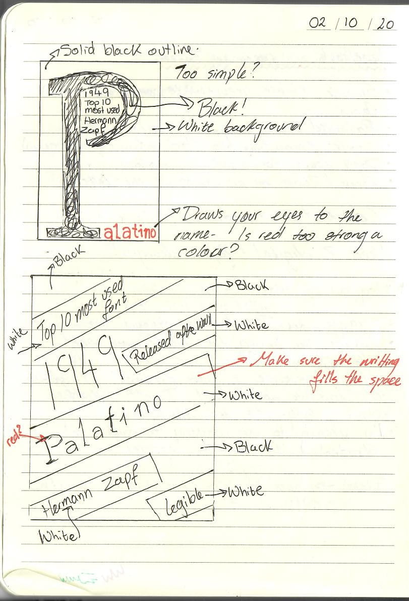
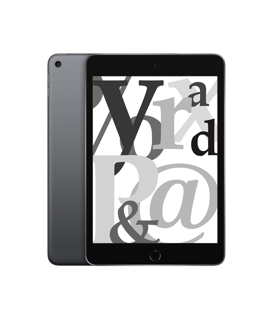
Initial digital designs:


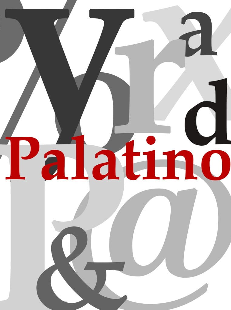

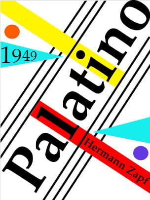


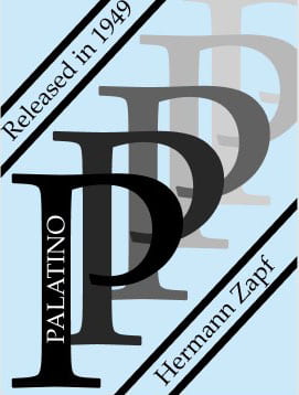


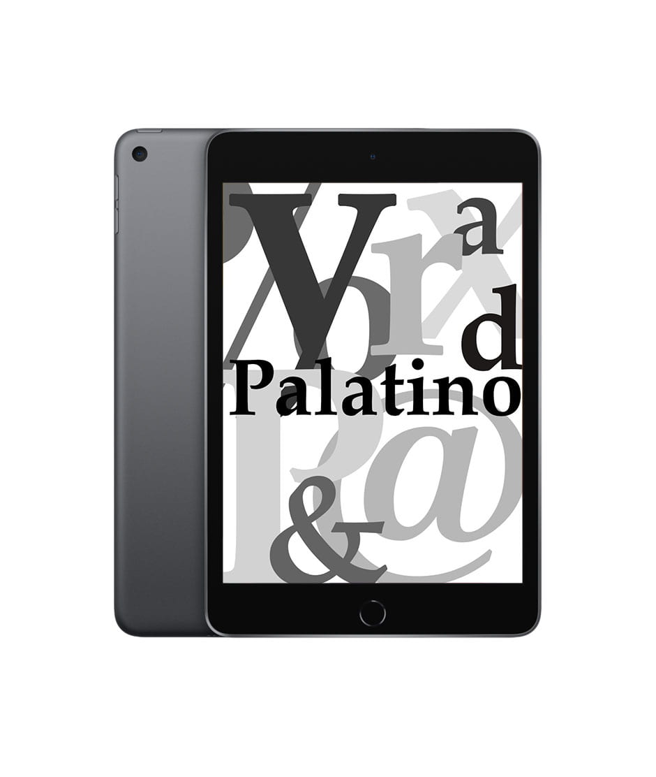
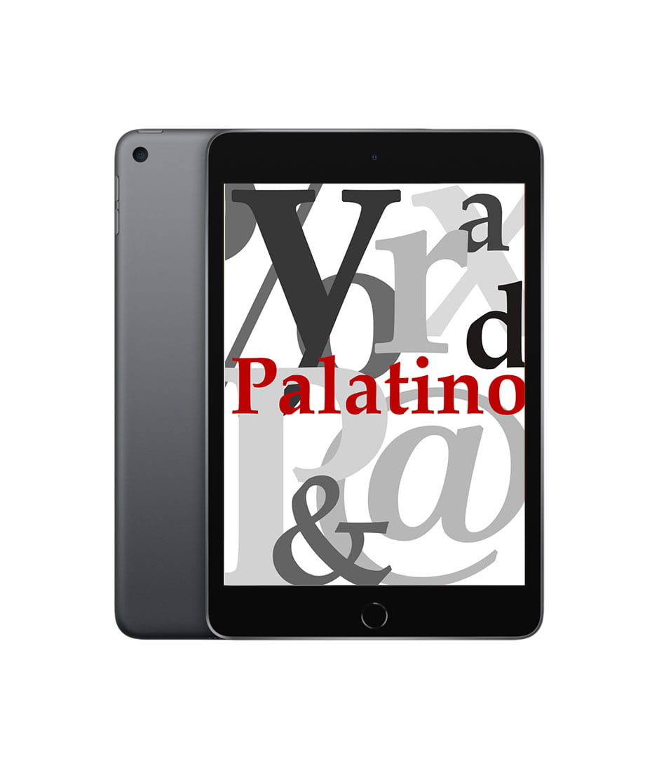
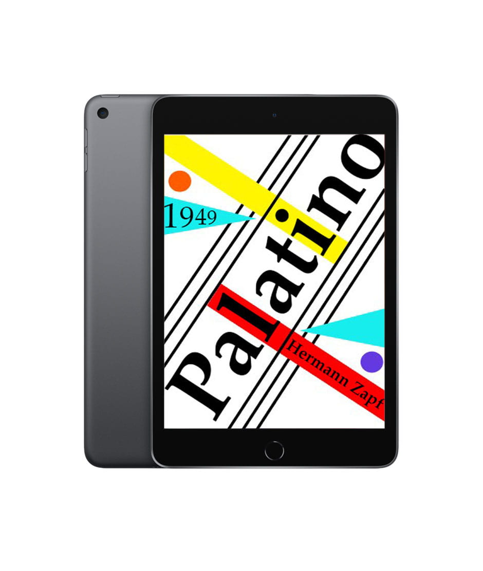

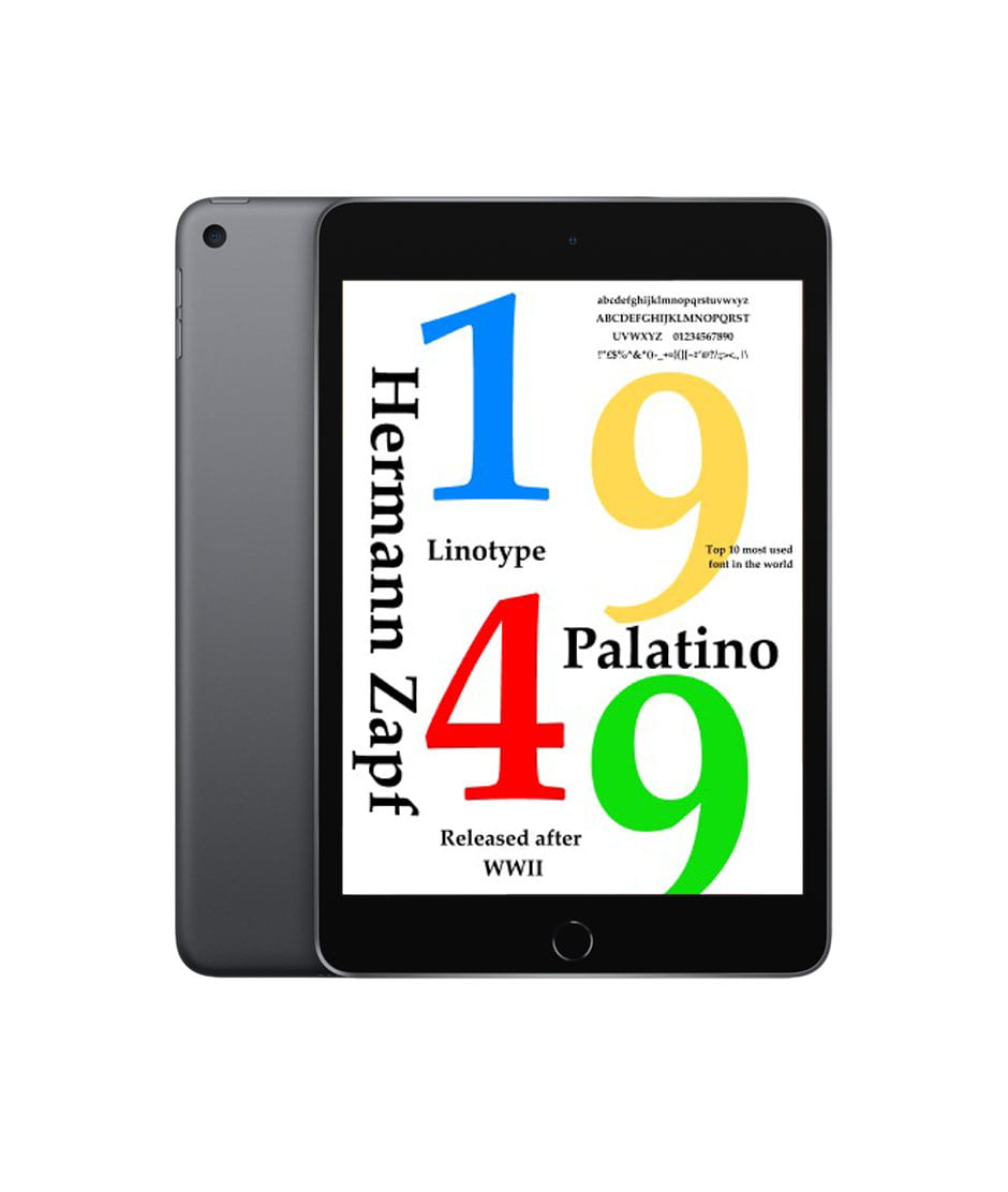


I think that the type specimen screen with the colourful shapes is the best one to represent the boldness of the typeface Palatino.
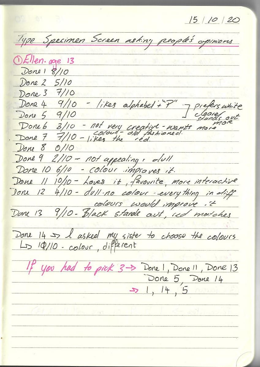
As shown in the pictures of my notes, I interviewed 4 people and I found that a younger viewer prefers the more colourful designs, I added up their votes and the 3 most popular designs were the following:
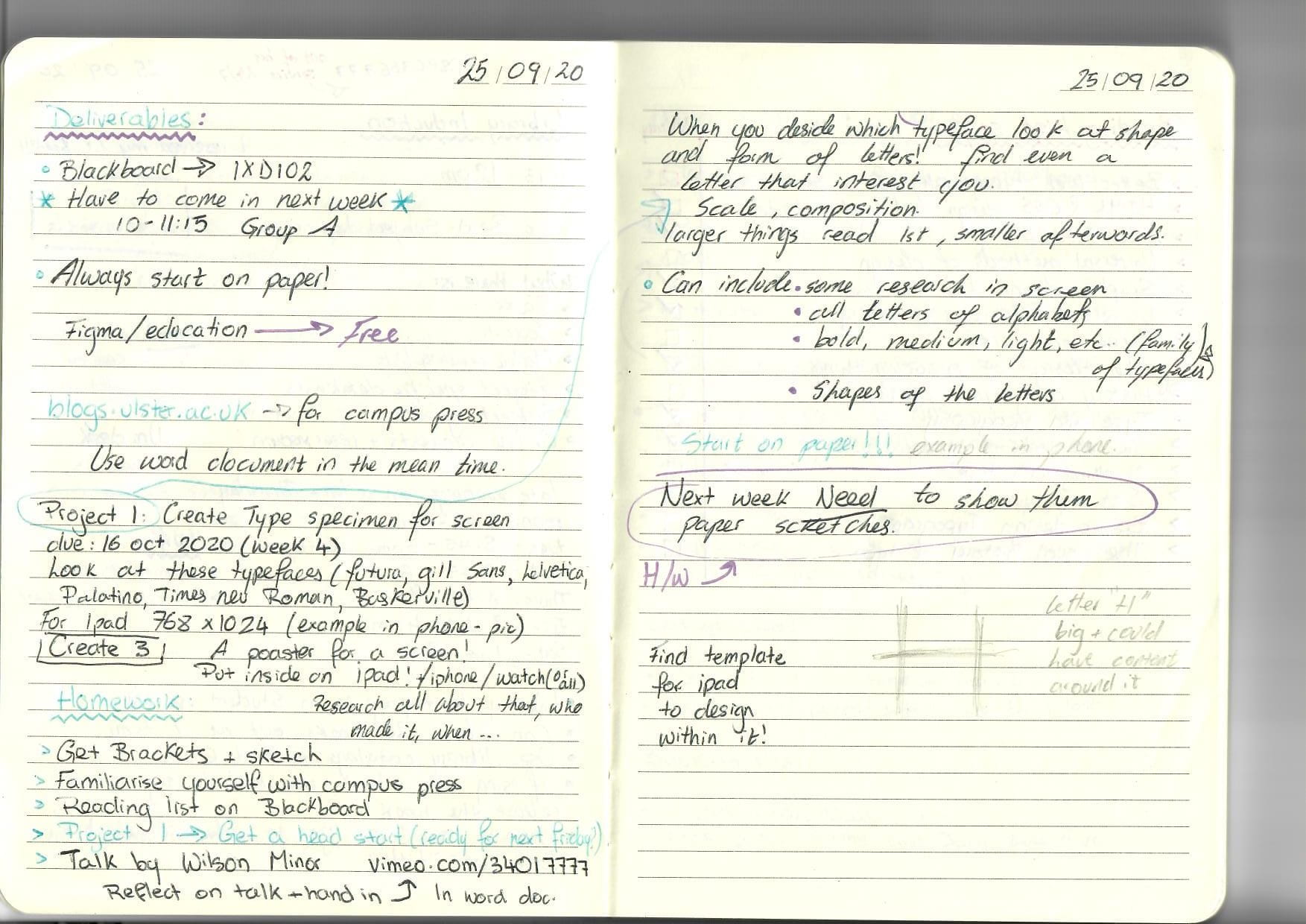
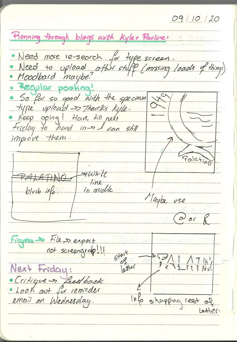
Critique – 16/10/20
After presenting my work to both Kyle and Pauline, they gave me a few pointers on how to improve my designs.
 This is a scan of my notes from that day.
My favorite design by far was the colorful one with shapes but as my tutors correctly pointed out, that that design focused more on design, and shapes and being appealing rather than the typography – which was the whole point of the project – focusing on the typeface. The design was competing against the typeface.
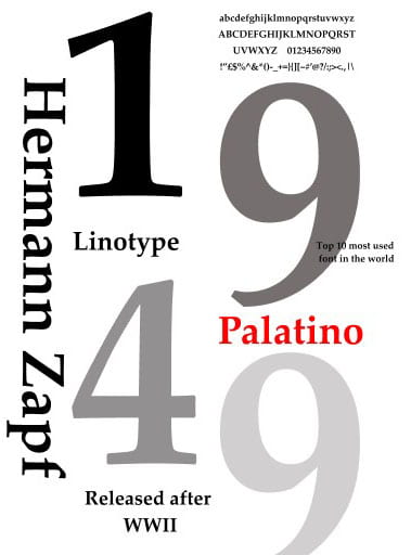
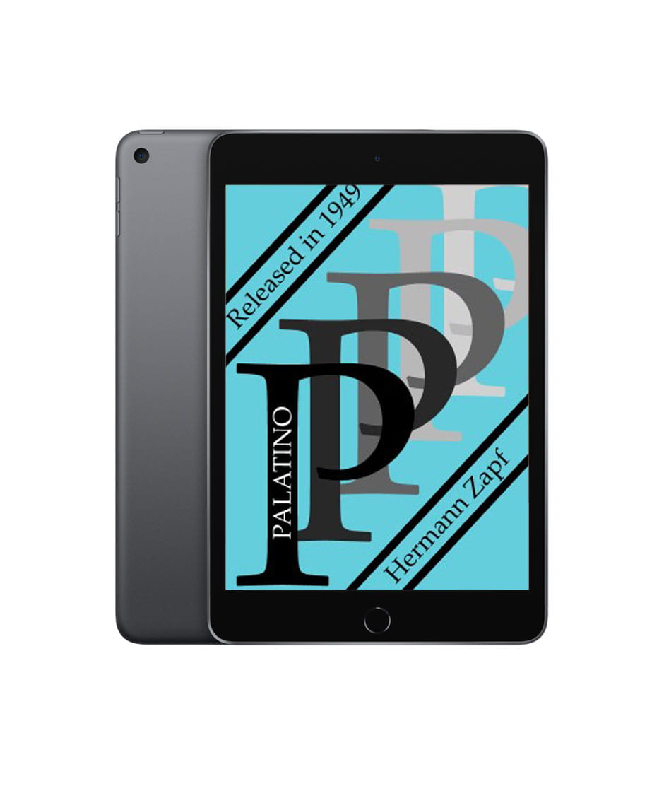
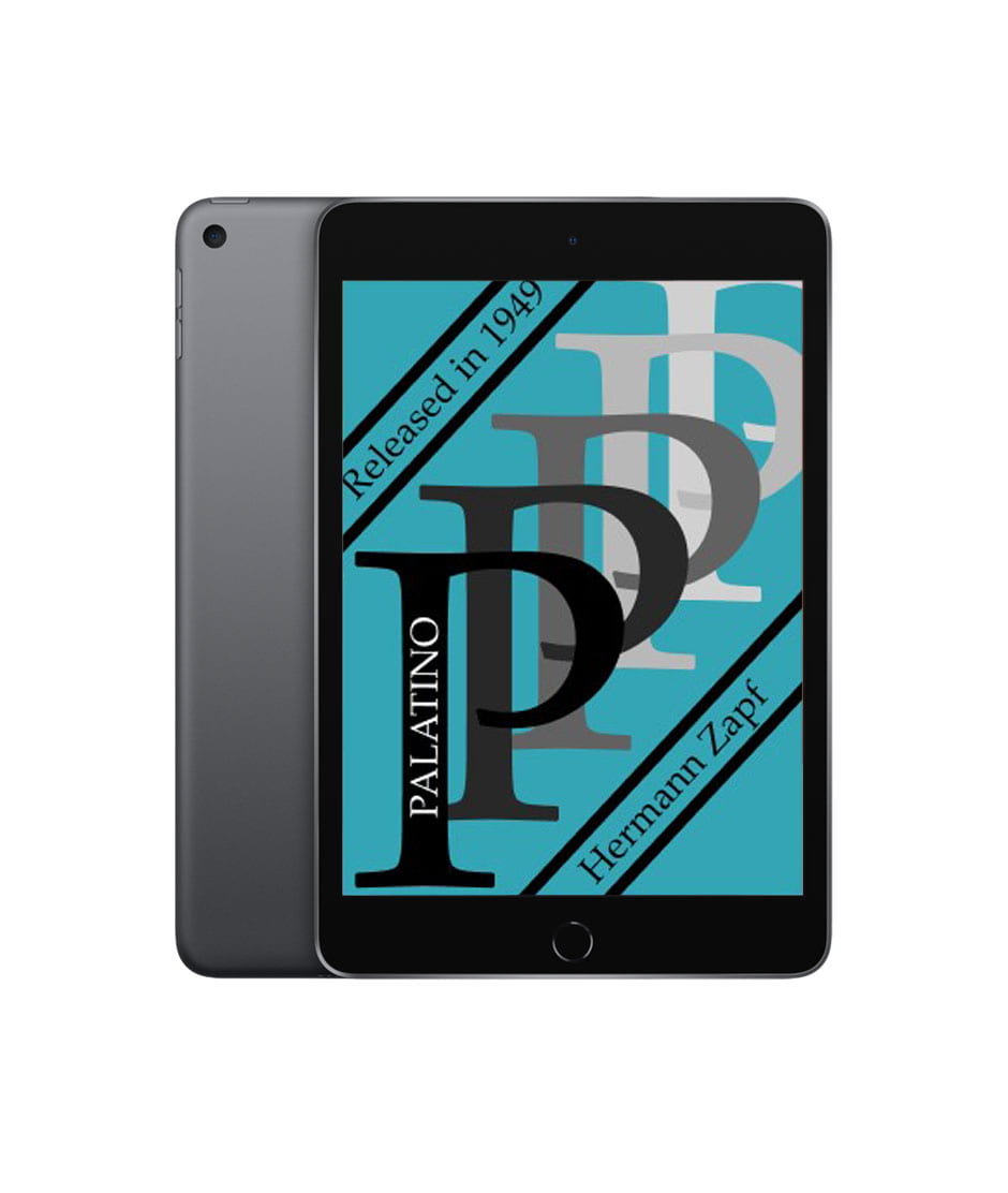
I decided to focus on the one with the big bold letters as I got positive reactions to it from my tutors and they suggested that less is more, I’m not normally comfortable with that so I am picking that one to challenge myself.
I applied some more of the changes suggested by my tutors using figma and this is the result:
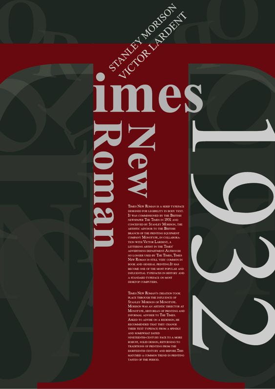
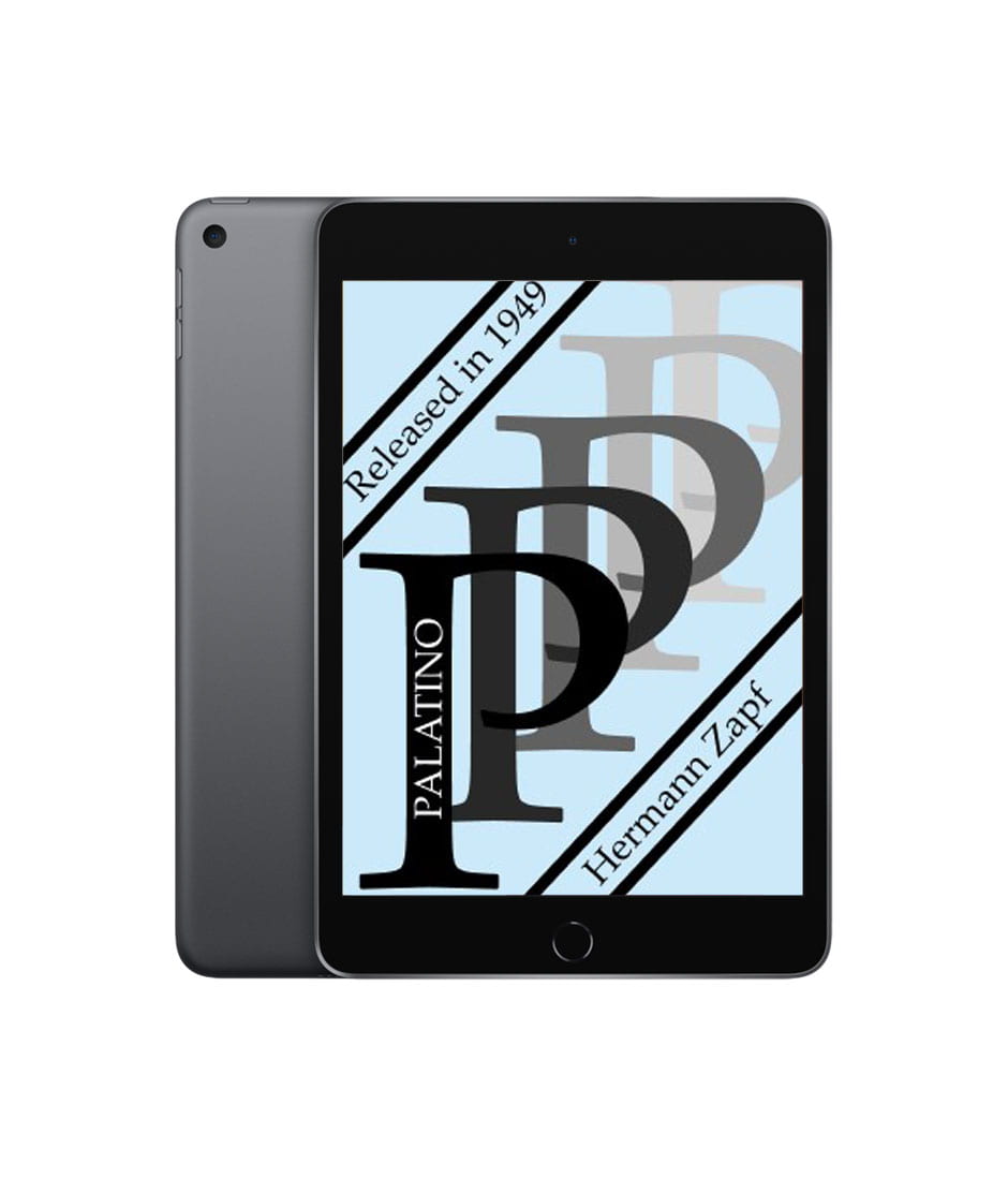
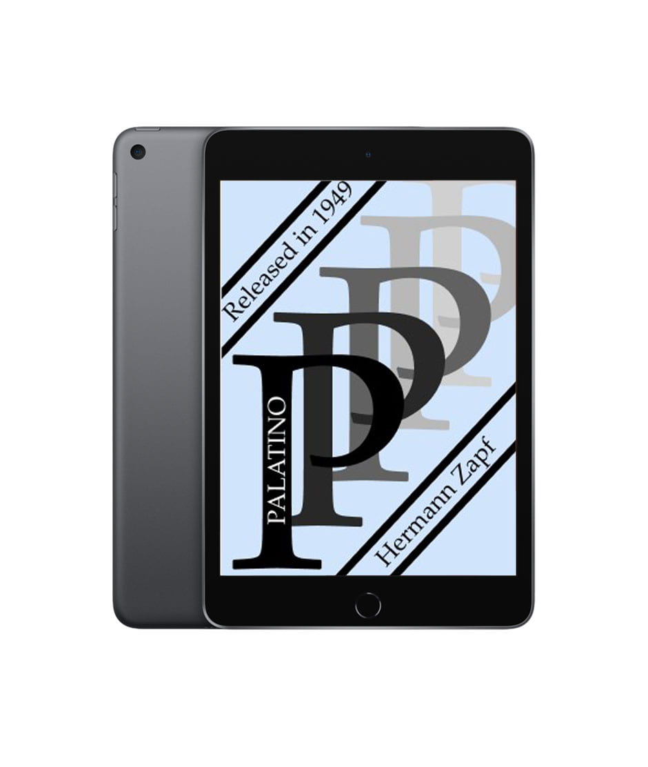
 This is the final outcome and I think it is very eye catching. I tried to keep it as simple and uncomplicated as possible. I reduced it to the minimal and only left behind the essentials.