Manifestos, Mottos and Mantras
To me a manifesto is a declaration of intent not only to the world but also to yourself, it presents values which a person stands for or is inspired by – or as Paul put it ” a battle cry to inspire you when things get tough”. A mantra would be more like a slogan or statement repeated with the purpose of uplifting oneself. Mottos would also be a form or motivation much like the mantra and the manifesto. A creative method for artists to express their intentions – a way to artistically articulate something that is meaningful to you.
I am not a fan of the ‘typical’ uplifting quotes as I find them kind of empty of real meaning. I want my manifesto to mean something and to do that I think it has to be personal – maybe like an inside joke or private story? Whilst I understand that a wider audience than just me will view it, I think that the message my manifesto will convey should be directed at me to keep me going; it needs to be MY battle cry.
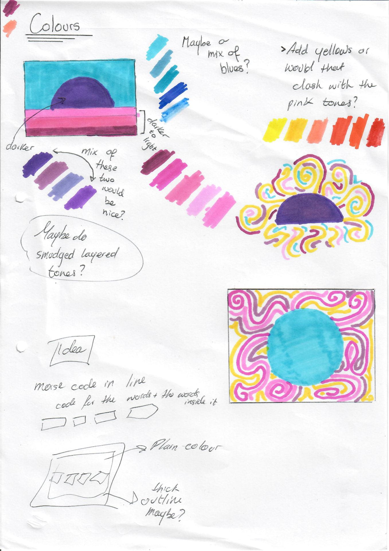
I want to not only consider the words I use but also the design and colorus I utilize as, for example, a background or design with a mainly pink colour scheme will feel more personal to me than a green color scheme would as this colour does not resonate with me as strongly.
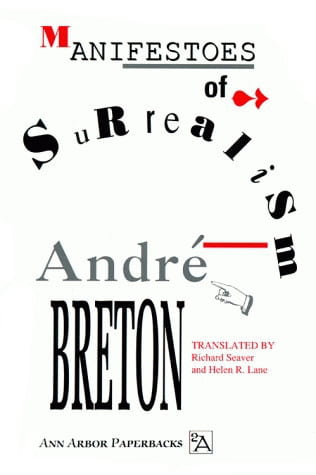
Breton, a surrealist manifesto
 Surrealism, as Andre Breton explains is the combining or merging of reality with dreams, in art and all aspects of life imagination is to be a person’s greatest quality.
  As Breton argued, there is no point in creating ordinary and boring art that reflects reality as perhaps doing this only pushes away the subconscious and the creativity in us. Breton stated that “realistic attitude” is the same to being “hostile to any intellectual or moral advancement.” I guess that he was trying to argue that if we only accept was is directly in front of us and look no further a different and perhaps better way of thinking, analyzing and imagining things can never be achieved as the rose-tinted glasses, or in this case the ‘wacky’ glasses have not been put on. Breton’s manifestos lay out the politics of the surrealist movement – he clearly conveyed his message, I would like my manifesto to do the same.
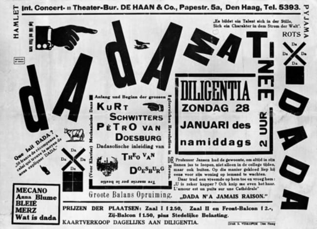
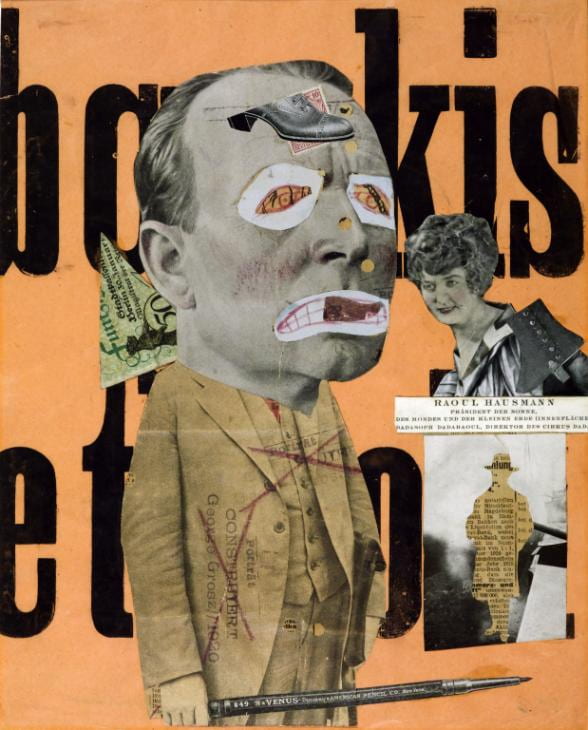
The Dada Manifesto
 Dada Manifesto is not a singular writing, it was a movement. the best-known pieces for this movement were created by Hugo Ball and Tristan Tzara. Ball wrote his piece in 1916, while Tzara’s wrote his in 1918.
The Dada movement originated during WW1 when young creatives living in neutral Switzerland decided to take their aim at the issues that led to the war, such as nationalism. They became known as Dadaists. They were searching for a way to disengage from the cruel reality of the times.
Dada was influenced by Cubism, Expressionism, Futurism, and Constructivism. This movement – the same as many other movements- had the urge or the aim to change the world for the better. They craved freedom. The anti-intellectualism of the time heavily influenced Ball and Tzara.
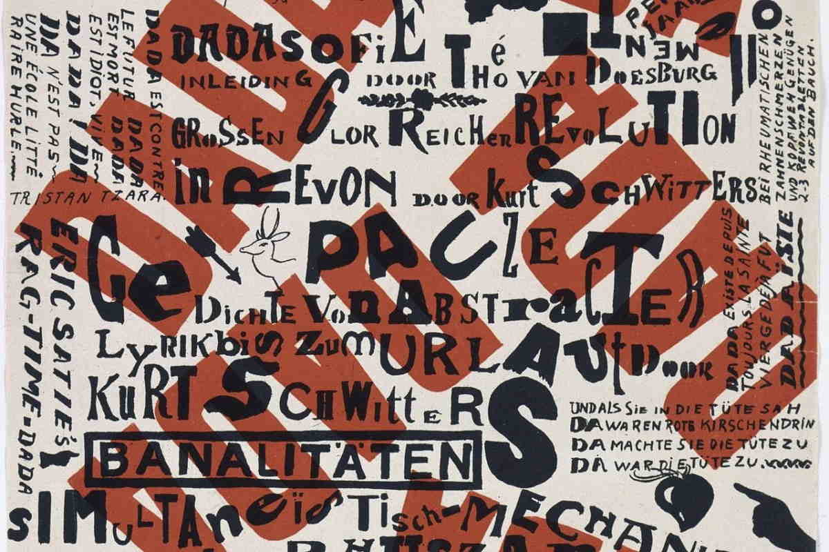
“Dada world war without end, dada revolution without beginning, dada, you friends and also-poets, esteemed sirs, manufacturers, and evangelists. Dada Tzara, dada Huelsenbeck, dada m’dada, dada m’dada dada mhm, dada dere dada, dada Hue, dada Tza.” – Hugo Ball, Dada Manifest.
“Freedom: DADA DADA DADA, a roaring of tense colors, and interlacing of opposites and of all contradictions, grotesques, inconsistencies: LIFE.” – Tristan Tzara, Dada Manifesto.
To Ball Dada perhaps meant goodbye but to Tzara Dada was meaningless, perhaps because he viewed art as also devoid of meaning. What comes to mind after researching this is that a manifesto can mean different things to different people – the way it is perceived and under which mindset will heavily influence its meaning to the viewer, even if the resulting meaning was not the one the artist intended to communicate.


What I would like my Mantra to be/do
- challenge and provoke
- Advertise me as a designer
- Not be too long – short and sweet seems better to me
- Theatrical – I want it to make a statement, to not be obvious
- Motivate me
Famous quotes by artists that inspire me
- “Every artist was first an amateur” – Ralph Waldo Emerson
- “Creativity takes courage” – Henri Matisse
- “Every child is an artist. The problem is how to remain an artist once we grow up.” – Pablo Picasso
- “Art enables us to find ourselves and lose ourselves at the same time.” – Thomas Merton
- “We don’t make mistakes, just happy little accidents” – Bob Ross
- “The “principles of true art is not to portray, but to evoke” – Jerzy Kosinski
- “As my artist’s statement explains, my work is utterly incomprehensible and is therefore full of deep significance” – Calvin and Hobbes
- “Creativity is contagious, pass it on” – Albert Einstein

- “Have no fear of perfection, you’ll never reach it” – Salvador Dali
- “You can’t wait for inspiration, you have to go after it with a club” – Jack London
- “Creativity is a drug I cannot live without” – Cecil B. DeMille
- “You see things; and you say, ‘Why?’ But I dream things that never were; and I say, ‘Why not’?” – George Bernard Shaw
- “Reality continues to ruin my life.” ― Bill Watterson
- “I’m killing time while I wait for life to shower me with meaning and happiness.” ― Bill Watterson
- “You can’t just turn on creativity like a faucet. You have to be in the right mood. What mood is that? Last-minute panic.” ― Bill Watterson
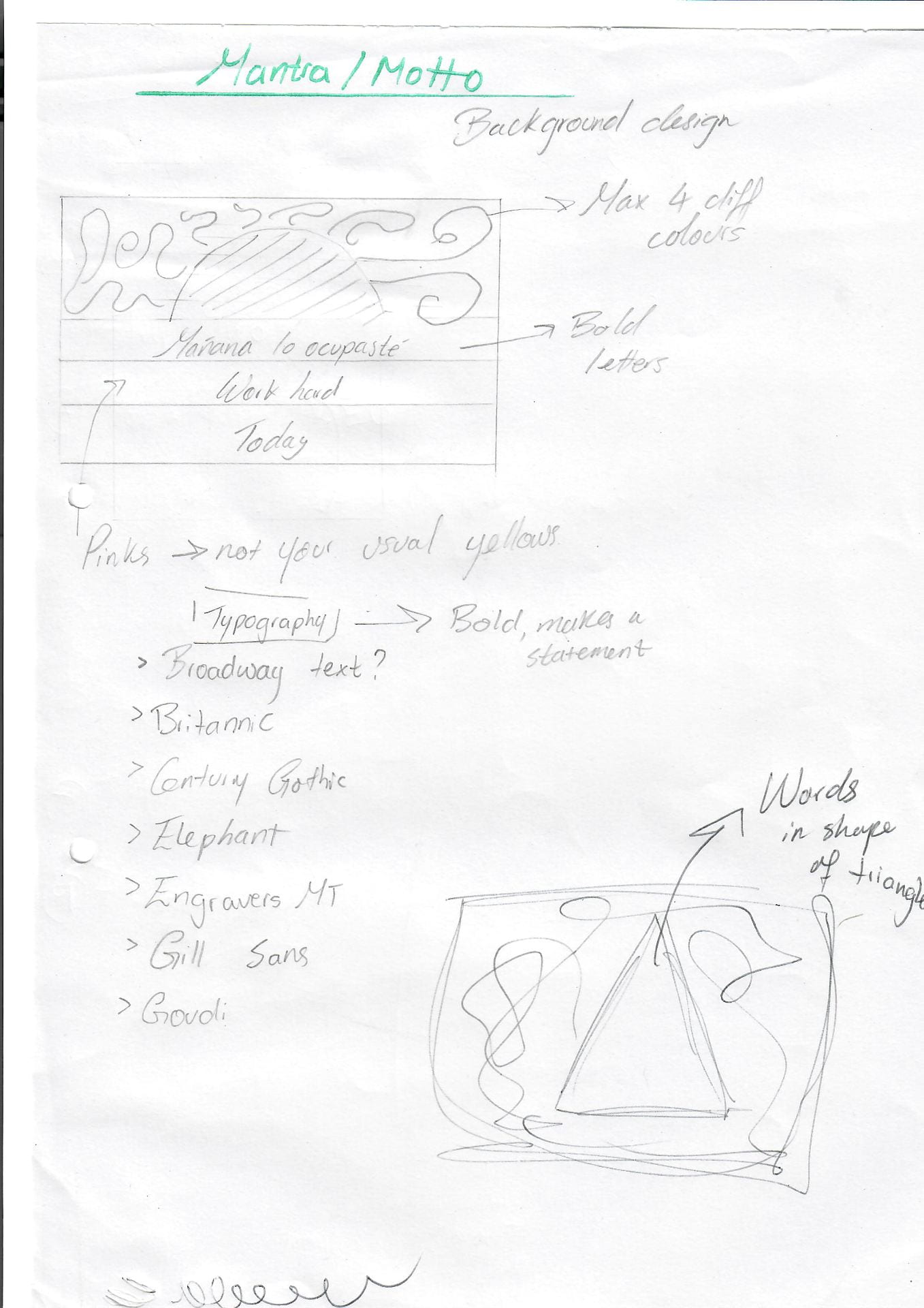
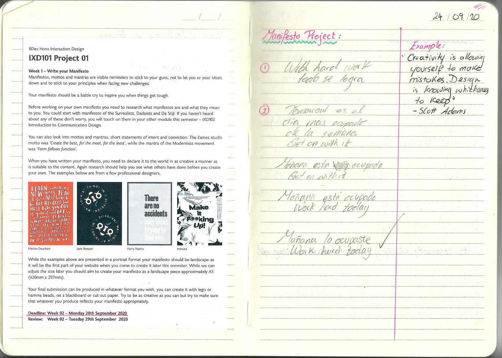
Motto ideas
- With hard work todo se logra.
- Tomorrow es el dia mas ocupado de la semana. Get on with it.
- Get on with it already.
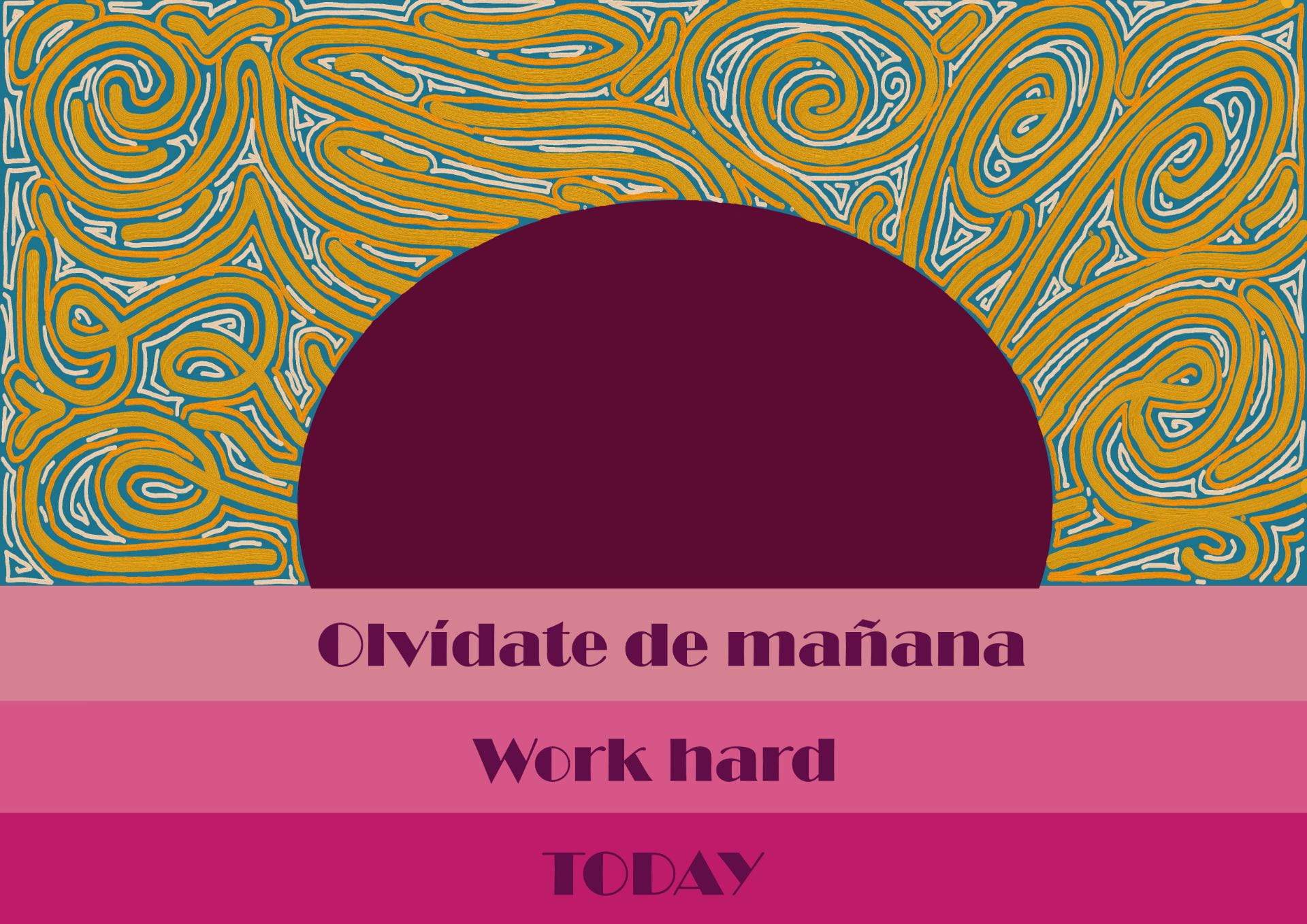
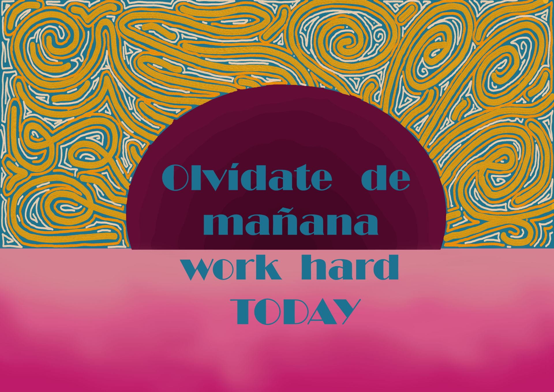
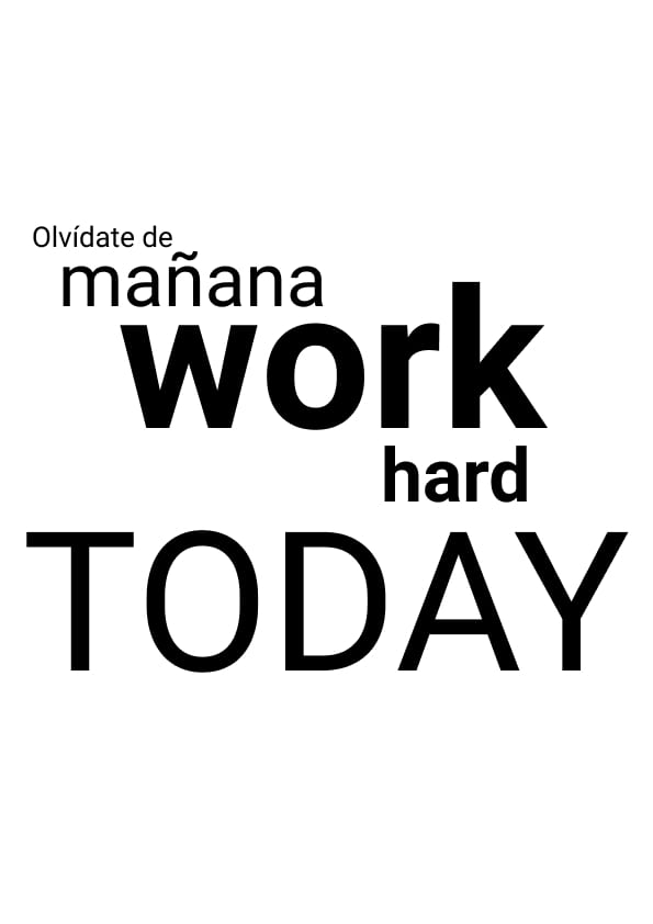
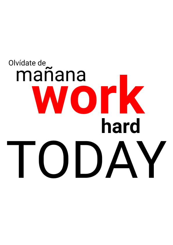
- Mañana está ocupado, work hard today.
- Mañana lo ocupaste, work hard today.
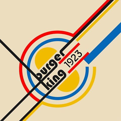
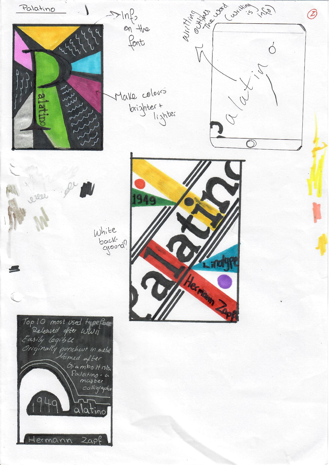
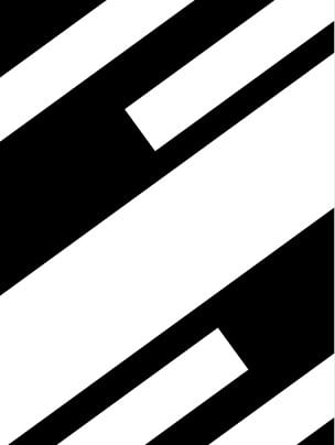
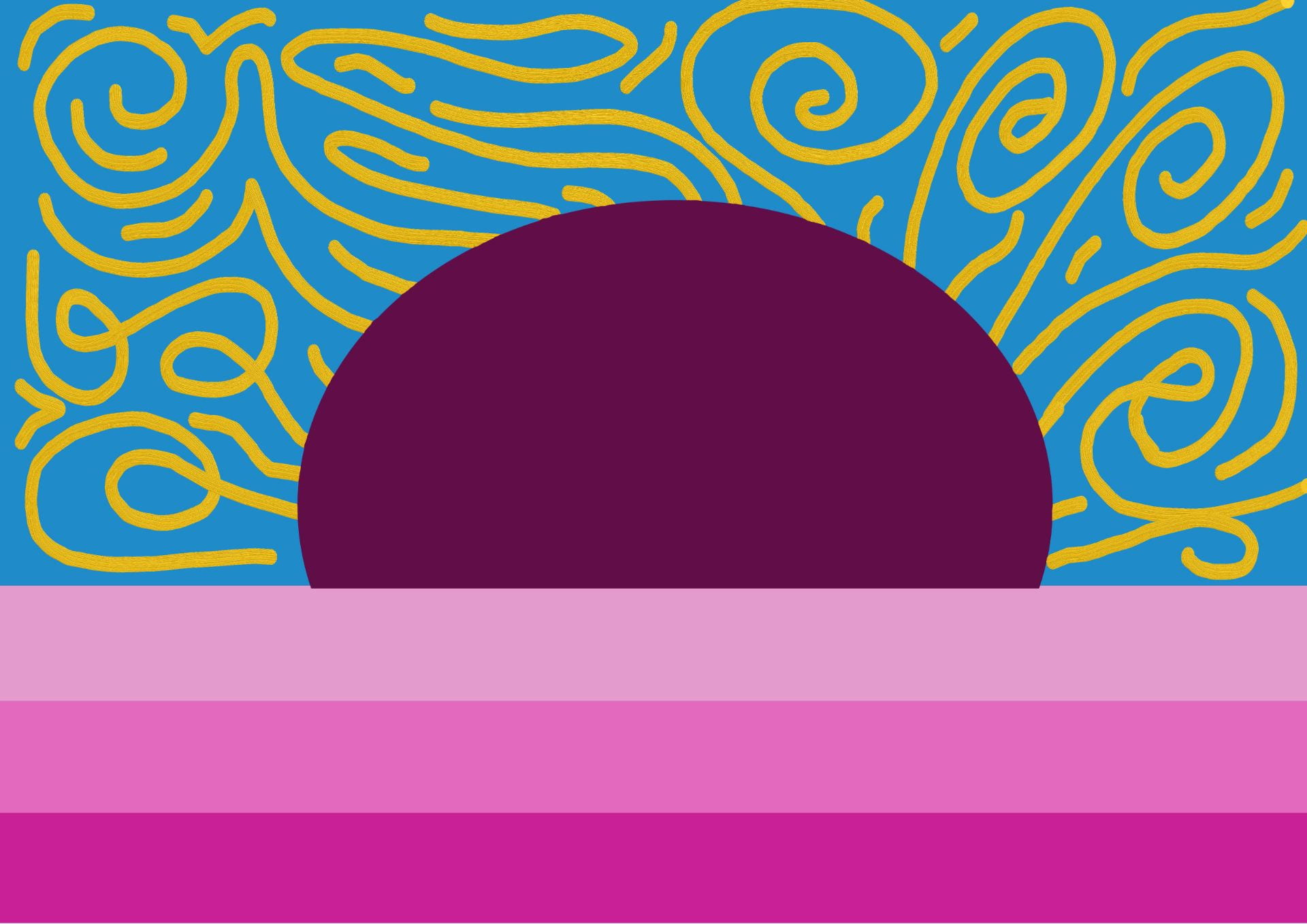
Design research ideas


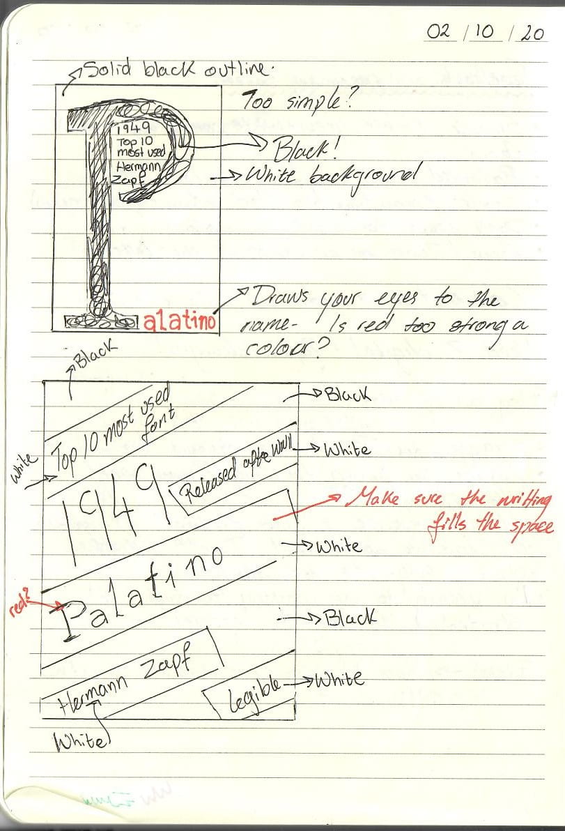
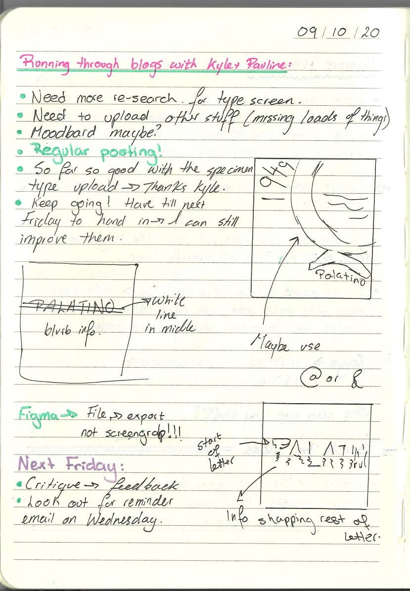
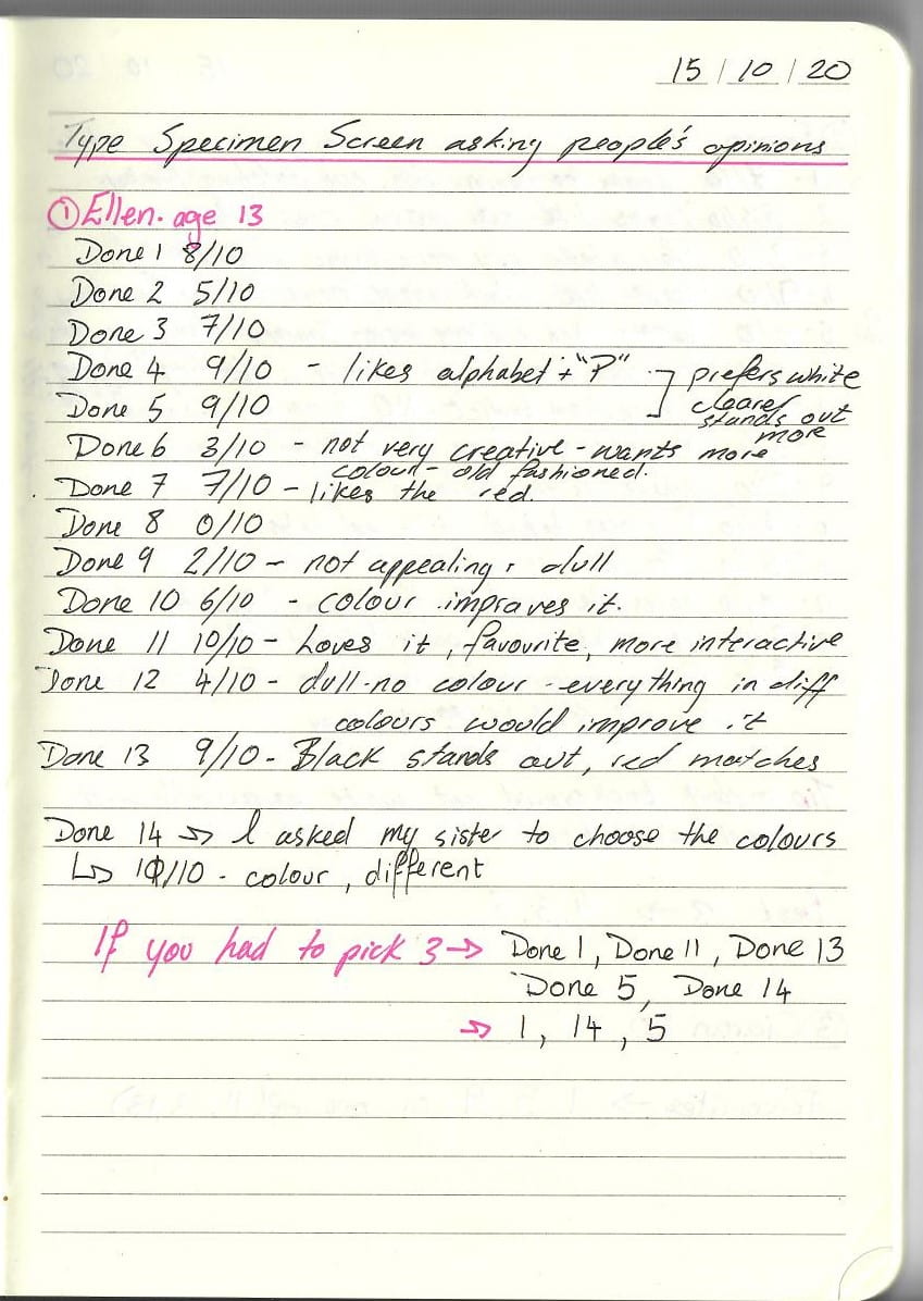
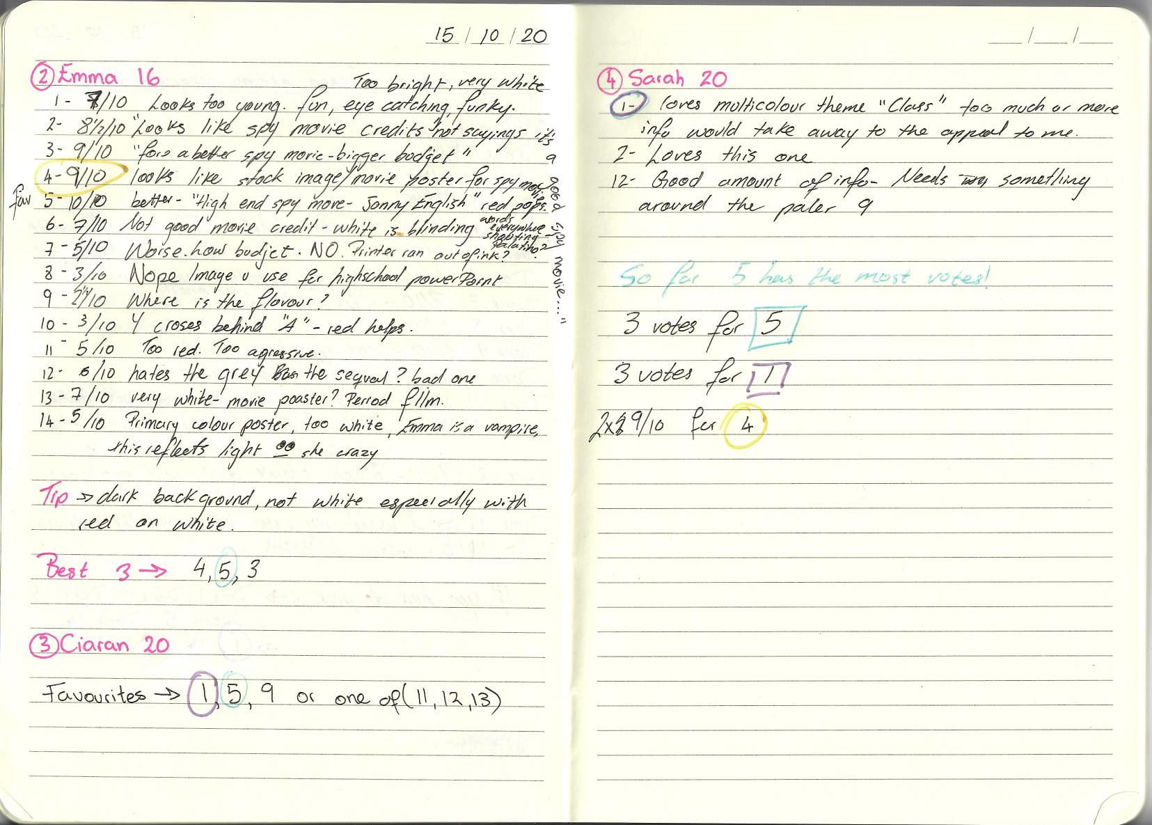
Sketches


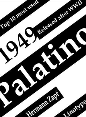
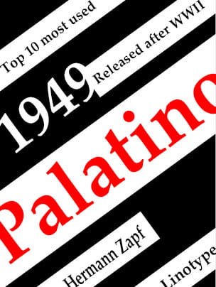
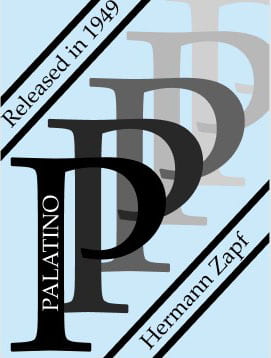
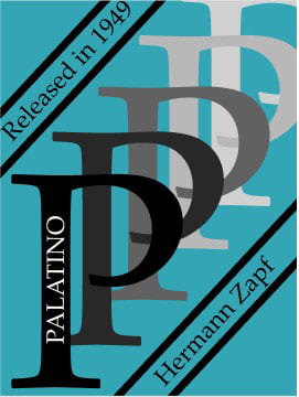
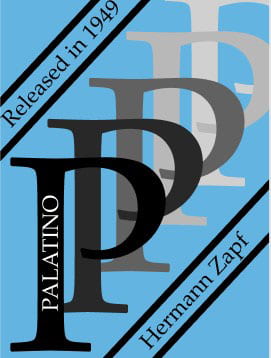
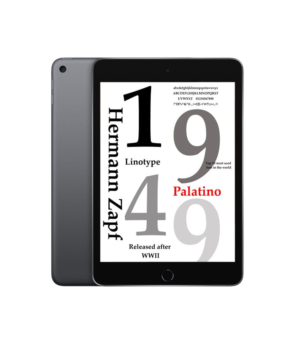
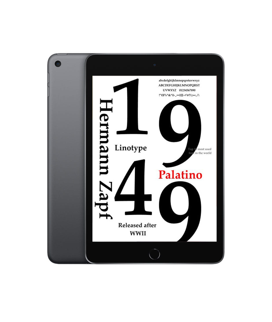
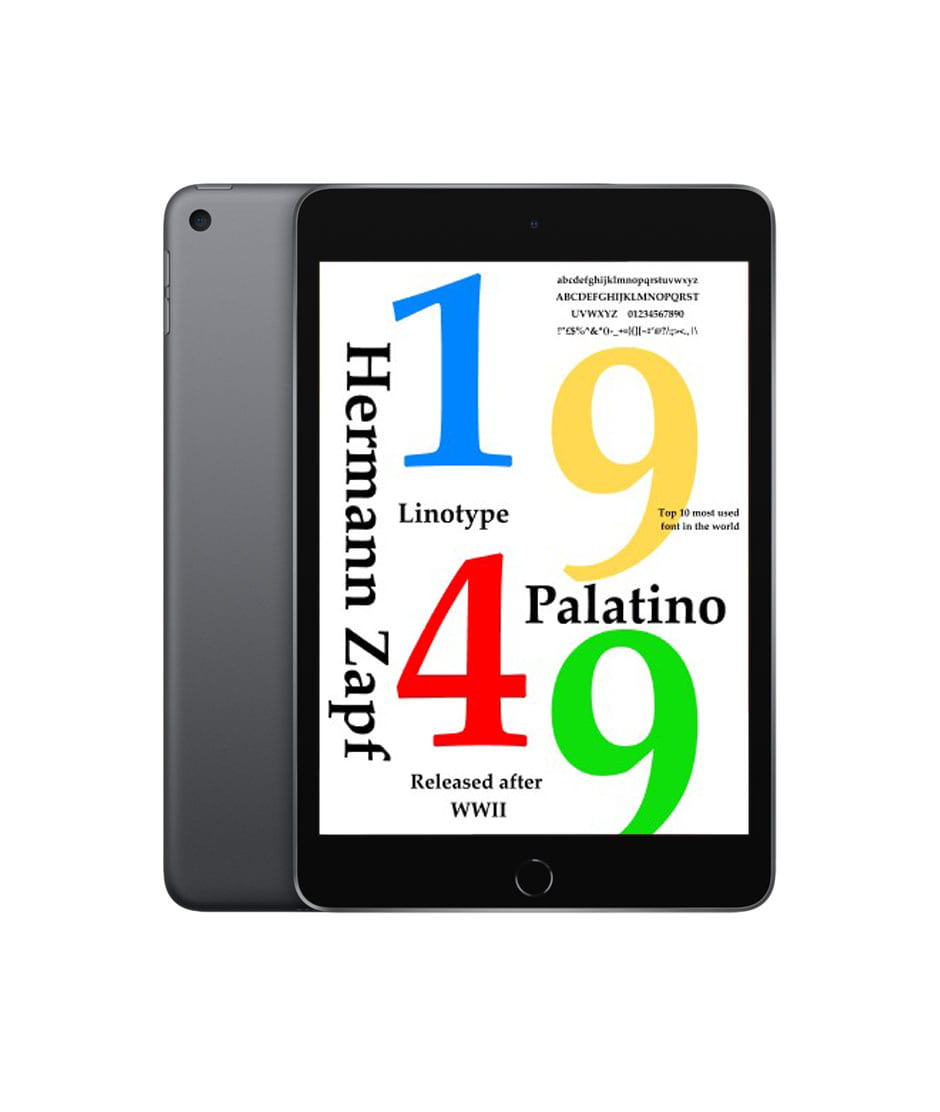
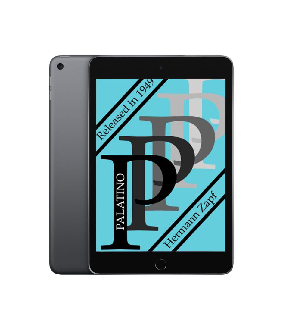
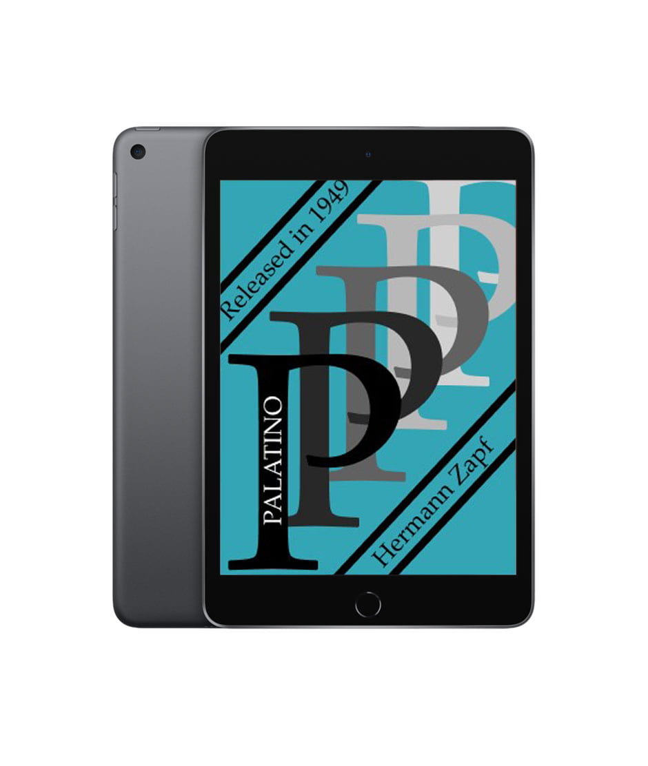
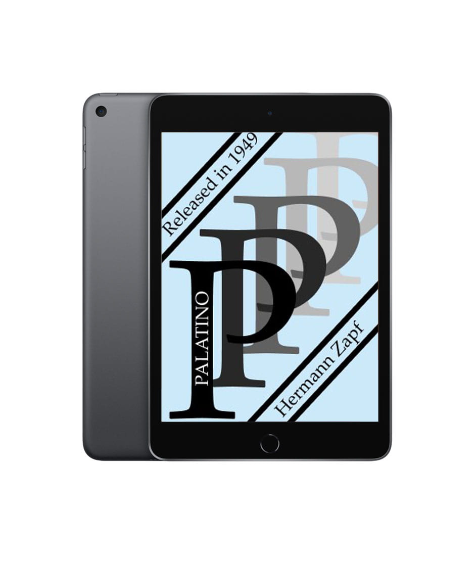
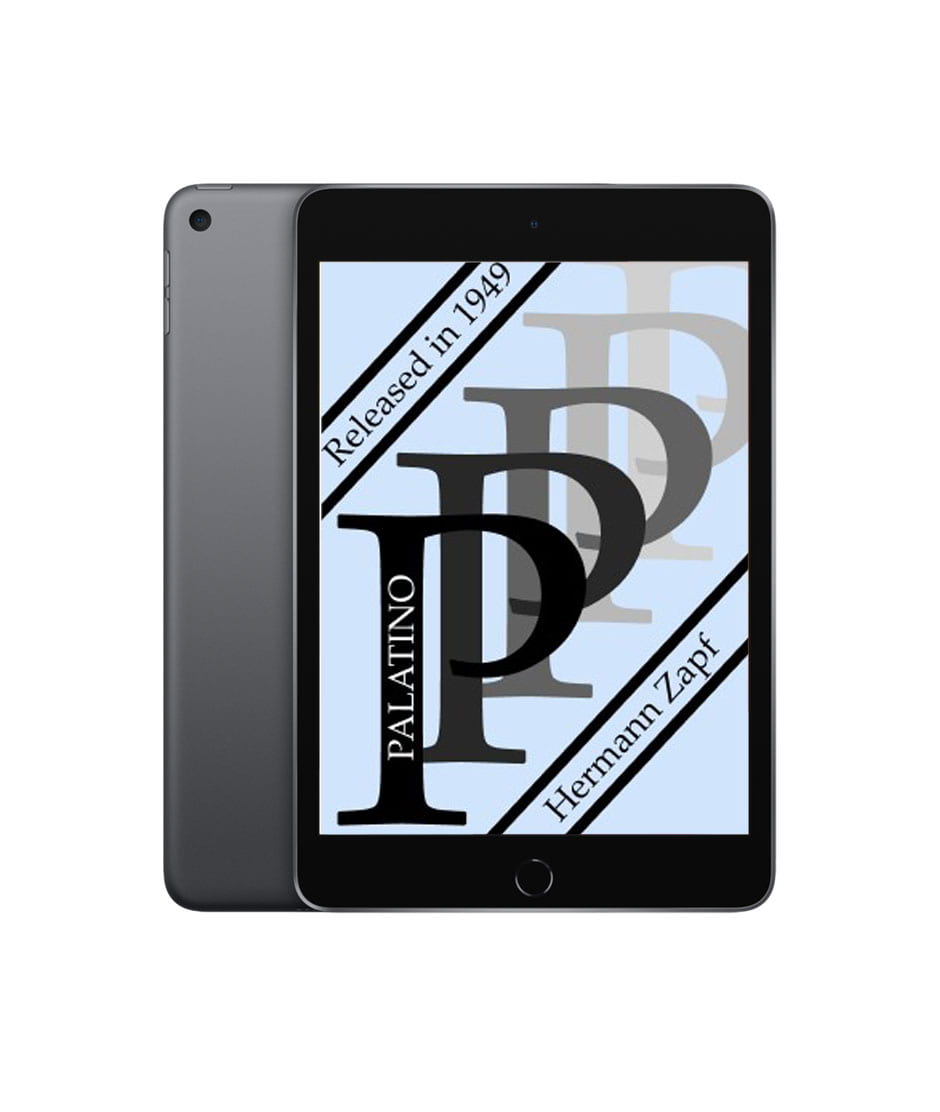
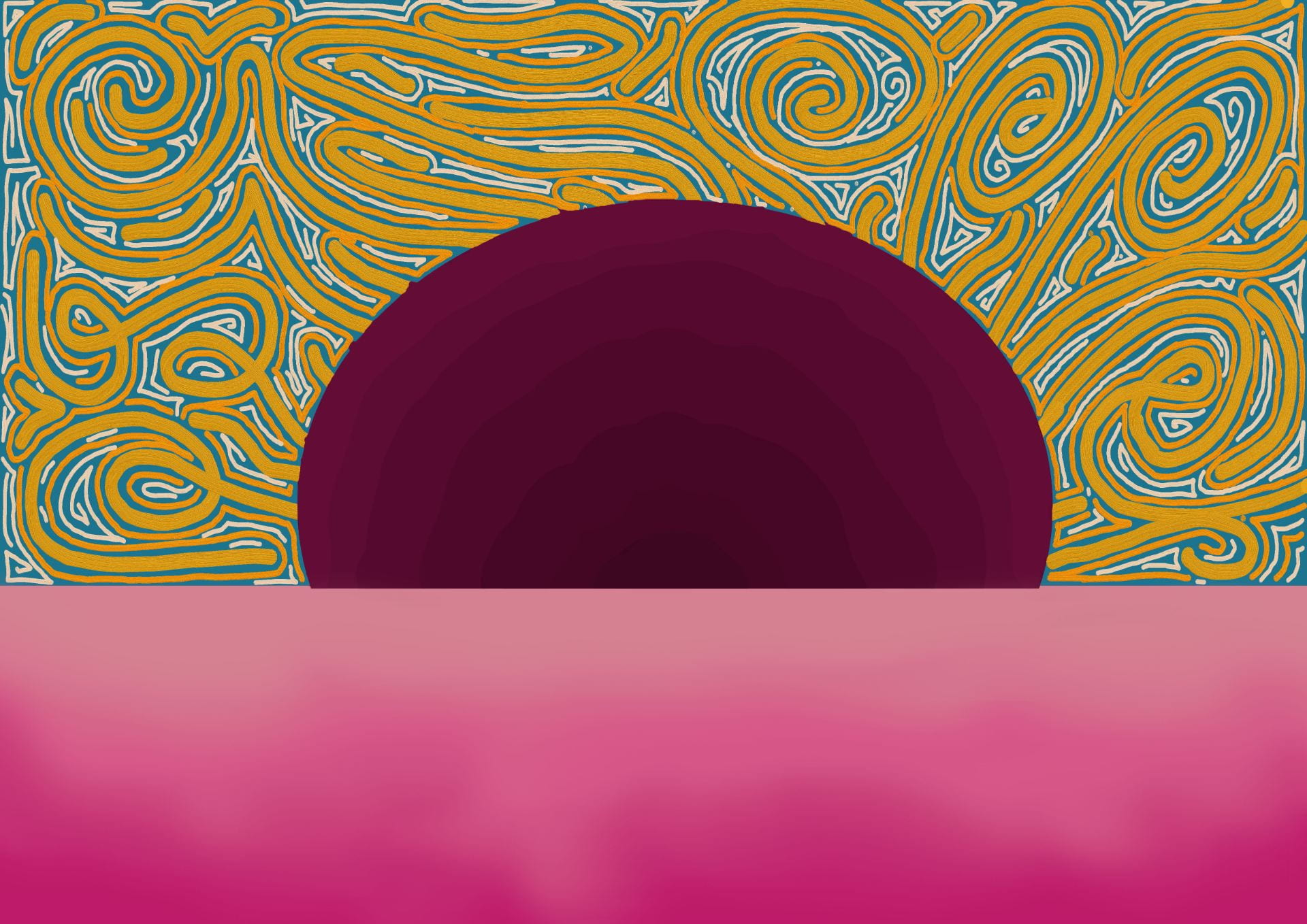
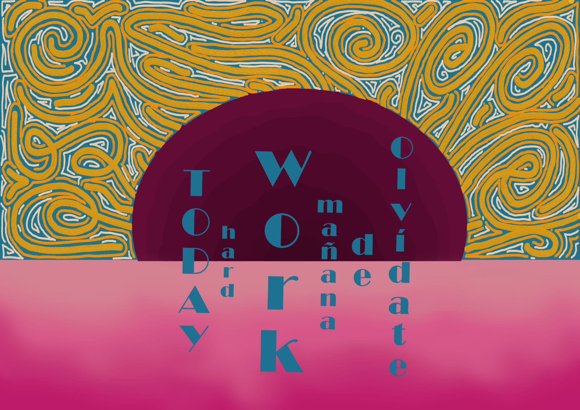
Digital progress and final outcome


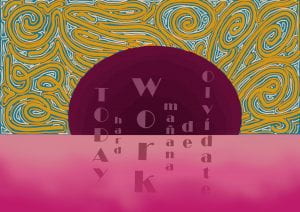

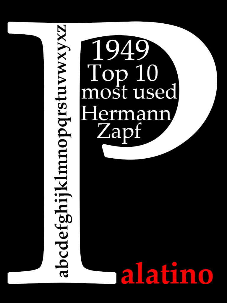
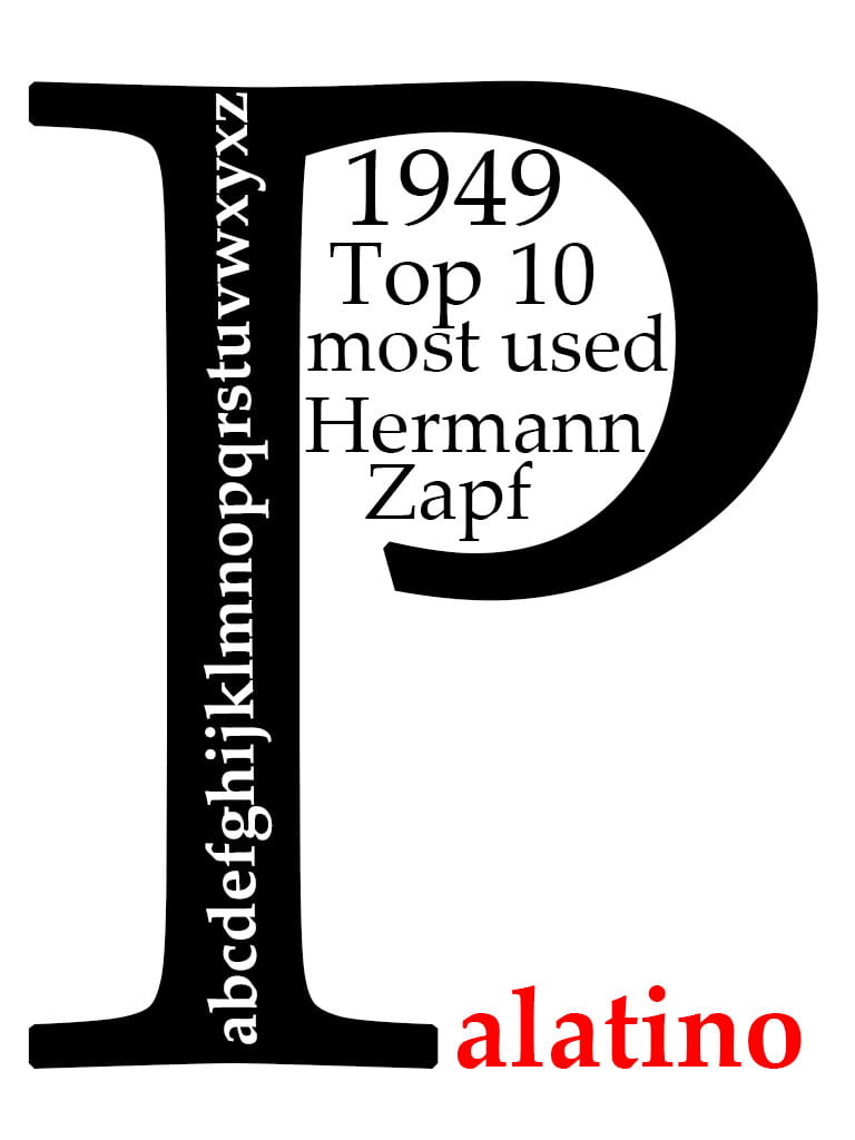
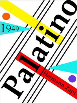
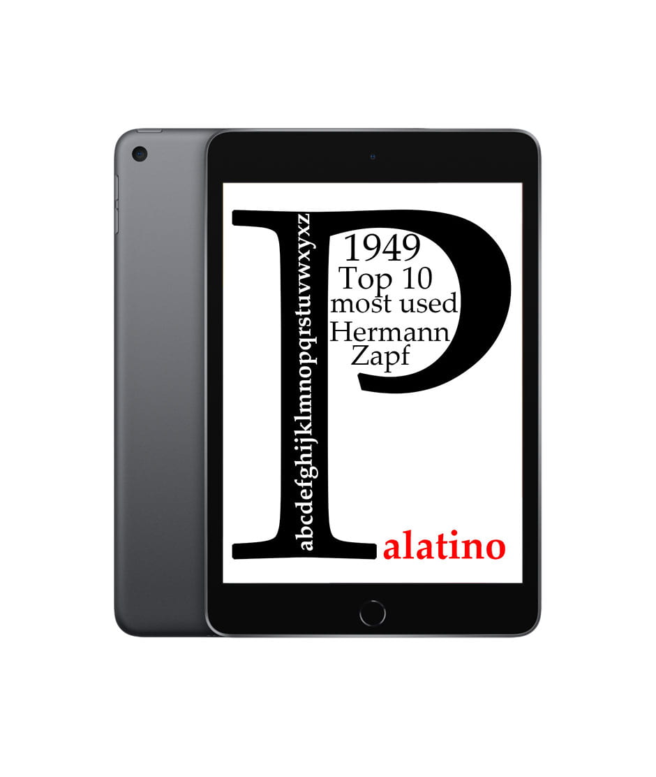
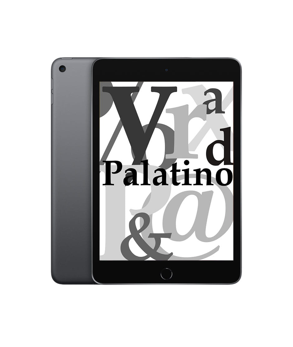
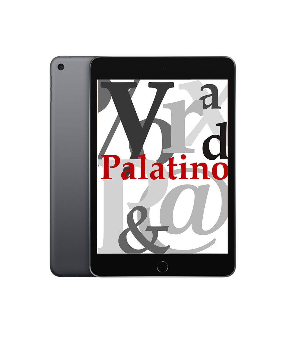
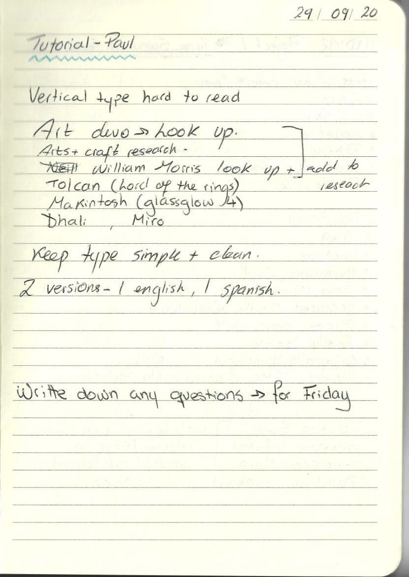
I really like this last version – after talking to my professor it was established that the previous 2 versions with the vertical writing were too difficult to read – Their complexity made them obsolete. Good design is easily understood – I did not take that into account here. My designs should be able to be appreciated by anyone. I would like to try and experiment using only typography, I want to make it – simple, BOLD and easy to understand.
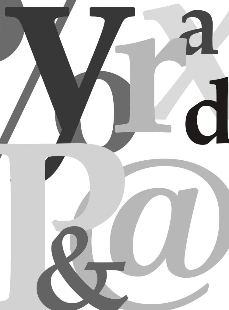
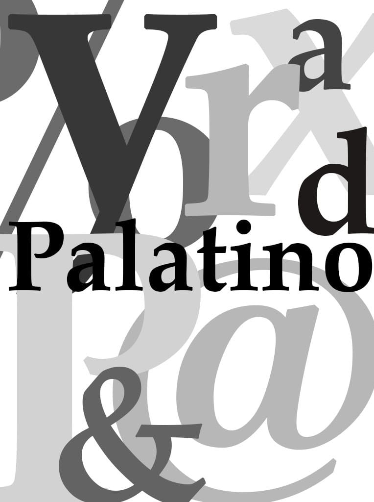
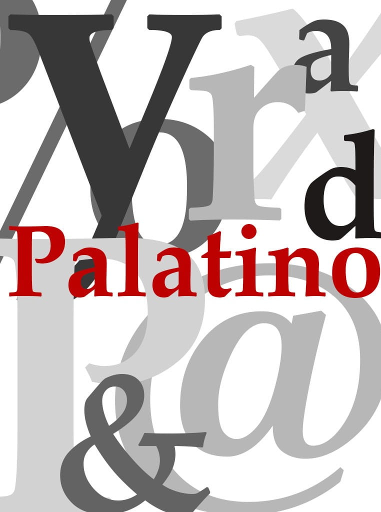
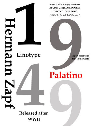
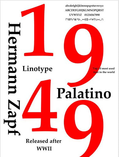
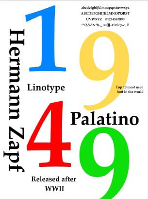
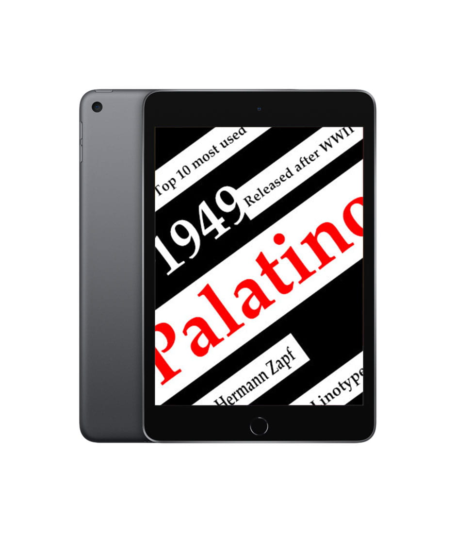
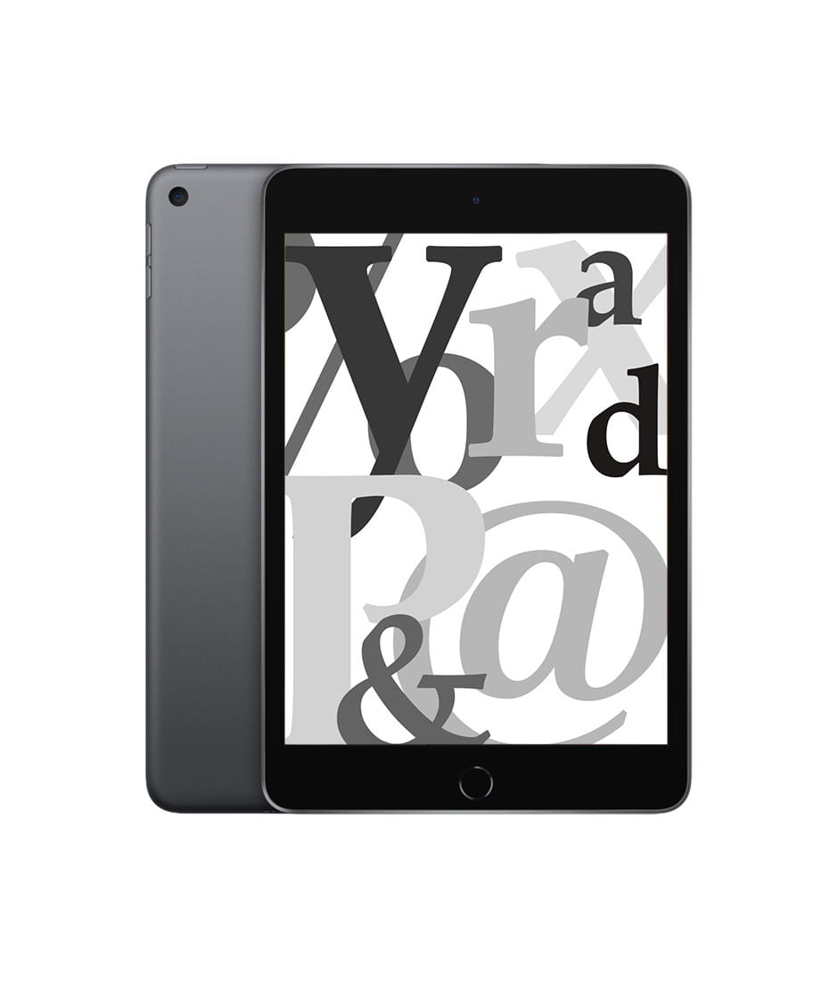
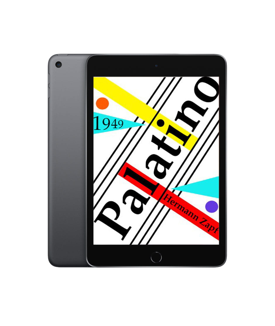
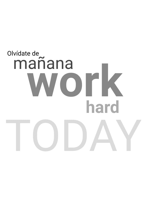
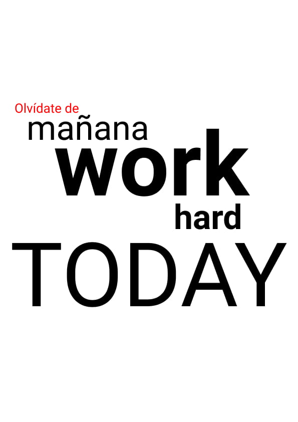
Experimenting with type


I think that using only the type without a background really helps the words pop and solidifies their worth. Sometimes less is more; this is something that I learnt while studying the Fibonacci Sequence.


 m,
m,