For today’s class, we got to see other students’ portfolios (mock-ups) so far. This was great as I could see how everyone was getting on. Even better the class commented on each other’s work both construct and critical feedback as it was necessary to identify what is going well and not so well.

Before the class started, I decided to do a quick self-assessment on both the positives and negatives of my website.
What I feel like I’ve accomplished so far:
Brand consistency – through the use of brand colours, typography and structure (home page)
Site Design – I feel like I’ve made use of negative space well especially around the case studies to create a minimalistic and playful website.
Original design – I have created a design original to my first vision.
Things I feel need to be improved:
Footer – I feel like the colour is too tacky and unappealing.
Case Study – The structure of the case studies can feel cramped with little sense of structure.
Home page – The start of the homepage isn’t properly aligned and looks unappealing; breaking the sense of simplicity.
Although the class went well many of the students thought my website looked great. I wish there was more critical feedback. Luckily, Kyle and I got into a call and he described some of the issues present in my website:
Home page
- Fix alignment during the home screen.
- Call to action “Learn more” needs to be changed to something more engaging.
- The call to action should be bigger and possibly aligned to the left.
- Add digital design and motto together.
- Create a hero banner instead of a right-aligned illustration.
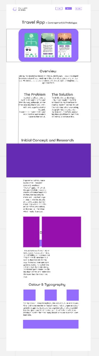
Case Studies – Home Screen
- Less roundness in the corners of pictures.
- Add tags underneath the title.
- Rename the titles e.g. Trave app to Irish Travel App.
Case Studies
Left align everything (or most)
Similar to page one have a hero banner to show off the product at the start.
Images should be spread out more.
Add way more negative space.
“The Problem” comes first then “The Solution” should be at the end.
Footer
Should have footer included
Find me elsewhere changed to alternative… e.g. Let’s connect *It can be added below the main heading*
Besides icons have just email @…… then icons smaller underneath
Conclusion
Today’s class has been a success in the terms of gaining feedback on my site. It was engaging and exciting reviewing other portfolio mock-ups as I could see what others do and how they are getting on. I have learned many different things about my site from this session so far and many of my judegments I made before class were correct. It’s like writting, sometimes you need people to go over it to see the mistakes. I will not begin to adjust those mistake in preperation for building my site.