In this session, our class was assigned to create a brief presentation on our branding so far. It was then to be reviewed by Daniel and other classmates.
Presentation slides
Critique
I was happy to hear both of the positive and negative feedback from classmates and Daniel during this exercise as it allows me to see where I am succeeding and where I am lacking. This allows me to develop on my areas of weakness.
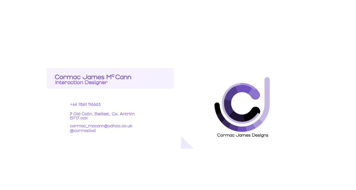
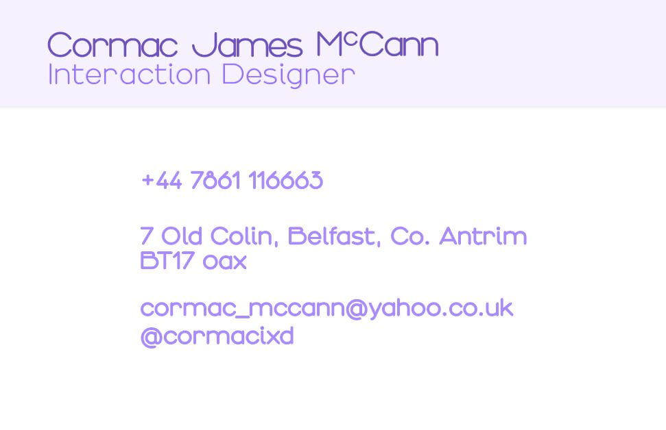
Business Card


Area of Weakness:
- Too chaotic
- Unnecessary placement such as triangle in the corner
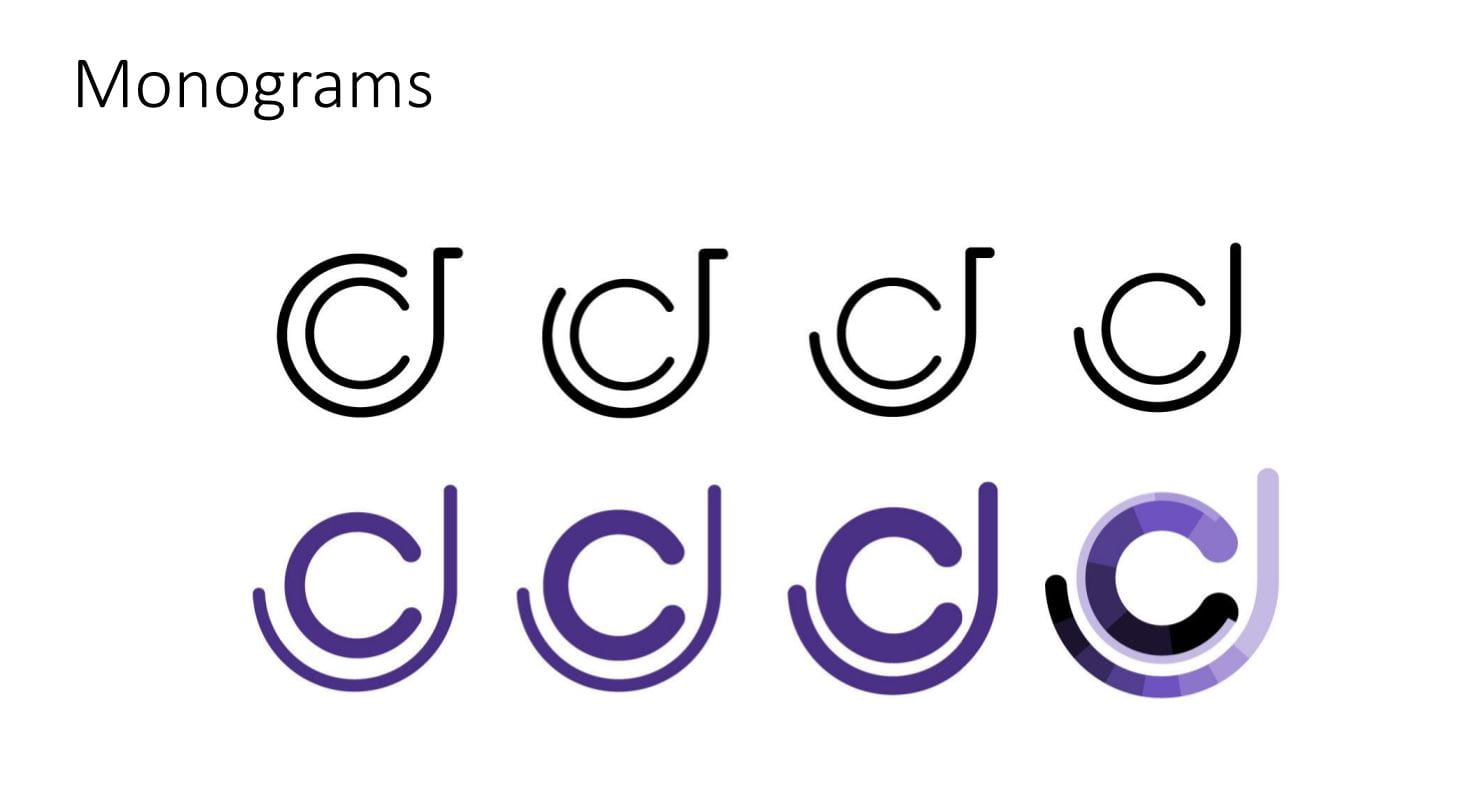
- Too many patterns in the monogram design
- Monogram could perhaps be removed or shortened
- Monogram uneven stroke – ‘C’ & ‘J’ are too different widths
- Too many colours/shades – printing costs/compatibility
Wordmark

Area of Weakness:
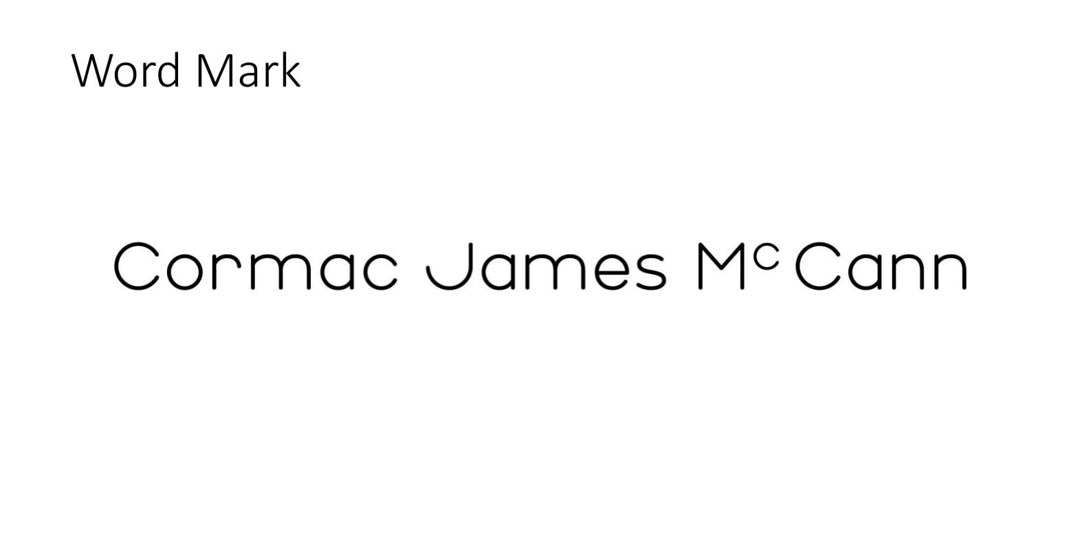
- Over kerned – too many gaps
- Uneven kerning – the lowercase ‘c’ isn’t proportional to the space at either side.
- Too long/Weighty
Visual Marque

Area of Weakness:
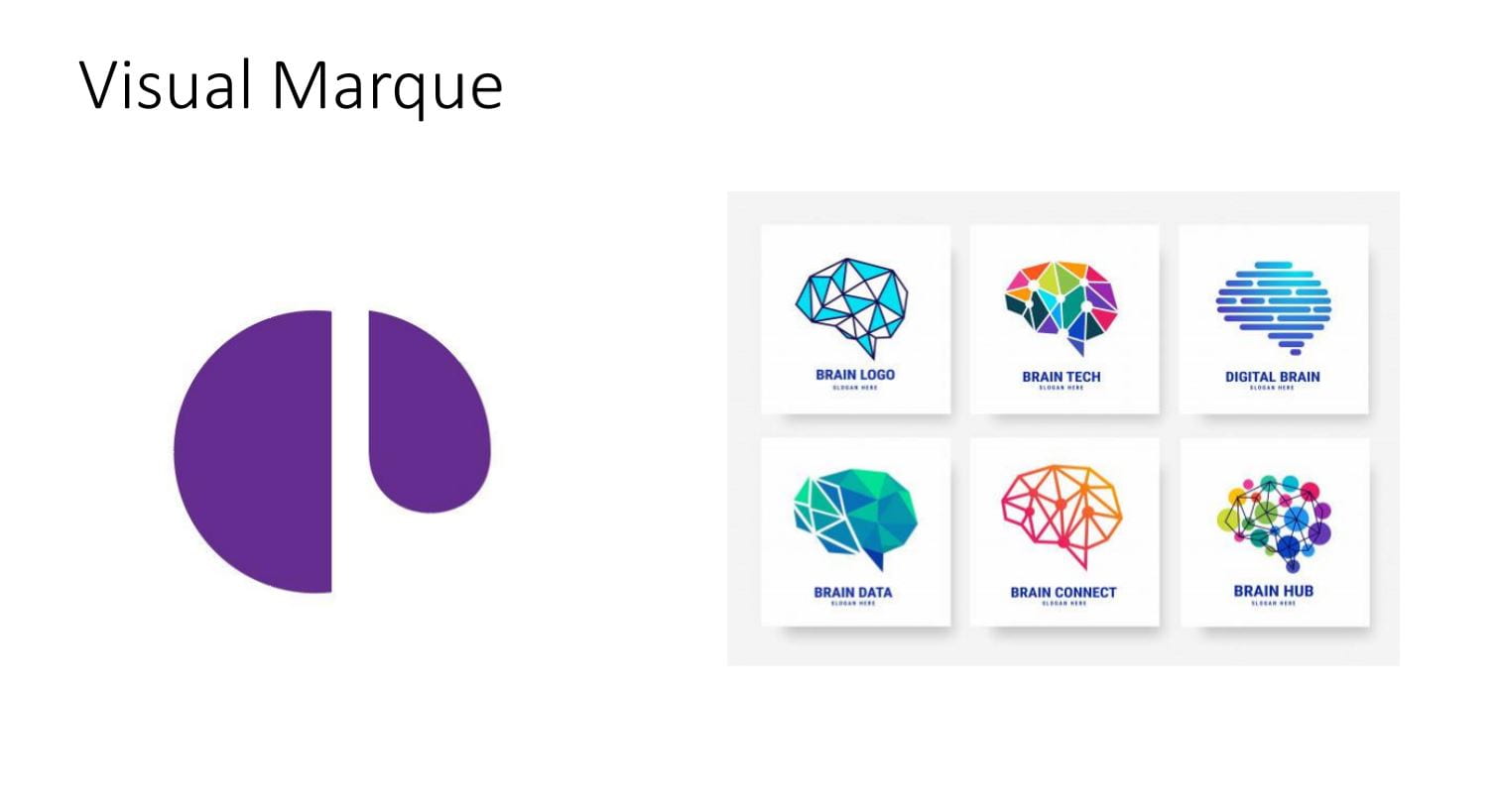
- Too abstract
- Hard to know what it symbolizes
Making Adjustments
Business Card

- Inverted colours – White monogram and purple background makes the monogram more eye catching
- More simplistic monogram design
- Even stroke width
- Removed wordmark – More clean and simplistic
Wordmark

- Adjusted wordmark and closed large gaps
- Made appropriate kerning where necessary
- Removed last name as it makes the wordmark too weighty
Visual Marques

- Complete revamp of the originally visual marque
- Resembles more of a brain
- More playful and less abstract
How has this helped me?
This class has gave me time to reflect on my work, giving me the chance to see what others think of my brand. I greatly needed this feedback to adjust and refine my brand in order to create a simple, consistent brand formula that stays aligned with my values.