The Importance of Typography
Type is approximately 94% of visual communication and is the driving force for visual communication. Throughout human history type has been ever present in all areas of the world in many different cultures expressing unique and individual visual gestures and visual communication with it being altered through cultural and historical reference. It allows information to be preserved and depending if it is displayed right both evolutionary and cultural it can enhance the effectiveness of communication and how it is perceived.
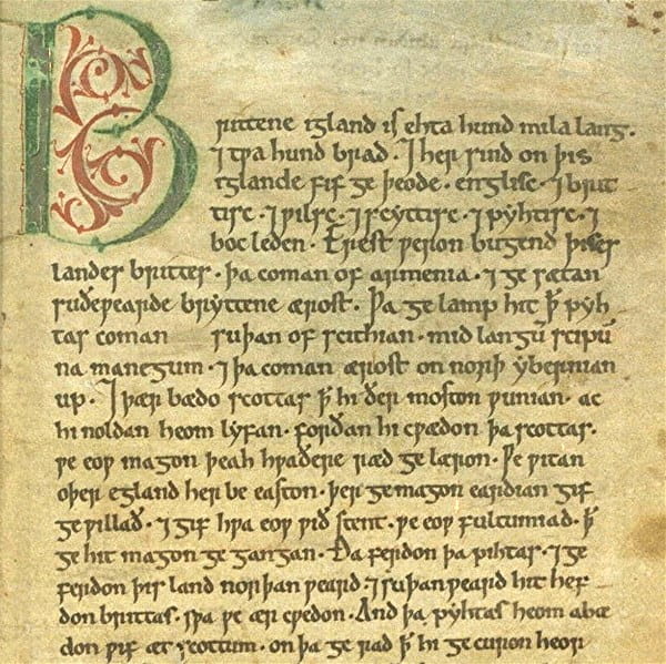
Down below shows how each culture creates evokes different emotions and feelings through visual written word:


There is a variety of ways typography can be used to communicate such as the age, gender, emotions, personality and tone of voice. An example of this would be age, there is no defining factor of what typography is considered aged or not but rather it instead comes from historic and cultural reference.

Anatomy of Type

I find these little ‘cheat sheets’ very helpful for working and analysing type.
The Point Measuring System
While measuring typography, the point system is the smallest measurement system there is. For reference there are 72 points to an inch with 12 points becoming the default reading style. Although this is default, it is a little uncomfortable to read, this is mainly due to the tradition typewriting being 12 points so it stuck. Most media outputs are set below 12 points which saves printing costs. A more comfortable size would be around 11/10 points for reading material. Although, the point system is a good measuring choice, it isn’t always accurate as one font may be different size to another but measure as the same points.
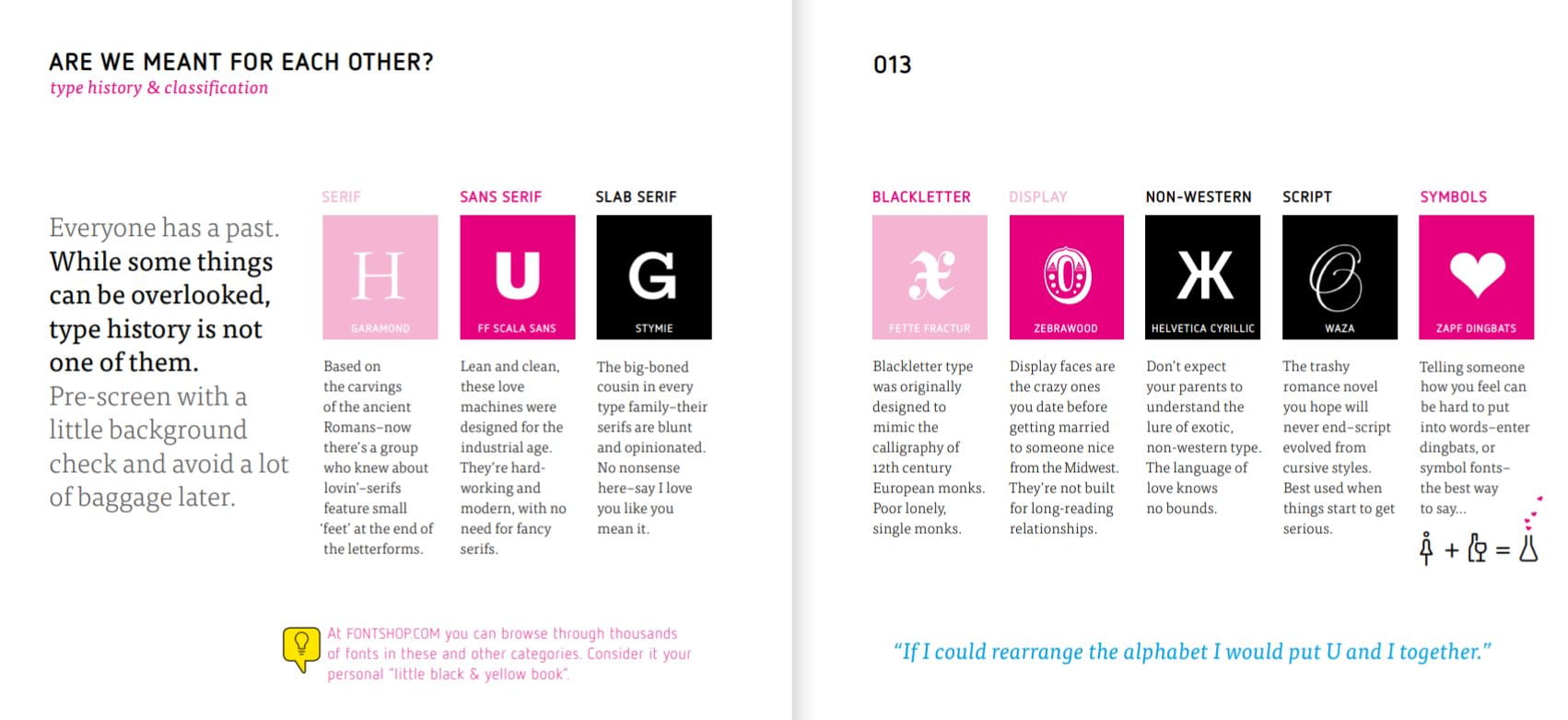
Type Classification

Kerning
What is it?
Kerning is the process of adjusting space between characters in a proportional and appropriate manner which can make letterforms appear more visually and structurally appealing.

Kerning can be implanted to enhance work flow and can make a big difference in making things look polished and visually appealing. Kerning can be auto corrected by computer generated scripts which generally can cause errors and leave unproportionable amount of space or it can be manually adjusted which is the preferred way.
The best way to kern is to visually look and judge rather than automatically adjusting it. A good way to do this is to reflect on the chosen text/letterforms and look at it backwards, the situation will become more clear.
Difficult letters
- Slanted letters such as A, V, W, Y, K
- Disjointed letter combinations such as W – V or T – F
- Letters with cross strokes or arms such as F, T, L
Problems
When kerning isn’t done right it can look worse than what it was previous. Over kerning which adds too much negative space and under kerning can cluster together and form unintended words. Both errors makes it difficult to read and makes the text visually unappealing.
Other useful tips:
- Two straight letters usually need the most space
- Letters can appear to interact differently and different point sizes
- Kerning shouldn’t be noticeable at a body size of 10, 11, 12
What have I learned?
In this class I have learned a great deal on type, anatomy and obtaining visual proportion. I have now appropriate knowledge on point size, kerning, visually anomalies and hierarchy of type to name just some. It has now sparked a general idea in my mind on what I want my wordmark to visually contain. I will no begin on researching my intended work mark.
Books to read:
Thinking with Type
Ellen Lupton