Who is he?
Armin Hofmann is an influential Swiss graphic designer and educator, born in Winterthur, Switzerland in 1920 he began studying at the School of Arts and Crafts in Zurich, a famous school which has produced world class graphic designers such as the famous Josef Müller-Brockmann. Armin is mostly recognized for his graphic design, typography and his books such as his 1957 book the Graphic Design Manual.
Hofmann’s teachings were universal and set the new standards of fundamental elements of graphic form and power of visual expression. Some of the things Hofmann worked in was typography, environmental graphic design, logotypes, symbols, books and more. Armin’s work remains one of the most influential among graphic designers and holds major importance in the design world, with his book still a reference for all graphic designers today.
Graphic Design Manual: Principles and Practice
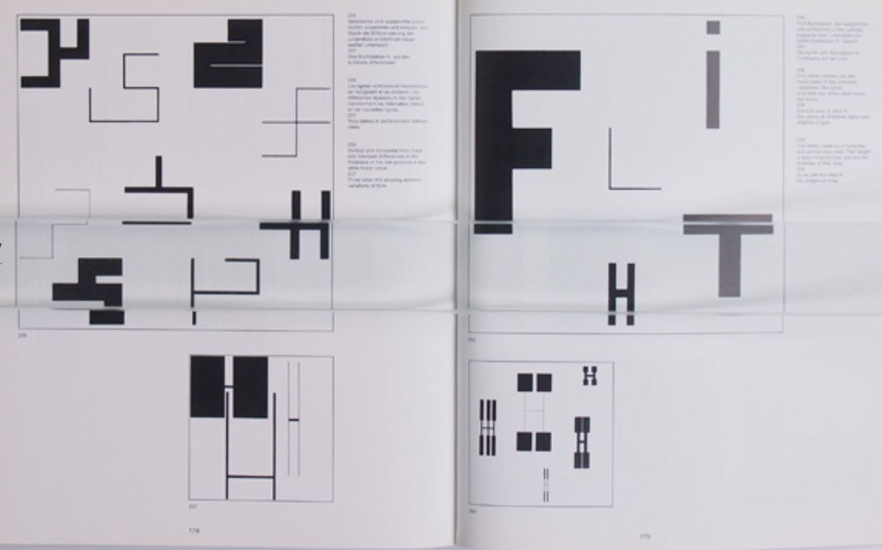
Researching into one of his books, I found it very interesting to see the methodology and criticism of educational art and his approach to visual practices of graphic form from initial conception to finish. His book contains upwards of 300 illustrations which contain many detailed and systematic approaches of point, line and shape combined with the commercial use of colour and fonts in his illustrative work.


Other Work


Analysing Hoffman’s posters such as the 1963 Wilhelm Tell (Left) and 1969 Walter J. Moeschlin (Right) I can see how he uses scale and 3D grids to show depth and to express visual language in his typography, this is good for understanding visual hierarchy in monograms or wordmarks.

I really like Hofmann’s use of black rectangles masking on top of the typography creating perceived closure and still being able to identify letters as he keeps the important parts out, e.g. the third letter is clearly an ‘o’ as one third is cut off leaving no other visible identification to tell us otherwise apposed to the ‘a’ directly below it we can see the corner is pointed which gives us the identity of an ‘a’.
Using Hofmann’s work is a good starting point for researching my monogram as he uses a mathematical grid to provide unity and an orderly structure, this is good for starting as I can begin with a systematic foundation before I come move onto creating and visualising more sophisticated and ‘creative’ monograms.
Hofmann uses primarily black and white colour palette which is what I’ll be using before I explore colour on my monogram, also he uses mainly san serif typefaces which is the type class I will be using for my monogram.