I really enjoyed this semester of IXD, even though it was online I still feel like I managed to get a good start on this year on interaction design and I got a good understanding of the course ahead of me. I learned many skills so far and I also learned a lot of history and contextual information that I want expecting to learn so early on in the year which was interesting. Keeping a diary helped me to retain lots of information and also helped me to lay out what I had to do in a simple format, so I plan on doing this throughout the year.
I also got to experience group work through blackboard which was interesting yet very fun to collaborate with new people in the class and we all felt a sense of accomplishment when we got to go into the university to present our presentation. I also got to complete various projects which differed in every way to one another which kept my mind active over the term. It was fun to move from project to project as there was always something to improve on or to work on. Some of my favourite projects were the Typeface Specimen, Follow the Rhythm and 9 iterations. I liked these projects so much because I got to keep creating different versions of each one and I could create endless design ideas.
Overall I feel like semester one has taught me a lot, however I feel like I still have lots to continue to work on and improve, therefore I am excited to see how the next semester goes and what I can create.
Throughout the year I have been working on recreations on weather and travel icons/ apps. I knew I wanted to learn and practise my design skills at the start of the year. I found interesting app designs when I researched weather apps and I found this specific image, this is where I further took inspiration from to make up other versions and designs.
This is the one I recreated, I chose the sunny one because I liked the colours. I chose weather because I thought it would a fun yet simple layout choice because weather apps have to be clear and easy to read. I then took inspiration from these to make other travel icons on Adobe XD.
I also recreated normal app designs which are basic yet since I am only new to this I wanted to start to perfect the basics, this is what I done:
I really enjoyed working on these throughout the semester and really feel like it has helped my skills for later on in this course. I am excited to see what else I can come up with this year.
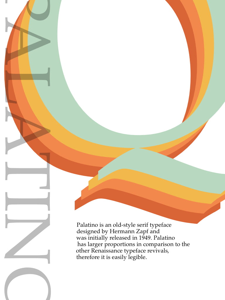
I went with this design because I really liked the choice of colours and I also liked the way the ‘Palatino’ is slightly cut off at the sides. I used a lighter opacity so it doesn’t look as heavy.
Blog posts about my progress:
IXD102 – Typeface Specimen
Inspiration for Typeface Specimen
Typeface Specimen Sketches
Digital Typeface Specimens
Typeface specimen final designs
Type specimen feedback
What I liked about this project:
This was one of my favourite projects because I got to work with lots of different ideas and develop so many of them. I really enjoyed making my sketches come to life on adobe XD. I also liked researching all about my typeface and finding out the history behind it. Another process I enjoyed was the progress from start to finish and the process of elimination and trying to figure out what works and what doesn’t work. Finally I really liked this project because I felt there was an equal importance on sketching and digitalising my designs because without them the final product wouldn’t be possible, and I always enjoy getting lost in my sketchbook.
During these 12 weeks I have been keeping a weekly diary on all of the information and skills I have learned throughout the week. I write in it on the Friday after Kyle/Paulines class because then I get to summarise and add in my input on their lecture that Friday morning.
I found that keeping a diary during this term has helped me stay organised and also its another form of learning and a way to retain the information I get in a week, because as I write I feel like it helps the information stay in my brain. It’s another method of repeating what I hear or read during the lectures aswell as the summaries and other research that I include in this blog. Writing it down on paper helps me learn in a different way. Here are some examples of the contents of my diary.
I also used this diary to set goals for myself and to summarise what I needed to improve on. Seeing what I need to do and practise written on paper encourages me to keep working on them. I write things like this:
I like doing this and feel like this exercise has helped me throughout semester 1 and I will be continuing this aid throughout the year.
Our lecture on the Bauhaus was very interesting to me, I had never looked that much into it before the lecture and I’m glad I got to learn all about it.
What did I learn:
The Bauhaus was one of the most influential modernist art schools in the 20th century. Its approach to art and deign and the relationship between the arts and technology and society itself had a major impact in art and design in Europe and in America, whenever this school had to close due to the Nazi persecution.
The Bauhaus aimed to reunite fine art and functional design, creating practical objects with the soul of artworks. It was founded in 1919 by Walter Gropius, and although the Bauhaus abandoned many aspects of traditional fine-arts education, it was deeply concerned with intellectual and theoretical approaches to its subject. Various aspects of artistic and design pedagogy were fused, and the hierarchy of the arts which had stood in place during the Renaissance was levelled out: the practical crafts – architecture and interior design, textiles and woodwork – were placed on a par with fine arts such as sculpture and painting.
The Bauhaus movement itself favoured a geometric style of art and in turn this was intertwined in all aspects including architecture, furniture etc.
The Bauhaus was home to many famous artists and is known for its infamous faculty such as Paul Klee, Walter Gropius, Josef Albers and many more who went on to change the face of art and design forever.
I also learned that De Stijl originated from the Bauhaus and was known as the inter war period. Piet Mondrian was an artist that really stuck out to me because of his revolutionary work in De Stijl, he was one ion the founders and his iconic geometric work is still used and is so relevant today.
The Russian Revolution – 1917
The lecture was also about Kasimir Malevich, El Lissitzy who were both known for their artwork inspired by Russian Constructivism. Some of the most famous artwork that a derived from the Russian Revolution are the posters such as this;
This poster was made by Aleskei Gan with the message “WE DECLARE UNCOMPROMISING WAR ON ART!”.
Gan and his artistic compatriots—including Alexander Rodchenko, considered the founders of the movement known as constructivism, as well as ,Liubov Popova and El Lissitzky, and others—sought new art forms and modes of making art to serve the masses. Art, they believed, had no place in the hermetic space of the artist’s studio. Instead, it should reflect the modern, industrial world; be formulated in laboratories and factories; and be deployed as an active agent in the broader Communist revolution.
I found these communist posters very interring because I love the bold layout and typography that was used to provoke change and a revolution. This showed me how powerful art is and was, and how these artists changed art as they knew it, which was figurative and traditional into constructed pieces used for propaganda.
Paula also gave us lots of examples of artists during this era to look at and create pocket profiles for such as:
Oscar Schlemmer
Wassily Kandinsky
Herbert Bayer
Josef Albers
Jan Tschichold
Laszlo Moholy
Alexander Rodchenko
and I plan to do so because this era of art and revolution and change both in society and the world of art and design is inspiring.
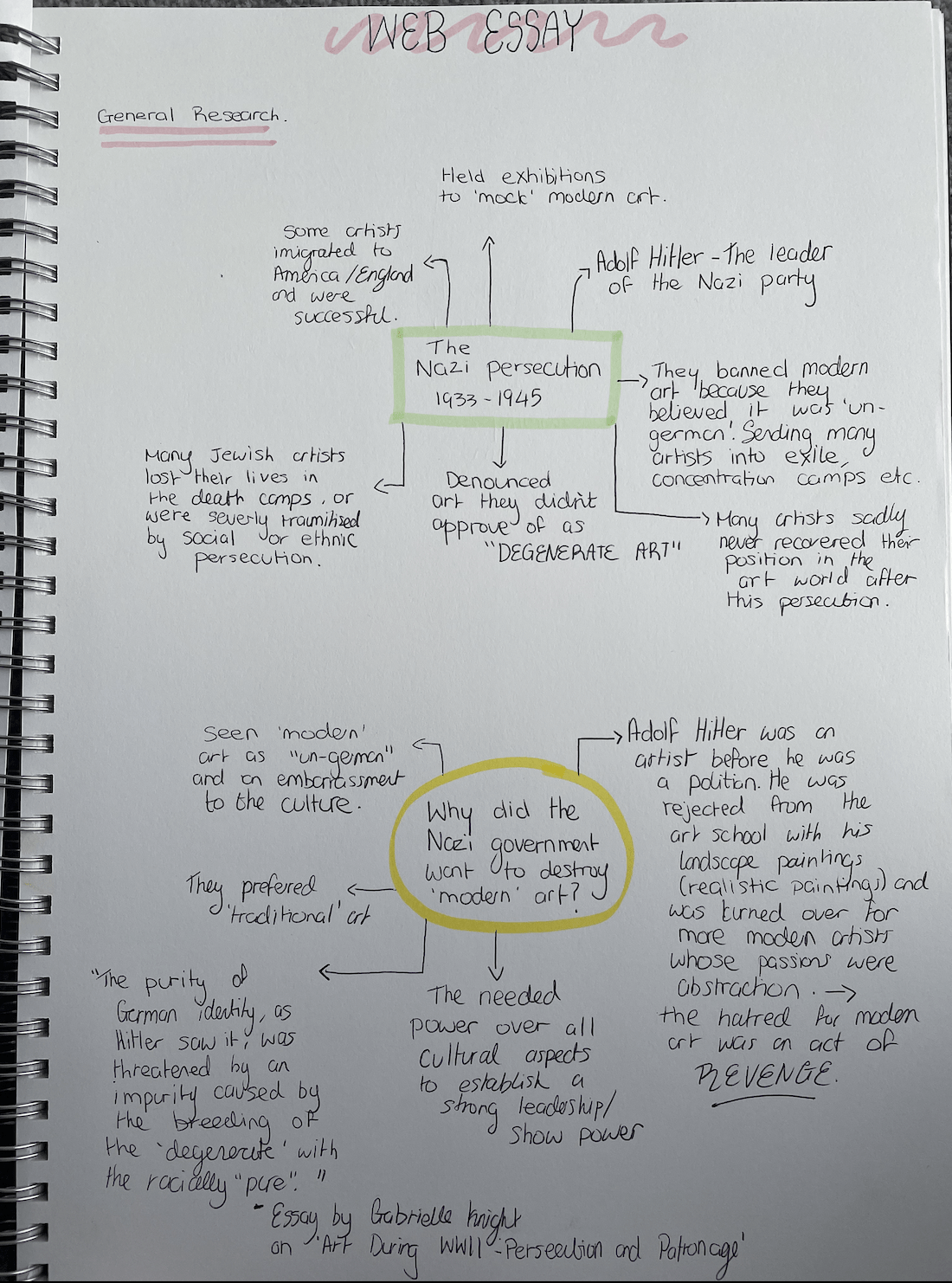
Q.How the Nazi attack on modern art in Europe changed art in America.
I chose this title because the history and background really interested me. I found it fascinating that such horrid acts on the art and design community in Europe took place and for many of the artists this led them to having to flee in order to live peacefully and pursue their passions. I started by using my sketchbook and making spire diagrams about all of my starting knowledge on the subjects.
I then started out by looking at where it started and the history behind the Nazi government hatred towards the modern arts. This made me look into World War I and the first few most famous artists that had to escape Europe or were forced into exile.
I discovered that Adolf hitlers’ hatred for the modern arts was most likely catalysed from his own art rejection from school, before he became a politician, his work was unwanted and cast aside. The school was in favour of the more abstract pieces. Therefore the banishment of modern art was most likely an act of jealousy and revenge. The Nazi Government seen modern art as ‘un-German’ and believed it made a mockery of the German culture. However, they allowed some art to remain but Hilter had to have control over it all because he became aware that art had to power to control nations, and was able to portray powerful messages, influencing the public. Therefore, he had to take over the one most important city where art lived and thrived – Paris.
The Degenerate Art Exhibition
(images from ‘The Degenerate Art’ exhibition in Munich)
This was a major event that took place in Munich during Hitlers reign. The goal was to make a mockery of current artists work such as Joseph Geobbels, Paul Kee and Oscar Kokoschka in order to get it across to the public that these modern artists should not be representing the country of Germany. The art was displayed in unflattering ways with mocking commentary written all around the art itself, to encourage the millions of people that came to this exhibition how ‘un-German’ their work is.
I read more about this and was saddened by how many artists had to flee or were sent into exile, this is the list of names I found,
Otto Dix
John Heartfield
Piet Mondrian
George Groz
Paul Kee
Max Beckhann
and many more.
In my essay I plan to write about a few of these artists, the ones that immigrated to America and discuss there effect their art had there and furthermore the effect their art had on artists today.
In order to understand ‘degenerate art’ and why the Nazi government hated modernism so passionately, overall I wanted to find out as much information and history about it as I could so I read an essay by Gaberielle Knight titled ‘ Art During World War II, Persecution and Patronage’. This was written in 2020 which is great because the information and facts were recent and not outdated. Through reading I found out lots of facts that had been fact checked and supported by sources, I discovered interesting information. For example there was lots on the term ‘degenerate’ itself, and what it originally meant, I was more interested in what it meant to the Nazi party. I learned that ‘Modern’ art as “degenerate” was adopted and popularised during Hitler’s regime as a way to persecute artists associated with the modernist avant-garde.
I also read information on the irony of the Nazi party that I never knew before in this essay which was fascinating. The Nazi government held ‘degenerate art’ exhibitions and here they sold the art they believed to be so ‘degenerate’ rather than destroy it, furthermore people who bought these modern art pieces contributed to fund the Nazi party. These hypocrisies are revealed through the pattern in both works in which Nazi personal and financial advancement outweigh a consistent application of persecution through the ideology of the “degenerate”.
Gabrielle Knights essay:
I found that reading this essay gave me a closer insight to what persecution the Nazi Government put artists through, furthermore giving me a clearer understanding as to what to include in my essay. I then decided to chose important and relevant artists that I believed had a real effect on the modern art in America that hadn’t existed there before, or wasn’t have as popular until these artist arrived.
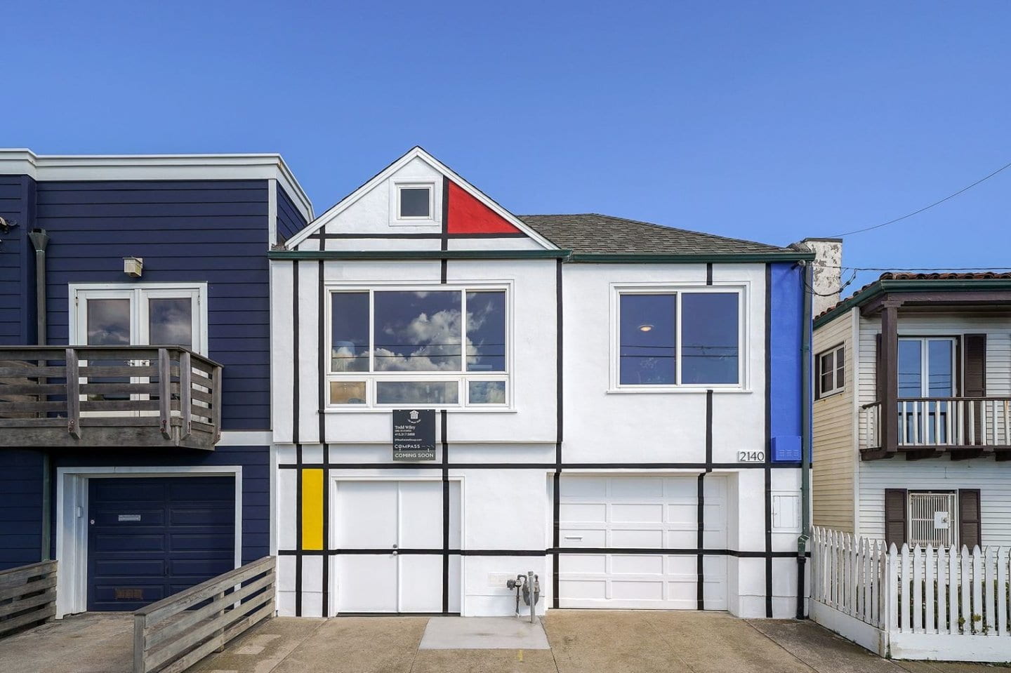
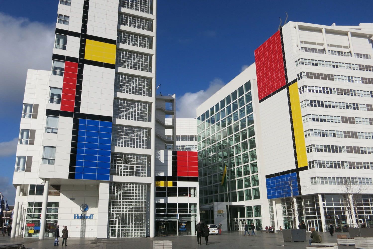
I knew I wanted to include Piet Mondrian because of his revolutionary work in De Stijl and how he expanded into all areas of the arts for example, architecture, interior design, graphics and so much more. Through further research I discovered his success in America and how his work is still being admired and appreciated today. I found that there was a festival held in his honour marking a ‘Century of Mondrian’, to admire how his work has been used for over 100 years in various art fields. I also wanted to focus on Modrian because I had already researched a lot about him for our Group project and this made me want to learn even more.
I then researched his work and found that people design their houses and buildings inspired by his work.
(A landmark home in San Francisco)
(City Hall in The Hague in The Netherlands)
Other artists
I plan to write about a few other artists during my essay that also had a huge effect on art in America after they were exiled during the Nazi persecution. I want to focus on abstract artists that helped to encourage modern art in America. I found two names that stuck out to me.
Josef Albers and László Moholy-Nagy are two abstract artists that I wanted to possibly include in my essay because they have similar traits in common with Mondrian. They all had to leave their careers in Europe and restart their lives in America, further changing the face of modern art in American society.
(Study for Homage to the Square 1964 Josef Albers)
(Yellow Circle 1921 László Maholy-Nagy)
These are the first images that caught my eye when studying their work. I thought both paintings reflected qualities in Piet Mondrian’s work during De Stijl. The colours are similar, the primary yellow, reds and blues, and also the shapes reflect one another for example the lines and squares – just like Mondrians’ work for example:
I think these artists and images will all tie my website nicely together and the primary colours colour palette will look simple yet effective.
Todays lecture was on the history of the internet and where it all started.
What did I learn?
I’m found the lecture very interesting especially the early discoveries such as Douglas Engelbart who developed interface ideas in the 1960’s and invented the first ‘mouse’.
He is considered as one of the early computer and internet pioneers. He also gave the first-ever live demonstration of networked personal computing in San Francisco. Today, it’s known as “the mother of all demos,”. He had a vision of people sitting in front of computer monitors, using words and symbols to develop their ideas, and then collaborate. “If a computer could punch cards or print on paper,” he said, “I just knew it could draw or write on a screen, so we could be interacting with the computer and actually do interactive work.”
I learned that the Interface Message Processor (IMP) was the first generation of rooters that the beginning of the process. The first message was sent and in 1971 the first email programme was created by Raymond Tomlinson which was something like ‘QWERTYUIOP’ which was a test email he sent to himself.
The most well known figure when it comes to the creation of the internet is Sir Tim Berners-Lee who is known for the World Wide Web. In 1990 he created the HTML which is still used today. Then in 1991 he created the first web page, the website can still be viewed today:
I also felt a sense of awe when the lecture was finished as I realised how far the internet has come from just that first simple html web page by Berners-Lee. It also reiterated for me the ever changing qualities of the internet, and how just in a few short years the development of webpages and the design changed so much.
This was the first proper web browser released in 1993 by Marc Andersen and Eric Bina, it is already visible of the progression in just a few short years and this is something to be marvelled at. The small icons and graphic elements are so simple and it is crazy to see the high quality and highly detailed websites that exist today.
When looking up Tim Burners-Lee I found out that he has many famous quotes of his, these are a few of my favourites:
‘The Web does not just connect machines, it connects people”.
“The Web as I envisioned it, we haven’t seen it yet. The future is still so much than the past”
These are very inspiring and a positive way to end my internet history research. It sums up my expectations for this Interaction Design course and the endless possibilities of the Web.
I tried my first wireframes design previously, however the circle images did not work therefore I went back to the drawing board and started over again. I included the primary colours and my updated idea for a black banner for my navigation.
During the group critique on my website I had some changes to make. The advice I received form Kyle and Pauline really helped make my website appear more interesting and professional looking. I had some problems with the entering of text and positioning the text to the left so it is more easy to read but they helped me with that.
They also told me to make sure my title is in line with the navigation for a cleaner look. I did this and realised it made such a difference.I also changed the colour of the heading titles of my essay to co-ordinate with the colours of Piet Mondrians work – the primary colours. I feel like this ties the website together and enhances the overall design, furthermore making it more interesting to read and look at because the all black text was a little boring.
They also advised me to put the title of each image underneath beside the ‘fig’, so it is clear what each image is and who made it etc. I chose a smaller font and to change the colour to a grey so it is still legible but not as heavy on the screen. I think this looks nice against the bold black navigation. This is an example of how the description of each image looks under this piece by Piet Mondrian.
I also took their advice on placement of my overall body copy and the centering of my website. I had to take away the padding I had and then I had to make sure I had text-align centre in my css. I also changed the bibliography to alphabetical order and changed the centering so it can be read from the left. Overall I think the end outcome was successful and I feel like I executed that clean look I wanted to with the black and white theme with splashes of the primary colours throughout.
During the feedback and group critique on my type specimen I came away with advice and tweaks I had to make on my designs. I chose this one for Kyle and Pauline to give me feed back on because I liked it the most.
They told me that the body copy was not in the correct placement and that I should just keep in a simple paragraph instead, near the bottom of the screen. They also said that I should work soon the opacity of my letters and add a mixture of having less opaque and opaque lettering so it doesn’t look as heavy. So I did all of these things and this is how it turned out.
Although I feel like this is an improvement I still was not happy with the end result I felt like it did make the overall design appear less heavy but now I feel like it looks weak and not the look I was going for.
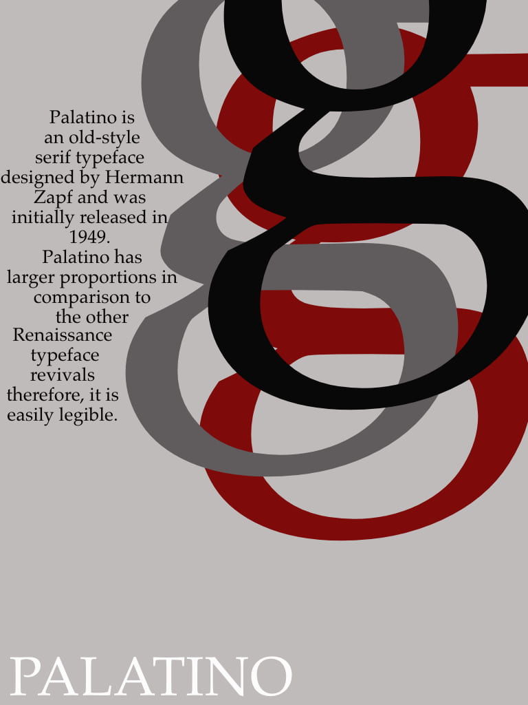
During the feedback Kyle said I should work on another type specimen that he liked and said could be interesting if I work on the opacity. This was the initial design.
They told me to take away the lines and perhaps take into account the beauty of the tail of the ‘Q’ as that part of the letter can be very interesting. I worked on this and this was the end result.
I tired two different tones of autumnal colours for both and varied the placement of ‘Palatino’ which I lowered the opacity on to not make it look so heavy. I think both turned out well however I like the first one where the Palatino is lighter and positioned in the background. working on this design I think I like it better than my grey ‘g’ type specimen.
During this weeks lecture we learned about postmodernism and how it was a climate of cultural change, how it challenged the order and clarity of modernism and it was known as the spirit of the decade.
What did I learn?
I found it interesting that there was a set date recorded for when postmodernism began. It began in architecture when buildings that were based on ‘modernism’ design collapsed on July 15th 1972 at 3.32 pm.
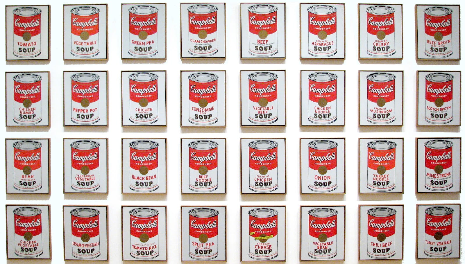
What intrigued me the most during this lecture was the Graphic design Postmodernism. I wanted to look into postmodernism myself and see what artists I could find that interest me. Of course one of the most iconic and most important artists of this movement was Andy Warhol.
Andy Warhol
Warhol was considered a postmodern artist because his artwork portrayed postmodern ideas such as, his lack of originality, his form and his use of celebrity figures.
His work was new and cutting edge, it moved away from modernism and helped to carve the way for contemporary art. He was the leading figure of the ‘pop art’ movement and people were shocked yet intrigued by this new style of art. I felt drawn to his work because I loved the bold choice of colours he used. Warhol blurs the lines between high art and popular culture, as his pop art has both the combination of images and writing, which was new and original at the time.
He was an American artist and film director but best known for his iconic Marlin Monroe and the Campbell soup prints, as shown above. I liked the boldness of his work and almost the proudness, he didn’t care what critics thought of his never seen before work that mocked modernism and the realism it represented.
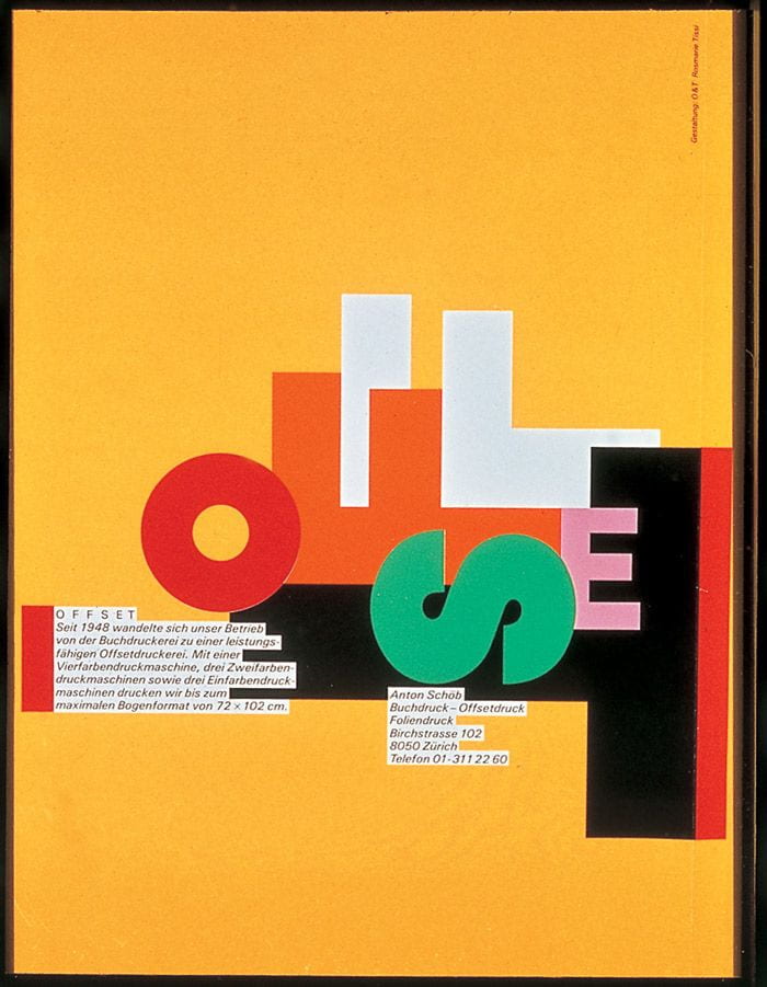
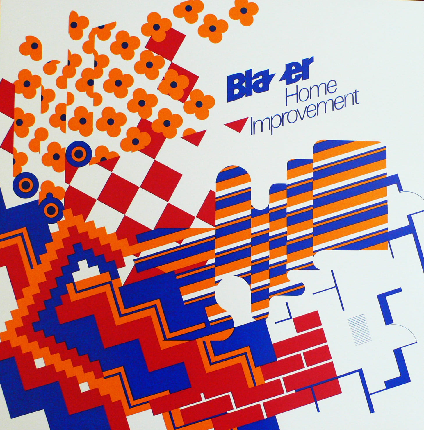
Graphic Design and New Typography in Postmodernism
Rosemary Tissi, Siegfried Odermatt and Stoff Geissbuhler all contributed to this part of Postmodernism and the ‘New Type’ that became so popular, they expanded the international style even more.
Rosemary Tissi
Siegfried Odermatt
Steff Geissbuhler
These three graphic designers all have things in common in their designs and layout – which is that they are all postmodern, they are classed as ‘new-type’ graphic posters. Not one is the same as the next and the layout of each is almost chaotic. There is no set positioning and that’s what makes them postmodern.
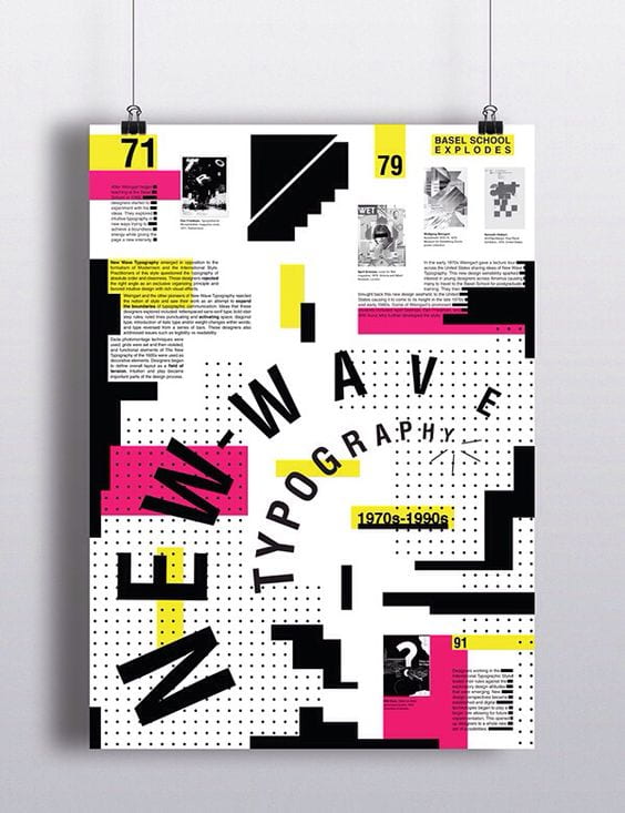
The New Wave Typography
‘New Wave’ or ‘Swiss Punk’ Typography refers to an approach to typography that defies strict grid-based arrangement conventions. Characteristics include inconsistent letterspacing, varying type-weights within single words and type set at non-right angles.
I really like this style as it is so different to all of the other graphic designers styles I have researched previously. Even though these posters were created in the mid to late 1900’s they look like modern day work.
An artist that is known for being a great contributor to this movement in typography was Wolfgang Weingart who created posters under this influence, however he never intended for his own style to be created, ‘the Weingart style’, the ‘swiss’ style was just his starting point. He never followed any rules, he just kept constantly experimenting with typefaces.
‘Weingart was interested in how far the graphic qualities of typography can be pushed and still retain it’s meaning’
New Wave Typography today
I searched on Pinterest to find the most interesting and fun posters that reflect the ‘New Wave Typography’ style or the ‘Punk Swiss style’. These are my favourites that I found.
These stood out to me because I really liked the colour selection and pairing. I also liked how they took such influence from artists like Dan Friedman and April Grieman, there is still that sense of chaos in the type placement yet there is also an addition of modern typeface aswell. I think these posters are such a fun way to show postmodernism in todays world and are a great example for inspiration for other projects such as the ‘Follow the Rhythm’ project for IXD101.