IXD301 – Creating User Personas for the Elements Project

Before I get started on me e-book I have to look at user personas. I love making user personas because it gives me a real insight into the users needs before I start a project. They are very necessary and really helpful and I enjoy making them. I created 4 different personas and went into detail on every one, I added sections like devices so I could see what children can use and are use to. Below are images of the personas I made.

User Personas


Why make personas?

  • To see the users needs and make are they can be met
  • To get an insight into users problems or issues they are having
  • To help make a better product
  • It is great user research
  • To gather information on the user and their skills/ abilities

What did I learn from this?

  • That kids can use devices like iPad, mobiles and tablets compared to computers and laptops, which they don’t use as much
  • I also now know that creating an e-book would help make children more interested in science in class
  •  I learned that the age group this is good for is 8-10 year olds
  • I also learned that an e-book would help give children more confidence in reading/ a more fun approach to reading and learning in class
  • I know what kids are struggling with in class and if they have learning difficulties or not

IXD301 – Digital Wireframing for the E-book

Since I have paper prototyped and sketched out my ideas on paper already for this e-book, I wanted to create a digital wireframe on Figma, just using boxes and text to get a solid foundation for a layout idea. I wanted to do this because layout is so important when it comes to books and I feel like this was good practise for the process when it comes to ixd. I love wireframing, it is one of my favourite parts of the process during every project, the image below is the wireframes I created for e-book.

Why was this helpful?

  • I got to explore freely with shapes instead of illustrations, I could be more imaginative with the placement
  • I also got to see what the order would look like on screen as oppose to on paper, this gave me an insight into the prototype
  • I found it really helpful because I now have something to refer back to when I am designing the book on illustrator

Reflection

I am glad I made these digital wireframes as oppose to just paper ones, because the screen is different. I got to explore what the book could look like and where I could place text and illustrations. I had fun playing around with different possibilities and am glad I have this as a solid foundation for help when I am creating the book. I also enjoyed playing around with buttons and placement because this is something I am going to have to think about a lot since it is for kids, they need to be able to navigate easily.

IXD302 – Pitch Development and Sketches

I wanted to start working on my pitch and more specifically the layout of the presentation since I now know what I am going to include as the content I wanted to sketch out what I wanted the pitch to look like.

I made a spider diagram to get some ideas on what I wanted my pitch to look like for the audience. I kept getting buzz words like clean, fresh and easy to read. I want the audience to be able to read everything on the screen and really take in my information.

What do I want my pitch to be?

  • Easy to Read
  • Clean
  • Legible
  • Mainly images – I don’t the audience to be reading the screen all the time, I want to be saying all of the information
  • Not too long – I don’t want there to be so many slides were I am clicking through so fast the audience can’t pay attention
  • Enjoyable

All of these words came out in my spider diagrams and I wanted to ensure this is what my pitch turns out as. I then moved onto sketching out a few ideas for layout.

Wireframes

I just sketched out some wireframes for a good reference when I am making the pitch on Google slides or Powerpoint. I wanted to go for a slick and simple design. I felt this was the best idea because the images I am going to be using are going to be shocking enough and busy. So I am going for a simple left text, right image layout and a white background so the images stand out.

Reflection

I am excited to get to work on this pitch because I have a nice vision for the layout in my head. I envision a really clean and fresh outcome that will really reflect my app idea –  A Go Green message. I think the wireframes will really help in the creation process and was a great way to get out some different ideas.

IXD301 – Plot Development

Now it is time for me to write the story for the e-book itself. This was scary at first but I knew that I had to bite the bullet and do it. I drew and assembled a series of user flows to help me develop the core parts of the story/plot.

The first thing I had to do was divide the story into sections, so I could digest it and figure out each part. I first started on miro and I made a user flow plot walk through type template (as seen above). This was so I could easily write in the plot form the start, middle and end. I added in boxes along the line containing the plot all broken up. I took this advice from the blog I read about breaking up the plot into sections. I really liked the way miro had a user flow option and thought that it would go great for my plot development.

Why do this?

  • To break up the plot so it wasn’t as daunting
  • To spark ideas as I moved along the line to the end
  • To think about the ending first
  • To help me when actually writing the story, this is something I can keep referring to


The next thing I did was create a user-flow on paper but this time I created multiple boards, to me this was like a helpful story board in a user-flow layout (as seen above). I needed to map out each part of the story in more detail. I needed to know each part so I can then split these into pages for the book. I took a sharpie and began drawing out the boxes, filling them in one at a time, this helped with the creation of the plot as well. I made sure to flow with the pen freely and not be too neat.

Why do this?

  • So I can write the story in more detail
  • To be able to split the plot into pages and decide if anything wasn’t needed
  • So I can look to see if anything is missing from the storyline
  • To follow this user-flow and make sure the plot makes sense to the reader


What did I learn from doing this development?

  • I learned how to divide up plots/storylines
  • I learned how to use templates on miro to help me in my actual work
  • I learned how to develop a plot from start, middle to end
  • I learned to leave out unnecessary plots and stick to the most important stuff

IXD302 – Global Warming & Climate Change Research

To better my pitch I needed to back up what I was saying, so I had to do some research to validate my points. I wanted to research all about global warming and climate change. I took to the news headlines for some shocking sentences that would catch the audiences attention and make them really pay attention to what I was saying.  This images below are the headlines I had chosen to include in my pitch and look further into.

All of these headlines are current which made me want to include them even more, because these are on the news right now so I know it is important to others. I tried to select the headlines with the most shocking language that would really captivate any audience for example hellscape, intense storms and plagues. There was so many other headlines I could of chosen showing me that it is so current every news station is covering it. I wanted to do some more research into this so I then took to more mainstream research,

What is Global Warming?

Global warming is the unusually rapid increase in Earth’s average surface temperature over the past century primarily due to the greenhouse gases released as people burn fossil fuels.Despite ups and downs from year to year, global average surface temperature is rising

What is Climate Change?

IXD301 – Sketching the Superheroes

I began on paper and tried a few different styles, and sizes. I wanted to start on paper because I think that’s the best way to start any illustration. I used a pen and then marker to sketch out the superheroes, I used a marker when I was more confident with my illustration.

My Element choices reminder:

  1. Helium
  2. Fluorine
  3. Water
  4. Titanium
  5. Silver

Sketching some ideas on paper

By iterating my illustrations, I got to narrow down my ideas and it really helped me develop my illustrations. I wanted each superhero to be unique and inclusive so by drawing my ideas over and over it helped me make them just how I wanted. I started with the original superhero – helium – the superhero the can fly. I wanted this superhero to be a boy, I wanted these superheroes to be child like, I wanted this because I want children to believe they are special too and inspire them to be unique, and use their special gifts to be different.
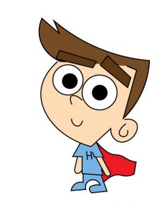
Helium

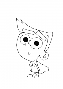
I am happy how the helium boy turned out and feel that he was a good starting point, and the rest will come more easily since have the style figured out. I made these illustrations on procreate. I wanted a strong and simple first character that just has brown hair perhaps. I think that his powers will show in his motion throughout the e-book for example he will be flying or levitating. I like the idea of helium and can’t wait to see what I turn him into when I take this to illustrator or figma.

Fire

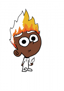
The image above is my sketch for rat enact superhero, Fluorine – the fire superhero. I was exciting to start this sketch because I had a good idea in my head of what I wanted this superhero to look like, I imagined a boy with flames for hair and fire emerging from his hand. I think I did a good job with sketch and think it will be easy to digitise. I can’t wait to bring him to life with colour on screen. I added in some colour on procreate to give me an idea on what it could look like and I think my vision will be successful.

Water

I wanted this next superhero to be a girl, I want this group to be a mixture of girls and boys. I had a vision of a girl who had water coming form her post-tail and her hands. The hardest part of this sketch was trying to make the girl look like then boys in some way – have the same style so the design is cohesive. I think I did a good job because their faces, body sizes and the line sizes are the same. I liked how the water droplets drip from the ponytail and feel this sketch will come to life with colour.

Titanium

This next sketch as the hardest, because I wanted to make this boy really strong looking. This was hard because I still wanted him to look child-like, and similar to the other heroes. I think I did a good job a recreating my idea, I also envisioned him with curly hair and fair skin. I am excited to see how this sketch will turn out digitally and feel the colour will really make a difference.
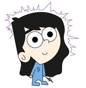
Silver

This sketch was the easiest because I have a real image of what I wanted her to look like in my head before I began. I knew I wanted her to have long hair and have the electric sparks surround her or come out of her hand. These sketches are pretty rough to just give me an idea on paper on what I wanted them to look like before taking them to illustrator. I imagined her having pale skin and dark black hair to make the sparks really pop.


Reflection

From doing this on procreate and on paper I have gotten use to the characters through iterations. I feel I am getting to know them now and am exploring colour, and additions to their powers etc. I really like the freedom on procreate with duplications and colour and tools etc, I found this part of the process really freeing and fun to explore the possibilities. I am now more prepared to take these sketches into figma or illustrator and find out what works and what doesn’t. I think my character development has really come along nicely and I am excited to see my progress.

IXD301 – Digitising the Illustrations

I took to adobe illustrator for this because I find it the easiest to draw free hand on. I scanned in my sketches and went from there. I stared by creating the outlines of them and then filled them with colour. The image is a snapshot of my development throughout this process.

Outlines

The image about is all of the superhero’s together. I feel this outcome worked well and that Illustrator was definitely the best tool for this task. I was very happy with the result and actually considered leaving the illustrations black and white but then thought this was not a good idea because this book is for kids. And kids appreciate colour. The next step for me was adding colour.


Adding colour

The image below is the group collectively, I chose the colour from a kids point of few and kept it simple with colours they are aware of. I kept their suits the same so it looks like they are apart of a team. Then I added various other colours for their powers to brighten them up a bit. I also went for various hair colours like red, black, blonde and brown to give a sense of variety for the group.

What works?

  • I think the overall colour scheme works well, a good addition of the primary colours too
  • The style is cohesive, they all go together
  • The size of the characters, they are proportional to the style and to each other
  • The lines are clean and the right width


Helium

H2O

Fluorine

Titanium

Silver

The images below are the final illustrations for each character (superhero). I am very happy with how they turned out and can’t wait to put the e-book together.


IXD301 – User Stories for Elements Project

The next step before I begin drawing or creating this e-book was to do some user research and create a series of user stories for this project. I made these user stories on some post-it notes asa I feel it works better for visualising and coming up with the ideas. I create 6 user stories, as seen below and love doing this at the beginning of each project to really get inside the head of the user, to make a better product.

I came up with user stories that would ensure that I created the best possible e-book, for example one said, As a user I will remember the interesting characters and relate them to the periodic table, so I can retain the information. This was an important user story for me to make because I really want kids to be able to understand that the characters in my e-book come from the periodic table and making that clear enough for them to digest id very important for me. I want the characters to be memorable enough for the child to retain the information on the periodic table easily and finds some joy in this.

Another one of my favourite user stories I came up with was this one, As a user, I will be able to naviaged through the e-book easily so I can enjoy the experience. This was vital for me as a designer because I want my readers of this e-book to easily be able to flick through the pages, add the book to their library or find the information button easily, so they get the best experience. I want all readers no matter the age to be able to navigate through the e-book with ease, so they keep coming back. I am aware I am designing for kids, so the buttons need to be big and easily locatable for them. These are things I need to think about and consider during the design.

Why make user stories?

  • To see the project through the users eyes
  • To learn what the users needs from the product
  • To learn what the user hopes to achieve when using the product
  • To help me make the best product possible

What did I learn?

  • I learned how to use user stories for creating e-books
  • I learned how to look at books from a kids perspective
  • I learned the most important aspects of my e-book are navigation, having an interesting plot, and making sure the child understands and retains the information.


IXD301 – Writing a Book – Research

I have never written a childs book before so this was very new to me. I have always liked English and felt writing was always a strong point of mine. But I needed to do some research on this, how to actually begin writing a book, so I took to the web to search for good sources for help, for example: blogs, websites on writing books, or even YouTube videos.

I found a few great blog posts on this, as seen above, I found this one on MasterClass.com – ‘How to start writing a book’. This was a quick 6 minute read on some tips on how to start writing a book for the first time. I got some real help from this. These are the tips that was discussed:

  1. Choose a word your want to spend a lot of time in. – This was a nice notion for me because I really like the idea of creating a world and spending time in it for example, a world where superheroes exist. This blog stated that it is important that the author picks a world that will keep them immersed and interested for hours, days or even years because the author is spending the most time there.
  2. Find a story idea within this world that you want to immerse in. – This made sense since the world will contain the storyline of the book. ‘The novel must contain a storyline that is complexing from start, middle and end’. This was important for me to understand because I must keep the readers attention throughout the whole book.
  3. Assemble a cast of characters. – ‘Now that you have a world and a story, figure out who the key figures in this story are. Your main character is obviously the most important among these. A strong main character will have a rich and detailed life that you, as the author, will know about—from personal backstory to character traits to greatest successes and failures. The more you understand your characters, the more you will have to say about them to an audience’. This was a very helpful snippet from the blog, however I am unsure if I want to have a main character, I want my book to be inclusive and since I am. imaging a team I want them to be of the same importance.
  4. Plan your ending. – I was quite shocked at this tip, because I always thought you should start from the beginning but after reading the blog it made sense. ‘Think ahead to the readers experience, The part of the novel that will linger the most is usually the ending, so make it a fantastic one!’. This was really helpful advice and has made me want to create a shocking and fun ending to my book already.
  5. Break the story into acts. – I liked this tip because I enjoy breaking things into sections to make it easier to get through. So a story should be the same thing. This will help me create a book quicker. ‘Classic stories follow a three-act structure, with each act ending on a significant moment in the overall plot. If you pace your narrative to develop progressively throughout the novel, you’ll end up with a book that’s consistently good from beginning to end.’ This segment was from the blog and was very helpful in understanding the tip.
  6. Start writing before you get cold feet. – ‘Planning is great and essential even but the author shouldn’t let meticulous planning put off the actual writing.’ This was encouraging because even though I do like planning I am eager to get writing and get the plot developed.

Was this blog review helpful?

  • Yes. I loved reading this blog and learning from the tips given. I really think it has helped me become prepared to write this story and has given me the confidence to just go for it. I think that the tips were very helpful and it was a great insight to another writers experience with writing stories.

What I learned:

  • To start writing before I get cold feet
  • To create a solid cast of characters
  • To plan an exciting ending for the readers
  • To break the story into acts (3 main acts)
  • To just go for it and not be afraid of it

IXD301 – Cartoon Style Research

Since I am creating a team of superheroes, before I start coming up with design ideas I wanted to explore the world of cartoons, comics, and animation to see what sort of styles are out there. I wanted inspiration from all areas including Disney, comic books, movies and many more.

Things I have to think about:

  • The age group I am designing for, the style can’t be too mature looking
  • Colour, the characters I need to make need to catch a young Childs eye
  • The periodic table element has to be added into the style so that needs to be revered as I search for inspiration for style also

Disney Inspiration

I wanted to look at Disney cartoon shows for this inspiration because I knew that they had some options for me to choose from that would really go with my superhero idea. I am looking for a friendly, child like cartoon style and know that Disney had some great ones.

Phineas and Ferb

Why look at this?

  • I think this style is really fun and the odd shapes of their head was really loved by all kids when I was growing up. This has potential for inspiration, I like the simple vectors and the large eyes.
  • I also like the addition of odd colour hair that really adds to the characters.
  • I like the young feel they have, you can tell they are children. This is what I am going for.
  • I like the amount of detail, not too much, not to minimal.


Gravity Falls

Why look at this?

  • Like Phineas and Ferb the cartoon style used for the characters in gravity falls is young, clean and really fun. This is what I want for my e-book.
  • Children can relate to them because the characters actually look like children.
  • I love the large eyes and how they take up the majority of their faces. This is something I will take inspiration from.
  • I also love the use of colour and how there is lots of block colour used throughout, this is good for kids when watching, there isn’t too much happening.
  • This style seems very versatile, I think that I can make lots of characters look like normal kids but superheroes at the same time with a style like this one.


Kim Possible


This was an 0lder find for me, I wanted to go back into the Disney realm and see what I could find that would be great research and or inspiration for my cartoon style. I then found Kim Possible,

Why look at this?

  •  I wanted to explore this kind of style because it is very different from the previous two I looked at, this style is more detailed and more mature.
  • I like the length of the characters, it is clear they are teenagers and not kids but that comes across clearly.
  • I like the lots of detail added to their faces like freckles and hair details etc.

Why doesn’t this work?

  • This style is too detailed for a childrens book, and an e-book version, I don’t think I will be able to recreate something this detailed on every page.
  • The style is too mature, I want a style that looks more like children, so the kids can relate to and are interested in.
  • Not kid friendly – this is not what I want.


Other Networks Inspiration

I wanted to look at something other than Disney so I looked at networks like Cartoon Network who created iconic cartoons like The Powerpuff Girls.

The Powerpuff Girls

Why look at this?

  • I wanted to look at another style, a different and more out there style of cartooning and this is it.
  • The characters are fun, kid friendly and appear like they are kids themselves.
  • I like the big eyes and how they appear to look heroic just by the design, this is something I want for my illustrations.
  • I like how unique the style is, it is really bold and out there.

What did I learn from looking into these styles and characters?

  • I learned that there are many different styles that can be used to make characters appear youthful, or kidlike that kids can relate to.
  • I also learned that Disney had a range of different styles they used throughout the years as time went on the more modern and slick the designs became.
  • I know I want to go for a younger character design, not mature. I want kids to be interested in the characters.
  • I learned I want my characters to have a normal appearance, like kids but have special features that can make them look like superheroes. I want the kids reading the book to think they can be superheroes too.