IXD302 – Global Hero – The App Wireframes & Development

For this app I sketched out some ideas for layout on my ipad and got straight to work on the elements. I wanted to go into as much detail as I could on the topic of climate change and try to execute my ideas well.

Wireframes 

Starting point/Development

The image above is were I started off at the beginning of the design process. I experimented with blues and whites and a bolder text but I felt it wasn’t working so I decided to try again.


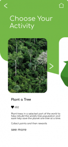
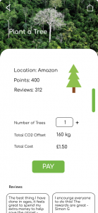
The images below are the screens

Homescreen


Info screen


Activities screen


Planting a tree screen


Rewards screen


What did I include?

  •  A Homescreen
  • A screen on who is global hero?
  • A Rewards screen
  • One screen focusing on one aspect of the tasks – Tree planting

What works?

  • The colour scheme – I really like the way I incorporated lots of greens to relate to the ‘green’ idea of trying to combat climate change. I think the app design is cohesive and really goes well all together.
  • The illustration – I think that my illustrations work really well in the design and really stand out especially the earth. I think the brand really stands out. I also like the images I found and used to show locations for tree planting I think they work well in the app.
  • The usability – I think the layout is really nice on the app and is easy to use. I wanted to go for a simple design that every can use.

What needs work?

  • Maybe I need to work a little more on the buttons and ensure they are all align and can be easily located
  • Text – I struggle with text and feel like sometimes the text i use is too big or small for the screen
  • Idea – I think I could work on the idea a bit more and really simplify it more or cut down on tasks as there may be too much going on in areas, too busy.

Reflection

Overall I really liked designing and working on this app and I loved my idea, I do feel there is elements I could change or fix but I really liked the journey. I think that it is important to be self aware in this work and I am aware that I could improve some areas before the pitch. I think that lots of my app came together well and feel it would be a great way for young people to be involved in a carbon cutting community with one another. I am happy with the outcome and can’t wait to put it in my pitch.

IXD302 – Global Hero – The Brand

For the pitch I wanted to work on the brand a lot. I wanted to audience to believe in my pitch as much as I did and to really envision the brand as I did. So working on the brand allowed me to do this, it also allowed me to put into practise all of the brand work I did last year with Daniel.

Who is Global Hero?

Global Hero is an app that allows the user to learn all about climate change, it gives users a place where they can earn rewards for completing earth saving tasks, for example, Planting Trees around the world or conserve water. The more points you earn for everyday activities the more you can redeem and spend in selected shops.

Why is this a good idea?

Aim

To encourage people to help save the planet while we still can. I wanted to create an app that was needed, easy to use and also had benefits that would actually give people the motivation to go green.

The Brand

Name

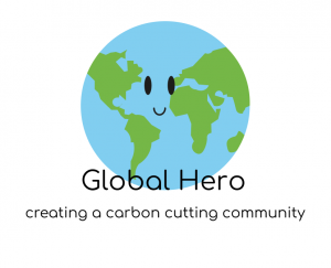
Logo


Together

Slogan

Typeface

Colour Palette

Reflection

I really liked making this brand, figuring out the aim, the logo, the catchy slogan. I think the elements work well and I think they will come together in the app nicely. I can see this app being a real one and the brand makes that happen. I also love the animated earth I think it makes the idea of climate change a little less scary if there is a face on earth. I learned a lot from doing this, for example, I shouldn’t give up, as I was working or starting out nothing was going right or working but I kept going until I found the perfect type and colour scheme etc.

IXD301 – Creating a Digital Storyboard

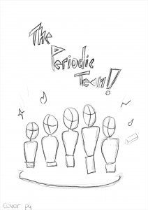
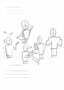
I then wanted to explore my procreate skills once more by creating a story board with some ideas I had for page layout. I had no idea how my illustrations would turn out in conjunction with the text itself so I wanted to explore what that would look like on the page. I made these on an iPad layout and used the apple pen to create the figures. The image below are all the pages I made, and then I selected a few to zoom in on.


Taking a closer look…


I think that this was a great way to look at layout, design and exploring storyboarding. I really liked the way I drew the figures and how they were just forms and not people because it gives it a real sketchy feel. Using procreate gave me lots of options of sketching pens for example pens, or pencils etc.

Why create a storyboard?

  • It helped me realise how my story will flow
  • It let me see any problems that I may not have noticed
  • This storyboard let me see how the pages work together in sequence
  • It let me explore sketching in an experimental way

Reflection

I really enjoyed making this storyboard, I think it really helped me come up with fun ideas when it comes to adding the plot into the pages. I also think it was a great help in my quick sketching skills, as I didn’t have to be too perfect when sketching on my Ipad with the figures. I feel I learned a lot from this task and think that the outcome is really nice to look at or scroll through as a looker. I really like having this addition to my process because I think it is vital to show the process of how I came up with this idea of layout and page order etc. This was my first time story boarding and I really enjoyed the journey, I now know what I have to do and where I have to take this idea, what was missing and what I shouldn’t do.

IXD302 – Competitor Analysis for The Pitch

For more research for my pitch idea ‘Global Hero’ I wanted to do some competitor analysis on what is out there currently for climate change apps or even websites that encompass my ideas like tree donations etc. I was surprised with my findings and am glad I did this as it opened my eyes to the possibilities that aren’t out there but could be for society.

The Website

Tree Nation

I found there was many websites that offered donations for tree building and or charity to help donate to climate change. This was a relief and also I got lots of inspiration from a particular website, this website is called.. and it is a company were the user will select where they want to plant the tree, how many trees they plant and then pay for it. I thought this was a great idea and something I want to include in my own app.


The App

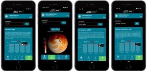
The only app I could currently find on the app store regarding climate change was a solar app that was made my university students in America. This app isn’t about how to help stop but is more of a global insight into how hot the earth is getting, the user can look up their country and see how hot it is getting were they live.  Although this is an interesting concept it is not what I want my app to be but it was interesting to see how little apps there are out there regarding climate change, this shows me there is a gap in the market for one.

What did I find out from this research?

  • There is a gap in the market for an informative climate change app for young people
  • There isn’t much out there as regards apps on climate change
  • There are multiple charities out there contributing to stopping climate change
  • Planting trees is a popular trend people are taking part in to help do their bit for the planet

Reflection

Overall I feel that I learned alot from looking into the few apps and websites that revolved around climate change. I think it opened my eyes to what is currently out there on the market and has given me inspiration as to what I could include in my own product. I feel I could design an app that includes some elements that current organisations offer like planting trees but I can improve the idea and add more. I am excited to see where this goes and what I can accomplish.

IXD301 – E-books and Kids – Taking a look at the benefits and Inclusive Design

I wanted to find out if e-books are even good for kids, or better than books. I wanted to find out from good sources how e-books benefit kids, not only kids that go to school but other kids who have learning difficulties or have health issues etc. I wanted to find out if e-books are inclusive or not.

I found this blog post on a reliable website called ‘Raising Children.net’ link here 

It is an Austrailian site but I found what I was looking for, information on the benefits of e-books for children ages 2-8. Here are some key points that I learned.

The benefits of e-books

  • Illustrations, animations and games can help children understand and recall story details.
  • Music can help children understand characters and plot developments.
  • Dictionaries and narration can help children learn words and expand vocabulary.

Why are e-books good for kids with learning disabilities?

  • They can follow the words while listening to narration
  • They can use interactive features to better understand stories
  • Support kids who can’t read independently by motivating reluctant readers

This website for parenting also gave a few disadvantages of e-books, this interested me because I have not read anywhere about the bad side to e-books, which are,

  • Ebooks can distract children from reading if animations, sound effects and games don’t work well with the text. For example if there is a game available to click they would rather play that than read.
  • Sometimes interactive features make it harder for kids to understand the stories. E.g if the sounds don’t relate to the story.

Another interesting part of this post on e-books was tips to look for in e-books for your child. This was a great insight into what I should be providing because there was a list of things that should be on a good e-book,

These qualities include:

  • well-told stories about things your child relates to or is interested in
  • a wide variety of words
  • funny, engaging rhymes that help your child learn language
  • non-fiction with accurate facts pitched at the right level for your child.

Reflection 

Overall from looking into this brand and website about parenting it really opened my eyes to the benefits of e-books for kids aged 2-8, I learned lots of things about how it is inclusive for kids with learning difficulties. How it interests kids more, encouraging them with illustrations or animations etc. I am also aware of the disadvantages now of e-books and I know to stay away from adding games or too many interactive additions that would take away from the reading. I am glad I read this article and feel more happy with my idea to

IXD301 – Don Norman Pocket Profile – Designer Research

I wanted to look into Don Norman because Kyle said that we all should and Norman is someone everyone should be aware of, but I wanted to become more than aware. I wanted to take a good look at his life, his beliefs in design and his books that he is so well known for, hoping that his greatness would rub off on me a little bit.

Who is Don Norman?

He is known as the father of user experience. Donald Arthur Norman is an American researcher, professor, and author. Norman is the director of The Design Lab at University of California, San Diego. He is best known for his books on design, especially The Design of Everyday Things. Why is he known as the father of UX you may ask well here is why, ‘Donald Norman arguably deserves the most credit as a pioneer in UX, as he is the one who coined the term “User Experience.’ Norman is also a psychologist and usability consultant who’s worked with Apple, HP, and the Nielsen Norman Group which I have previously looked at.

I wanted to understand what design was to Norman and found this:

  • ‘Design is concerned with how things work, how they are controlled, and the nature of the interaction between people and technology. When done well, the results are brilliant, pleasurable products. When done badly, the products are unusable, leading to great frustration and irritation’.

This was a segment from his book ‘The design of everyday things’ and this proved to me that the book itself would be priceless, his knowledge on the world of design as the father of UX is unmatched.

A good design should put an emphasis on utility, not only with beauty’

Within this book Norman also discussed some key points that I must write about, he talked about the Five Fundamental Principles of Interaction.

  1. Affordances
  2. Constraints
  3. Mappings
  4. Conceptual Models [Consistency]
  5. Feedback

‘The design should keep users informed of actions or interpretations, changes of state or condition, and errors or exceptions that are relevant and of interest to the user through clear, concise, and unambiguous language familiar to users”

His book is so well loved and appreciated and for good reason, it should be in the collection of every good designer, Norman strips it back to basics and elevates the world of design to another level. He talks about human centred design and how important it is saying ‘it is a step above user-centred design’, this was eye-opening to me and made me realise just how important human centred design is to all big designers out there. His book ‘The Design of Everyday Things’ is a powerful primer on how — and why — some products satisfy customers while others only frustrate them. Norman also how discusses how design serves as the communication between object and user, and how to optimise that conduit of communication in order to make the experience of using the object pleasurable.

Overall this research into the father of UX has got me inspired to focus on human-centred design and to focus on how design serves as the communication between object and user. I feel like if I always keep in mind the user then I can’t go wrong. I want my products to be enjoyable for the user and a pleasurable experience, like Norman I must follow the principles of design for this to happen, and from reading about his principles I feel more educated and aware of them now in my own work.


IXD301 – Portfolio Refinement

Taking into consideration of what Kyle said and the class said about my portfolio and how it can be improved from the critique I have made the following changes to my website.

My website can be accessed here – Portfolio

What did I change?

  • I added a blue background to my banner image for my case study on my Travel app and think it definitely works better. I am glad I took Kyles advice on this because it made the image pop
  • I also centred the button on the home screen because that was an issue I was having
  • I also fixed some sizing of text and made it bigger so it is easier to read

What can still be improved?

  • Spacing – I still feel as I add more case studies and more projects to my portfolio, that I will have to continue to alter and change my spacing/padding of text. This is something I struggle with and think that practise will help me. I always leave text too close to the edge so this is something I need to work on
  • Contact me page – I feel that my contact me page is not really needed so this is something I could consider removing but I wanted to leave it in because I wanted to make it as easy as possible for people to contact me and get a hold of me
  • Images – I could be bolder with images, I feel that I tend to play it safe when it comes to adding images and I leave them too small or too squished with other images. I should try to be more bold and go for bigger full width images for my work

Overall I think that the advice really helped and it was great to get the feedback from the class as well as Kyle because in the end their help has made my portfolio better. I really enjoyed making the changes and having them work was really satisfying. I am really happy with the end result and feel that my brand really shines through and shows my work well.

IXD302 – The Youtube Pitch Review

I wanted to look into the pitch by youtube for when they were pitching the idea of it, Daniel showed us in class and I wanted to take a closer look myself at the individual slides they used. I thought this was good inspiration and research for my own pitch and great insight into what such a huge pitch looked like back then.

Content

  • Company purpose
  • Problem
  • Solution
  • Market Size
  • Competition
  • Product Development
  • Sales Distribution
  • Team
  • Metrics

I was surprised to see that there was not that many slides and that the content on each slide was limited. This was a shock but I understood because:

  • The pitch was easy to follow
  • Got to the point
  • Hit the major and most important points
  • Informative

The slides that most intrigued me were market size, competition and metrics. These are things I have not looked at yet for my own pitch and I think that those are the sections I need to look at.

Market size 

This pitch talked about how digital recording technology is cheap enough to mass produce for the first time. They also mentioned how it is now integrated into existing consumer products. Basically meaning the market is there some a site like Youtube because it will be available for everyone now. The slide also mentioned how broadband in households which makes the internet available for videos. Proving there is a big market for this.

Competition 

I was interested to see what youtube had to say about the then current competition at the time when this was launching. In the pitch they listed that their competitors were Our media.org, Open media Network, Google video, Vimeo, Dailymotion and Putfile. I have not heard of most of these things and it was really insightful to see what was popular back then for video access. I plan to do competitor research into my pitch and really see what is out there in regards climate change apps.

Metrics 

I was unaware of what metrics were but it made sense when reading this pitch, it was when it was released and how well it is already doing in the market, as it is surpassing all existing competition. I feel I will not include this in my Pitch because my product will not be being released it is just pitching the idea but it was interesting to see this in the youtube pitch and see when it was released etc.


Overall thoughts on the Pitch

There was a lot of text in this pitch, well more text than images than I thought there would be. But it made up for it because the text wasn’t too long or too boring. It was easy to follow and it was straight to the point. It was really informative and interesting because I had never seen this before. I feel I learned a lot of what to put in my pitch now and to always get to the point and only put in relevant information.

IXD302 – Week 10 – Proof of Concept & Initial Research

This weeks lecture from Daniel was all about research, mainly user research and how we should be doing it, methods we should be using and the reasoning behind all of this. It was great to get this detailed summary of all that encompases user research because I feel much more aware of what methods I could be doing when it comes to this. Daniel did say that he went into a lot of detail on this and we don’t have to do all of the methods, focus on a few that is relevant. This was reassuring because there was a lot he mentioned and I thought there is no way I could do all of this for my projects.

He firstly talked about a book recommendation that I intent on reading, I love finding new ux books and reviewing them, it is one of my favourite research parts of each project. The book is called UX for lean startups by Laura Klein.

Daniel then went on to say that user research is knowing your audience, he then listed a three point journey that we all should be taking:

  1. Systematic investigation
  2. Establish facts
  3. Draw conclusion

These were the three markers we should be hitting during the research we should be completing for projects. Daniel then went onto talk about Qualitative vs Quantitative. This was a new concept for me as I have never done this before when it comes to research but Daniel said on the research journey you need both and then demonstrated in a diagram including these words. This made it easier to understand and I can visually see where I should be at the start of my project. This was helpful and a new plan to follow for me.

Daniel added that research should be done throughout the length of the project even at the end. This was good news to me because research is my favourite part of the whole process sometimes. I will be ensuring I do this at the end of every project too, to make sure my outcome is the best it can be. The next part of the lecture was Daniel going through the basic steps. I went on miro and write the steps out onto post it notes:

The next part of the lecture was all bout Bias and he explained how this needs to be left out when resreach is involved for it to be fair and right. He gave some examples of bias,

  • Cognitive bais
  • Group thinking
  • Selection bias
  • Confirmation bias
  • Cluster illusions

and many more, this was interesting to me because I had never thought there was so many types of bias to consider when conducting research but they all make sense and I will be ensuring that I do not take part in any bias’ when I conduct my research.

Daniel then went into some detail about interviews and observations as a part of research, this is something I haven’t done yet for research but I plan to for my project this year. He gave a list of reasons why this is a good idea to conduct:

  • Challenge assumptions
  • Gather user requirements
  • ‘get out of building’ opportunity – to step away from where you are creating or analysing research
  • Goals, behaviour context
  • Motivation

Online surveys was the next method Daniel talked about and he listed the following exampling why it is good to do:

  • Easy way to gather user requirements
  • Powerful
  • Insightful
  • Can reach a wide group of people


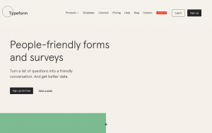
He then gave some examples of good online surveys that we can use for example, Typeform and survey monkey. This was a great help and something I will be doing.

Card sorting was the next method Daniel discussed with us on user research. He gave some bullet points as to why we should be using this method:

  • Qualifiable
  • Helps define structure and priorities
  • Helps understand user experience

This is something I haven’t done but the images Daniel showed made me want to because I love anything post-it note orientated and seems like a fun way to break up research and information.

Analysing the research 

The next part of the lecture was all about analysing the research collected, Daniel talked about triangulation, and showed a diagram explaining this. Once I seen the image I then understood, it is to see if there are any common findings within the research or user testing etc. This is a unique and new way of sorting through the research and something I have never done before. I am excited to try this.

User Personas was the next part, Daniel said that these can be short or long depending on how much information the client had offered to give, but I have looked into these before and know about them. Daniel added they are a great way to get to know the needs of the users and really lets a designer figure out what the user should get out of the project etc.


Daniel also talked about empathy maps. This is something I want to do and am going to do soon for both projects because I think it is similar to the user personas but is a bit more personal and assisting to the user, it will allow me to fire out the users needs and really empathise with them.

Affinity Diagrams was the next method Daniel talked about. He recommended the k’s method and this also is new to me and looks to be an interesting way to sort through research and break it up so it is easier for me to understand it and move forward with it. The diagram on miro really interested me.

Reflection 

Todays lecture was very detailed and a lot of help. Research is one of my favourite parts of any project and learning about user research has really helped me understand the importance of it. I also learned why all of these methods are so important and imperative for the user and myself. I learned various methods and how there really are endless amount of ways to collect user research today wether it is online or in person. I also learned lots of tips and reminders from Daniel throughout fro example, call people people, do not referent to them as humans, people are not data points, avoid leading questions, use plain English. These tips were really informative and I will be sure to take them on board. Overall I really liked this lecture and learned a lot from it, it was great to learn new methods of user research and go over ones I already use as a refresher.

IXD301 – Week 10 – The Art of the Pitch

Todays class was all about presenting and the ‘art of the pitch’. This is where Kyle talked us through how we will be presenting all about our modules in a few weeks. He went through what makes a good pitch, how to present and how not to be nervous. It was a great lecture that was really helpful as I have to present a pitch in Daniels class soon too. The first thing Kyle talked about was how presenting is like stories and when presenting you need to have a good story, you need to have good planning.

He then went through a list on essentials:

  • You must be prepared
  • A good story – Add an anecdote, he then lead on to say all good stories have a start middle and an end
  • It must be coherent and simple
  • It must be memorable

Kyle then went into showing a good example of speakers and he showed JFK – He said that this president is a good example of a presenter, good story teller. Knew his audience, used simple language, this is something I should be doing too.

Give yourself a structure when creating this prevention, Kyle said that the beginning is very important,  people want to know where you are going. E.g What you will learn etc. The middle, tell the audience how you sketched, wireframe, mockup etc, How long did it take etc. – the structure and the chunk, breakdown of project. Then the end – what was covered.

Is it tweetable? can it be grasped by the audience. This is a concept I had never thought about, if it is short enough to be tweeted.

There must be a key point to a presentation. When Kyle went into this I wondered what my point is or what it will be. I then thought that the point to my presentation is showing my work.

Plan the narrative. – plan on paper in boxes etc.

Operas and overtures 

  • Say what your going to say
  • Say it
  • Say what you have went through

Sketch out content – it can be messy. Rough cut and then move onto keynote or power point etc.

Know what your talking about, know your material and your audience. If you don’t understand it don’t include it. This was helpful because sometimes I feel I would add too much or talk about too much in presentations in the past. Kyle then added that we should give the story form, a reason.

Slides and alternatives 

Why use them?

Slides divert gaze, and they are a tool for showing what you are saying. Helps the audience understand what you are talking about. Less is more with slides, they are there to support you not the other way around. Kyle then went on to talk about google, apple events and how they have great slides in the background – their slides are slick, not text heavy.

Complicated is evil, there are slide crimes:

1. too much text

2. a million slides

3. Spelling mistakes and poor grammar

4. Line things up neatly

Visualise when you can was a good point he made also, he showed some good examples on what to do and what not to do so this was helpful.

Supporting material can be used, when Kyle talked about this I thought that I would probably not include this in my presentations because I am just showing my work on screen and I don’t think have anything to give out to Kyle when he is watching, perhaps a sample of my book in written form for the elements project.


Use rhetoric – it can be learned (Obama used to do this very well), repetition, humour, alliteration. metaphors etc. I remember learning about this at school and watching previous speeches and thinking Obama was such a good and captivating speaker, this is something I admire to become.

A few final things he talked about were the following:

Confidence

  • practice, practice, practice
  • Breathe the Room

Delivery

  • clear
  • slow

Extra tips

  • Practice is everything!
  • Show your enthusiasm- this shows, and breathes confidence
  • consider personal appearance
  • introduce yourself
  • use a script or not?
  • for a shorter presentation don’t – don’t read your presentation.
  • use your hands
  • use your eyes
  • humour – with caution
  • keep it visual
  • no pressure , Kyle is marking the work not the presentation
  • no sounds
  • no videos

Kyle then gave some examples of who does presentations well and he said Steve Jobs does a great jobs. So I am going to look up the iPad launch, because of Kyles advice that Steve jobs is a great example of a presenter and slides. I am excited to review this or watch his ted talks because watching talks/presenters is something I love to do for help.

Finally Kyle talked abut when we have to present  – Week 13 – present final module work from the semester. I am excited to get started on this and create my slides, practice and become more confident in my presenting skills.

Reflection 

I learned a lot from this weeks lecture and in combination with Daniels lecture on pitching I feel so much more ready to tackle my upcoming pitches. I learned about some good examples of speakers or story tellers that do this for a career, so I am going to look them up to research more. I learned about what slides to use when presenting and what not to include on them, I found this part very helpful because making presentations is something I haven’t done a lot of so am new to what not to do or show. I also learned lots off tips on how to relax before a presentation from Kyle, like breathing and going into the room alone first to breathe the room etc. This was very helpful and I left the lecture remembering this. Overall I am glad Kyle went over this and am excited to start putting my slides together of all of my work this year.