My final design poster
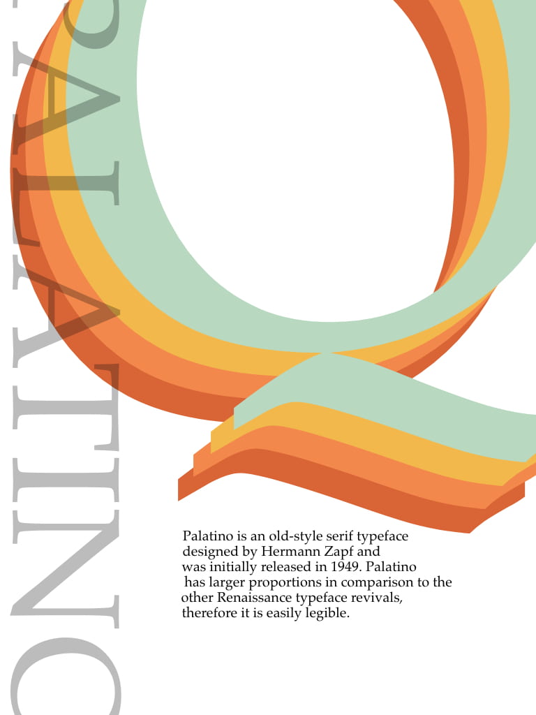
I went with this design because I really liked the choice of colours and I also liked the way the ‘Palatino’ is slightly cut off at the sides. I used a lighter opacity so it doesn’t look as heavy.
Blog posts about my progress:
- IXD102 – Typeface Specimen
- Inspiration for Typeface Specimen
- Typeface Specimen Sketches
- Digital Typeface Specimens
- Typeface specimen final designs
- Type specimen feedback
What I liked about this project:
This was one of my favourite projects because I got to work with lots of different ideas and develop so many of them. I really enjoyed making my sketches come to life on adobe XD. I also liked researching all about my typeface and finding out the history behind it. Another process I enjoyed was the progress from start to finish and the process of elimination and trying to figure out what works and what doesn’t work. Finally I really liked this project because I felt there was an equal importance on sketching and digitalising my designs because without them the final product wouldn’t be possible, and I always enjoy getting lost in my sketchbook.