In addiction to the John Baskerville and history of type exercise we were given a short exercise to practise css further. We had to take three of the same pieces of text – version 1-3 and make each one a different type. I chose ‘libra Baskerville’ , ‘open sans’ and ‘lato’ for my three choices and this his how they turned out.


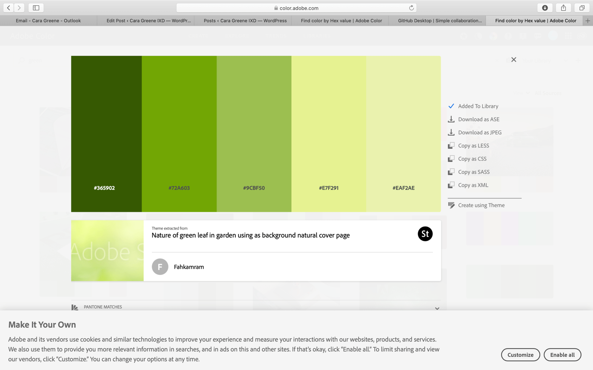
I chose this green colour because it caught my eye as I was browsing through Adobe colour. I thought that this earthy green tone would go well with the black and grey text.
I think all fonts work well and I especially like the drop cap in the first version ‘Libra Baskerville’. I really like the tale on the ‘J’ that this from cap possesses unlike versions 2 and 3 that have more modern and sleek looking fonts.
What I could improve on:
Looking through this exercise again if I could have done something differently or the areas in which I need to improve on regarding CSS is fonts. I think the fonts ‘open sans’ and ‘lato’ are too much alike. This got me into researching both fonts and found lots of blog posts and online discussions on designers websites on ‘Open Sans vs Lato’. Both fonts are so alike but there are slight differences that encourage discussion for which is better.
However I think that to show a wider range of this body copy I should have looked for a three very different fonts. Overall I enjoyed this exercise and the learning skills that came along with it such as the introduction to the drop cap and the addition of breaking up each version with the black line. I am always discovering new tips and techniques when practising a new css exercise and I am finding it easier each time I use it.