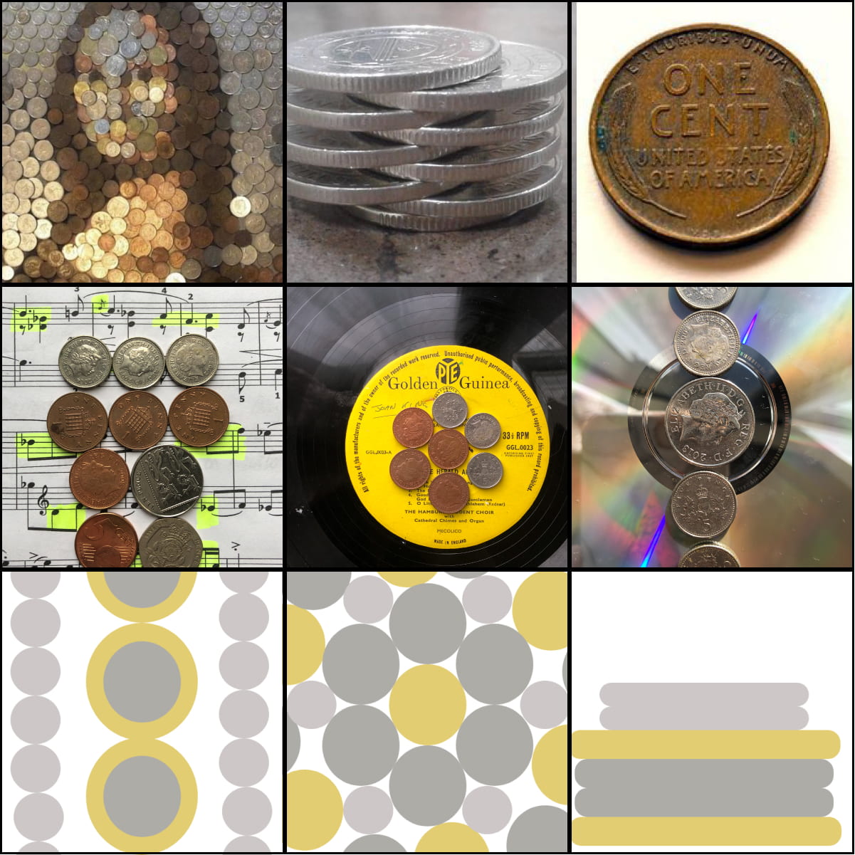
Revisting my 9 iterations I knew I wanted to illustrate my ideas on sketch or adobe XD was I wasn’t sure how I would start. I wanted to go for a pastel like theme like most of my other projects. My narrative was the point like composition of three items, coins, cd’s and records. So in order to illustrate them in some way that was interesting but still related to my initial 9 iterations, the pictures I took myself and my first sketches I made on figma. So, this was what I had to work on and my started point – my first design.
I liked some of the compositions in this but I didn’t like the bronze colour. I feel like it was too overpowering, bringing too much attention to the ‘coin’ aspect of these iterations. So I took to the drawing board, my sketchbook, and began to doodle interesting colour schemes and compositions that would hopefully spark some ideas for me.
Development
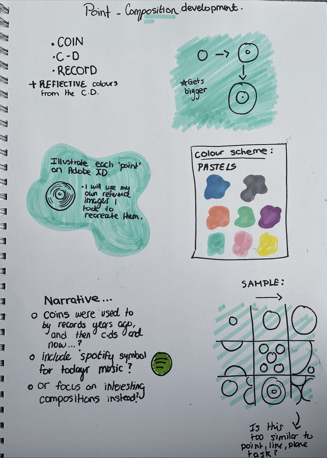
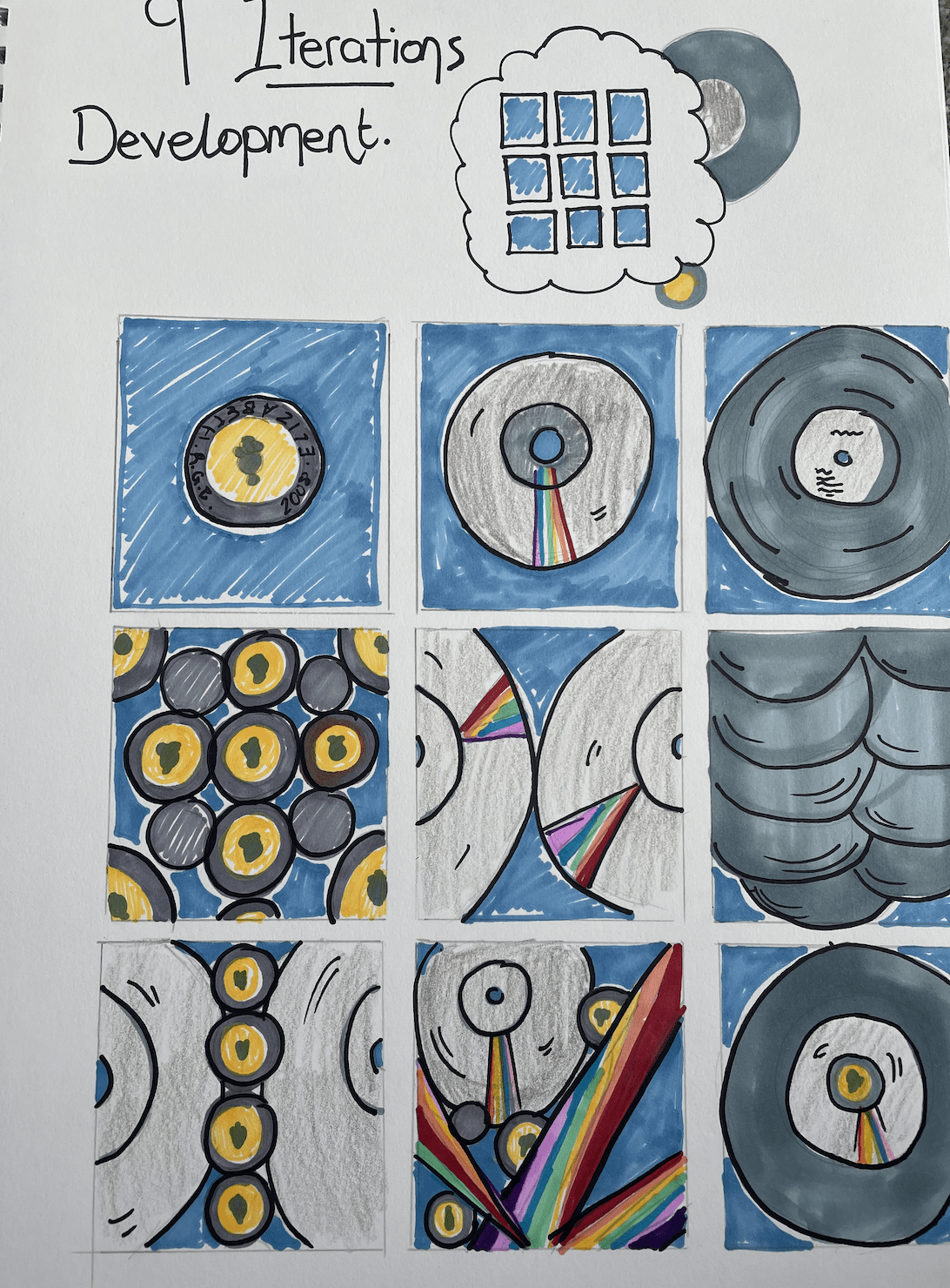
These are my sketches of how I think my designs should look digitally and how I feel like the compositions and placement should look in each square. I also sketched out a colour inspiration and overall design page including what this task entails for my 9 iterations, including my reasoning behind the narrative and why I chose these images to recreate.
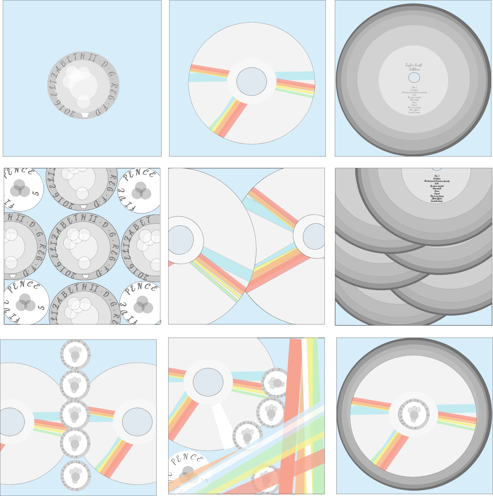
This is what I came up with. I used adobe XD to illustrate my designs into a digital design and I think it turned out well. I feel like the compositions really come across and it is easy to depict what the drawings are. I specially like how the rainbow reflections from the cd’s turned out digitally, I created larger and more spaced out spectrums of colour to create a chaotic combination for on of the images. I also added my own favourite album currently as the record and I had to list the songs in a small text on the front of the record. I feel like this made the record look more realistic and I liked adding my own touch to the records.
The first hand images I have of records are old-style records of Hymes or classical music so I really enjoyed making the records in this design more modern and my taste in music.
I feel like my illustrations appear realistic in an animated sort of way and I feel like the colour palette I chose, pastels, work well and create a delicate effect.