During our John Baskerville assignment we were asked to use information given to use an d to recreate the html and css tasks on our own with the ‘History of Type’. I liked this process because it made me practise the skills I had been learning in class.
I chose a different colour to my John Baskerville piece because I wanted to experiment with adding different colour with CSS.I chose a blue, green and orange colour scheme which I think worked well and was complementary. I found it tricky trying to transfer the same skills I learned from the Baskerville sample but with practise it got easier as I kept going. I enjoyed doing this project on my own as I felt a senes of accomplishment at the end of it.
The first versions were similar to the Baskerville project it was adding the simple html and the standard CSS and choosing the colour.
I chose a more modern typeface in comparison to the Baskerville piece I went for a more traditional type but for this one I wanted to reverse the concept. Since the topic is ‘History of Type’ I didn’t want to go for the stereotypical traditional old-style typeface to match, I wanted to do the opposite. Therefore I went for a sans-serif and more modern approach. I think this works well as it is easily read and works nicely with the colour palette also.
There was a table to be added just like the Baskerville task, however this table was different and more complex than the Baskerville one. Therefore, it took longer to input the information in the HTML. There wasn’t just two columns, so I did find it more tricky and if one section was incorrect then it would mess up the whole table. But when I got it right it was satisfying to see a correct table. I like the colour I chose the earthy green complements the blue header well I think.
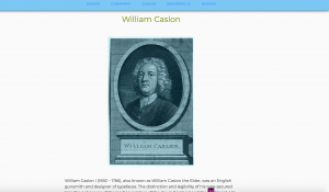
To add images to this project I wanted them to stand out and be different from the Baskerville task, not just the plain image. So I want to take them to photoshop and experiment with colour, hues, size, and perhaps try different positioning or crop out the portraits and place them on a different background.
I went with a blue/green tint over each image to tie in with the navigation, I tried green and orange but they didn’t look right. Blue just seemed more complementary. I like how the overall outcome turned out and feel like this ‘History of Type’ project helped my CSS and HTML skills improve greatly. I found it really enjoyable to put into practise my skills I learned from the John Baskerville project.


