During this weeks lecture we learned about postmodernism and how it was a climate of cultural change, how it challenged the order and clarity of modernism and it was known as the spirit of the decade.
What did I learn?
I found it interesting that there was a set date recorded for when postmodernism began. It began in architecture when buildings that were based on ‘modernism’ design collapsed on July 15th 1972 at 3.32 pm.
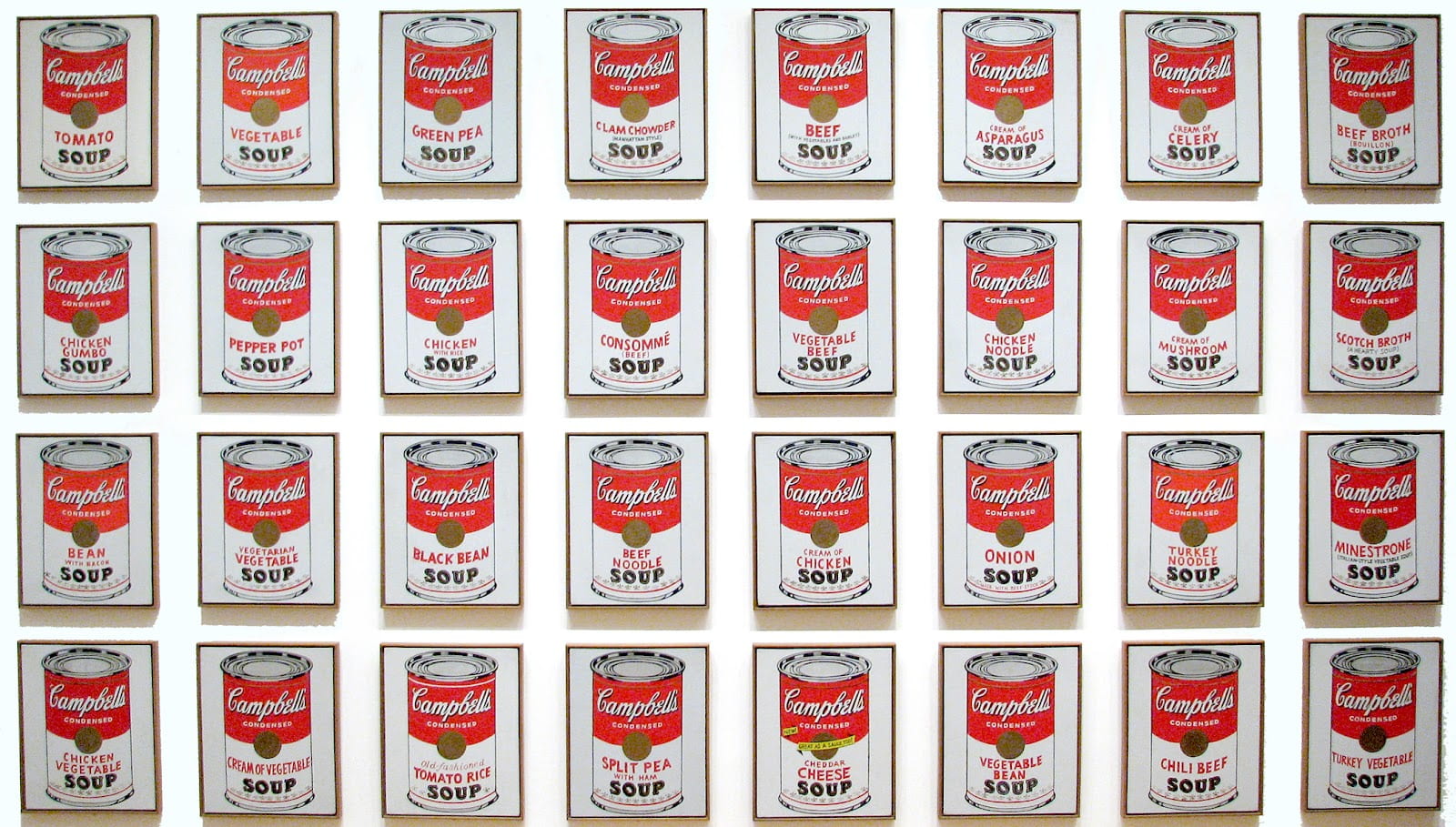
What intrigued me the most during this lecture was the Graphic design Postmodernism. I wanted to look into postmodernism myself and see what artists I could find that interest me. Of course one of the most iconic and most important artists of this movement was Andy Warhol.
Andy Warhol
Warhol was considered a postmodern artist because his artwork portrayed postmodern ideas such as, his lack of originality, his form and his use of celebrity figures.

His work was new and cutting edge, it moved away from modernism and helped to carve the way for contemporary art. He was the leading figure of the ‘pop art’ movement and people were shocked yet intrigued by this new style of art. I felt drawn to his work because I loved the bold choice of colours he used. Warhol blurs the lines between high art and popular culture, as his pop art has both the combination of images and writing, which was new and original at the time.
He was an American artist and film director but best known for his iconic Marlin Monroe and the Campbell soup prints, as shown above. I liked the boldness of his work and almost the proudness, he didn’t care what critics thought of his never seen before work that mocked modernism and the realism it represented.
Graphic Design and New Typography in Postmodernism
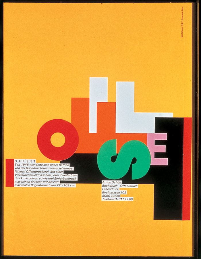
Rosemary Tissi, Siegfried Odermatt and Stoff Geissbuhler all contributed to this part of Postmodernism and the ‘New Type’ that became so popular, they expanded the international style even more.
Rosemary Tissi

Siegfried Odermatt


Steff Geissbuhler
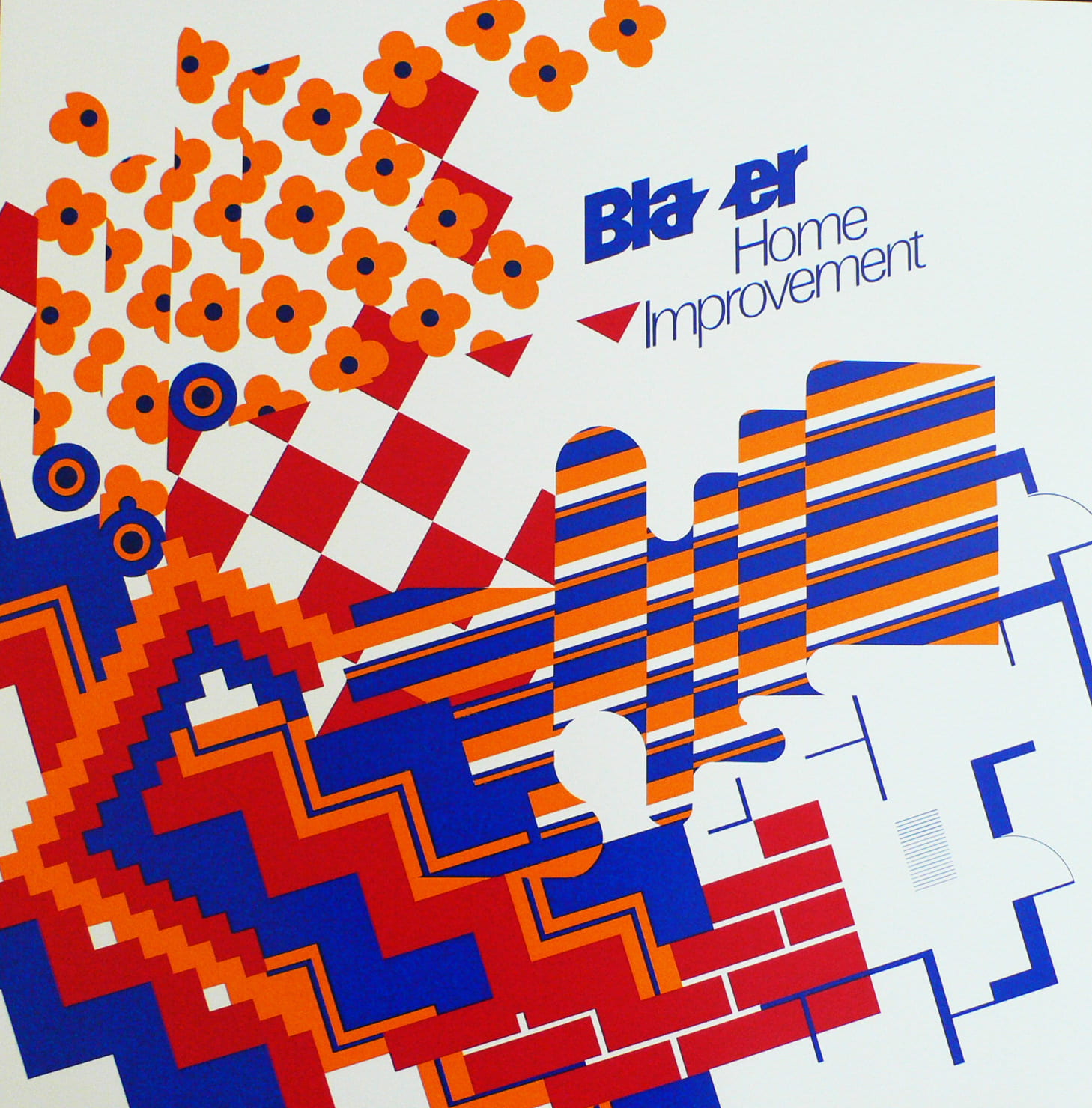

These three graphic designers all have things in common in their designs and layout – which is that they are all postmodern, they are classed as ‘new-type’ graphic posters. Not one is the same as the next and the layout of each is almost chaotic. There is no set positioning and that’s what makes them postmodern.
The New Wave Typography
‘New Wave’ or ‘Swiss Punk’ Typography refers to an approach to typography that defies strict grid-based arrangement conventions. Characteristics include inconsistent letterspacing, varying type-weights within single words and type set at non-right angles.
I really like this style as it is so different to all of the other graphic designers styles I have researched previously. Even though these posters were created in the mid to late 1900’s they look like modern day work.
An artist that is known for being a great contributor to this movement in typography was Wolfgang Weingart who created posters under this influence, however he never intended for his own style to be created, ‘the Weingart style’, the ‘swiss’ style was just his starting point. He never followed any rules, he just kept constantly experimenting with typefaces.
‘Weingart was interested in how far the graphic qualities of typography can be pushed and still retain it’s meaning’


New Wave Typography today
I searched on Pinterest to find the most interesting and fun posters that reflect the ‘New Wave Typography’ style or the ‘Punk Swiss style’. These are my favourites that I found.


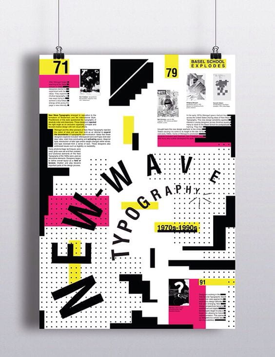
These stood out to me because I really liked the colour selection and pairing. I also liked how they took such influence from artists like Dan Friedman and April Grieman, there is still that sense of chaos in the type placement yet there is also an addition of modern typeface aswell. I think these posters are such a fun way to show postmodernism in todays world and are a great example for inspiration for other projects such as the ‘Follow the Rhythm’ project for IXD101.