What are the key characteristics of International typographic style (otherwise known as Swiss Style)
- Asymmetrical organisation
- Mathematically constructed grid
- Objective photography and copy
- Sans serif typography
- Flush -left/ Ragged -right
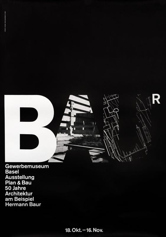
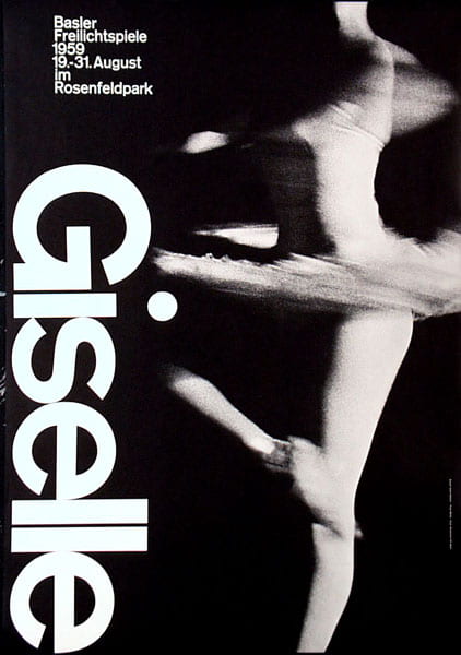
The international typographic style was introduced post war, it was a response to the period of the war, a reflection of culture and society. Artists used this style to change the way posters or books, anything that included typography, was designed. To introduce a different, unique layout that would catch the eyes of the reader. The Swiss Style stressed a belief in an absolute and universal style of graphic design.

Emerging from the modernist and constructivist ideals, the Swiss Style can be defined as an authentic pursue for simplicity – the beauty in the underlines of a purpose, not beauty as a purpose in itself. The principle “form follows function” became a battle-cry of Modernist architects after the 1930s.
Some of the most influenced artists during this ‘Swiss Style’ take over were Emil Ruder.
Emil Ruder
Ruder joined the Basel school of design and became an important figure in type, he created these ‘Swiss Style’ books of typography. He used the grid structure, like many artists did at this time to bring type and illustration together.


Ruder used different fonts and weights but uses the same ‘x’ height for each, so his type becomes different yet consistent. He created a balance with his work, a balance that was never seen in type before. The grid idea was used throughout the ‘Swiss Style’ fad.
The ‘Berlin’ book had a huge impact in the world of typography and was published in many languages such as French, English and German. It played a pivotal role in spreading and projecting the ‘Swiss Style’ to the world. Also Ruder was a significant member who helped establishing the International Centre for the Typographic Arts, New York (ICTA)
Amin Hofmann
Hofmann was a Swiss Graphic designer who pushed the boundaries of the Swiss Style. He done this by adding imagery to his type posters, this wasn’t usually seen at this time.
Hofmann collaborated on many projects with Emil Ruder in 1947 and onwards, their successful teaching methods awarded them with somewhat of an International reputation. He too taught at the Basel school of art and wrote a book on his findings, outlining his philosophies and practises like Josef Muller-Brockman and Emil Ruder did. His ‘Graphic Design Manual’ he wrote in 1965 is still used and favoured by many graphic designers today.
He is well known for his posters that have been widely exhibited as works of art in major galleries such as New York, such as his theatrical posters are some of his most loved as they capture the dramatic experience of watching and listening as it’s displayed in the enlarged grainy photos of an ear and eye. His work is recognised for its reliance on the fundamental elements of graphic form such as – point, line and shape. I feel like his work is easy to take inspiration from because simplistic forms like line, point and shape never go out of style they are always timeless when it comes to design. When I began researching him a lot of his work reminding me off the work I did at the beginning on IXD101 -Point, Line and Plane, so it was nice to see how simple shapes can become beautiful posters or book covers.