Web Design Inspiration and Wireframes

In order to research for my website essay I looked at several websites and found some interesting and visually pleasing ones, both layout and colour palette.


Ustwo


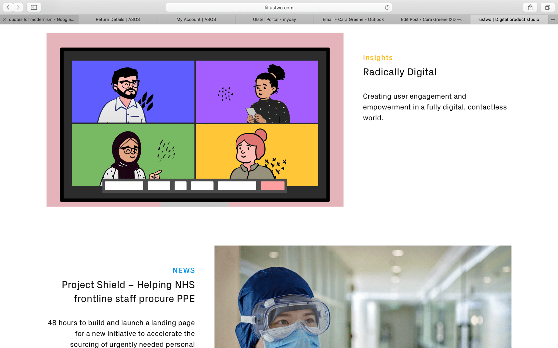
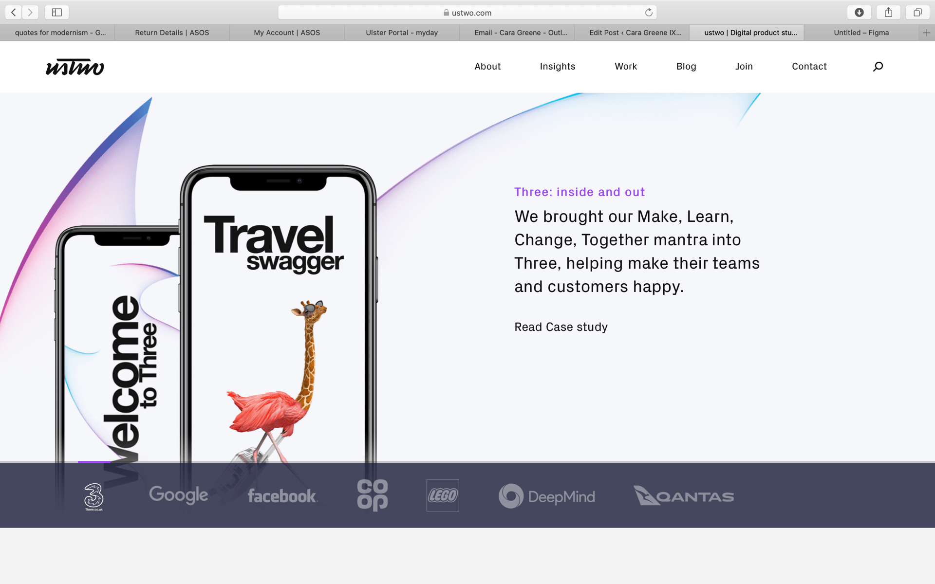
They design and build digital products, services, and immersive experiences. They help clients boost their own digital culture and capabilities. I liked the homepage of this website and I liked the choice of colour and how the detailing in the background is almost moving. I also like the alternating text and images, it makes the website more exciting to read.


IDEO


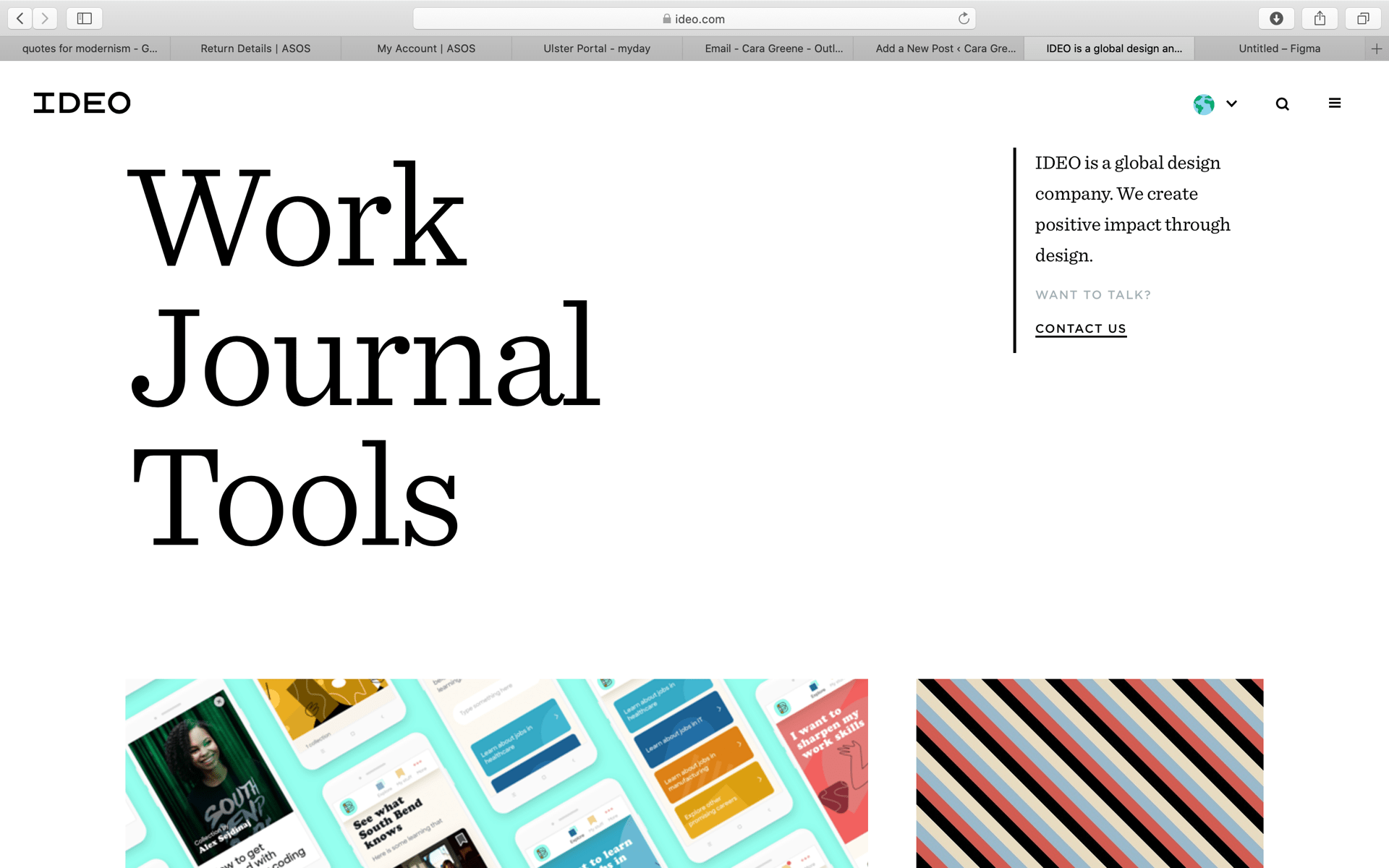
The next website I looked at was IDEO.com. It is also a digital design company and what I particularly liked about this one was their choice of font and the circle images instead of rectangles. The circles make the website look interesting and draws attention to the images inside the circles. The placement of the lettering at the top right corner is small but informative, it informs the viewers on what this company is and how to contact them. The size of the text is important and this website uses large lettering for ‘work, journal and tools’. This is because this information is important and the company wants the viewers to click on the words.


Rainforest Guardian

I came across this website while looking for new and innovative websites that are different than others. I was pleasantly surprises when I clicked into it because as soon as the page opens the viewer is transported into the rainforest. With moving 3D graphics this website literally shows you moving through the forest. I have never seen a website like this and I loved roaming through it. This is a non-profit organisations that uses interactivity to bring awareness to the cause and try to reach volunteers. So not only is the website truly beautiful, it is a heart warming company that wants to save the rainforest. I like how the birds-eye view of the rainforest takes up the full page and the rest of the buttons and resources surround it. The iconic forest green colour scheme ties in the earthy tones nicely. Although this interactive experience would not be practical for my website I still like aspects of this website and plan to incorporate some into mine.


Guillaume Tomasi

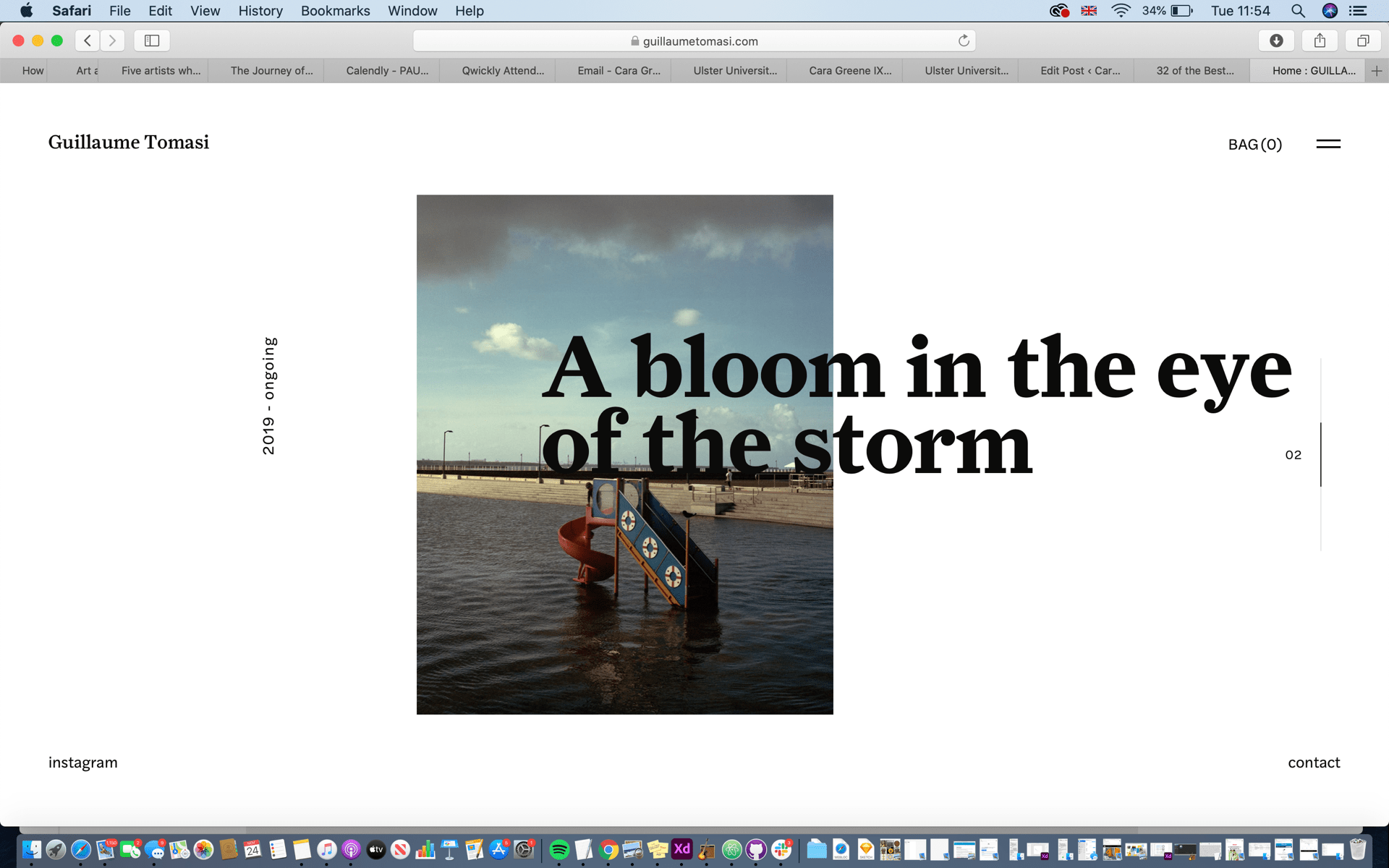
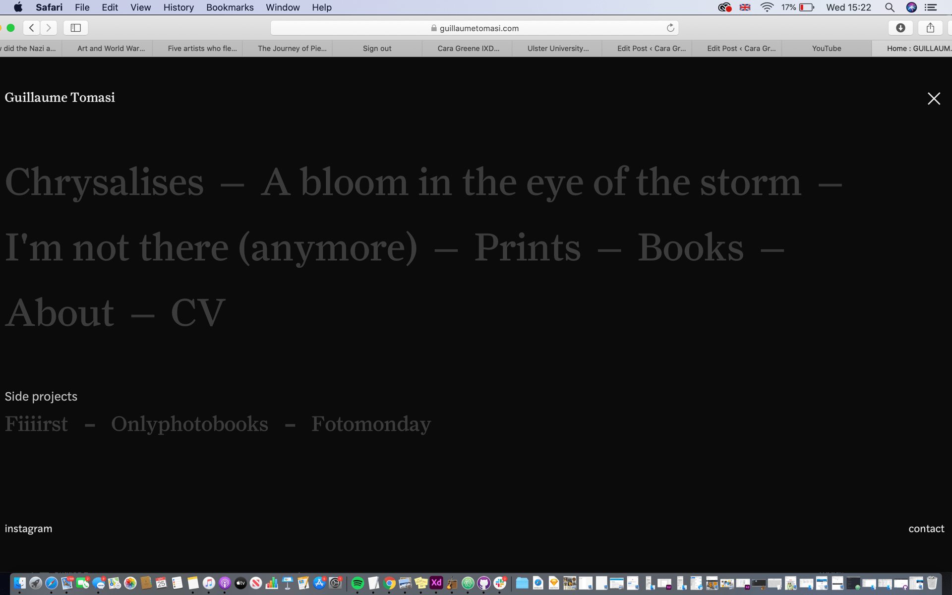
This is a photographer in Montreal, his portfolio is his website and was made to fit his unique and awful photography. The navigation for this website is what attracted me, it is interesting how the user has to slide over and down through his images it’s like a never ending flip book. I also liked the simplicity, there are no bright or in your face colours. This is fitting to the calmness and peaceful pictures he has created. The black and white colour scheme makes his work very sophisticated and minimalistic, this could also be the direction take when designing my own website because these colours are timeless.


KOOX

This website caught my eye because of the watercolour illustrations. It adds a personal touch to the website. The designers have clearly worked hard on these beatiful designs and the animations of the vegetable illustrations make for a lovely browse through this website. The smooth transitions and overall aesthetic are very visually appealing and this is something I feel like I want to experiment more with. I like the idea of adding special touches such as animations and watercolour illustrations, because it brings the not only the website to life but the brand also.
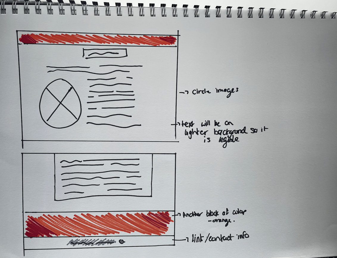
 

Wireframes

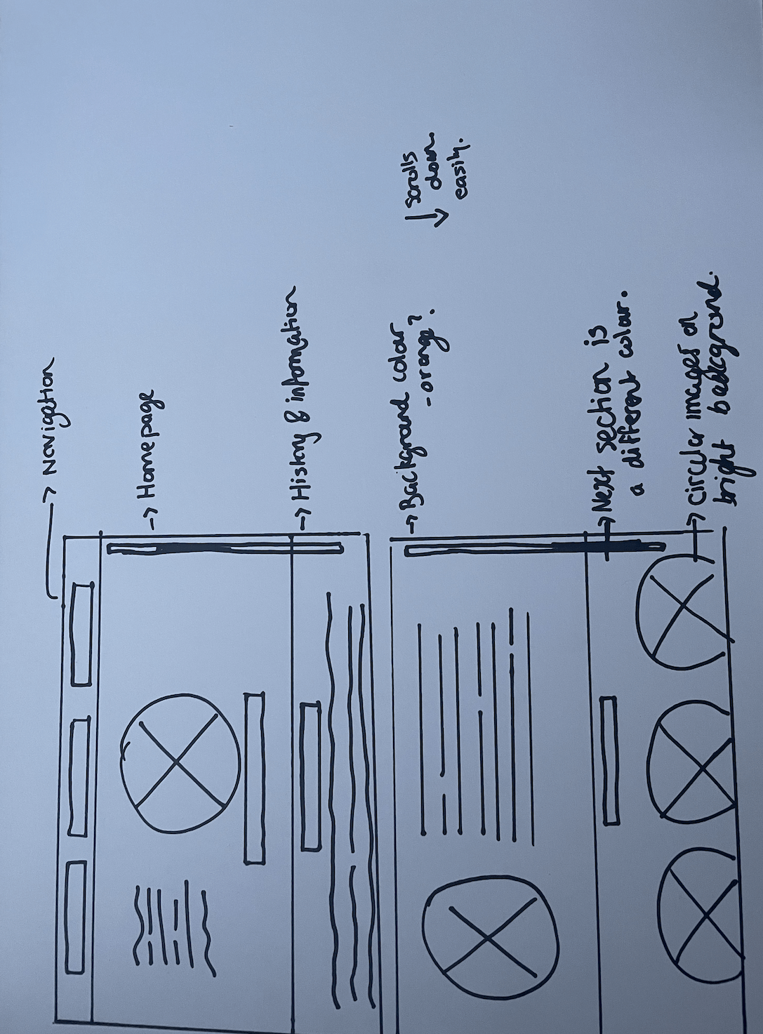
I wanted to sketch out a wireframe with some colour, I am initially interested in an orange and grey colour palette, this is how it turned out.

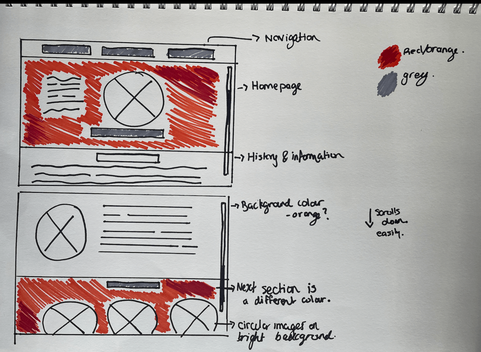
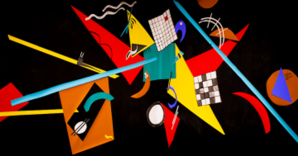
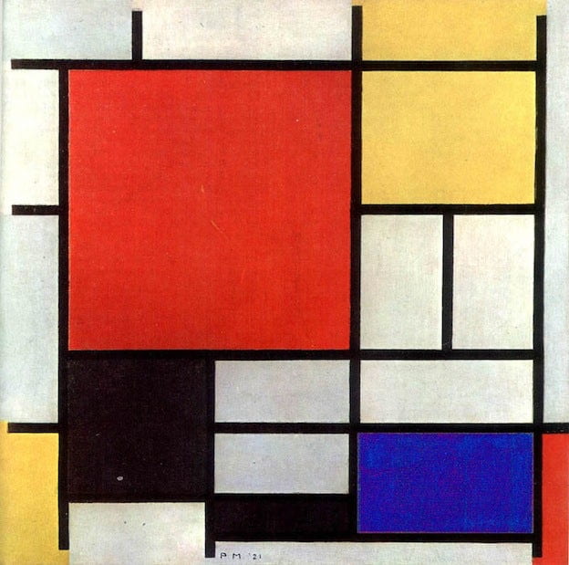
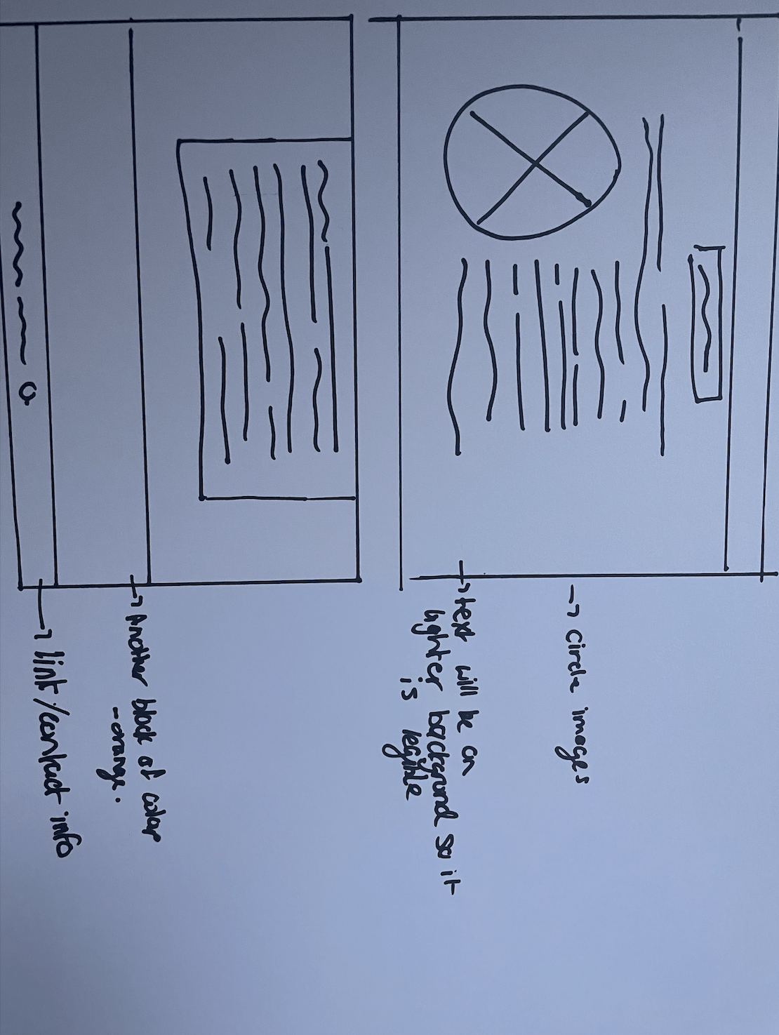
Im not sure this will suit my theme of essay which has a lot of information about Piet Mondrian and his primary colour pieces, so this got me thinking that this simplistic idea could be a great colour scheme for my website. I sketched this idea out and this is how it turned out.

I will try this out digitally and see how it looks, im not sure the circle images will work but I will see.


Group Presentation – The impact of modern art

For our group presentation we decided to go with the impact of modern art because we were all interested in the separate movements involved in the evolution of art through the twentieth century. We had to research modernism and what it was before we started.

Modernism

Modernism refers to a global movement in society and culture that began in the early decades of the 20th century. Artists believed they could deigns a better life for themselves. They wanted to break away from tradition. The term moved across all forms of creative outlets, such as literate, architecture, art and design , fashion and many more. By the 1960’s modernism had become a dominant term in art, there were many artists that contributed to the key moments in modernism and as a group we want to discuss the most pivotal ones.

We all chose two movements to research and talk about. I chose Fauvism and De Stijl. I wanted to do De Stijl in particular because I found the lecture we had on the Bauhaus was very interesting and it was such a pivotal movement in the world of design I had to include it.

I used my sketchbook to make spider diagrams to start my research and try to focus and zoom in on important facts that I wanted to include.

Fauvism

I started researching Fauvism and this is what I found.

Fauvism was one of the first leading modernism movements in the early 20th century, it was short lived and only lasted about 5 years in total, in comparison to other movements that followed. It refers to ‘Le Fauves’ which is French for the wild beasts. This name was given to the artists for their depictions of their models and use of vibrant colours and shapes.

This is Henri Matisse’s work, he is one of the most well known fauvism artist who founded this movement. Henri was a French artist, painter, printmaker, sculptor and many more. He is most known for his paintings however, and alongside Picasso was one of the artists who helped to define the revolutionary developments in the visual arts throughout the first few decades of the twentieth century.

One of his most famous pieces was the ‘Women with a hat’, his intense use of colourism was eye-catching and very knew to the people of the time, people believed this piece to be unfinished and the ‘loose brushstrokes’ shocked viewers as this wasn’t seen before. It is said that this painted strikes up such controversy and was the catalyst for the start of the ‘Fauvism’ movement along with the other major contributor to this time ‘André Derain’. They both shared an interest for bright colours and expressive brushstrokes on the canvas and were so expressive that they took the paint tubes and applied it straight to the canvas. I found the bright colours and abstract feel so mesmerising and I knew I had to chose this one to talk about. This movement expressed emotion with wild, often dissonant colours, without any regard for the subjects natural colours.

Other artists participated in this movement such as Gustav Moreau who was the movements inspirational teacher, he taught the students to ‘think outside the lines of formality and follow their visions’.

Fauvism in Graphic design 

I then began to research fauvism in todays society and I found images such as these


I found that these 21st century artists are taking aspects of fauvism and recreating it/adding it to their own work. I then found lots of images of that broken up leaf image that was from Henri Matisse’s later works and cut outs. This was due to his illness he could no longer stand and paint, therefore he had to come up with new techniques, some of his most creative and interesting work is to have come from this period of his career – the cut outs.

Henri Matisse and Paul Rand.

Through researching more about fauvism in todays society and the art world I discovered that people were linking this bold and vibrant work to Paul Rand – the greater of the IBM logo. Other than his revelations with graphic design and branding Rand also created many posters. His work, like Matisse, was simple in effect yet extremely bold and outgoing. He took inspiration form Matisse’s cut out and collage type pieces as seen here.

Paul’s work:


Matisse’s work:


Masterfully balanced composition, simplicity of forms, the use of austere, pure colours and the technique of cut-out and collage makes the artworks of both artists visually coherent. Seeing that Matisse had this much of an impact of artists work today is exactly why I have to include him in my fauvism research and project, because the reasoning behind this presentation is the impact of modern art, and what better way to display that than showing how fauvism influenced graphic design so heavily.


De Stijl

I then had to chose another movement that interests me and that is, De stills’ impact on the art world. During a lecture, De Stijl and the Bauhaus were mentioned and this amazed me, I thought the narrative of how it came about and had to end was tragically fascinating. I knew I had to include it in the presentation as it was such a defining moment in art and design.

De Stijl was founded by Piet Mondrian and Theo Vandoesburg in 1917, it was a dutch movement that was a response to the horrors of world war 1. These Dutch artists wanted to break away from traditional art and create something new, that hadn’t been seen before. They promoted a style of art that only used horizontal and vertical lines, primary colours and regular forms.

The artists envisioned nothing more but the fusion between function and and form. This resulted in the artwork, architecture etc to become ultimately simplistic but very effective. De Stijl influenced the Bauhaus and the international style, it was used in design, graphic design, typeface, artwork, architecture and many more. This ripple effect took over and De Stijl stands out because its aspirations were as social as they were aesthetic. By ostensibly removing the individualism of the artist in favour of precision and universal harmonies, the De Stijl group believed they were laying the groundwork for a future utopia.

A 1921 painting by Piet Mondrian.

Their goal was to reform society and to do so in their art they took away false distinction of ‘high art’ or ‘applied art’. I found the political aspect of this movement very interesting and I found myself wanting to know more.


Typeface created by Theo VanDoesburg


De Stijl poster


De Stijl today

Through research it wasn’t hard to see that many designers still thrive of this movement and these techniques, many designers believe that De Stijl is the answer to modern designer’s questions. The geometric shapes and simplistic elements make for timeless graphics and is used today by many, I found the very interesting.

‘Inception’ poster-inspired by De still

Gerrit Reitvelds – ‘Red and blue chair’

A De Stijl inspired building in the Netherlands


From seeing all of these images and how De Stijl made such a lasting impression in the art world I knew that it had to be mentioned in our presentation. I learned that the term today that De Stijl has inspired is called ‘colour-blocking’, which is s technique used widely in todays society, particularly in architecture, however it has been adapted, there are more colours and tones being use – its not just primary colours.

I found it very relevant to focus on the use of De Stijl techniques today and how these artists and this moment have is kept alive today because of the impact it has on 21st century artists. To conclude both of these movements and the rest of my group looked at were pivotal moments in the art and design world, influencing type, fashion, movies and many more. Without modernism I feel that todays society would not be so vibrant and exciting.


Abstract – Olafur Eliasson

I watched the artist Olafur Eliasson on a Netflix series called ‘Abstract – The art of design’. I found the episode on the ‘Design of art’ that he was featured in very interesting and awakening. He is known for making experiences in his art, and he interacts beautifully with his environment. From this documentary I learned that Eliasson was born in Iceland, whose father was also a painter, an artist like he grew up to be. To him, the way he sees the world is how we experience it. Eliasson operates on a global scale, having galleries and workshops all over the world. His work is completely dependent on the spectator.

These are some of his famous outdoor spectacles that were mentioned in the episode.

He created the rainbow in 1993, he wanted to this spectacle to be dependent on the eye, the person. His object was to create something that was different for every participant, so the angle is very important. Other people can’t see your rainbow, which I thought was a lovely notion.

The other image is from his Brooklyn bridge work, in 2008 he made a waterfall under the bridge. These types of outdoor pieces of art are not about nature per-say but about the people watching it, because without them there would be no spectacle to look at.

Why does he make what he makes?

He answered this question in this episode. Growing up in Iceland, he was use to mist, ice and water. These elements came naturally to him, so therefore lot of his work revolves round nature or he refers to them in some way. He stated that nature became a way for him to create a language everyone can relate to.

Olafar then talked about how ideas work for him and how he takes an idea and turns it into art. He started of thinking where do ideas come from?, then moved onto how do I verbalise them? and then how do I take this idea and make it into a reality, into a model. He iterated ‘why’, Eliasson stated that ‘What drives every decision is not how but WHY. I thought this to be very enlightening.

One of his best known works was the ‘Yellow Room’, this light takes away all colour from the room. This meant that as participants in the room we see less with the more colour that has been taken away. He used this light again in 2003 during the ‘Weather project’. His question to himself was ‘how can I make the air visible’, he used fog for this effect. Once again, every persons experience was different during this showcase. Some thought the experience was apocalyptic and gloomy, while others thought it was spiritual and felt like a relaxing time. The yellow monochromatic light aided these views.

Abstract work

Olafar then talks about his abstract experience, he wanted to make abstract tangible. He wanted to hand over the responsibility to the participants and he done this by using light, sound and shadows. Like all of his work everyone saw different things when they walked into this space. In doing this, it empowered the audience. Eliasson said that this gives the viewer a sense of ‘I am good enough’ because they were able to co-produce the narrative.

He talked about how he felt that abstract is the imagination and its not about creating something intricate but its about the fantasy behind what an abstract piece of art can be.

Current work

Eliasson is now involved with politics and works with advocacy projects in order to try and change the world. He started a project called ‘The Ice Watch’ in 2014. He placed a circle of glaciers in a town and lets them melt in order to show climate change. This evoked behavioural change because you know it’s going to disappear.

He also created the ‘Light Project’. He designed a solar panel powered light that enables families who can’t afford lighting to never have to sit in darkness. This is the perfect example of how to turn thinking into doing.

This episode ended in a very interesting way, the artist asked the viewers ‘what is in this for you’, ‘why are you watching this episode?”. This had me question myself. Why was I watching this? I came to the answer of that I wanted to learn more about abstract art. I got more than I expected to out of this documentary. I learned that it is important that we don’t take our surroundings for granted. He finished with showing different daylights around the world, symbolising daylight varies everywhere. Everyones perception is different and that reflects abstract art, people portray abstract art in so many different ways but that’s what makes it so beautifully intriguing.