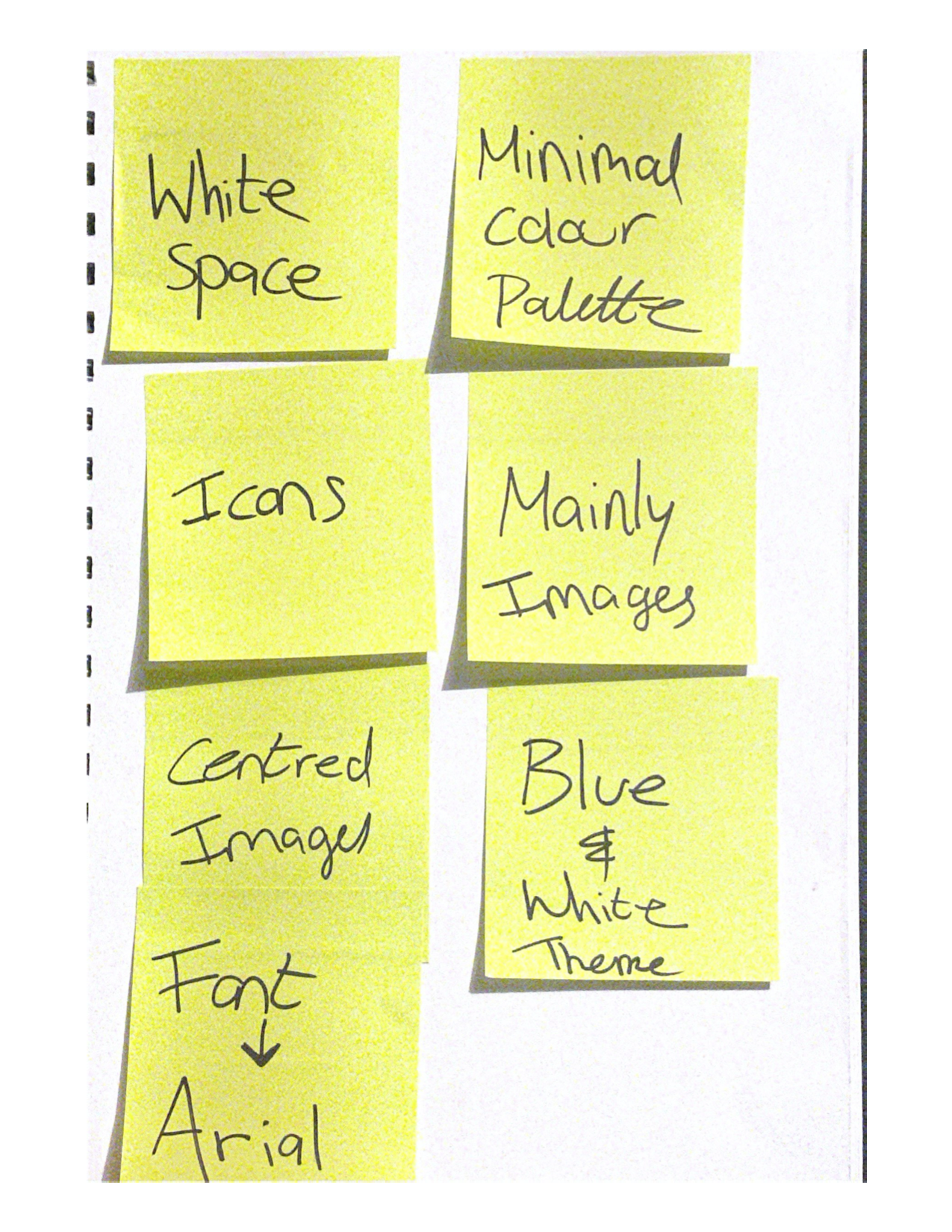
Planning the Design
I thought about what kind of style do I want for my pitch slide deck. I want the style to match the idea- for it to look and feel consistent. Below I brainstormed some design elements that I want to include within my pitch.
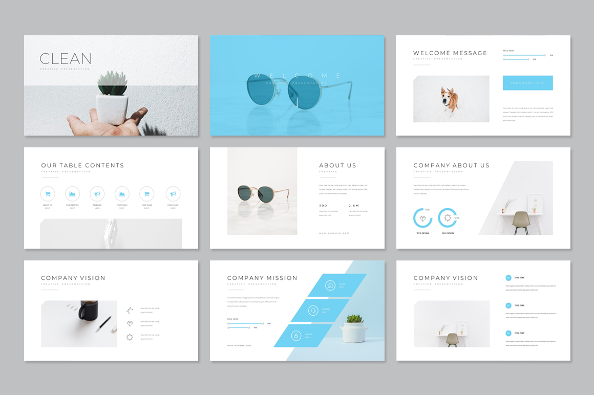
Inspo
I then went on Pinterest to get some online inspo. I wanted to go for something really clean and clear to read, that was really important to me. As long as it is clear and my audience can read it. Just like the inspo I found below, they have no real visual noise and they focus on the images and little text!


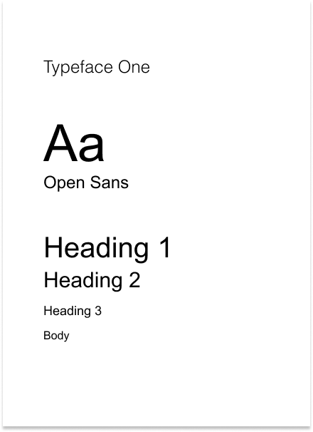
Typography choice
I wanted something modern and simple, that was easy to read and I decided on Arial.

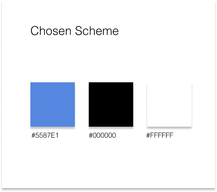
Colour scheme
I went with the same colours that I used on my brand and the app, I thought this would add to the cohesiveness and tie everything together. Making my pitch look professional and well thought out.
The use of illustrations-
I made these on Figma, I wanted to include these instead of text.

Thoughts
I am so pleased with how this turned out I think the design matches the app and the product and everything syncs up really nicely. I think as far as the design goes I think I executed it well and I achieved the look and feel that I wanted to with this. The next thing is to present it, wish me luck!
Link- https://docs.google.com/presentation/d/1IcLQCgsvkSH09kCM7yZG9ItS9O8qb7BAF-Wnq4Ac56U/edit?usp=sharing