Planning
Asking myself the question what sort of style do I want?

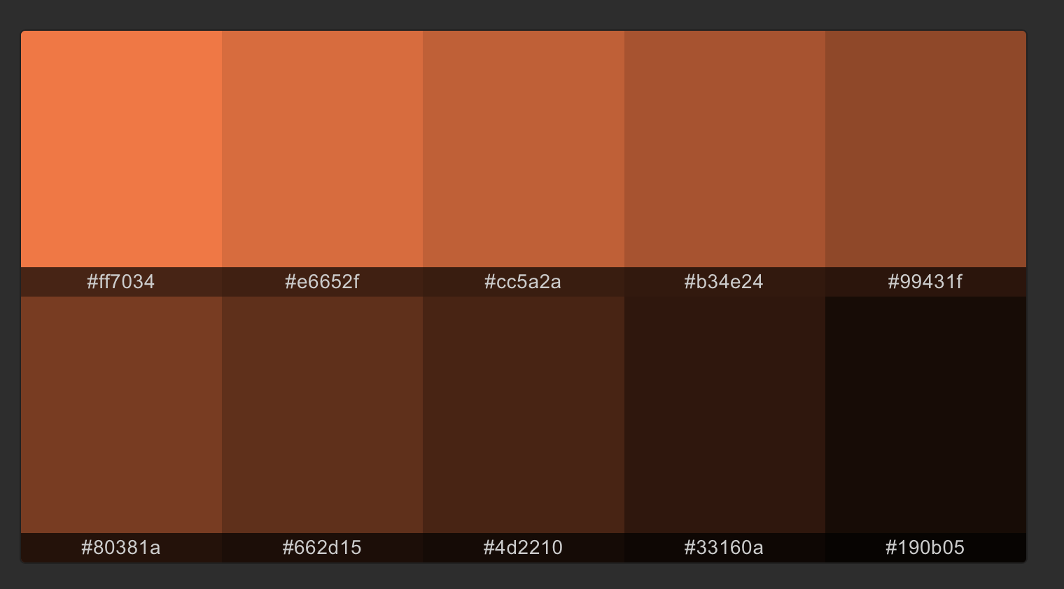
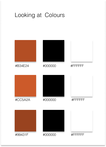
Looking at colour inspo
I took these colours from inspo of the many ‘bricks’ that are all over Hill Street. I thought this could be a nice colour to add to the title page and page numbers for example.
Looking at type options
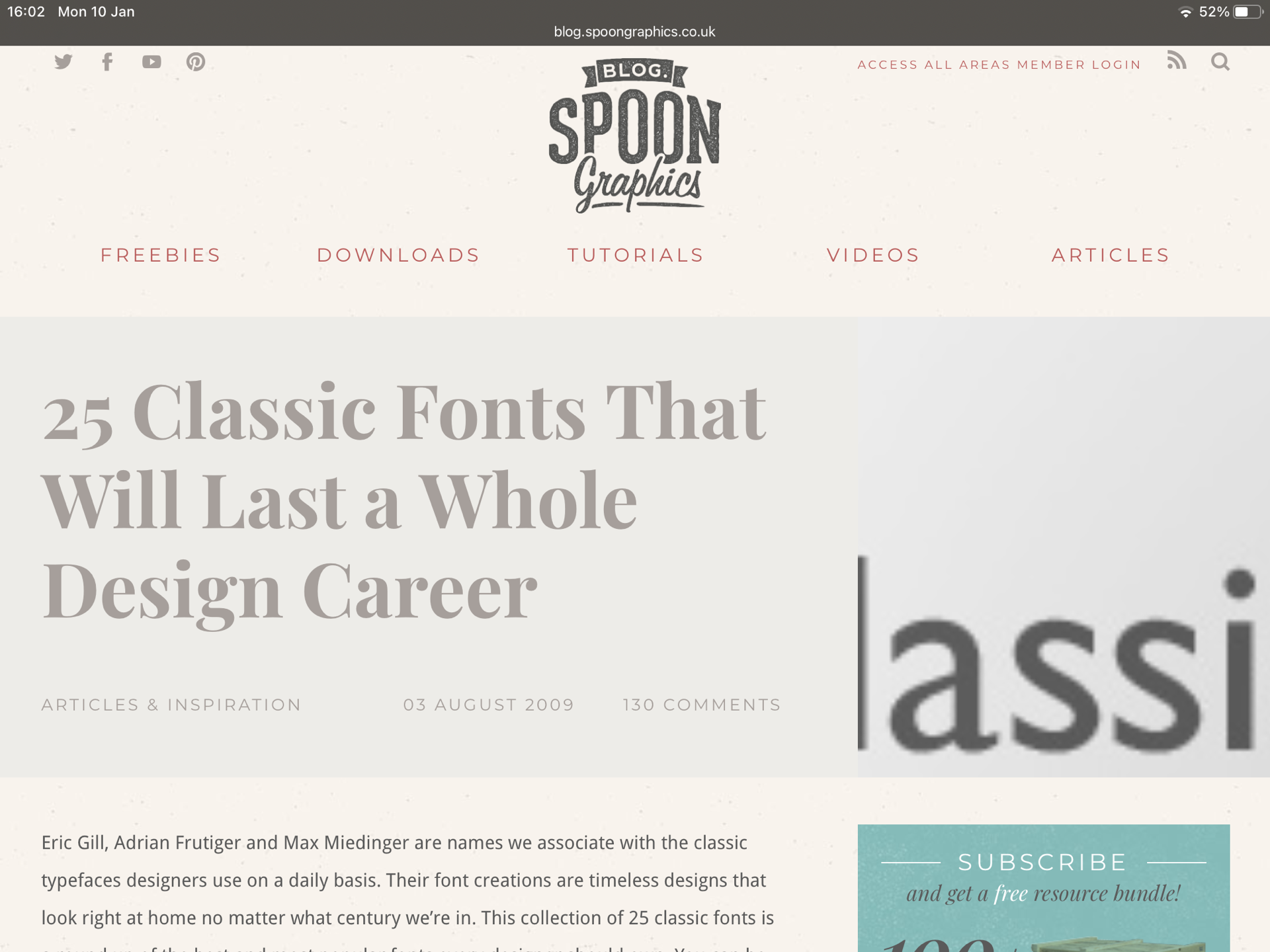
A big thing for me was to have really suitable type for my proposal that suits the vibe of Hill Street. I am so interested in nice type and I am learning about this all of the time, so I did some research into classic fonts that still had a modern take. I screenshot this research below and added in some of the really nice fonts that would suit this project below.
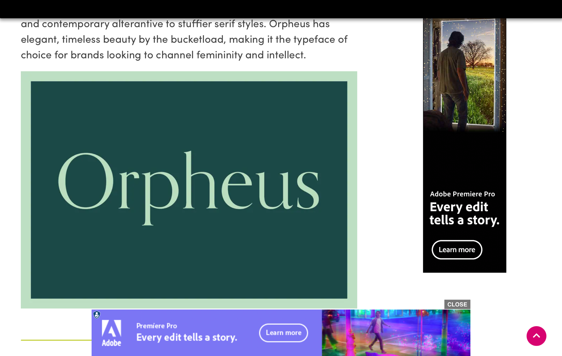
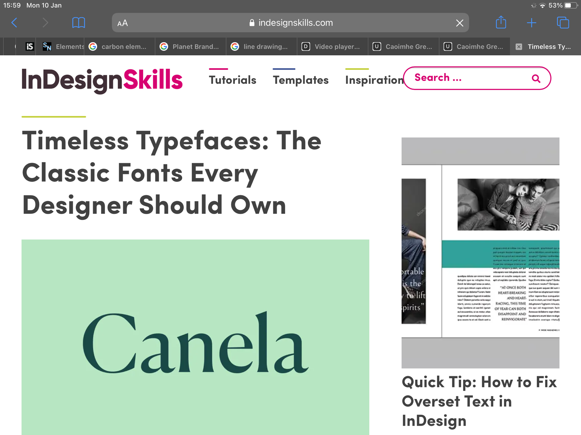

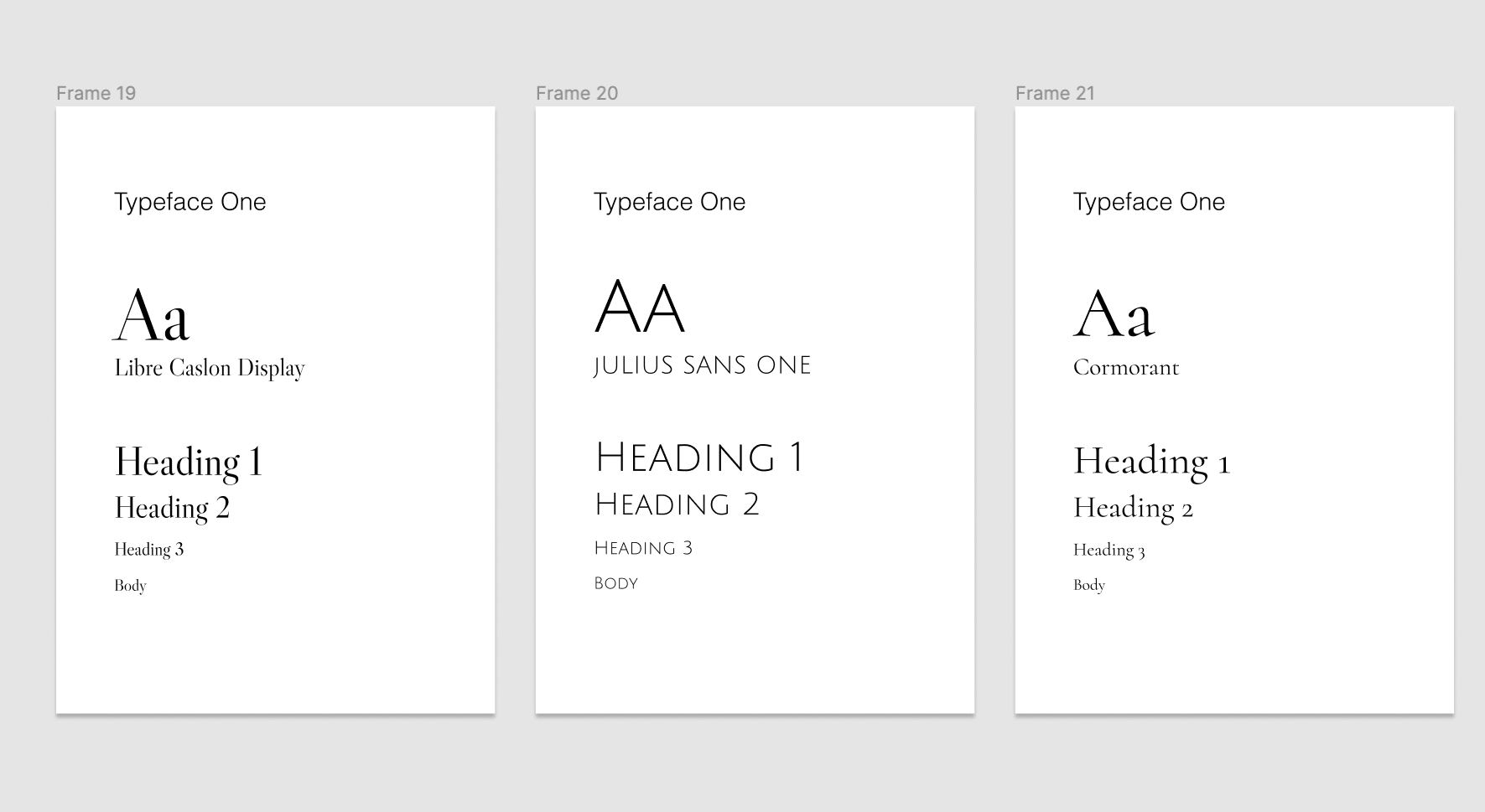
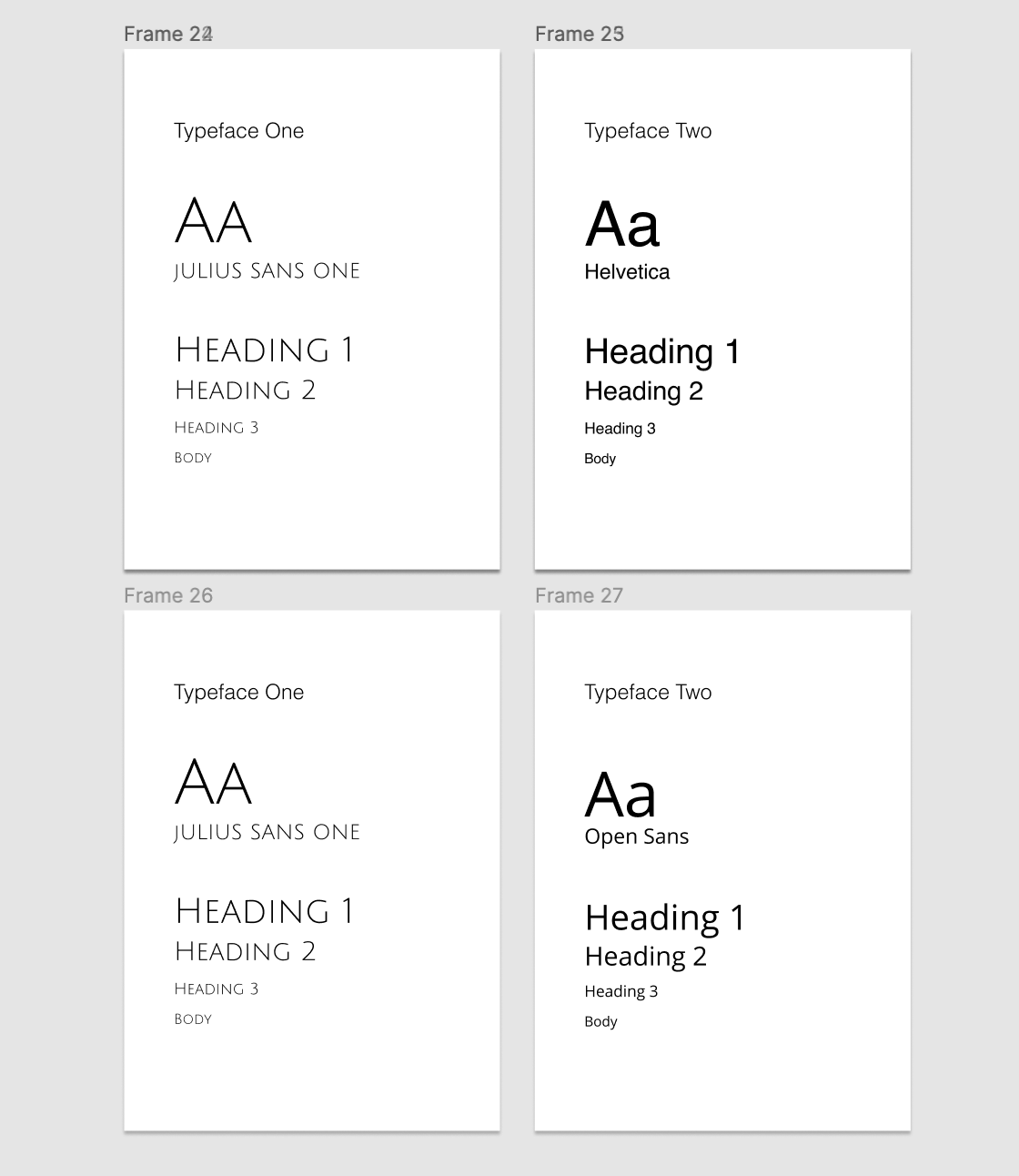
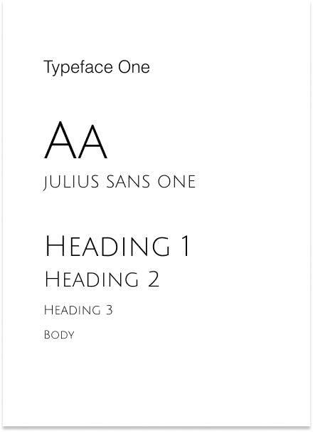
Exploring these fonts-
I took to Figma to actually see how some of the above fonts looked online and I made typeface design systems to show this.
Final font pairing
I ended up using the below fonts- Julius sans one for the main titles and then Helvetica light for the main information of my proposal. I think they pair well together and I think the Julius one is the perfect blend of modern and traditional which is what I wanted it to give.

Front page exploration
I wanted to do something fun on the front page to show what the website could look like. Since Hill Street in Belfast is full of lovely , traditional old bricks I thought I could incorporate this into the title page design. I sketched this idea out below to see what this could look like.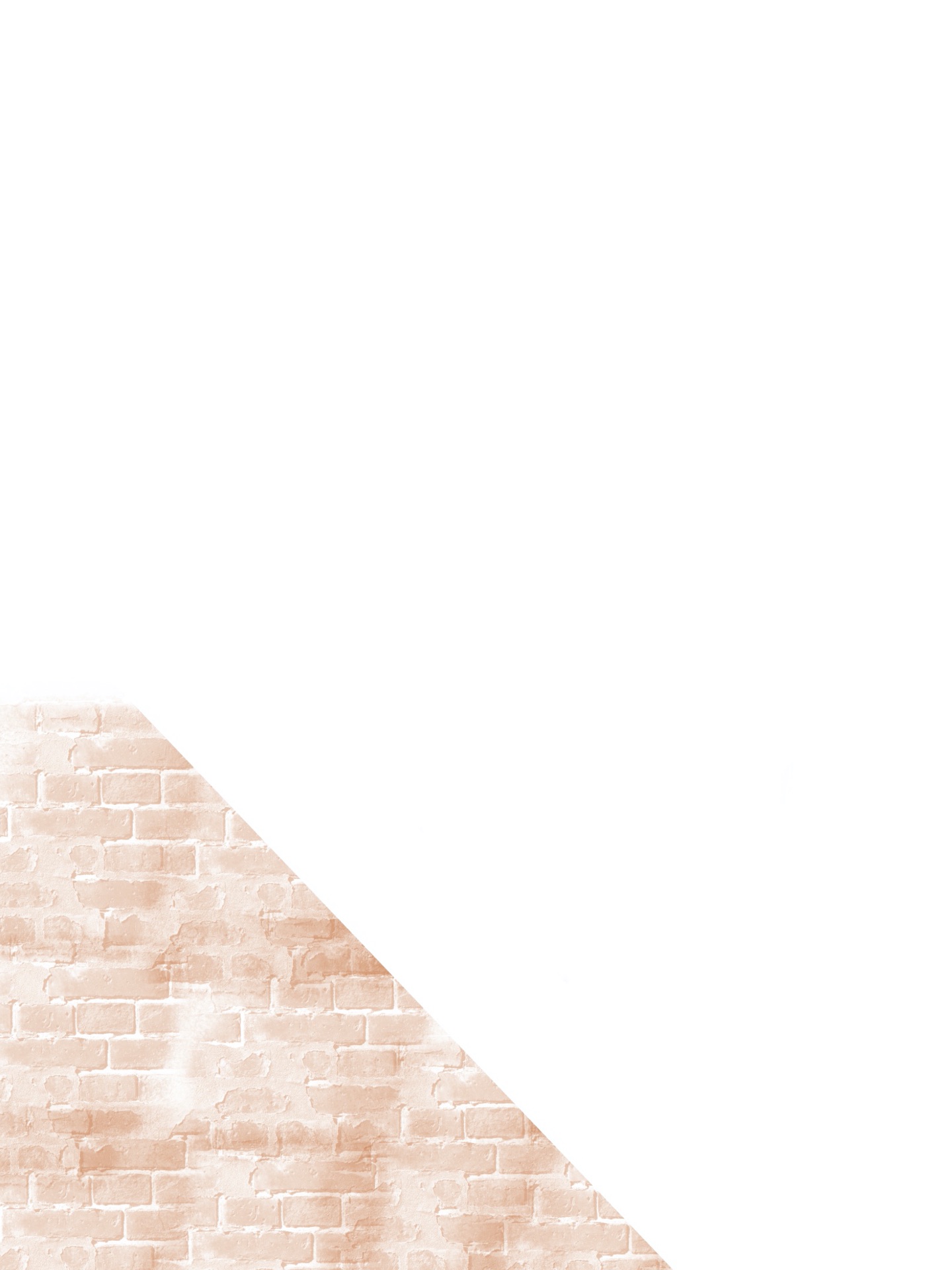


Choosing a colour scheme
I took the colour inspo from the images I took of Hill Street and its warm autumnal feel. I don’t want to saturate my proposal with these colours, I want to add them in subtle ways. I think my chosen colours really give that warm, old style vibe that I wanted it to.
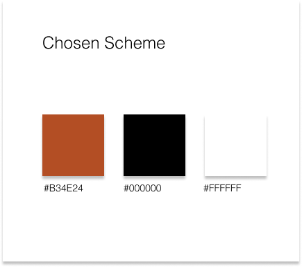
I will incorporate these colours in subtle ways- e.g. through page numbers and titles etc.
Building it
I decided to build this on Indesign where I have built my CV and cover letters on too. I felt like this was the best option for my as I find it really easy to use and it keeps all text and titles aligned really well. I have included screenshots of me working on this below.
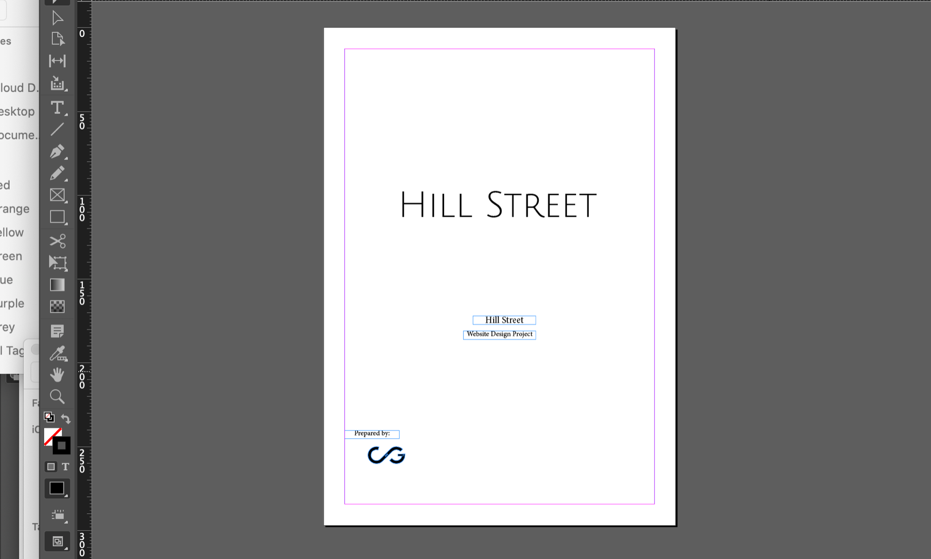

I decided to keep the info to the left and keep it all neat and aligned. I liked working with a lot of white space here it was a good challenge for me.
Reflection
I really enjoyed designing and making this proposal. I think I tied in everything that I wanted too and I think the overall style really compares to the street and what the websites vibe would give off. I will post my final draft along with an invoice on my blog.