How to pair fonts well…
First step- Know what you’re dealing with…
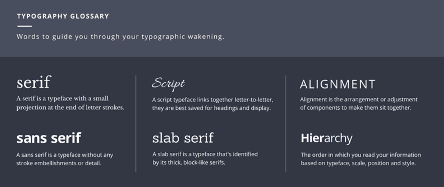
Typography is one of the most important parts when it comes to ux/ ui design and design in general! It is over looked in a lot of situations and this is obvious when it comes to the outcome of a lot of designs- it is clear when the designer has considered typography and when they have not. I wanted to do some research into typography, I want to get better at font pairing and choosing the right fonts for the right design problems. I started off with some basic type recap which I have looked at previously. I thought this was a good stepping stone before looking at how to pair fonts correctly and how to do this well.

Research into font pairing like a pro
I did some research on tips for pairing fonts which I have noted on my iPad below…

Context
I must consider context-
What is my website/ app about? What do I want my choice of font to say? Font styles can play a big role in cementing the overall look of your design, especially if you’re going for a certain aesthetic. I need to consider what vibe I want my element project to give off and pick fonts that radiate that too. the fonts I choose must reflect my context.
Create a contrast
One of the main reasons that pairing serif and sans-serif fonts work so well together is that it creates contrast. This idea of contrast brings together multiple concepts that you should be considering, including hierarchy and how fonts complement each other. To achieve a good contrast I should look at size, weight, spacing, kerning and colour. A thicker font paired with a thinner font – these differences help create distinct roles for each font, allowing them to stand out as individual pieces of information. This can also make is more pleasant for users to read and look at.
However on the other hand…
When combining fonts, you do want contrast, but what you don’t want is conflict. Just because fonts are different doesn’t mean they will automatically work well together. So how do I avoid this? I should look at fonts that have similar proportions and share qualities. this could be that the lowercase letters have the same height for example, and by doing this research into the fonts this will allow them to work well together.
Examples I came across
I took some time to look at some of the aesthetics that matched what I wanted my brand and app to give so I have included some of the examples in this post. I am leaning towards a futuristic font paired with a more modern typeface for the boy copy, but I will explore this soon.


Reflection
I learned that practice amjeks perfect here, learnign to pair fonts is not an easy job but it is a necessary one if you want to be a great designer therefore I must practice this art. I have learned a lot of tips when it comes to font pairing from the research I have done which is great, such as limit the number of fonts I use and don’t pair fonts that are too similar or too alike. its all about getting that right balance. This is a topic I am passionate about so I really did enjoy gaining this new knowledge! So what is next for me? I want to experiment with my own font pairing and explore what will compliment my brand and my element project.