First draft of my portfolio website
I have developed my first portfolio and I have included screenshots of my first draft below. To design and create my website I decided to do it through WordPress as through my research and trying out various website building platforms I found that this method the best. I was able to add a number of features to my portfolio website including Google Analytics, this is important to me as with this feature I am able to see how many views my portfolio gets and more importantly I am able to see where the audience are coming from, e.g. social media links such as Instagram. Features like the Google analytics are important to me as a designer therefore this method of designing a website suited me the best.
I have decided to go for a multipage website instead of a single page website, I felt like this would give me more freedom to add in a wider range of materials including my process for solving problems and briefs. Including my process of how I complete projects was a really important aspect that I wanted to include in my portfolio website, therefore creating a multipage website felt right to me. This also gives the user more control and they can navigate the site themselves and choose what they want to look at, e.g. my work or my contact details etc.
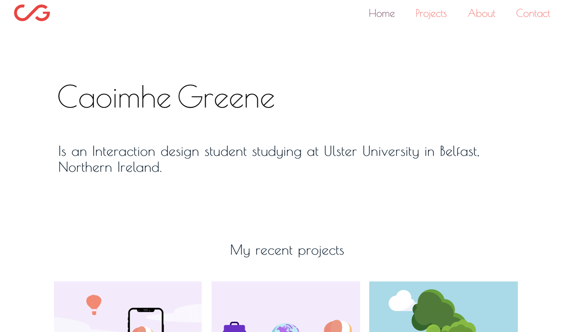
Home page
I have included my monogram at the top left hand corner of this website and my nav at the right. My wordmark is below this with a short description of who I am and what I do below this. I didn’t want to overcrowd this page with irrelevant and unnecessary information, I wanted to keep the focus on my work. I have included a recent projects section below my intro, were I can add in my recent projects and this can edited at any time as I complete more and more projects in the future. I felt like this would help keep my portfolio up to date and relevant. There is a button below my recent work that allows the viewer to go directly to my projects page where I have displayed all of my projects.
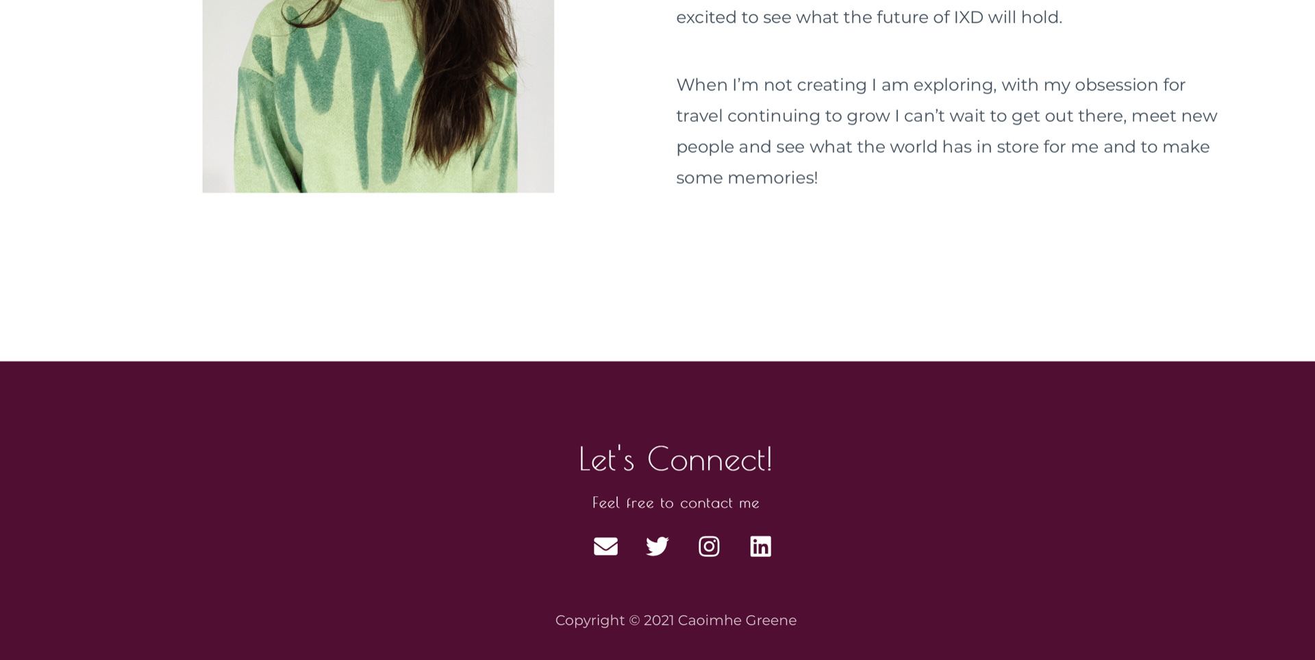
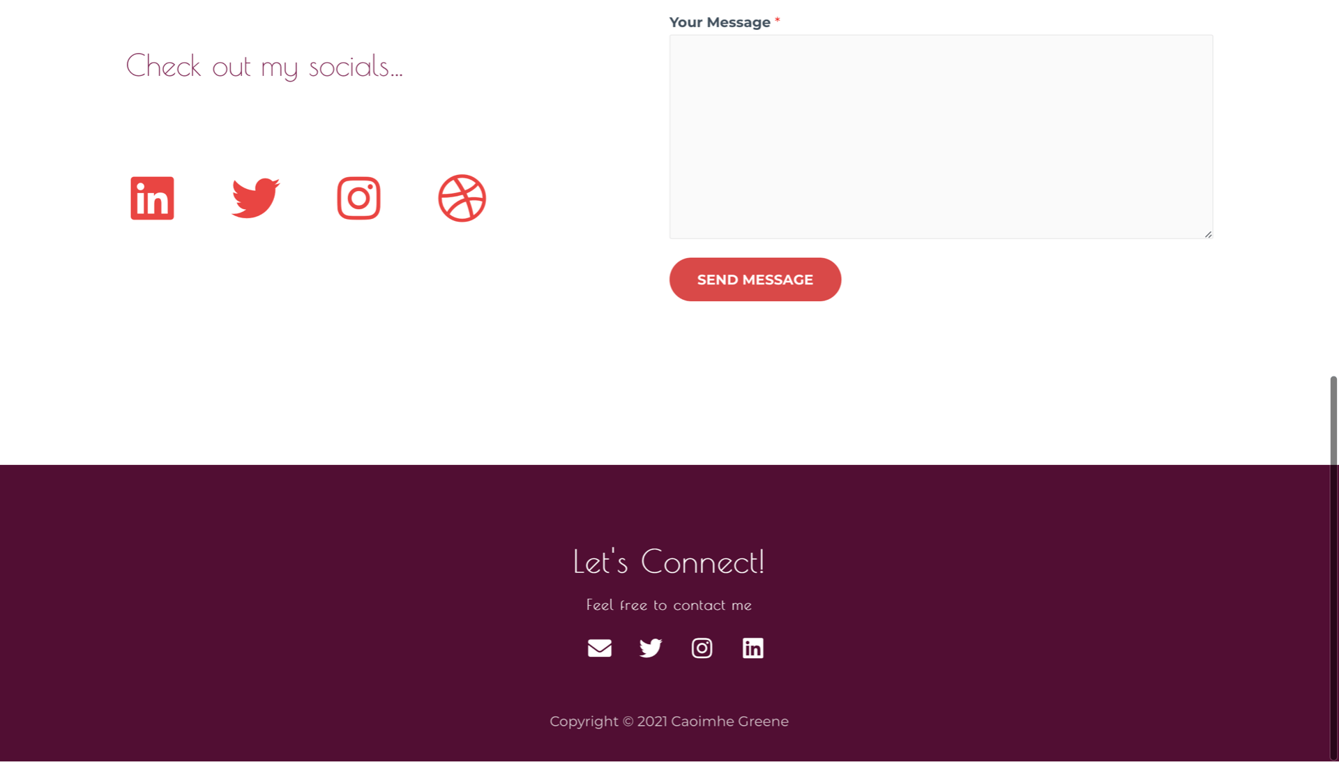
Footer
For my footer I decided to include a few contact links, so my consumers could easily contact me if they had any of the following social media or simply with email. I decided to add ‘Let’s Connect’ to add a bit of personality to my website and give off a more friendly and welcoming vibe.

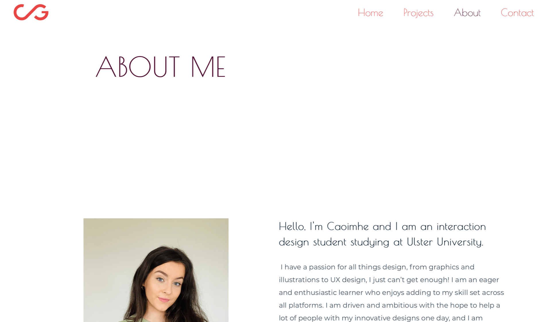
About me page
For the ‘About me’ page I had previously decided to included a picture of my on the left hand side and text on the right, I feel like with including a real picture of me my consumers will feel like they can connect with me and see me as a ‘real person’. I included two small paragraphs summing up who I am and what I hope to do with my career in ux/ui design, I added my interests in travel and passion for all things design including ux and illustrations.
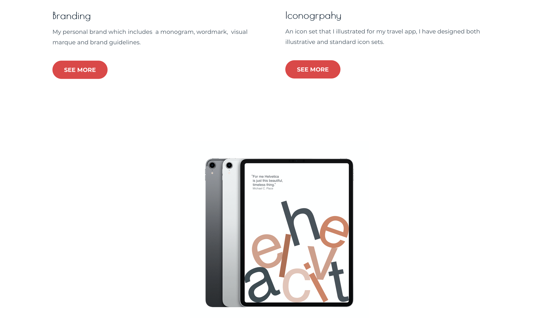
Portfolio page
My ‘portfolio’ page consists for each of my projects in separate containers, I have only included my best work here and this is a page that I will continue to add to in the future. I have added in the names of my projects and a simple small description of what that project is below this, I have included a button where the viewer can click to read more about that particular project in greater detail. These pages include more detail about the project with the inclusion of sketches and wireframes and my entire process of how I created the project.


Contact me page
I wanted to keep my ‘Contact’ page simple and straightforward, I have added in contact details and social media links. I want to revisit this page and include my social media icons that I had originally designed for this page previously and see how they would look here. I have also included a contact form if they have any inquires about me or my work which is very easy to use.

Tutorial critique
I spoke to Daniel about my work and he expressed that I should consider the following points:
- To add more emotional feeling to my portfolio- I can do this by adding a little more excitement to my page trough an image carasaelll of the project I am the most proud off or a large banner below my wordmark. This will help my brand and my work to stand out immediately when someone views my portfolio.
- I feel like I wanted to add more colour so Daniel suggested I rethink the placement of my monogram, perhaps if I place my monogram where my wordmark is and vice versa this will add that splash of colour that I want.
- I should revisit the first line in my About me page, it is the same as my homepage introduction so I consider removing it as I don’t want to sound repetitive.
- I also felt that I wanted to add more information in my About page and Daniel suggested that if I want to add to the emotional connection between my and my audience then I consider mentioning things that I like or that I am interested in on my About me page.
What’s next?
I am happy with my first draft and I will make the previous changes and suggested adjustments and I will present this improved portfolio on week 11 for my group critique to get my peers opinions and thoughts on my work. I am excited to see my peers portfolio sites and give feedback too.
Link to my portfolio website- caoimhegreene.com