Week 10- The Art of Information lecture
Within Week 10 Paul discussed the beauty in information, and how as a society in todays age we view data and how data is presented to use; and the wide variety of methods and approaches and designers use to present data to use.
The beauty in Simplicity
A point within the lecture that I found very interesting was that good design doesn’t have to be complex- this showed me that my infographic doesn’t need to be high detail and made over complicated with large data visuals with copious amounts of numbers and information to be a good infographic. The example below shows simple how blocks of colour or information can still produce a very effective and informative infographic. the simpler I make my infographic the easier it will be for reader to understand and will more likely encourage people to read is as it isn’t overpowered with unnecessary information, it will keep people interested for longer!
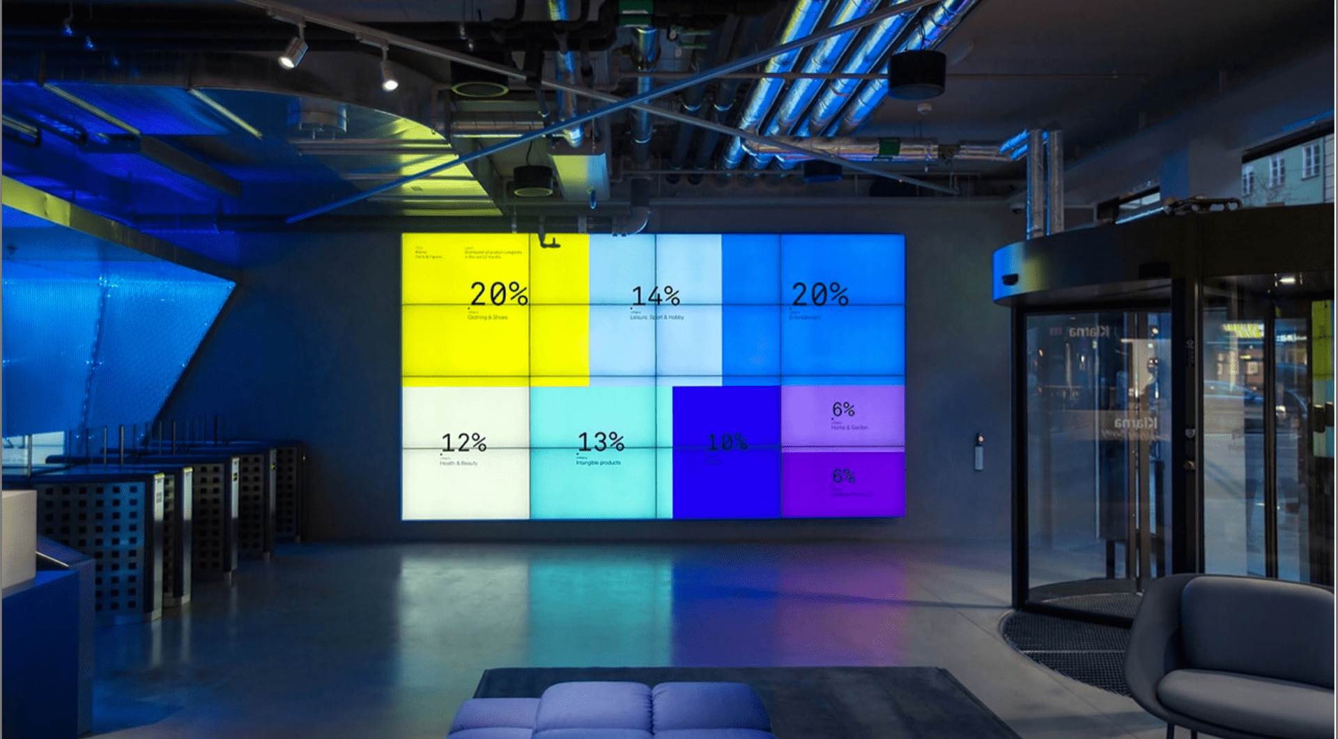
As you can see in the image above this data visualisation is just simple blocks of colour with a statistic, there are no complex illustrations of graphics, just a simple statistic. The coloured blocks do liven it up and separate out that information which makes it easy and quite satisfactory to read and observe.
Paul talked about Aaron Koblin within this lecture, I have already looked at his data work previously access – here.
Real time data
Glacier project by Herald Harbinger

This was another data project that was mentioned within the lecture and this was my favourite one. This project incorporates a collection of data feeds to illustrate the interrelationship between human activity in Calgary and the natural system of the Bow Glacier in the Canadian Rockies, creating a visceral public presence for this restless complex of ice, rock, and water. That continues to move when the natural elements do.

This project stood out to me the most within this lecture. I have never seen anything like this before and it was so interesting to see the lines move and that meant that the glaciers had movement too, this real time data just shows the power that data visualisation has and its great potential. You are able to see things and results that you wouldn’t be able to a few years ago. This field continues to grow and more impressive data visuals can be created and enjoyed by millions worldwide.
What did I learn?
I enjoyed this lecture, I in particular enjoyed seeing examples of data projects that show real time results as I find that so fascinating! At the beginning of this model I was expecting to see a lot of number however all of these innovative data projects are so interesting and really makes me wonder how they create them! I really enjoyed the examples that I got to see today and I have learned even more about the power of data and how it can be presented in so many various and creative ways.
What is next?
I will complete both of my projects and get them ready for a one to one with Paul next week and my group critique on week 12. I am looking forward to seeing all of my work pulled together and seee the final results.