Developing my own brand book
The content I want to include
I have sketched out a list of the things that I want to and need to include within this brand book, this will most likely be the chapters of my book-

Short intro
I want to include a short introduction to what this book is and what its purpose is, this could be something like:
-Hello, I am Caoimhe, an interaction design student studying at the Belfast School of Art. I am a creative person who has a passion for all things design as well as learning.
-Hi, there and welcome to my brand book, within this book I explain everything there is to know about my brands identity and why it is so special!
My brand story
I wanted to add in a quick summary of my brand and my beliefs and wishes for it, this could be something like:
- My brand is a creative and fun space where all design possibilities are infinite. I have a great passion for all things design and my brand represents the idea of never ending possibilities and ideas. I am eager to explore the design process in every project, my brand has a strong belief in the importance of the constant connection between the designer and client.
My values
I want to include a few key words about my brand values, I want this to be short and easy to read. These key words that I want interjected into my brand book could be:
- creativity
- loyalty
- passion
- inclusivity
Tone of voice
My brand is:
- creative
- infinite
- fun
- powerful
- inclusive
I want to reflect this into my brand book and inject colour and creativity into it so it isn’t boring to read.
My logo
I want to include how to use my logo, the do’s and don’ts. These need to be clear and easy to understand and they must include the words Do and Don’t. Examples of this type of information could be:
How to use my monogram-
This is my monogram and this monogram symbolises the idea of endless possibilities for all things design. My monogram should me used for presenting my brands identity to the world, via social media or letter heads for example.

How not to use it-
Don’t distort the infinity shape by making longer or shorter, proportion and geometry is key here.


When reducing the size of the monogram ensure that the proportion are in tack and everything is symmetrical! With a reduction in size below is how it should look.

Typography
I need to include the two typefaces that use within my brand which are Poiret one and Monsteratt. I could explain within this chapter that I wanted typefaces that added that extra layer of personality to my brand but also paired well with my monogram. an example of a paragraph about the typography could be-
Primary font- Poiret One
I chose this font because it brings a creative, light heartedness to my brand but still reflects a modern, sleek feel that ties in nicely with my monogram. When using this font make sure the G is the same as the G in my monogram and do so by making a few modifications. Always use a regular font weight for text but use a bolder version for headings.
I need to include images of my wordmark too-
![]()
Imagery & 5th elements
For the imagery I want to include images of the mockups I made, this will show people how my brand looks in action, I want to include the necessary added features to my brand including my 5th elements so that would include how to make my icons and patterns.
The process
I took all of the content above and more and included this in some way into my book. I designed my brand book using Illustrator as I wanted to include some imagery and patterns into my brand book, I feel like this added a lot of character to my brand book and some personality. I didn’t want this book to be boring with too much unnecessary information. I have added in a few examples of how some of the pages turned out below.
The design
Imagery
For the imagery I wanted to add in images of my brand merch and products to show what my brand looks like in action. I did this by including prototypes that have made previously and I have included a sample fo my patterns within this book too.

Colour scheme
I have decided to go for my brands main colour scheme which is purple and an orange colour, this is seen throughout the whole book, included in the type colours, imagery and patterns. I wanted to keep this consistent colour scheme throughout this book, from start to finish. I kept most of the pages white with black text and added the appropriate images and illustrations, the white background makes it easier for people to read and it looks more professional.

With the idea of endless possibilities in mind I have interjected this idea into my colour scheme, so I needed to include this information too, I decided to show this colour scheme in a clear and easily understandable set up, I have included my layout below.

Logo do’s and don’ts
This is how I designed one of the logo pages, I have kept it mostly white and a large emphasise on the logos with minimal text.
![]()
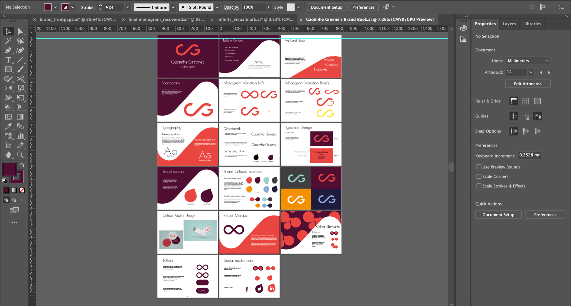
Final brand book- first draft
I have a total of 17 pages within my brand book, below I have included a screenshot of all of the finished pages in Illustrator and a link to my brand book pdf.
What is next?
I am very happy with how my brand book has turned out, I have a few things to fix up with the alignment of title, etc, but I will present this brand book to my group during the group critique that is in week 11. My peers and Daniel will give me their feedback and I will see if I have to make any adjustments to my brand book.