Infographic Illustration
Tree illustration research
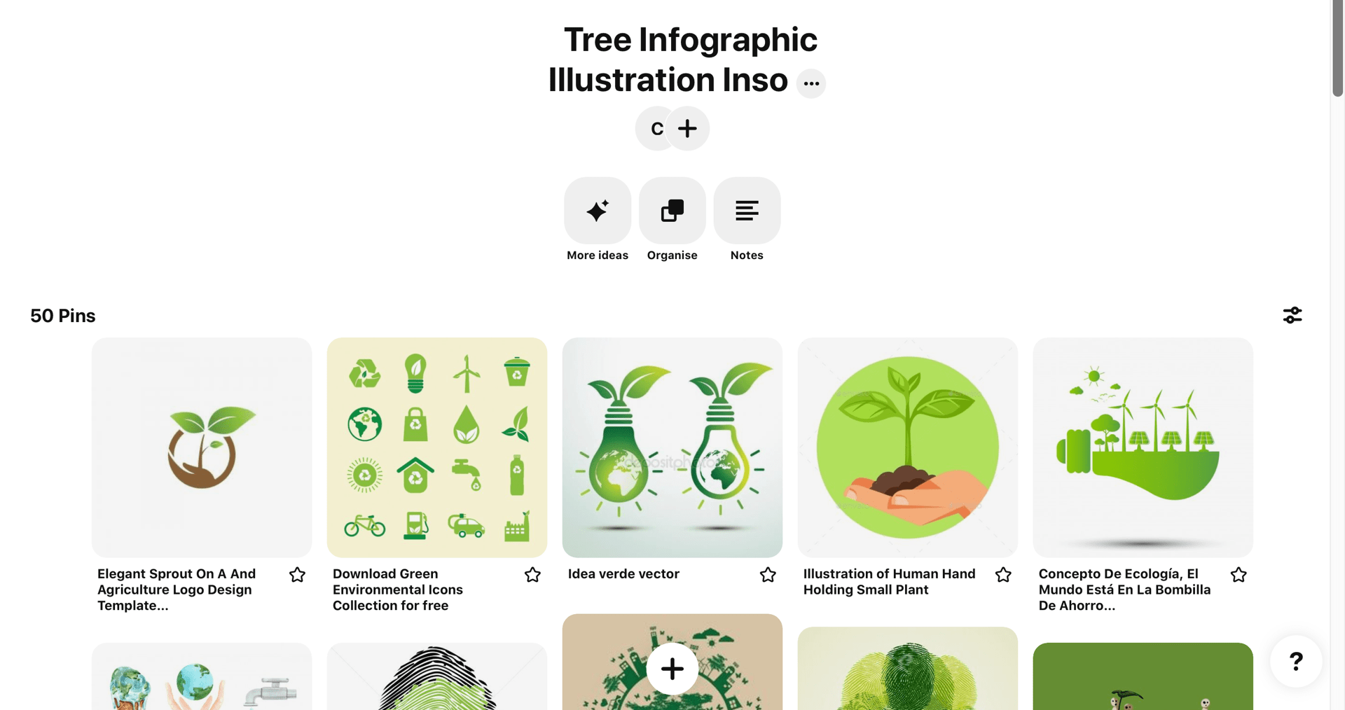
I wanted to get some inspiration for my illustrations for this tree infographic, I know that I want a flat design style but I wanted to do some extra research. I have made a Pinterest board where I have saved a lot of different styles of nature illustrations. This exercise definitely helped me narrow down a few styles that I wanted to try out and explore further for my infographic.
Pinterest board- link
Sketching
I started of with sketching a lot of different ideas for the individual sections that are in my inforgpahic, those sections are-
- Intro
- Deforestation
- Rainforest
- Re-plantation
I have sketched out ideas of the type of illustrations that I can include in each section, that will make sense to the reader and will compliment the information that I will include.

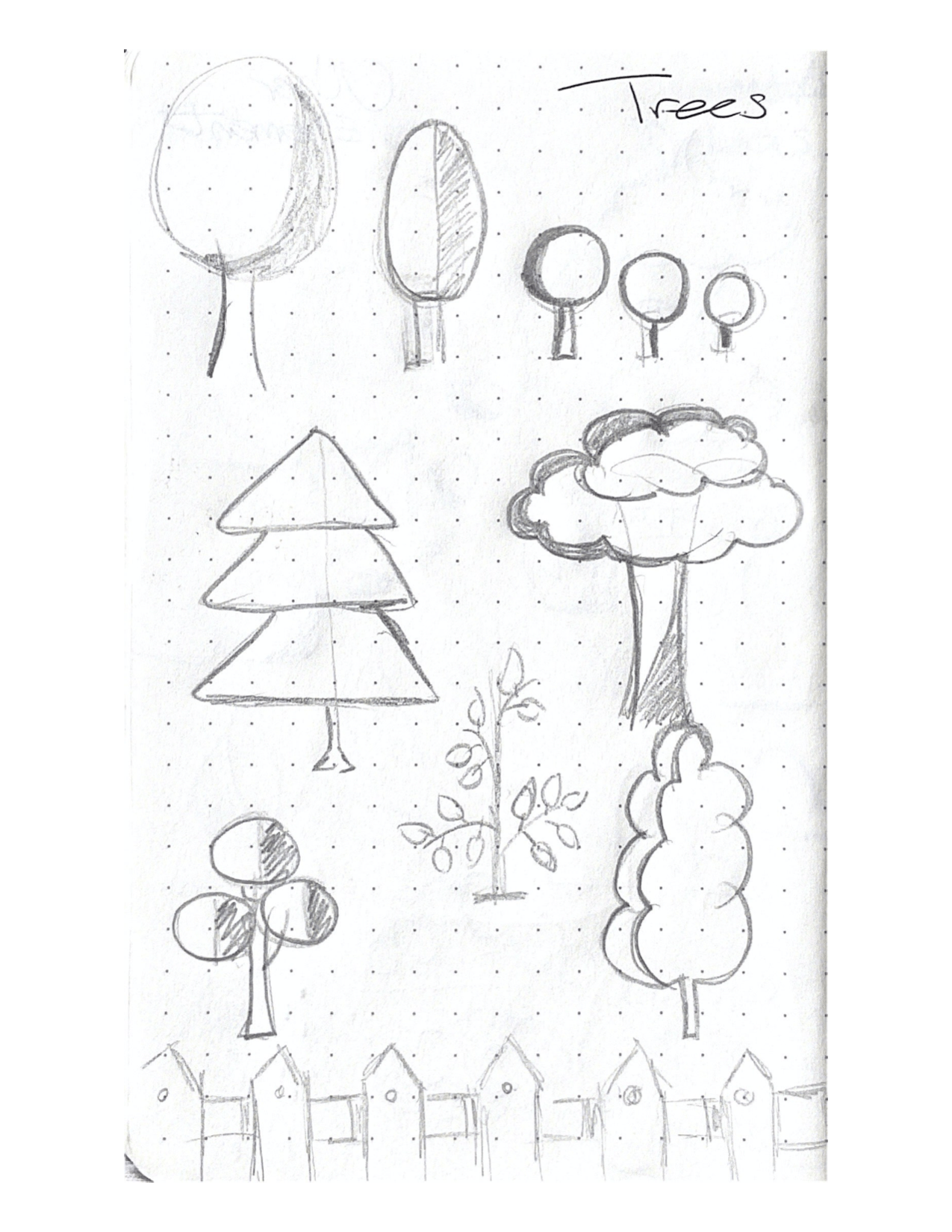


I love the sketching aspect of a project, it is very beneficial as I get to explore different concepts and ideas. I accumulated a wide range of ideas that I got to use to develop further digitally and they had a lot of potential.
Digital development
I have taken all of these sketches into Illustrator and I tried and tested a good range of styles, this has allowed me to see which ones fit best fo the style I want to go for.
Idea 1
I had a few different ideas of the tree illustrations for this infographic, this particular illustration is the most important as this is what my infographic is based on so I really wanted to get this aspect right. This first illustration idea below is fun and quite quirky, the curves on the tree are unsymmetrical and give off a strong cartoon vibe.

Idea 2
I have kept this second idea more symmetrical and I made the tree out of circles, I felt like this could be promising as I could use the circle throughout the infographic, e.g. in the clouds or a sun etc. This would enhance the consistency of the overall piece. I also prefer these colours of green to the ones above I find them easier on the eye.

Idea 3
This idea is typical flat design with the use of very simple shapes, there is something about this simplicity the I love here, however for my main tree illustration I don’t think that this is bold enough and doesn’t have enough detail. I might use these trees somewhere within my infographic but keep them at a smaller scale and not a main central tree illustration.

Final design choice
After deliberation and careful consideration I have decided on this stye of tree, it is friendly and the colours work great on screen and I think this will make a great main illustration that my infographic is centred around as the overall shape is strong enough and it has enough detail.
Rainforest section
I wanted to include some creatures in this infographic and the rainforest is the perfect section for this. In the above sketches I had explored some potential animals that I could include in this section and that are rainforest relalted, I have decided to go with a frog and I have included my digital development of this below.
Frog illustration sketches
I have kept this frog green to tie keep the illustrations consitisen but to add a tropical flare I added this bright orange, I think they pair nicely and I think that this adds to the brighter rainforest vibe that I want for this section.

For an experiment I thought I could try adding this frog behind a leaf to have it’s eye peaking out, this could add to the fun factor of this infographic and give it a playful personality?

Deforestation section
The main illustrative element to this section in particular was the axe, I wanted this to add to the seriousness of this section and I felt like this image in particular resembles deforestation in the best way. This is an important element so I want to have this illustration in a large scale and the perfect design to fit my style. I like the shape and form I have created here and I have payed around with colour too, I think that the red and grey one would both work in my infographic.

Experimenting with wood
Within my deforestation section I wanted to add a chopped wood element and I haven’t designed a wood effect on screen before so I found this very tricky. However with patience and a steady hand I added curved lines to replicate the lines that are present in wood and I think that the before and after speaks for itself. It adds more personality to the piece and it definitely resembles wood in a much more obvious way.


With text
I think that this element is a perfect sign for a large, shocking statistic- I have included an example below.

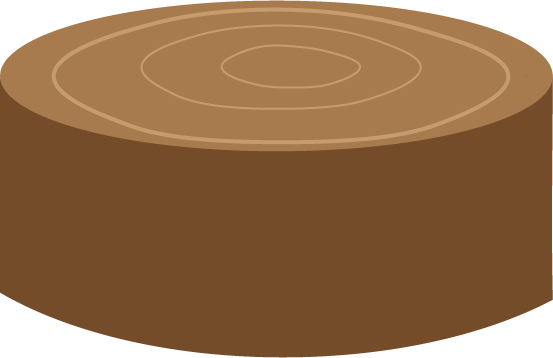
Cut down tree
I created a stump with smoother edges and one wtith a smooth base, I think the colours are a good match and this fits my style so far. I feel like with the tree with a rougher edge will compliment my other elements as it resembles a tree more that the smooth based one. I will try both when I begin to build my infographic to see.

Other elements
My main focus with the illsutariotns is on the trees however I didn’t want to forget about the smaller elements as I think that they can really make of break an illustrative piece like this one. I really like smaller elements and attentions to detail is always nice to see on a piece of work so I created some smaller elements and I love how they have turned out. They are simple but I think when I add them into my infographic they will make the world of difference and really add some more personality to it.

Clouds
I kept the theme of using circles to build this shape of cloud, the same thing that I did with the tree illustrations. I felt like this would keep my infographic consistent and on the blue background I think this will bring some more life into my piece and add to the nature side to it. Perhaps this could be used as containers where I could insert data visuals are text.


Using my other tree illustrations
As I mentioned above I wanted to include those shapes of trees that I was exploring at the start and from research into informatics I had noticed designers using this type of style to present information and I thought I would try this out.
Process
I took the trees that I originally created and placed them around a circle in an even pattern. I then changed the colour of the entire shape to a darker green.

This can be used as another container for a shocking fact about trees.

Intro image
I have combined some of the above elements to create this front cover style image, this can be used for the banner at the top of my infographic and on my portfolio site to advertise this project.

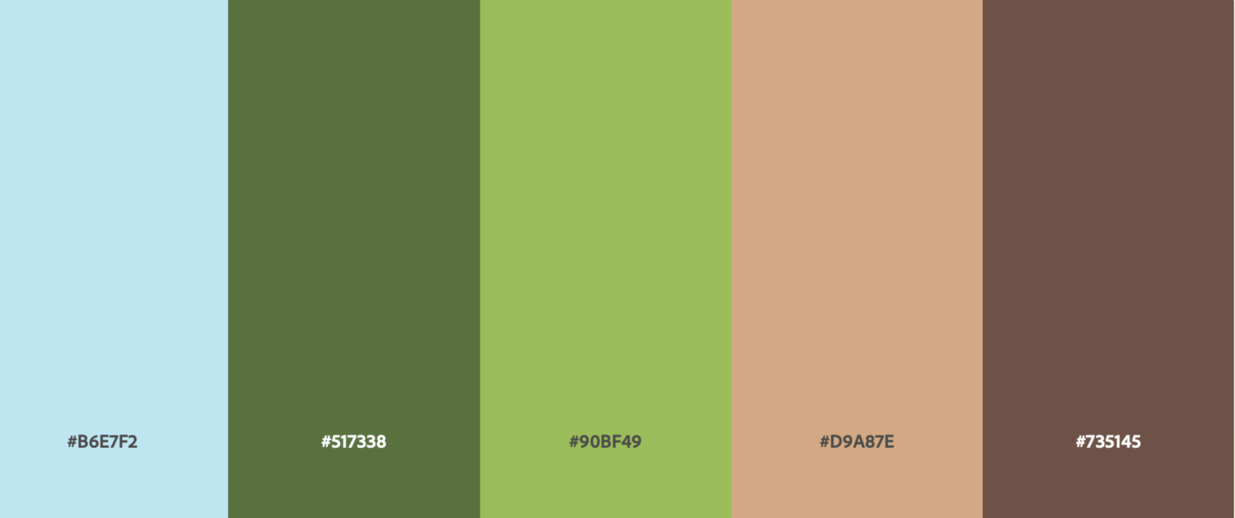
Chosen colour palette
This is my final colour palette choice for my infographic, I think the tonal range is perfect the colours aren’t too harsh but they still show the nature and deep environmental aspect that is so important to portray in this inforgaorphic. I will use these colours throughout my infographic, including text colours and background colours.
Reflection
I am very happy with how my illustrations have developed and how my skills they have grown over the last few months. I am very excited to pull each of these individual elements together and start to build my infographic! I need to decide on a font for my infographic and I need to pick one that matches well with all of the above illustrations.